


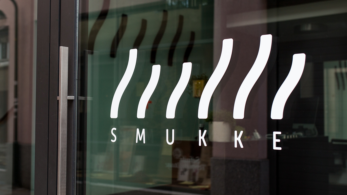
Name: Smukke
Hairdresser in Germany
Task: Corporate Identity
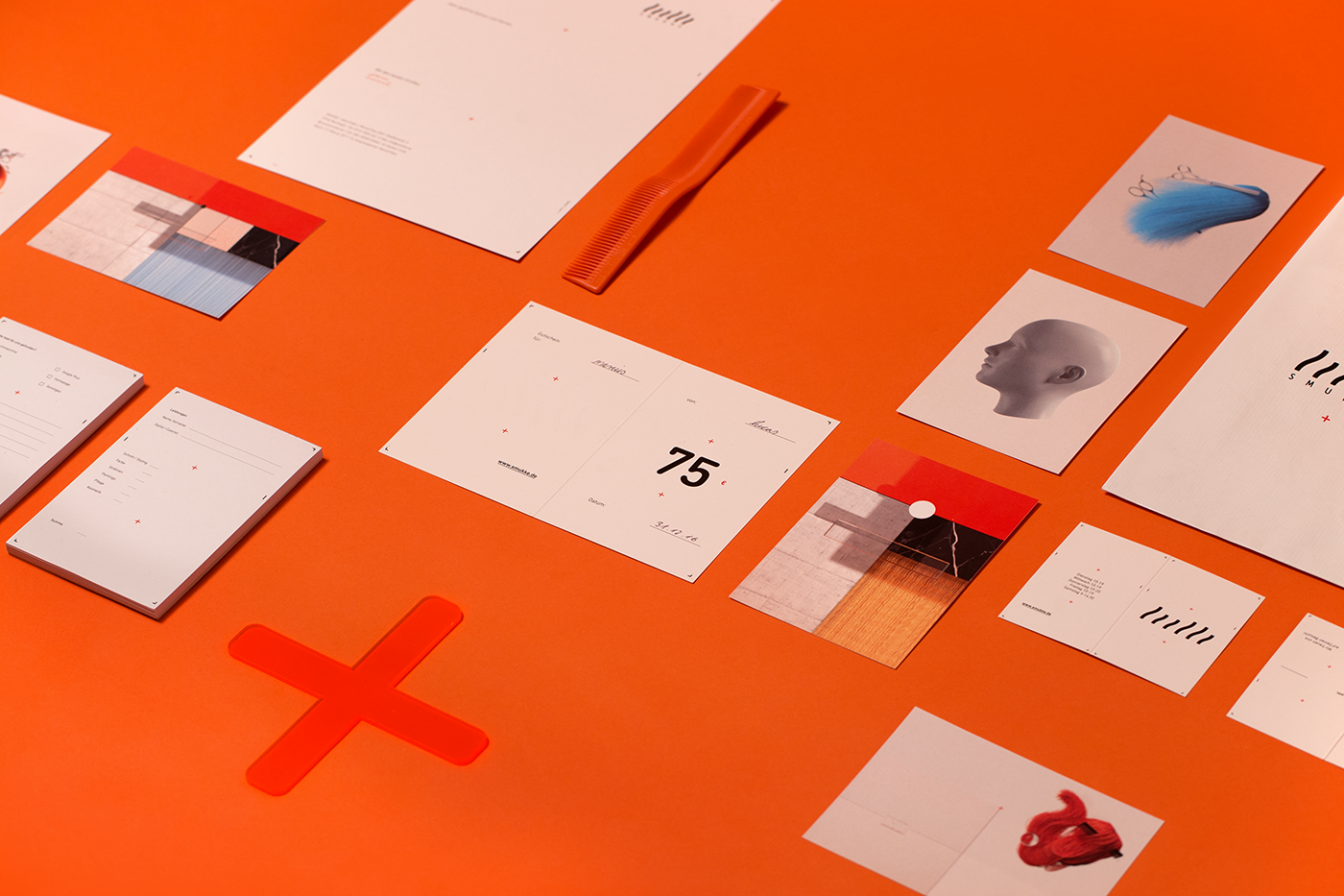
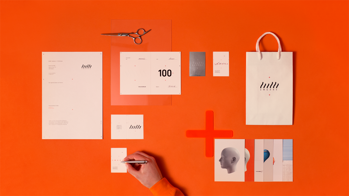
From naming up to the full corporate identity we took on the foundation and development of the hairdresser Smukke. Timelessly designed, influenced by tradition and artwork. The basic idea of the branding is to bring together both, traditional craft and modern style. Customer appreciation comes first in every step they do. On top, a grid system has been developed which is individually adaptable to the respective format. The design takes up the merge of geometry and creativity of the hairdressing trade, perfected in high-quality print finishing.
Date: 2017, Field: Creative Direction, Branding
Design System
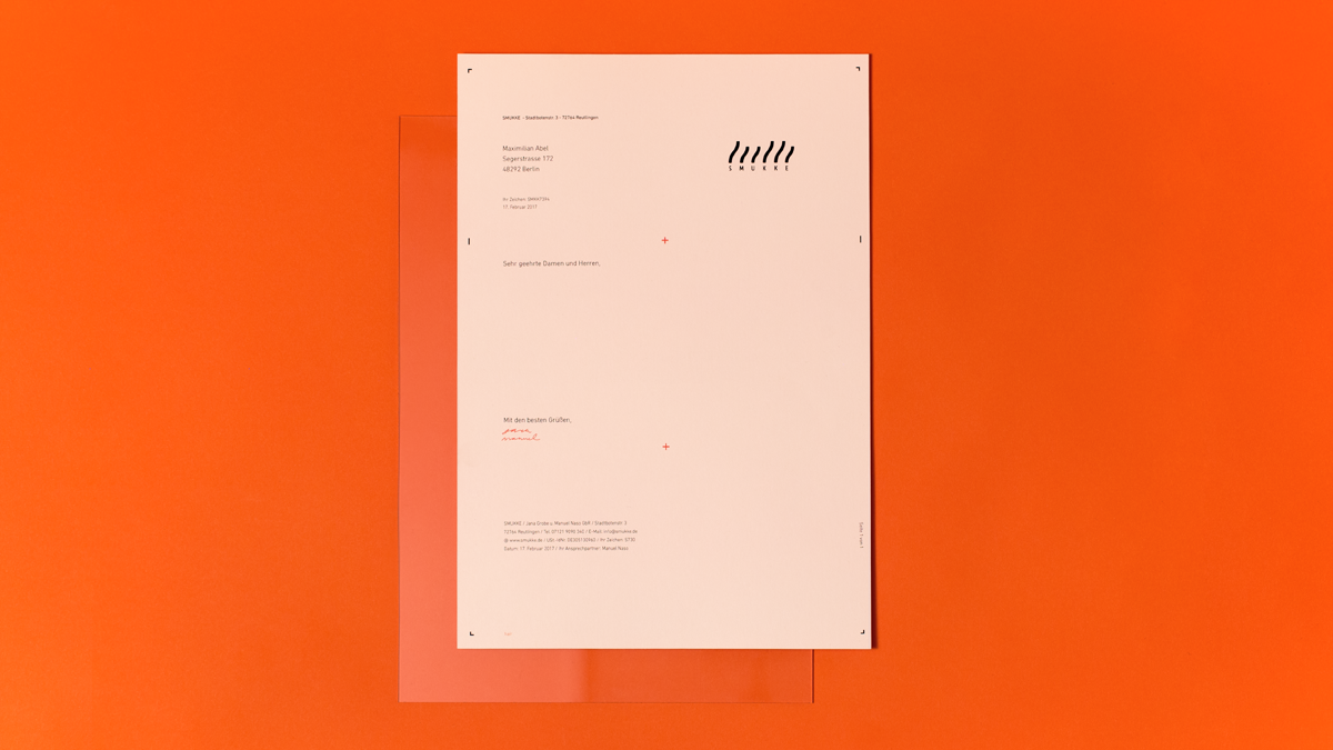
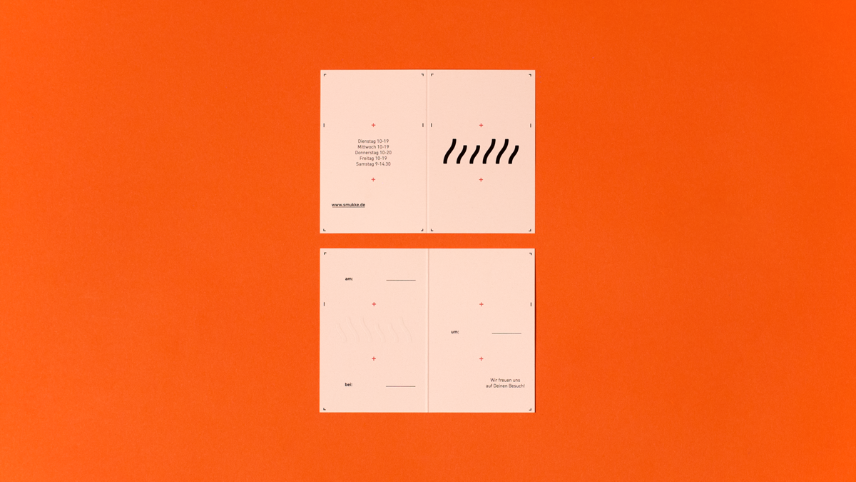
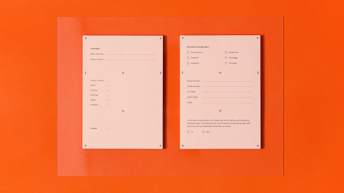
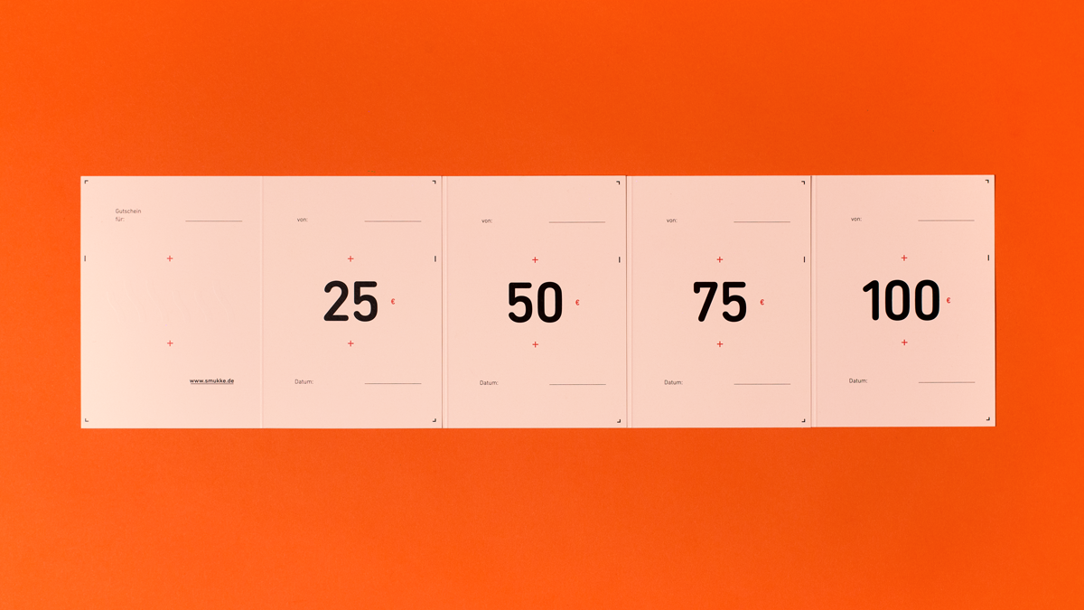
The grid system builds the centerpiece of the branding. It consists of six boxes, resulting from the number of letters of the name Smukke. Two plus signs in the middle part represents the owners - Manuel and Jana. Together, they are what the branding features: Cornerstone, anchor - the good soul of the brand. The pattern is adaptable to every format. Even the given boxes leave enough space for creative design - this is exactly what perfects the mix of geometry and creativity.
Business Cards
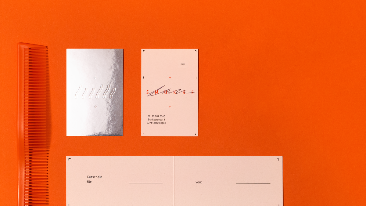
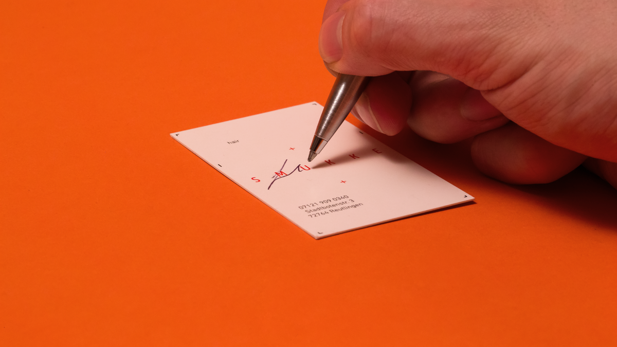
The idea is to upgrade a common, rather less exciting product. By means of print finishing a mirror foil turns one side of the business card into a hand mirror for on the go. It provides the hairdresser with a creative and fashionable give away plus added functional value for the customer. With the aim of linking both, the combination of traditional craft and modern style with customer binding measures all printed products are signed by hand.


Section: Webdesign
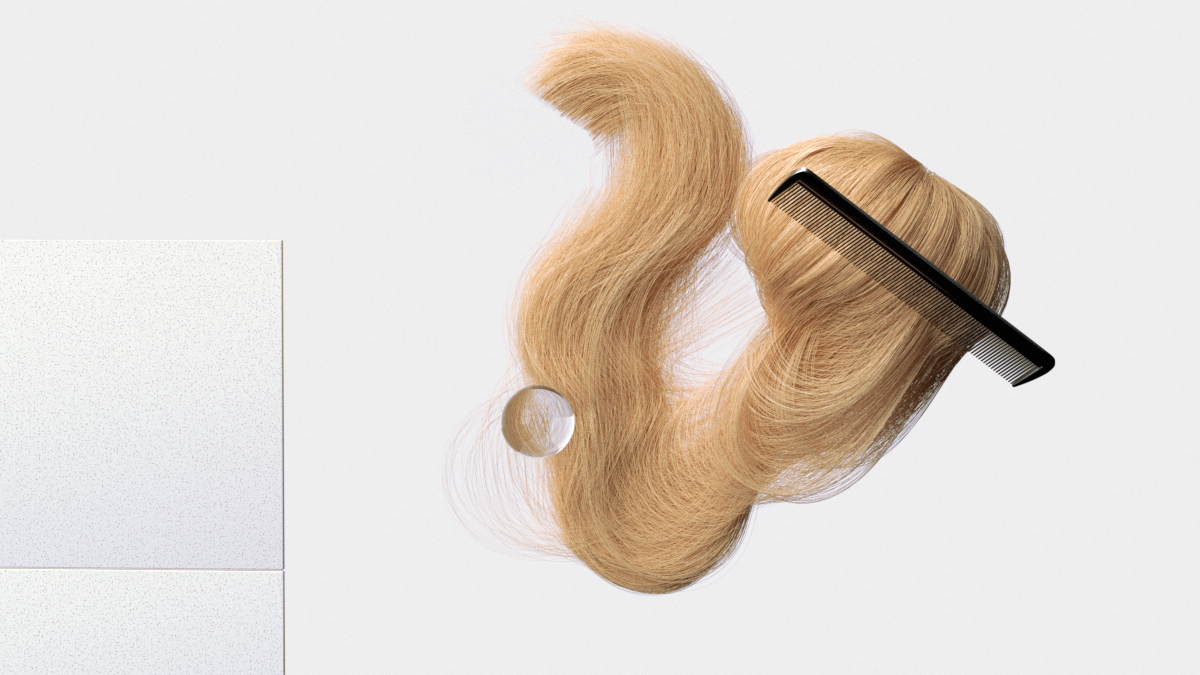
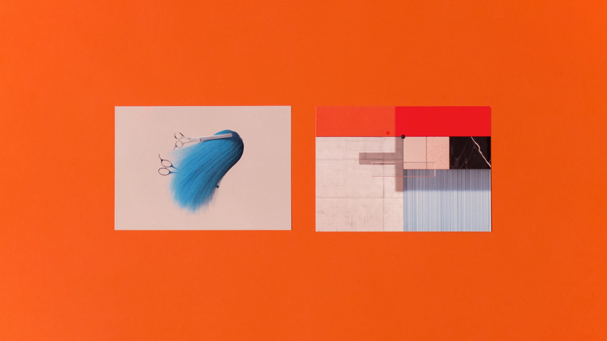
The one-page site concept unifies all design elements of the corporate identity. The abstracted grid system ensures an easy to understand and clearly structured representation of the content. Illustrations and animations are relaxingly breaking up the design and emphasize the creative approach of the hairdresser.
Intro
Price list
Slideshow
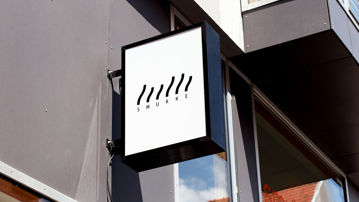
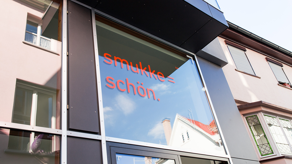
Section: Store Design
The store front is designed with foils (which are) displaying opening time, meaning of the name as well as owners' personal signatures. This kind of visual representation is also applied to the grid system.
Also, we have designed the work clothes for the stuff.

Thank you for watching.
A project by Lucas Doerre and Marius Sperlich.
Feel free to visit our studio: www.vaterlinmiro.com
Just drop us a Mail for any requests.


