


Wauw!
BACKGROUND
We always wanted to have our own products and ice cream is of course an amazing starting point. But when eating ice cream we gain weight faster than we can put on the next episode on Netflix. So we found a great factory that innovated with us to produce a new brand with no added sugar. We branded the ice cream to look tasty rather than light or boring. We wanted an ice cream that cheated sugar and was an "all you can eat"-product.
THE CASE
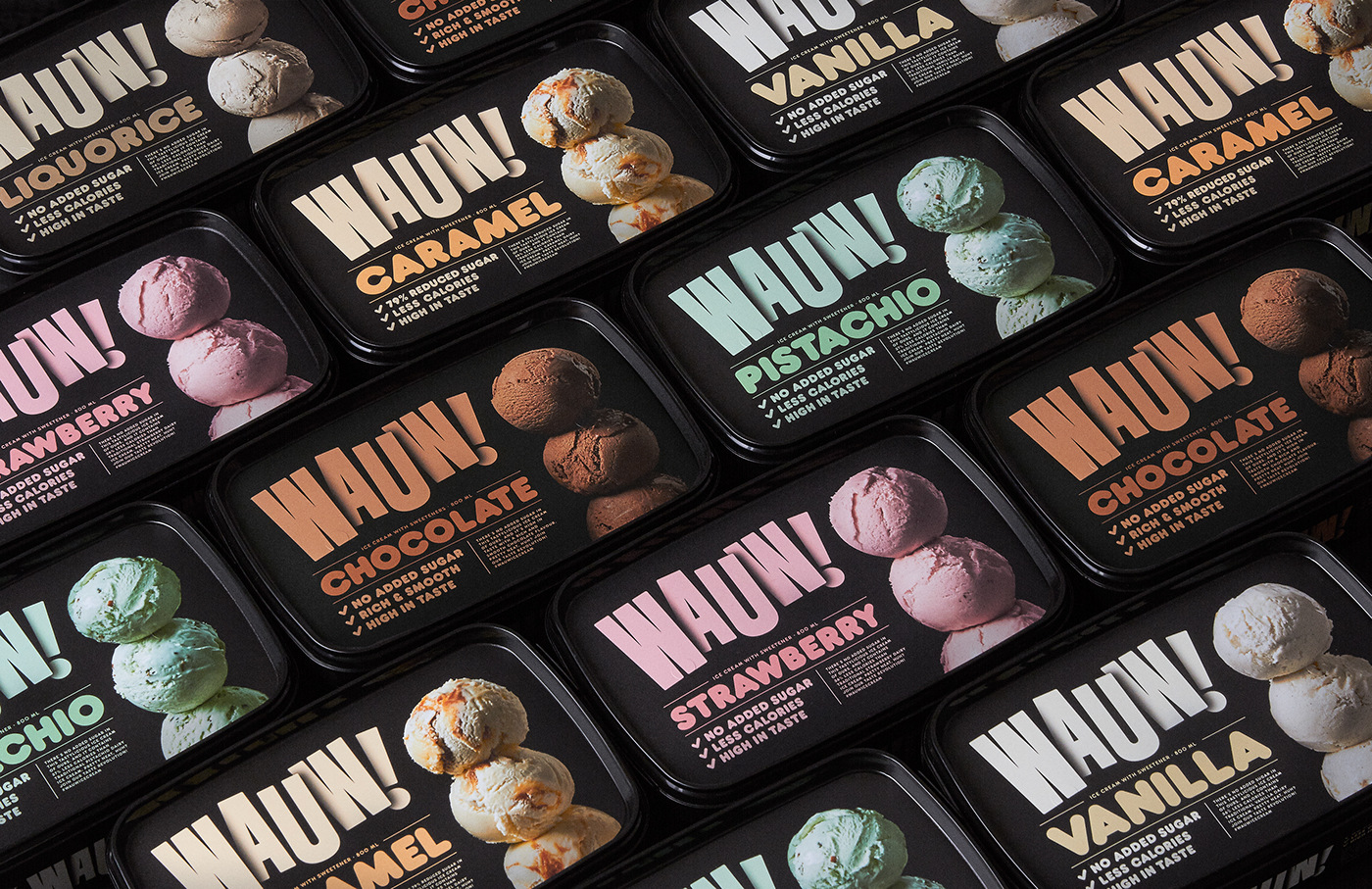
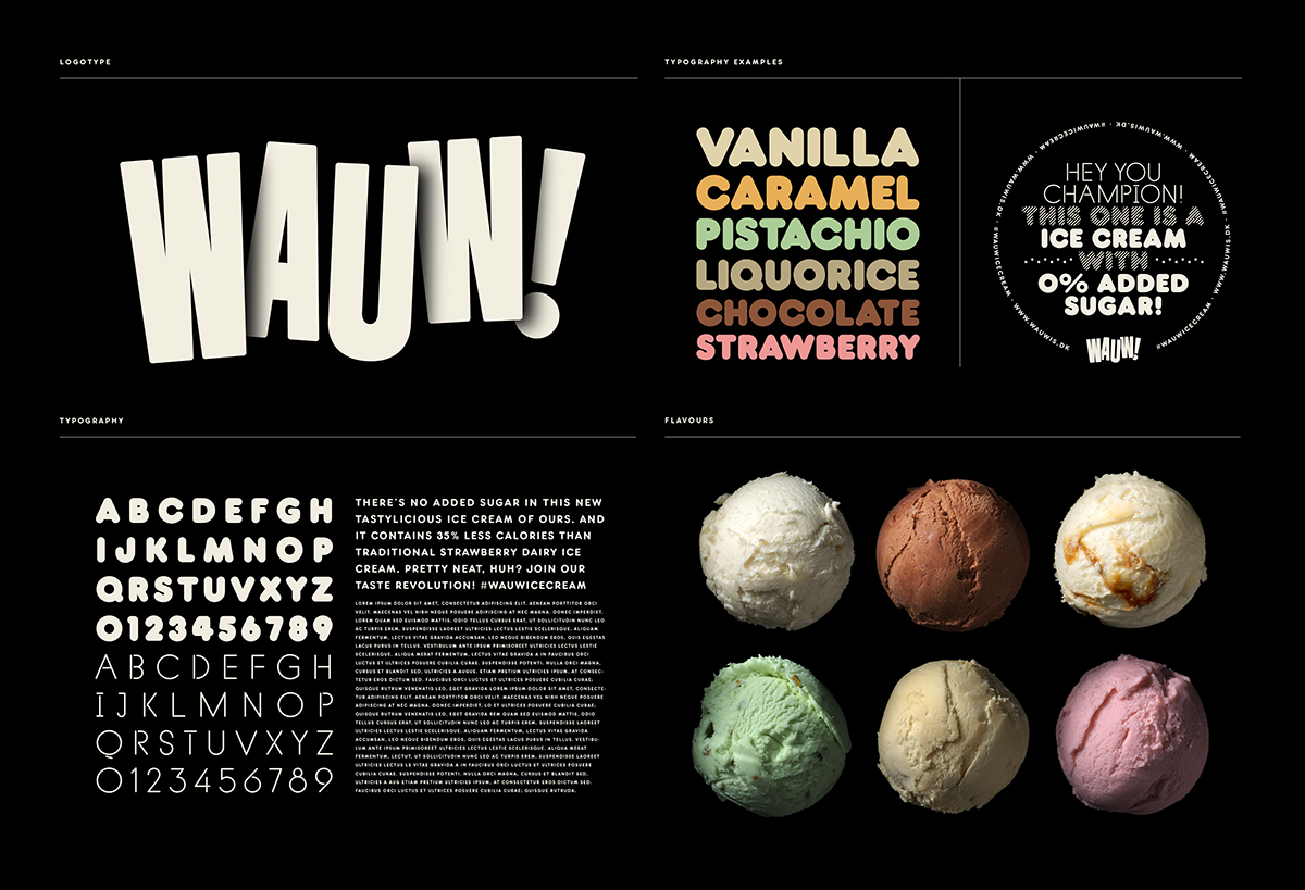
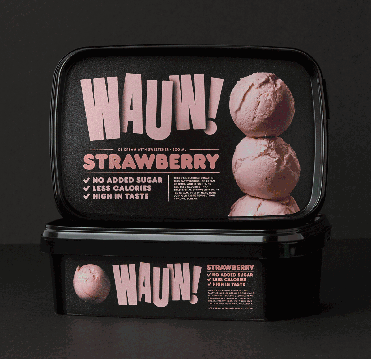
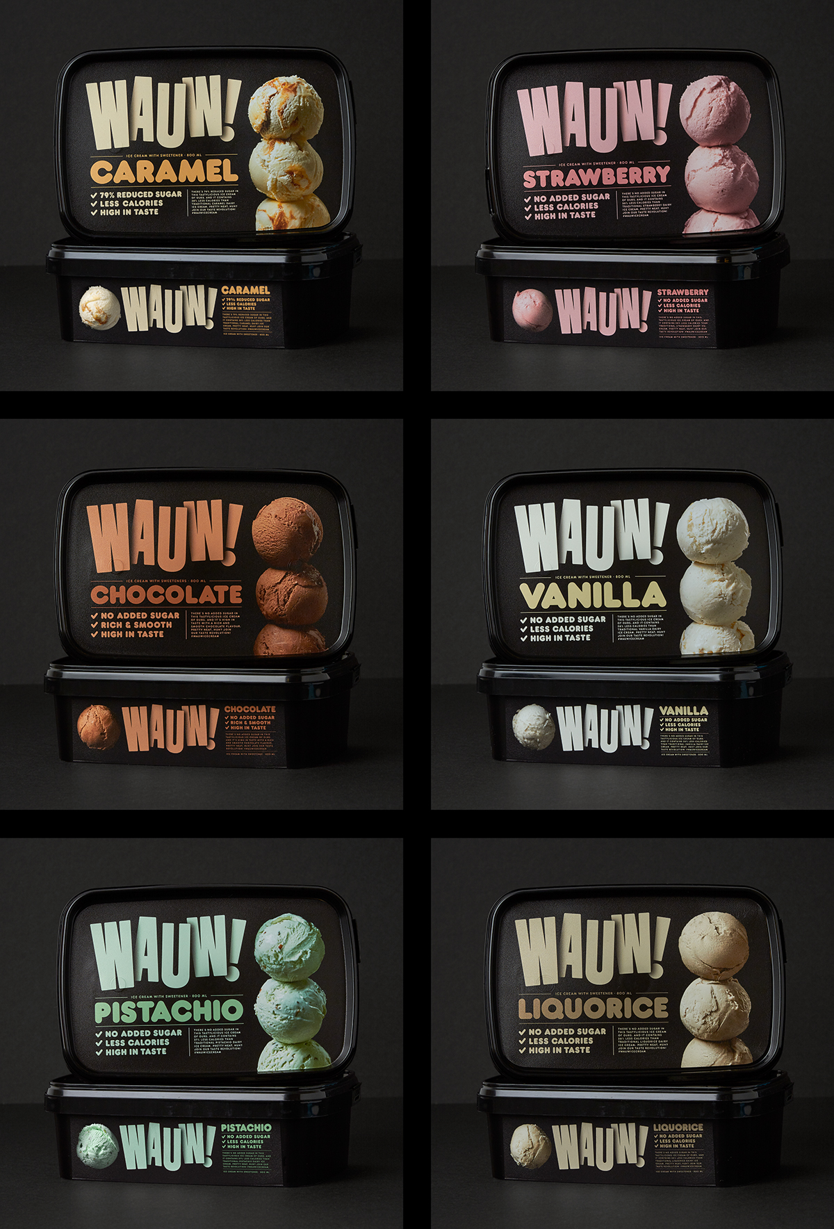
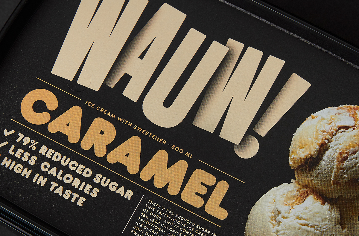
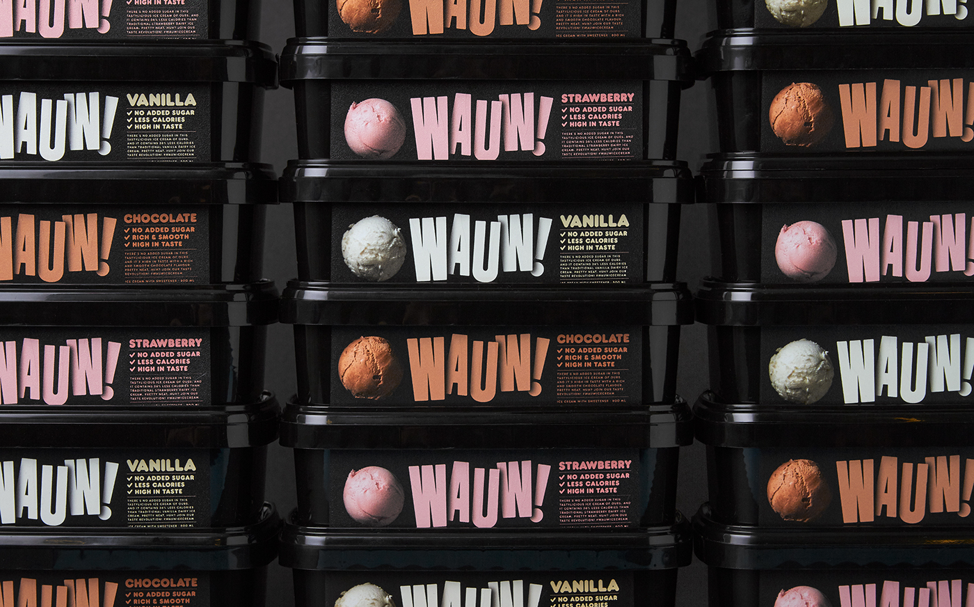
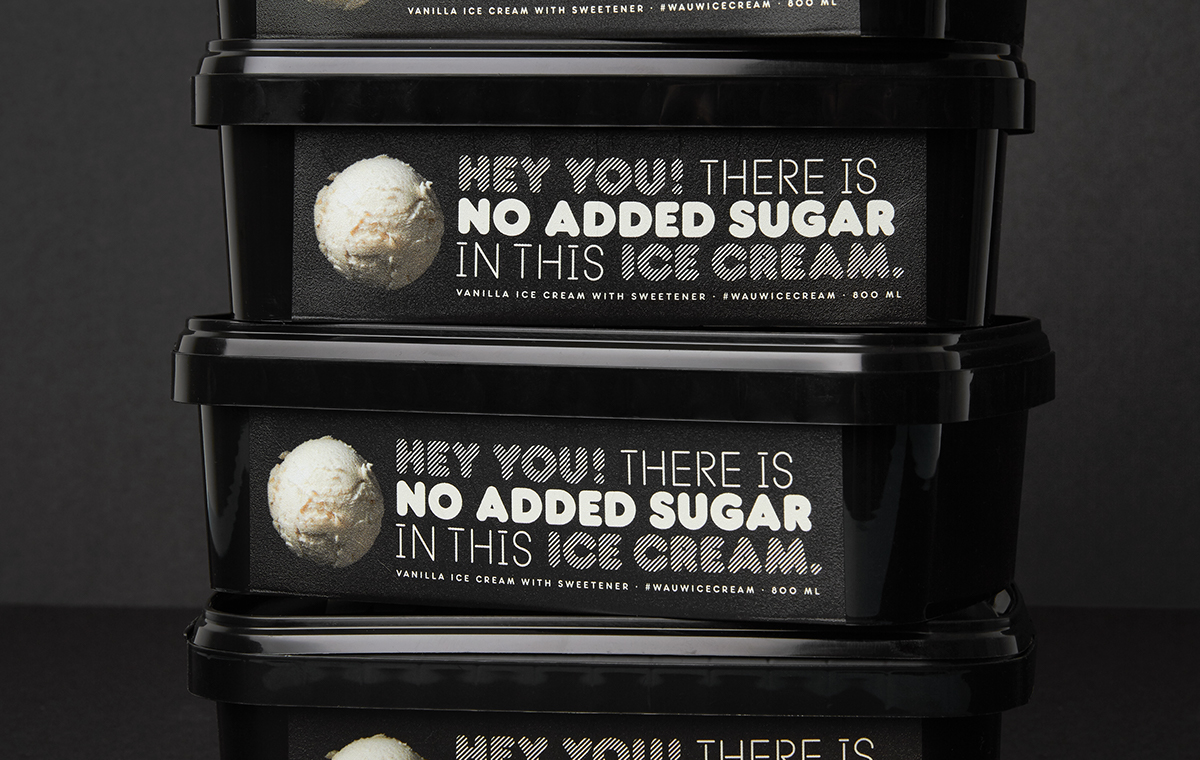
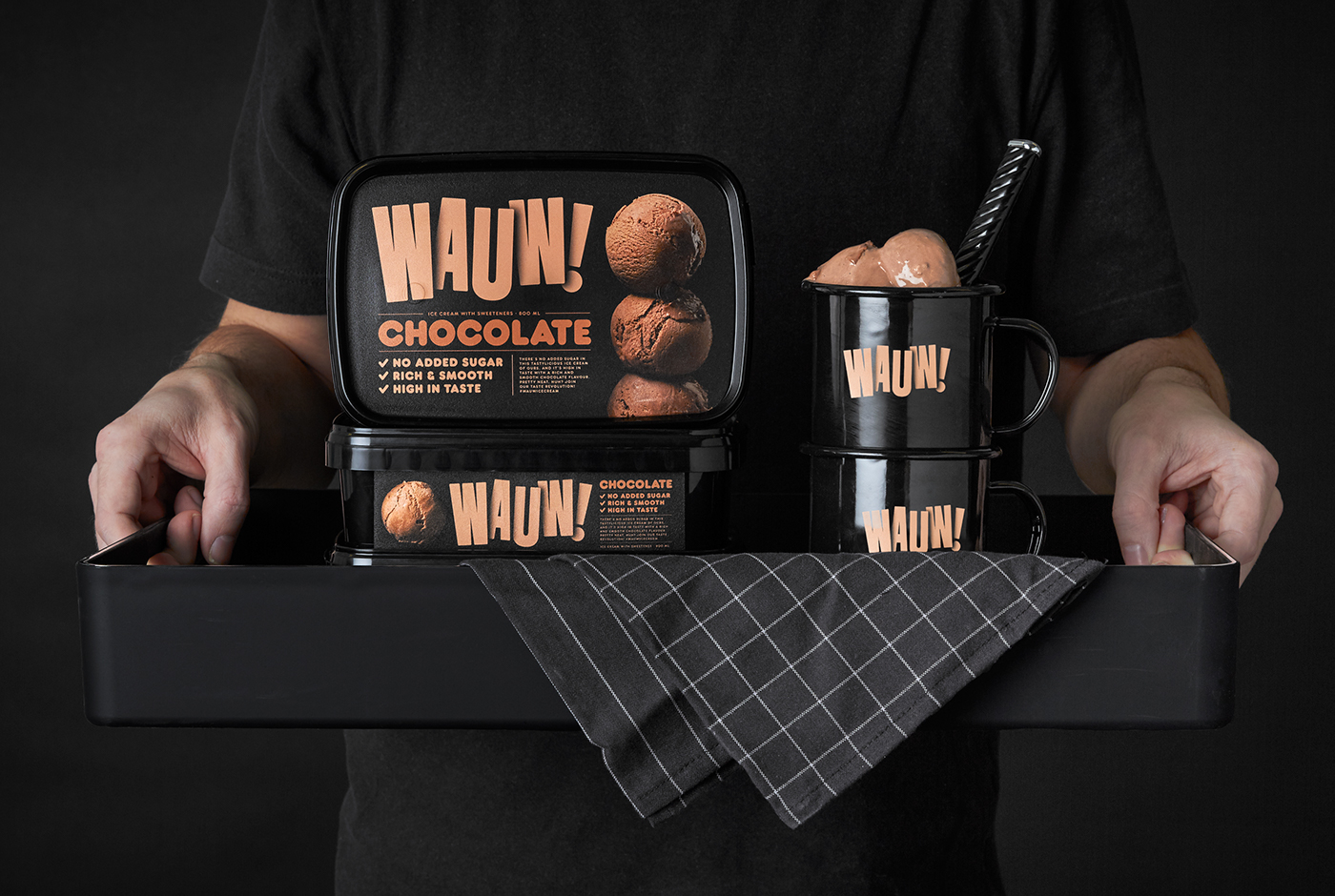
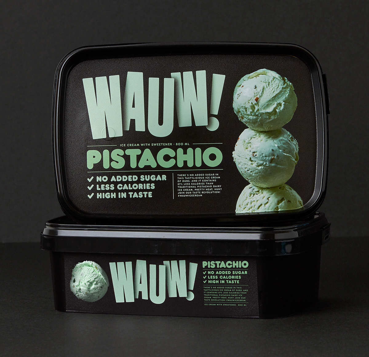
We started by naming the brand to Wauw as it's the feeling you get when you eat the ice cream. In order to differentiate the packaging from competitors we chose a black case. We wanted to avoid the luxury bracket so we used a "tasty" and "kind" typography and form. We used the classic ice cream ball since it's great as well as geometric. We also added a shadow to the logotype to harmonize with the shadows of ice cream balls.
The taste? Oh it's fantastic. You should really try it. Check it out on wauwis.dk/en
Factory photography by Per Björklund and Philip Tolgén
Photography of the ice cream scoops by Wolfgang Kleinschmidt
Food styling of the ice cream scoops by Elisabeth Johansson
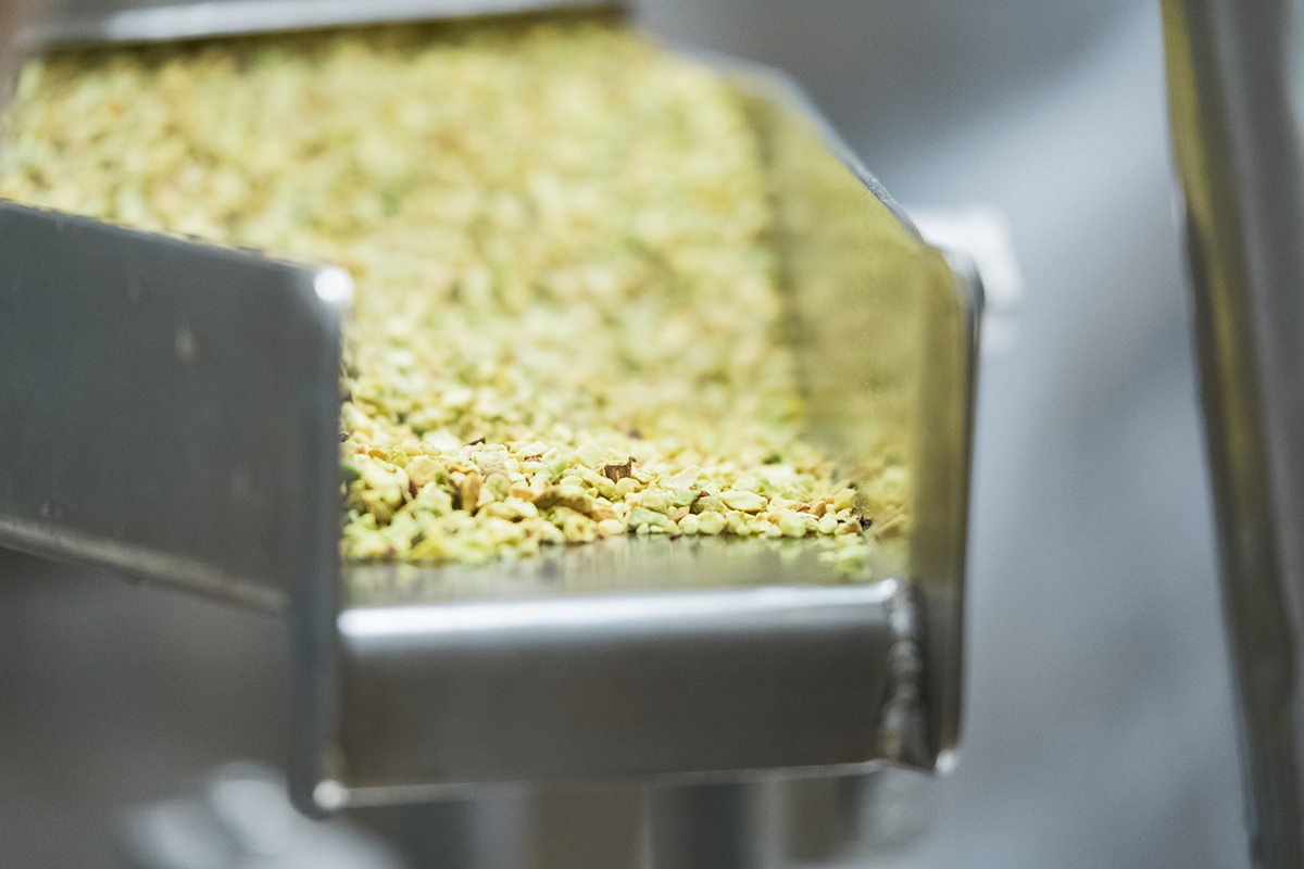
Factory photography by Per Björklund and Philip Tolgén
Photography of the ice cream scoops by Wolfgang Kleinschmidt
Food styling of the ice cream scoops by Elisabeth Johansson


