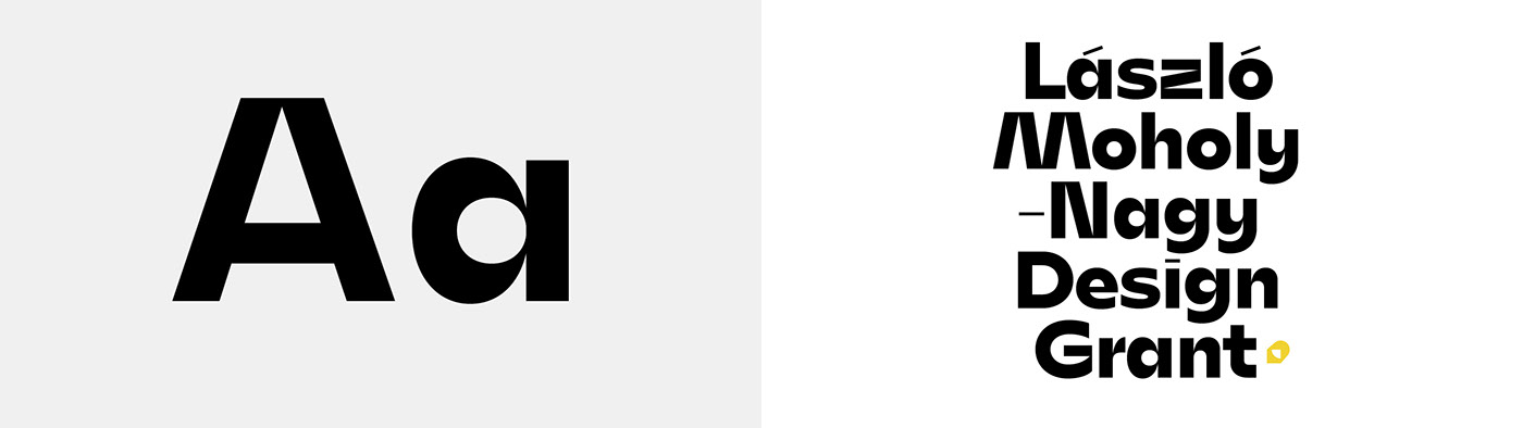
Mohol, a custom typeface for the Hungarian Design Grant
The László Moholy-Nagy Design Grant has been providing opportunities and support to young designers dedicated to their area of expertise. The grant mostly helps to shape an exceptional environment for those who have newly graduated from institutes of education in order to foster the development of their creative activities.
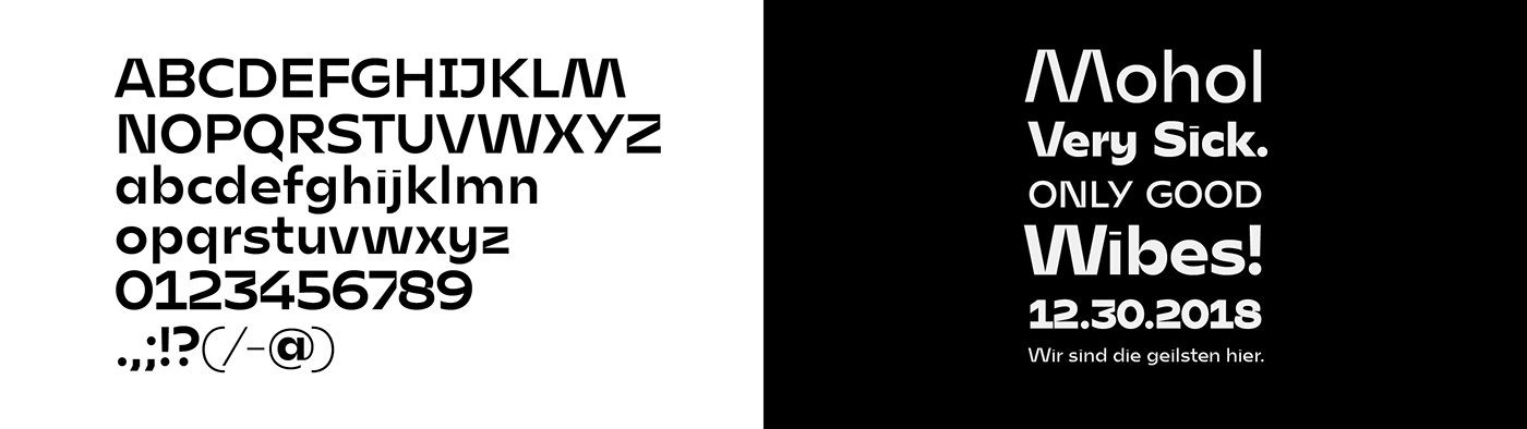
The brief was to design a new typeface, in respect of László Moholy-Nagy's work and heritage. He was the most famous hungarian in the Bauhaus, painter, photographer. Moholy-Nagy was influenced by constructivism and a strong advocate of the integration of technology and industry into the arts.
The grant needed a high quality typeface, that works well in display and text sizes too.
Design concept
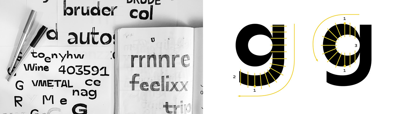
After my research I started to experiment with my Pilot Parallel Pens. I was curiuos, how I could draw sans-serif letters with similar horizontal and vertical weights. I worked out a method: when I reached the top or the bottom point of a shape (1), I didn't turn to continue the shape, but I held my pen only vertical or horizontal, and finished the shape with that movement (2). See on the illustration below. With this idea I've got really high contrast at the connections (3). With changing the pens from 2.4- to 6 mm wide, I could sketch the shapes from Thin to Black really easy. I got similar contrasts at the connections, but different widths.
After my research I started to experiment with my Pilot Parallel Pens. I was curiuos, how I could draw sans-serif letters with similar horizontal and vertical weights. I worked out a method: when I reached the top or the bottom point of a shape (1), I didn't turn to continue the shape, but I held my pen only vertical or horizontal, and finished the shape with that movement (2). See on the illustration below. With this idea I've got really high contrast at the connections (3). With changing the pens from 2.4- to 6 mm wide, I could sketch the shapes from Thin to Black really easy. I got similar contrasts at the connections, but different widths.
Construction of the shapes
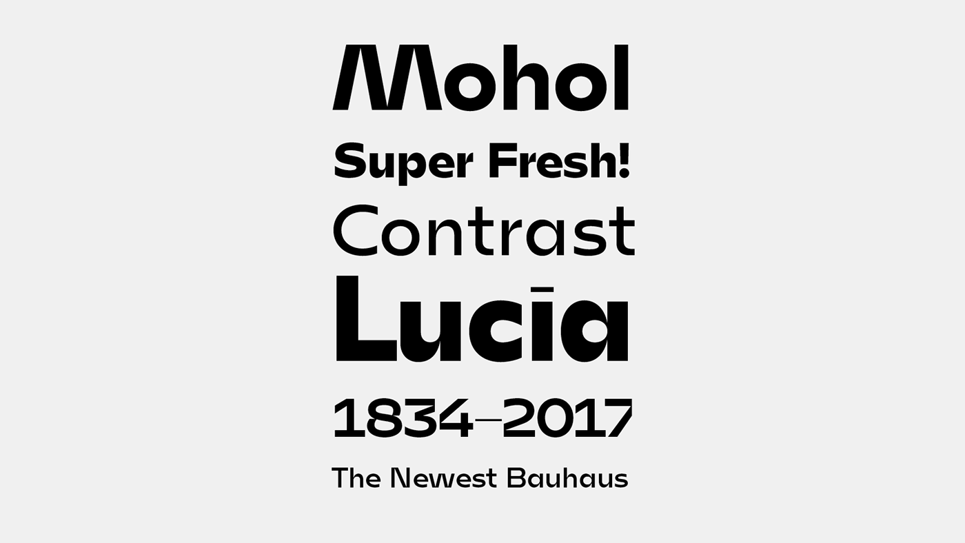
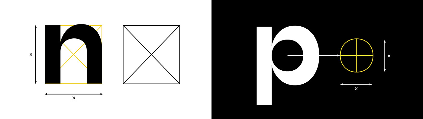
László Moholy-Nagy was one of the biggest artists in the Bauhaus. Continuing his spirit, I built up my letters from basic shapes, e.g. in the Regular style the lowercase «n» fits in an optical square, and the counter of the rounded shapes is a circle.
László Moholy-Nagy was one of the biggest artists in the Bauhaus. Continuing his spirit, I built up my letters from basic shapes, e.g. in the Regular style the lowercase «n» fits in an optical square, and the counter of the rounded shapes is a circle.
Inktraps, Small size
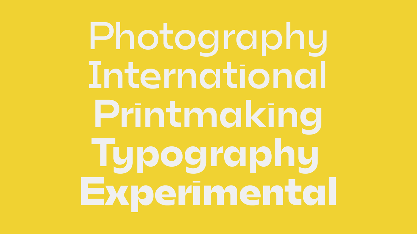
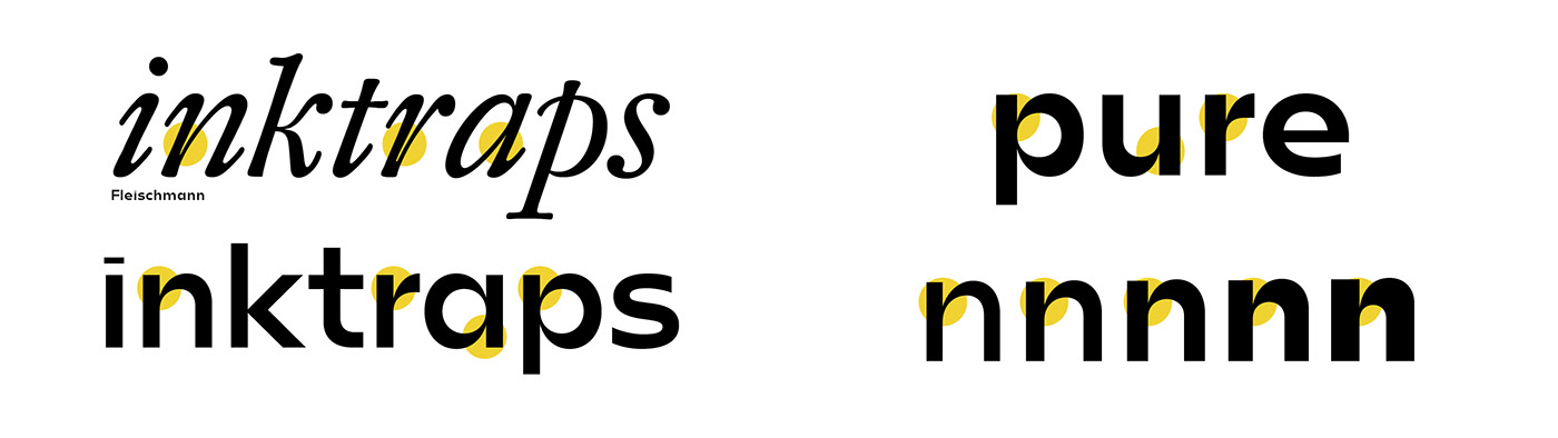
The typeface has to work in text and display sizes too. In the good old days the punchcutters used inktraps to avoid the big black shapes at the connections. True, we use less lead type today, but the inktraps could help our work too.
The typeface has to work in text and display sizes too. In the good old days the punchcutters used inktraps to avoid the big black shapes at the connections. True, we use less lead type today, but the inktraps could help our work too.
Contrast
All letters have the same weight optically at the connections, it works between the different weights too. I decided to use high contrast at the connections, so in small (~6pt) size the shapes are still recognisable and the text is legible.
Display and text features
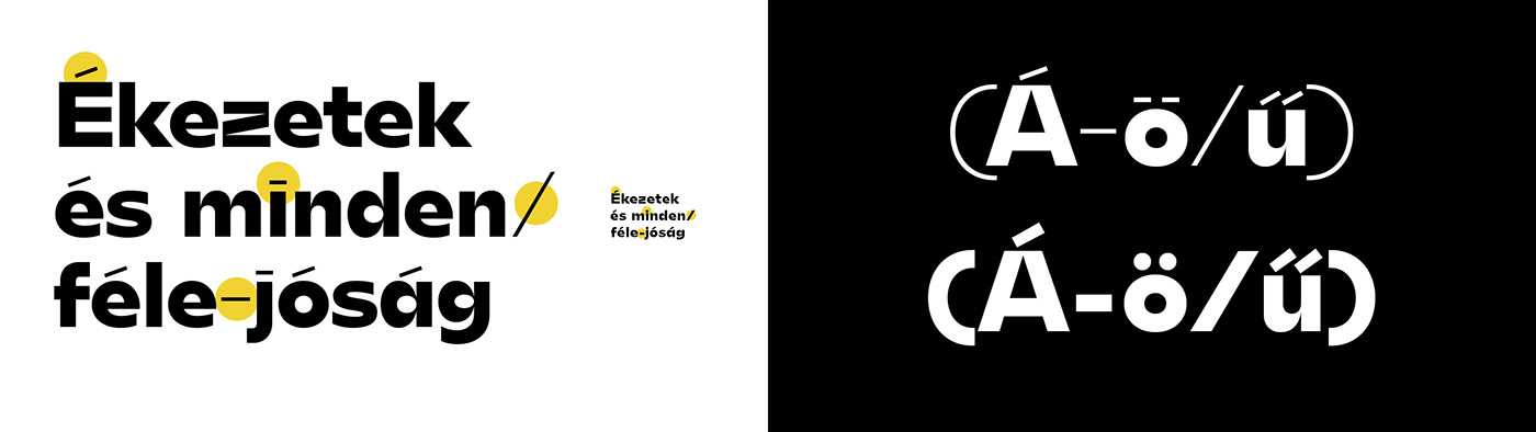
Making stronger high contrast feeling, the typeface has really slim accents and some of the punctuations are also super-thin. But in small size those shapes don't work well. That's why Mohol has some heavier alternates for the Text size.
Making stronger high contrast feeling, the typeface has really slim accents and some of the punctuations are also super-thin. But in small size those shapes don't work well. That's why Mohol has some heavier alternates for the Text size.
Styles, weights
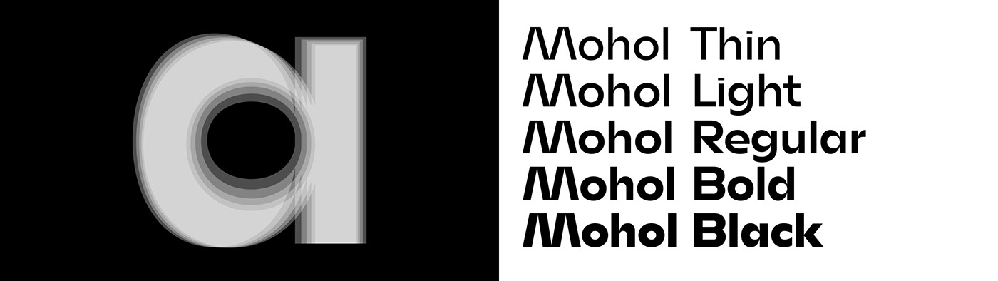
The Mohol type-family contains five weights: Thin, Light, Regular, Bold and Black.
The Mohol type-family contains five weights: Thin, Light, Regular, Bold and Black.
FAQ: When will be this available for sale?
The organisation behind the Grant has a two years exclusive license, it will be available for sale end of 2018.
Countdown starts!
The organisation behind the Grant has a two years exclusive license, it will be available for sale end of 2018.
Countdown starts!