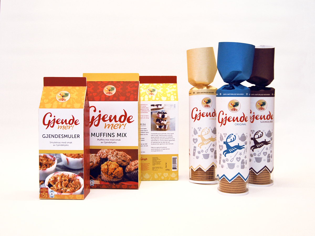
Gjende is a classic biscuit most people in Norway have a nostalgic relationship to. It is the biscuit you get at your grandmothers house, the biscuit you have in your backback when hiking, the biscuit you always eat in good company. The brief was to redesign the packaging with the original values intact.
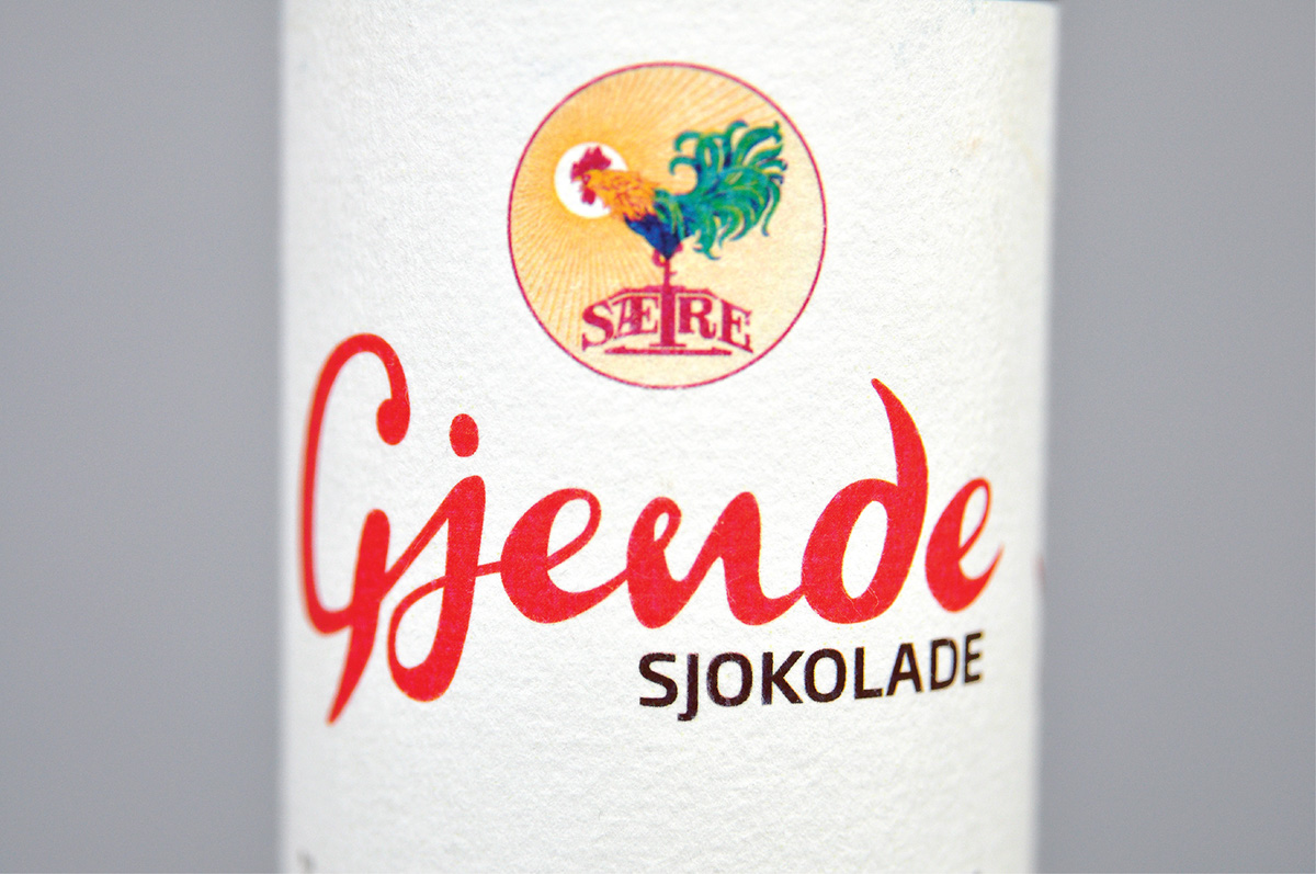
Typography by Mille Windfeldt.
This is a school asignment, and is not in use by Sætre productions.
Typography by Mille Windfeldt.
This is a school asignment, and is not in use by Sætre productions.
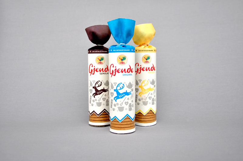
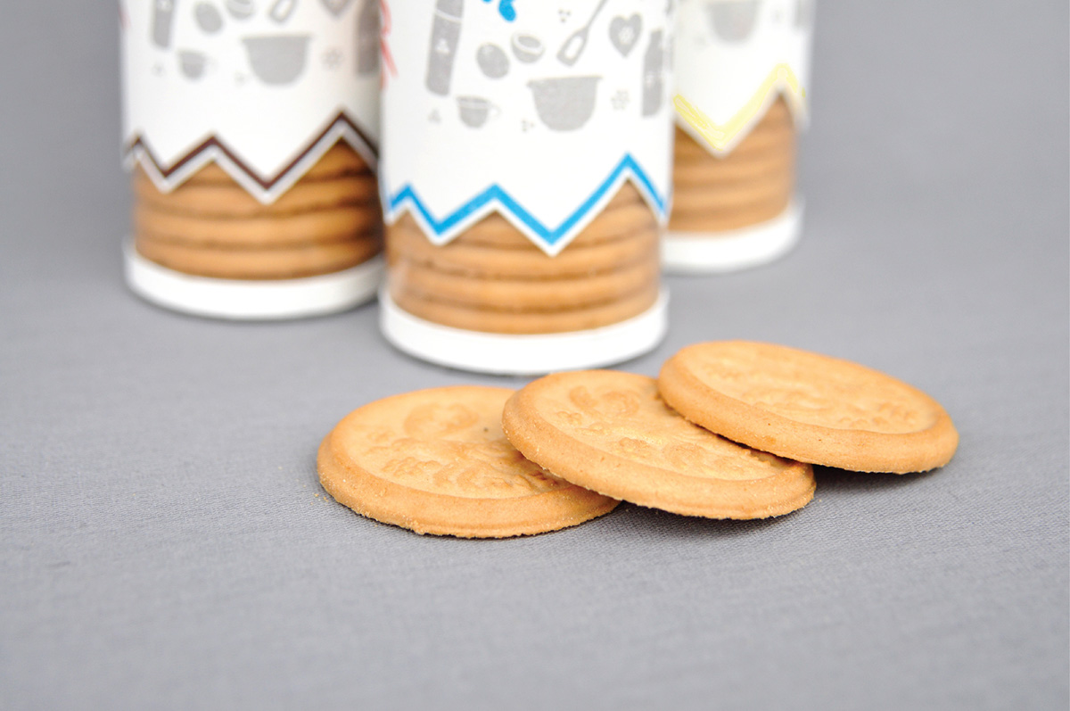
The functionality also needed improvement, which resulted in a open/close solution. (No more Gjende crumbs in the backpack - woho!)
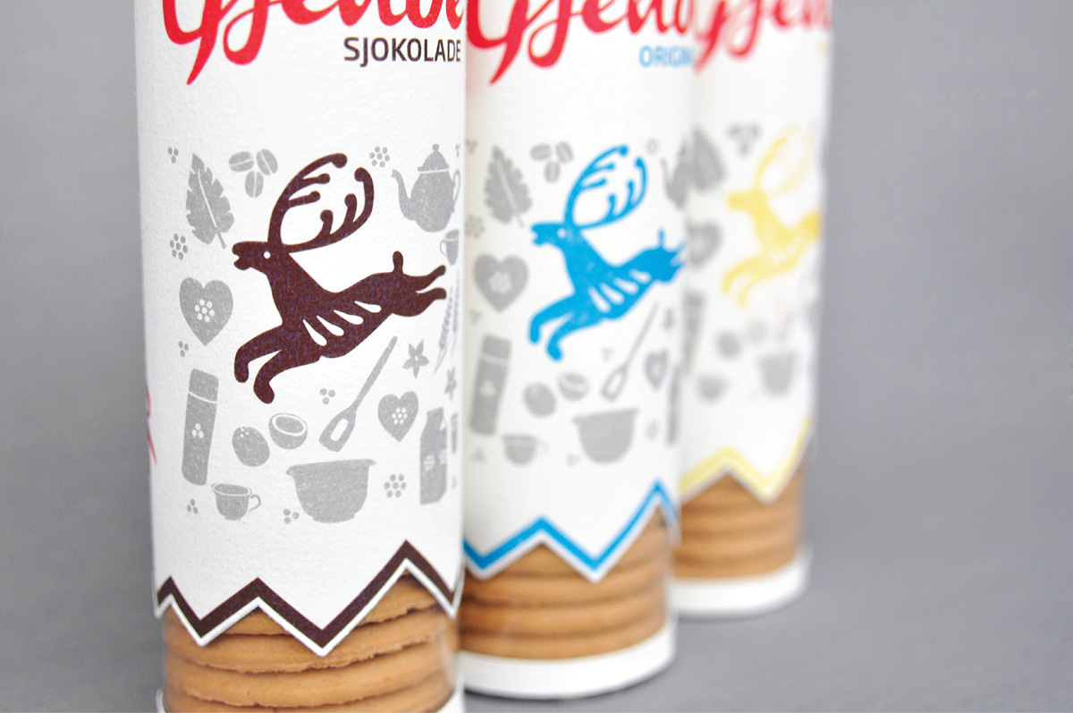
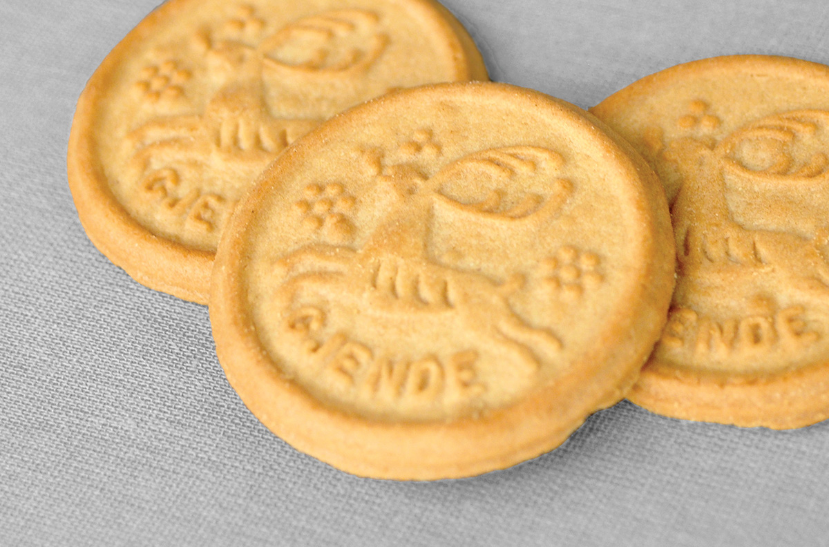
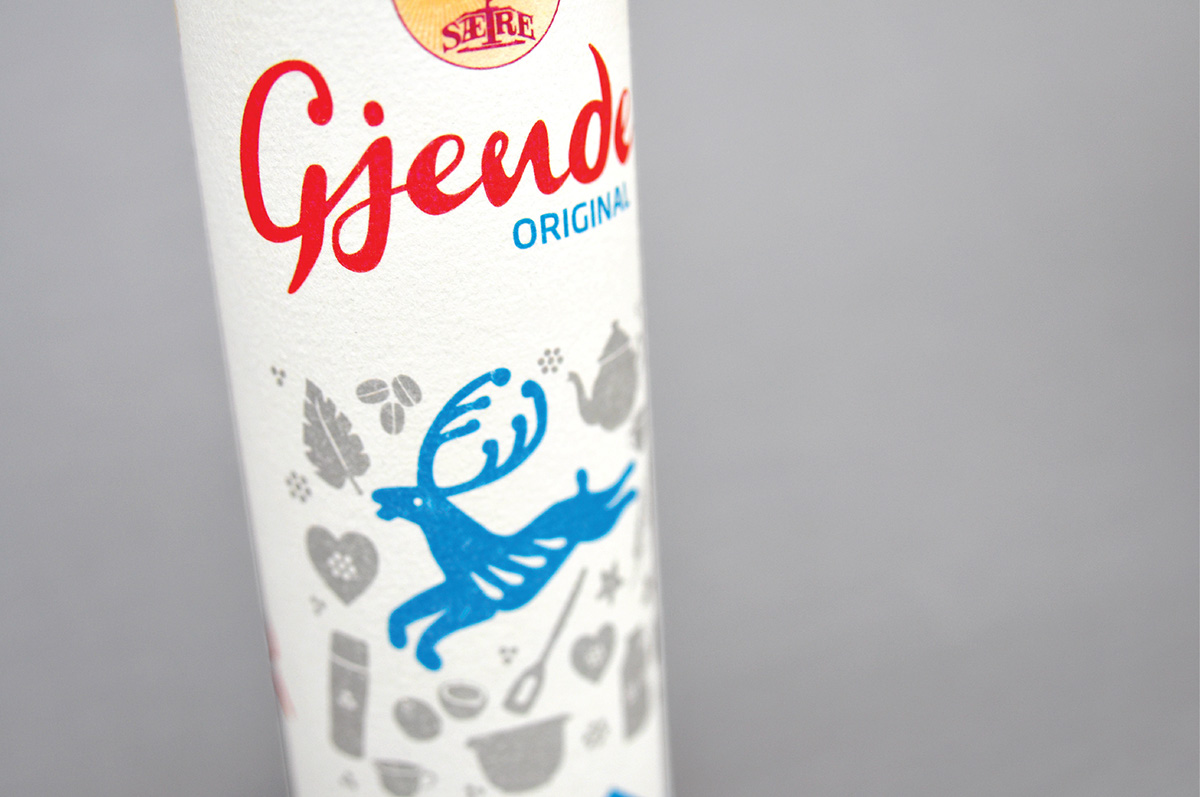
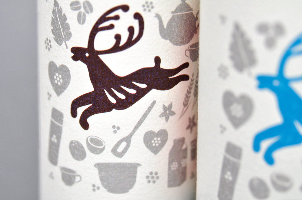
A lot of people have a stronger relationship to the deer on the biscuit than the packaging. This led to a leading role to the dear deer on the new packaging, where he is surrounded by illustrations inspired by the ingredients, Gjende experiences and Gjende occasions in nature and home. The name Gjende stems from a mountain range, therefore the mountain shaped window.
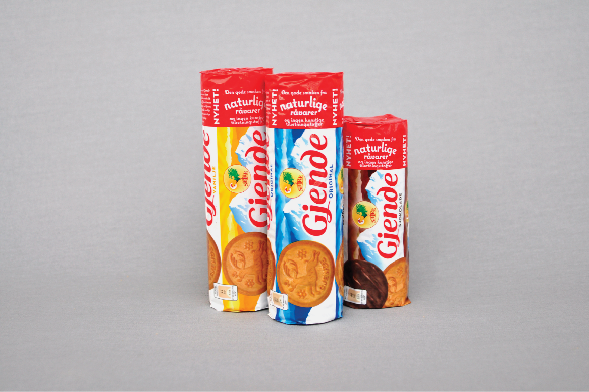
The original packaging.
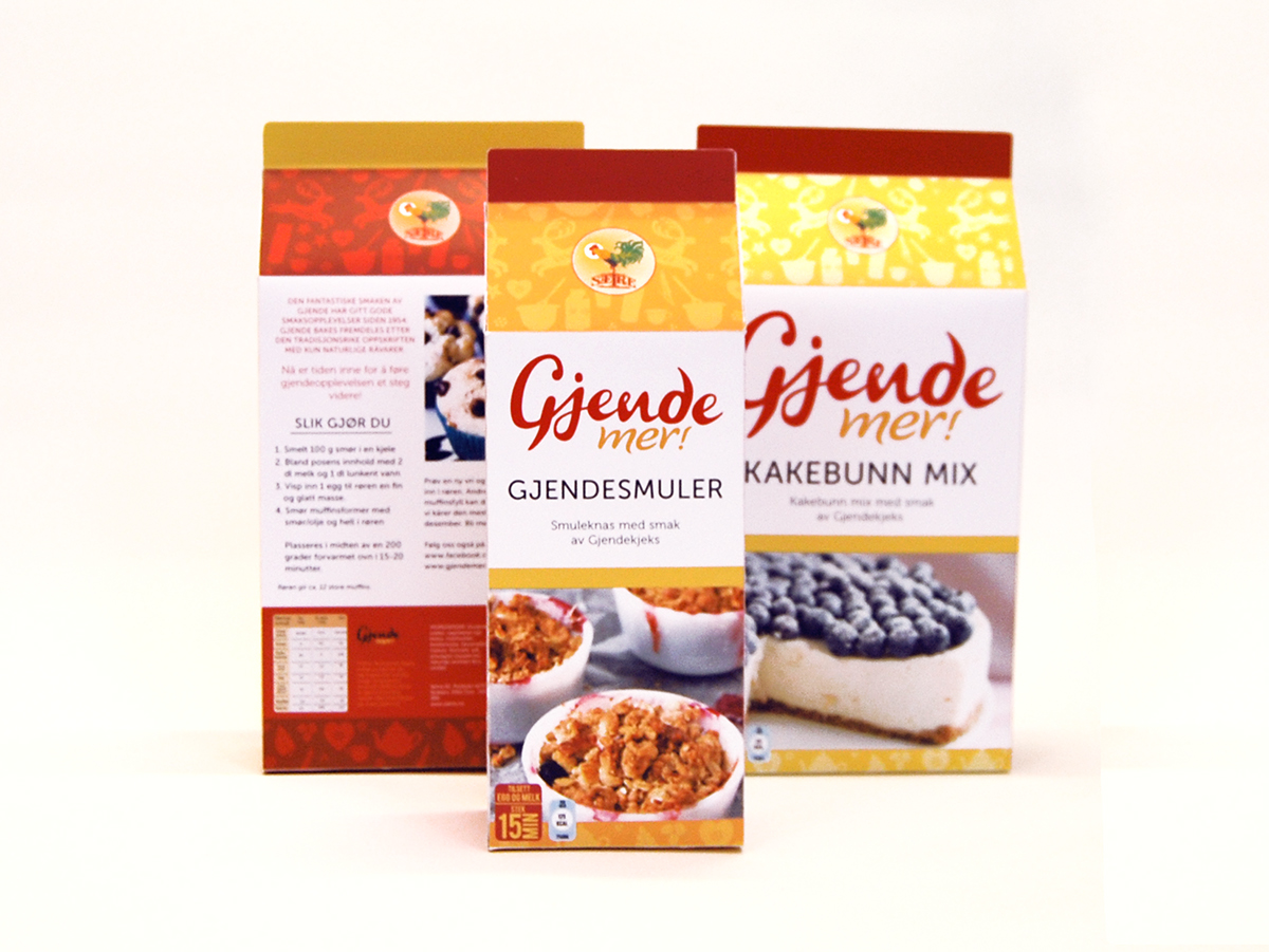
Gjende asked us to come up with a new line of imaginary products that used the biscuits ingredients in a new way. We came up with "Gjende Mer" - translated it means "More Gjende".