Baseline - A Typographic Survival Kit for Design Students
Final University Self-initiated Brief and Exhibition piece.
Final University Self-initiated Brief and Exhibition piece.
For my final graphic communication project (and exhibition piece) I decided to explore the role and importance of typography in design and consider how a new design student could be better prepared to utilise it. The project had to simplify a great deal of information and provide a fresh solution for creative students, I wanted it to both inform and inspire.
From my research I noticed a lot of resources split typography into very specific aspects (for example: type terminology, history of modern typography, and kerning and leading) I choose to divide my project in a different way. Instead I focussed on what the designer is trying to achieve with the use of type and how I could assist them with this goal in mind.
In Graphic Design - A Concise History, Richard Hollis considers that design can still be categorised into the 3 main purposes it has always had - to inform, to identify and to promote. I used these 3 classifications as the basis for my typographic survival kit, sourcing information from books, magazines, design journals and creative blogs, I produced a different guide to each area in a form that I felt reflected it. The name Baseline provided a great umbrella for the project, literally being the base of typography and I utilised the 4 'main lines' (the ascender, x-height, baseline & descender) within the brand and throughout my work.
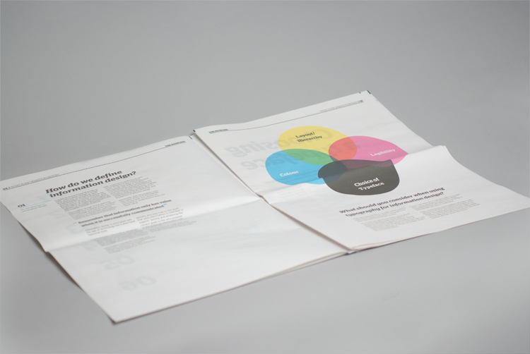
Typography for information was designed and printed in a newspaper format with the design a stark contrast to the style modern newspapers - with particular focus on legibility and choice of type.
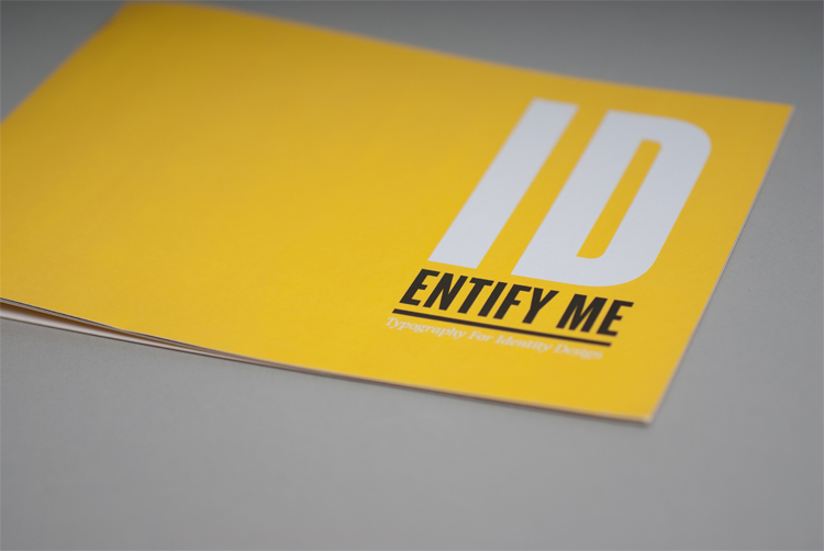
Typography for identity was styled into an imitation of a brand guideline book, with each spread considering another area of information for student to use when designing identities.
Typography for promotion took the form of an A1 poster, folded in a concertina this could be opened to reveal a large map guiding students through the basics of designing for promotion, which helped reflect the importance of suitable design for your medium.
I found the best solution to my brief was to encourage students to consider and to question their own design choices rather then trying to deliver all the answers. The kit provides a useful resource on how to approach typography, not overwhelming students with information but offering practical advice for their work.
From research and personal experience I know typography is an area lecturers are keen to highlight to new design students and emphasise it's role within communication. Whilst there are plenty of books and online guides to typography, I feel it can be overwhelming for new students to know where to begin and how to decipher this information, particularly what is relevant to their specific problem or medium of work. With this in mind I looked at ways I could make this huge topic more approachable.
From my research I noticed a lot of resources split typography into very specific aspects (for example: type terminology, history of modern typography, and kerning and leading) I choose to divide my project in a different way. Instead I focussed on what the designer is trying to achieve with the use of type and how I could assist them with this goal in mind.
In Graphic Design - A Concise History, Richard Hollis considers that design can still be categorised into the 3 main purposes it has always had - to inform, to identify and to promote. I used these 3 classifications as the basis for my typographic survival kit, sourcing information from books, magazines, design journals and creative blogs, I produced a different guide to each area in a form that I felt reflected it. The name Baseline provided a great umbrella for the project, literally being the base of typography and I utilised the 4 'main lines' (the ascender, x-height, baseline & descender) within the brand and throughout my work.
Typography for information was designed and printed in a newspaper format with the design a stark contrast to the style modern newspapers - with particular focus on legibility and choice of type.
Typography for identity was styled into an imitation of a brand guideline book, with each spread considering another area of information for student to use when designing identities.
Typography for promotion took the form of an A1 poster, folded in a concertina this could be opened to reveal a large map guiding students through the basics of designing for promotion, which helped reflect the importance of suitable design for your medium.
I found the best solution to my brief was to encourage students to consider and to question their own design choices rather then trying to deliver all the answers. The kit provides a useful resource on how to approach typography, not overwhelming students with information but offering practical advice for their work.