
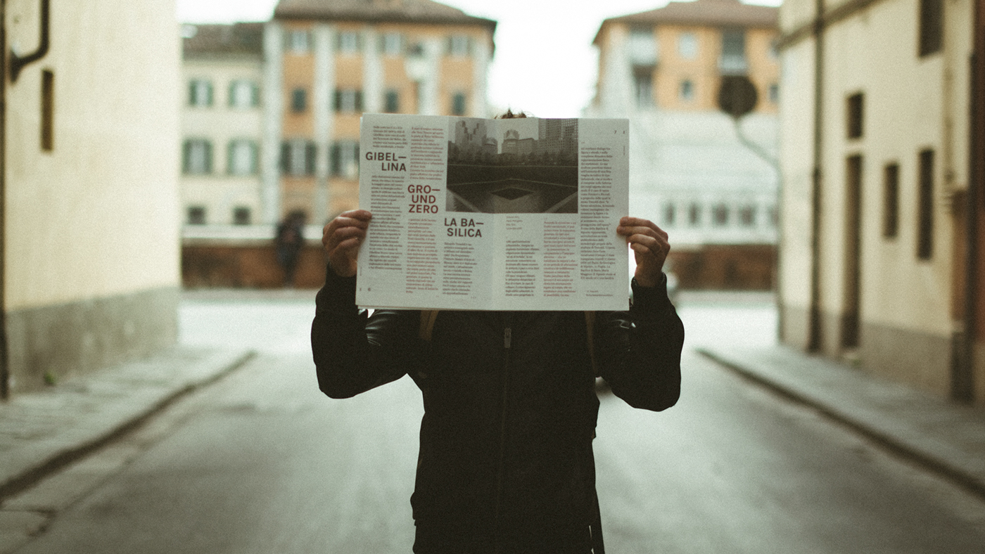
We are very proud to introduce you the very first issue of 120g’s magazine, the dossier 1•2016 called “Lacuna”. After several months of hard work writing the texts and refining the layout, the result is for us very exciting. We are very happy to feature some of Paolo Pettigiani unpublished pictures from New York and the fine drawings by Mister Mourão, printed on an amazing Fedrigoni Old Mill 130gsm paper.
We designed 6x6 grid based on a 25x35 sheet, optimizing the 100x70cm paper format of a magnificent Fedrigoni's Old Mill 130gsm.
The structure is simple: an introduction essay about the meaning and the history of the "lacuna" [missing] in architecture and restoration; three case studies about the central theme, declined in urban, social and artistic points of view; a closing essay with our consideration. The layout is respectively 2-columns, 3-columns, 2-columns.

The central part of the issue is occupied by the three case studies, which play with the three columns and flow in parallel through the central pages. The color and, only in the first part, the crux desperationis help to understand the reading flow, which however is very intuitive.
We used two typefaces: Miller Text (the serif) at 14pt and Karla (the sans) at 12.7 pt, having considered the different x-size and readability; the baseline grid is set at 9.5 pt.
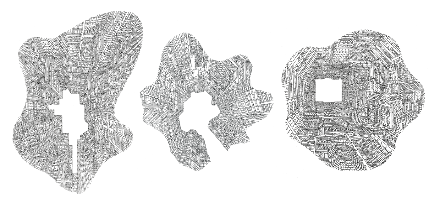
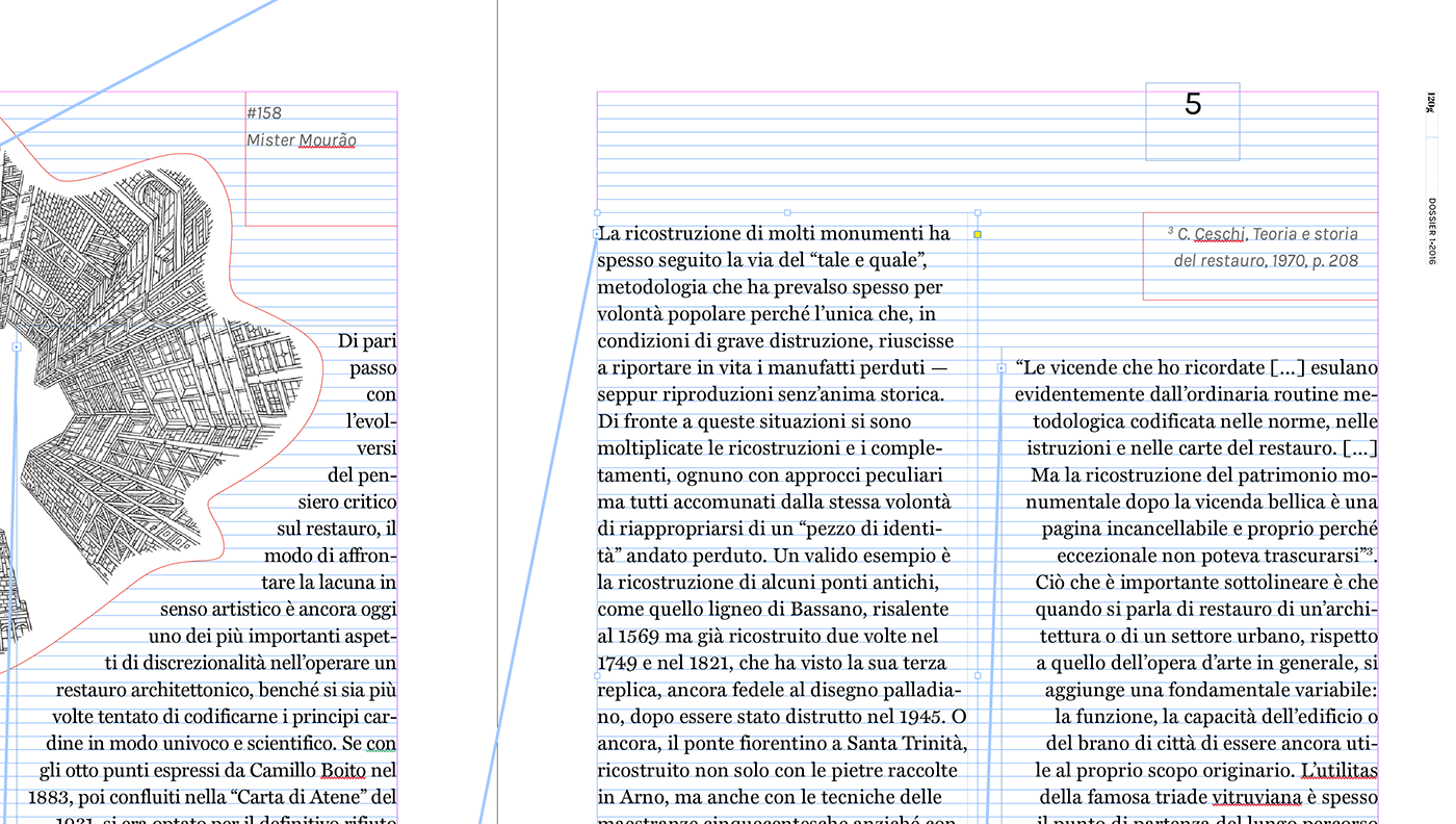
We are so proud to feature the wonderful drawings by Mister Mourão, #158, #159 and #164...
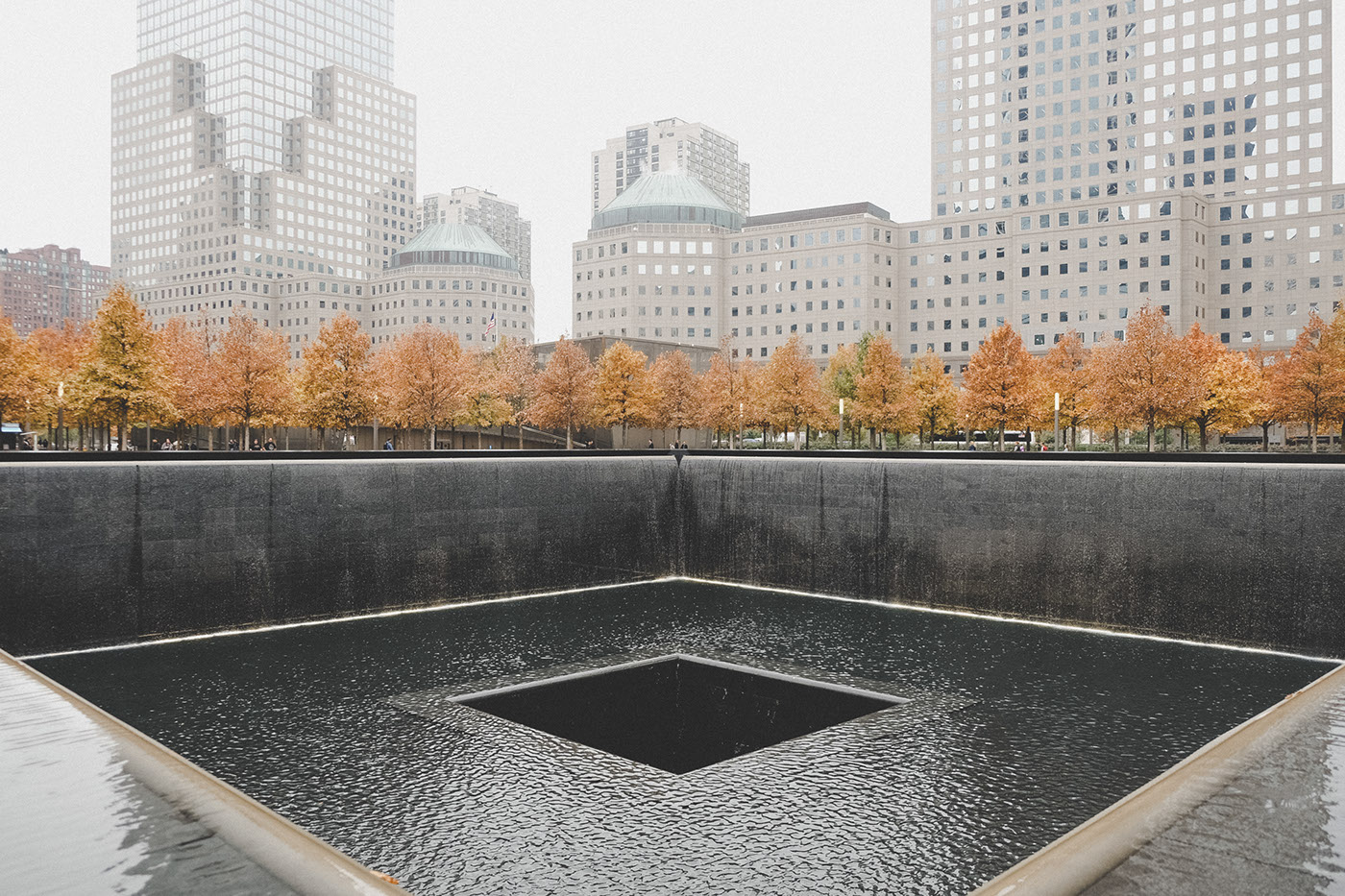
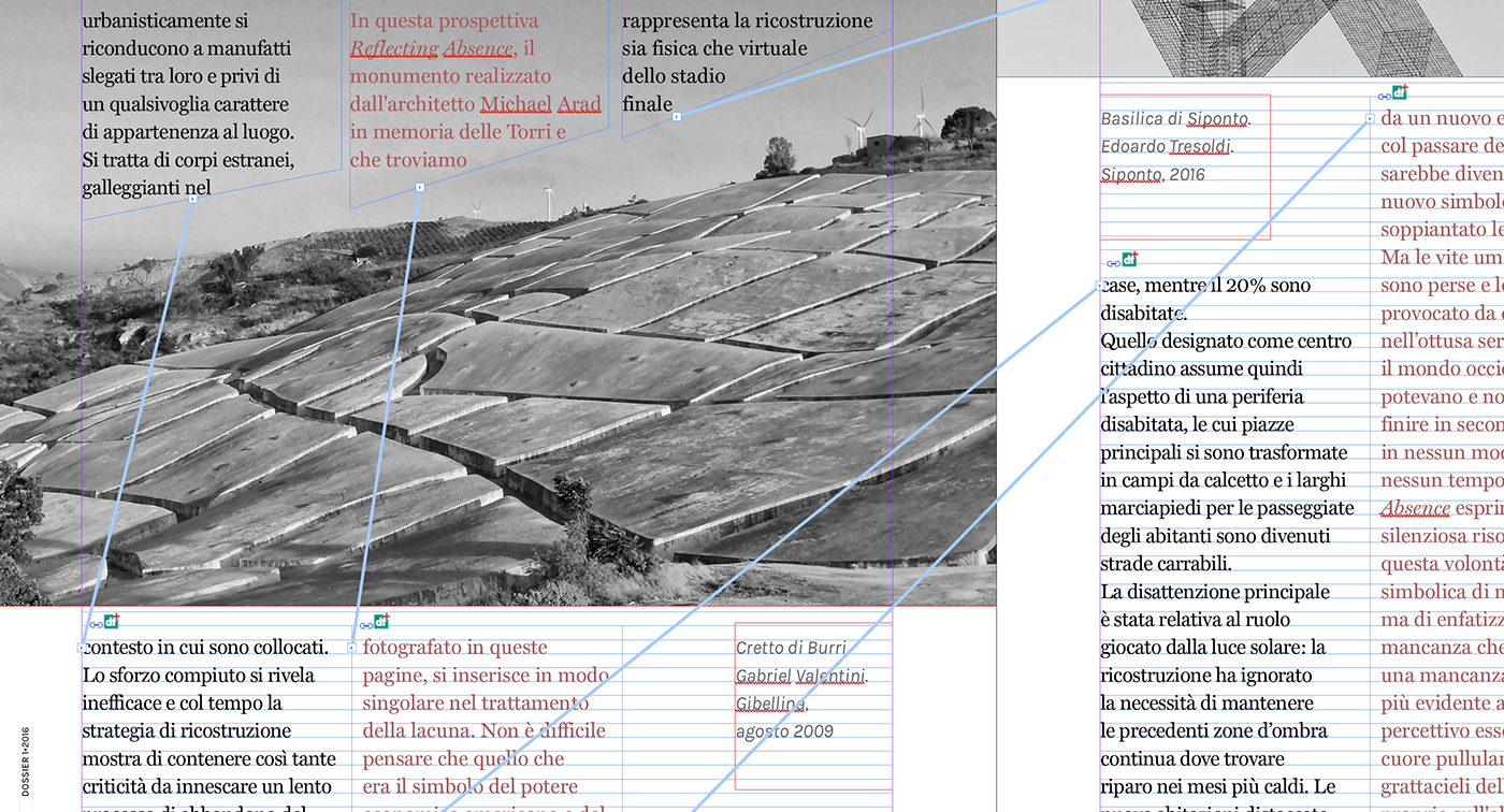
... and Paolo Pettigiani pictures from Ground Zero, New York City, taken just for this project.
Enjoy, and turn the volume on, it worths it ;)