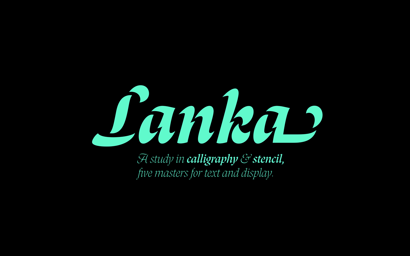
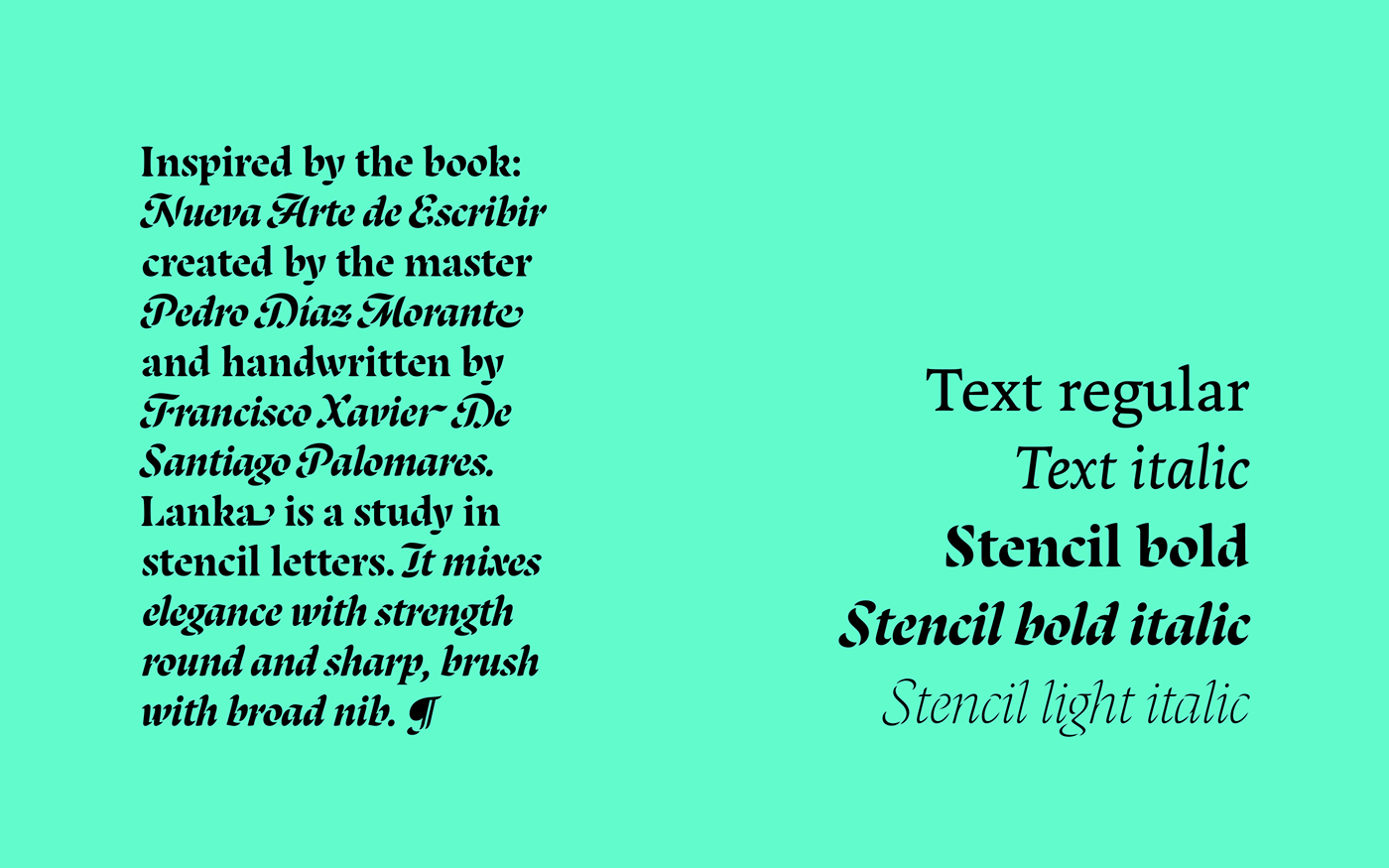
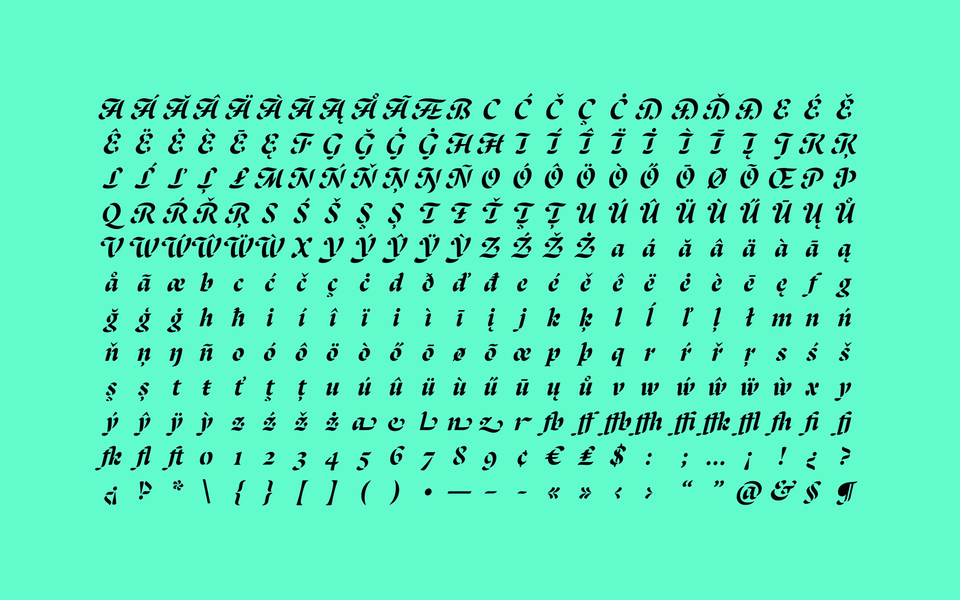
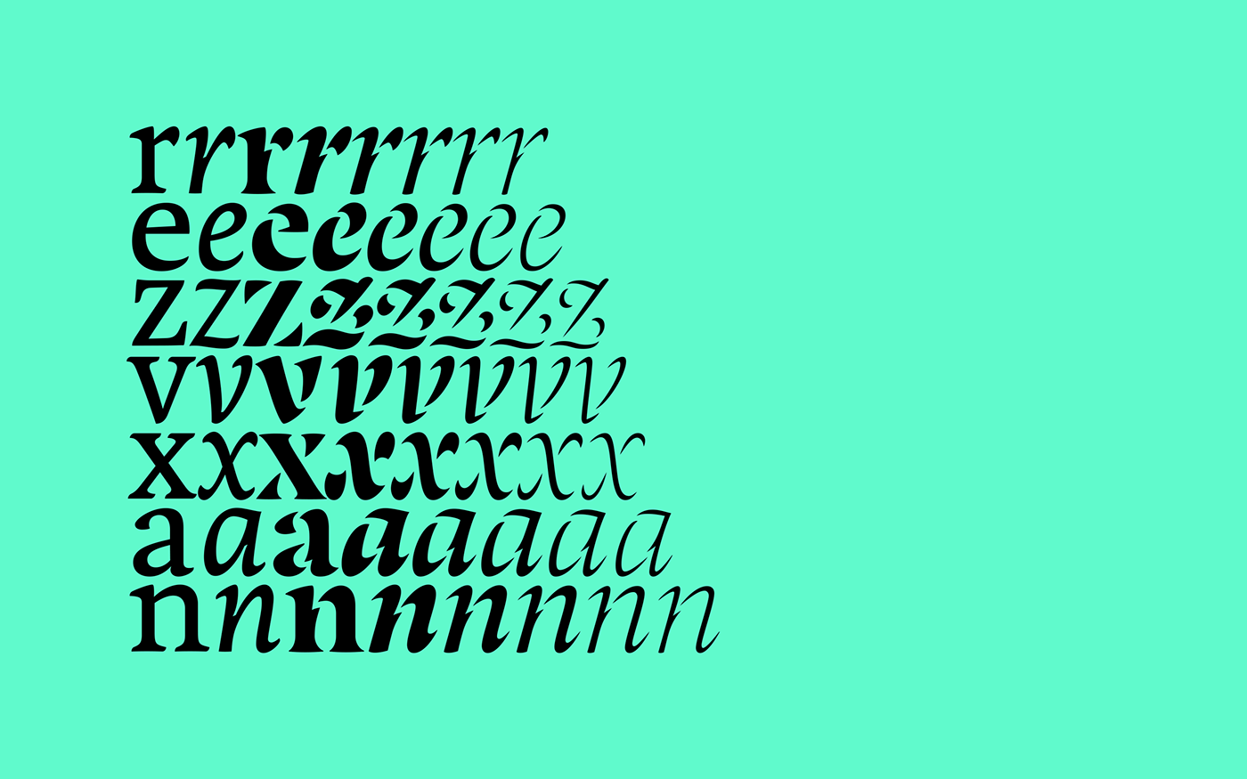
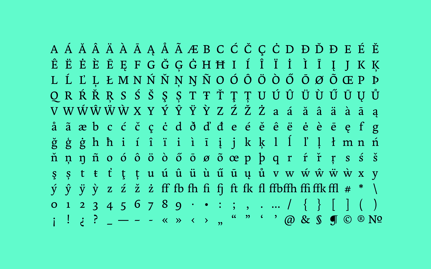
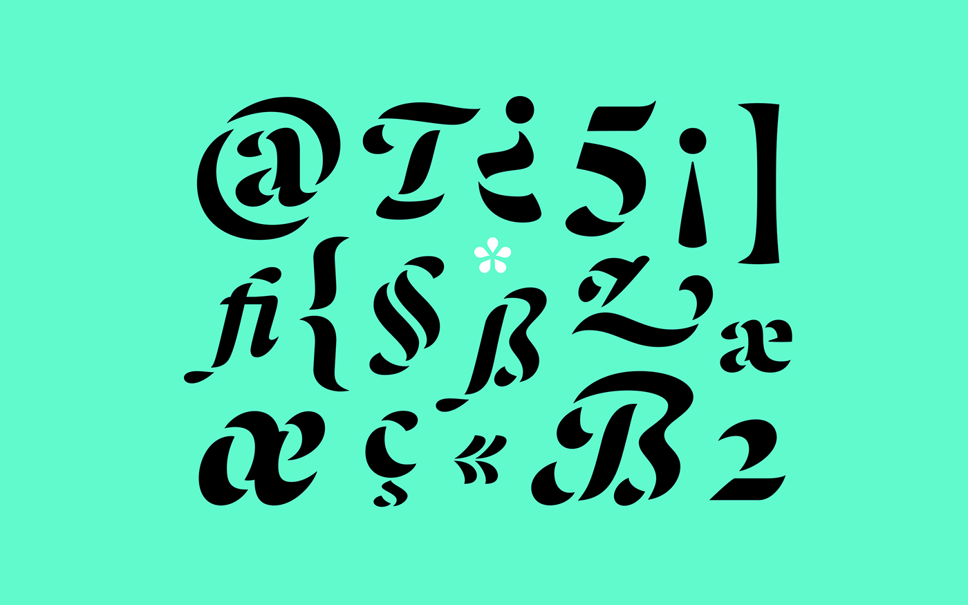
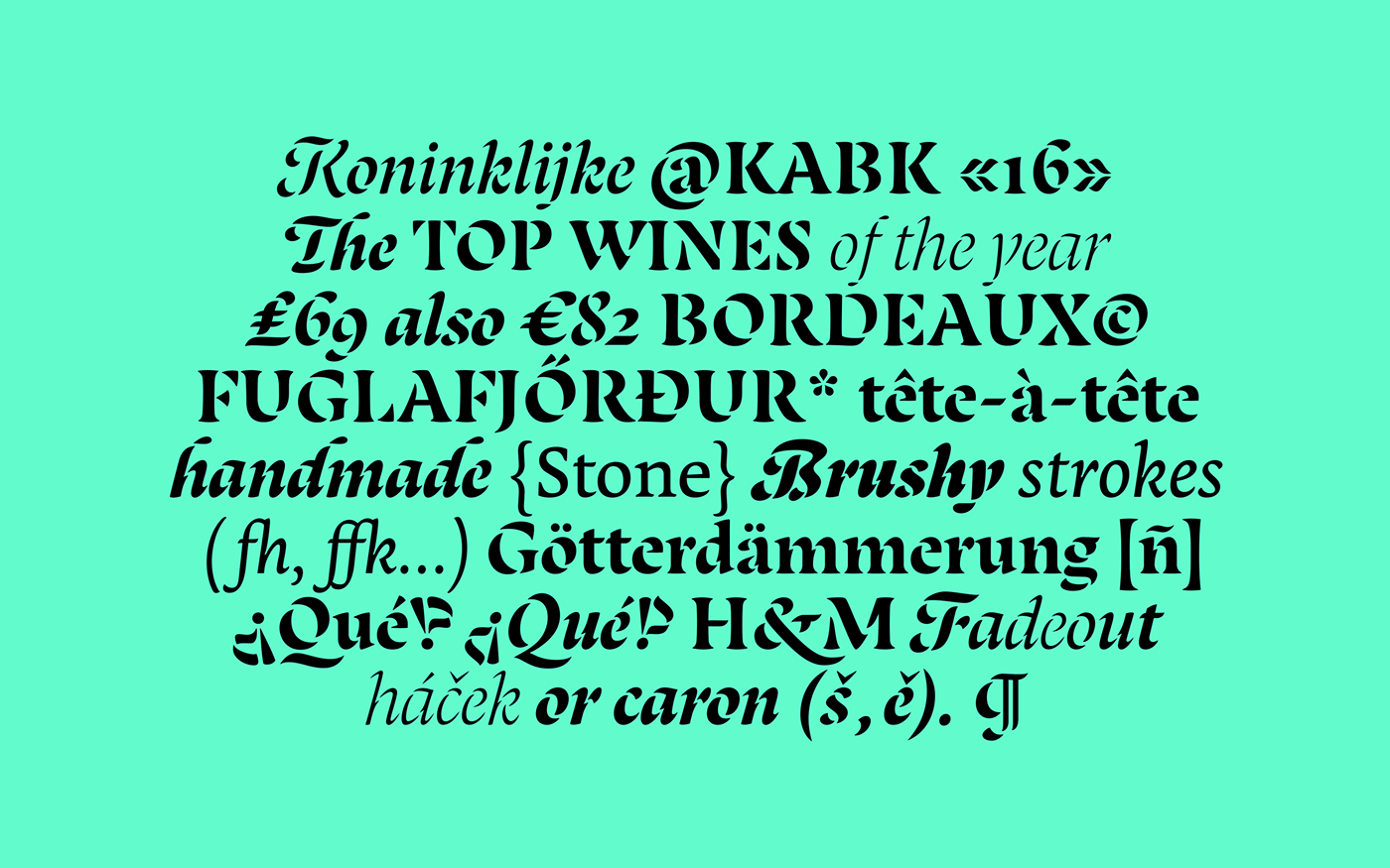
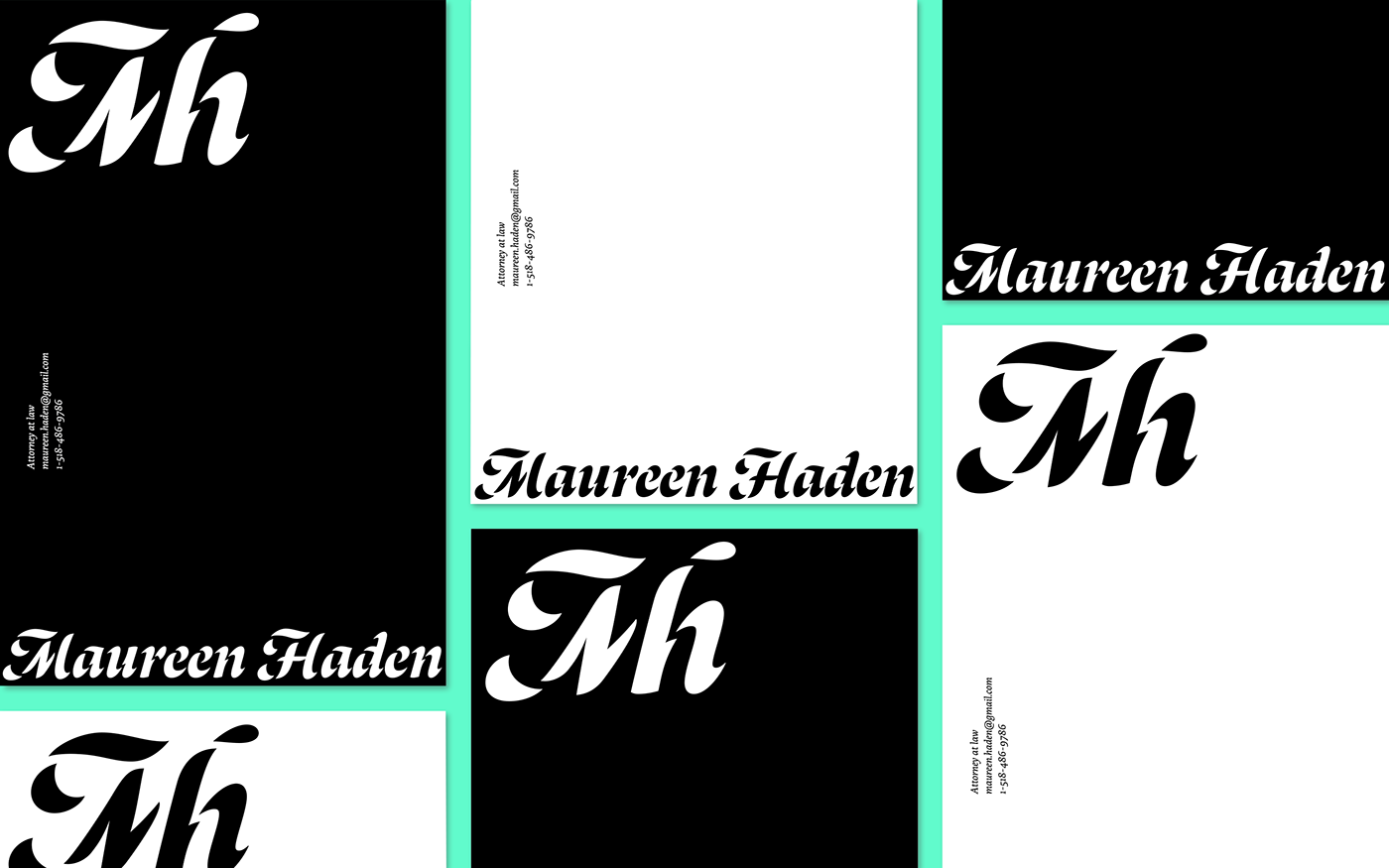
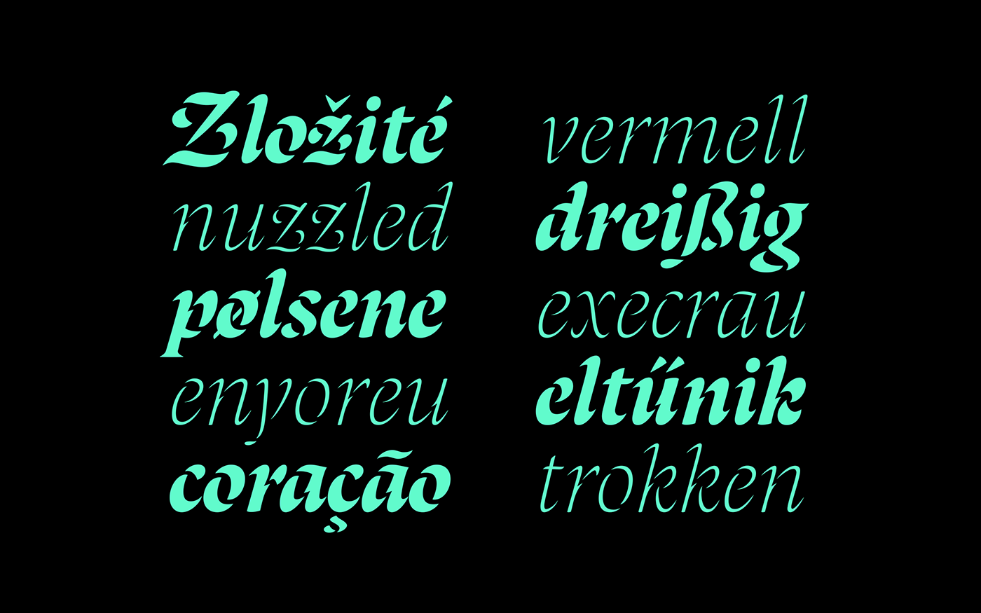
Stencils tend to be associated with sturdy and industrial shapes, but what if they were based on broad nib calligraphy? Lanka uses the junctures of calligraphic strokes as an opportunity to achieve stencil effect, shifting those connections in order to create unexpected shapes. The starting point was inspired by a Spanish book of engravings published by Francisco Palomares in 1776: “Arte nueva de Escribir”. Some of its reproductions show an uncommon stencil effect that attracted my attention. While Lanka’s stencil styles make it an eye-catcher, the text weights are sober workhorses suitable for longer pieces of text. The family is enhanced with different flourishes and alternates that add liveliness and variety.
This project was part of the Type and Media Master in KABK, The Hague, The Netherlands.
Check the website to see all the projects.


Process of Lanka
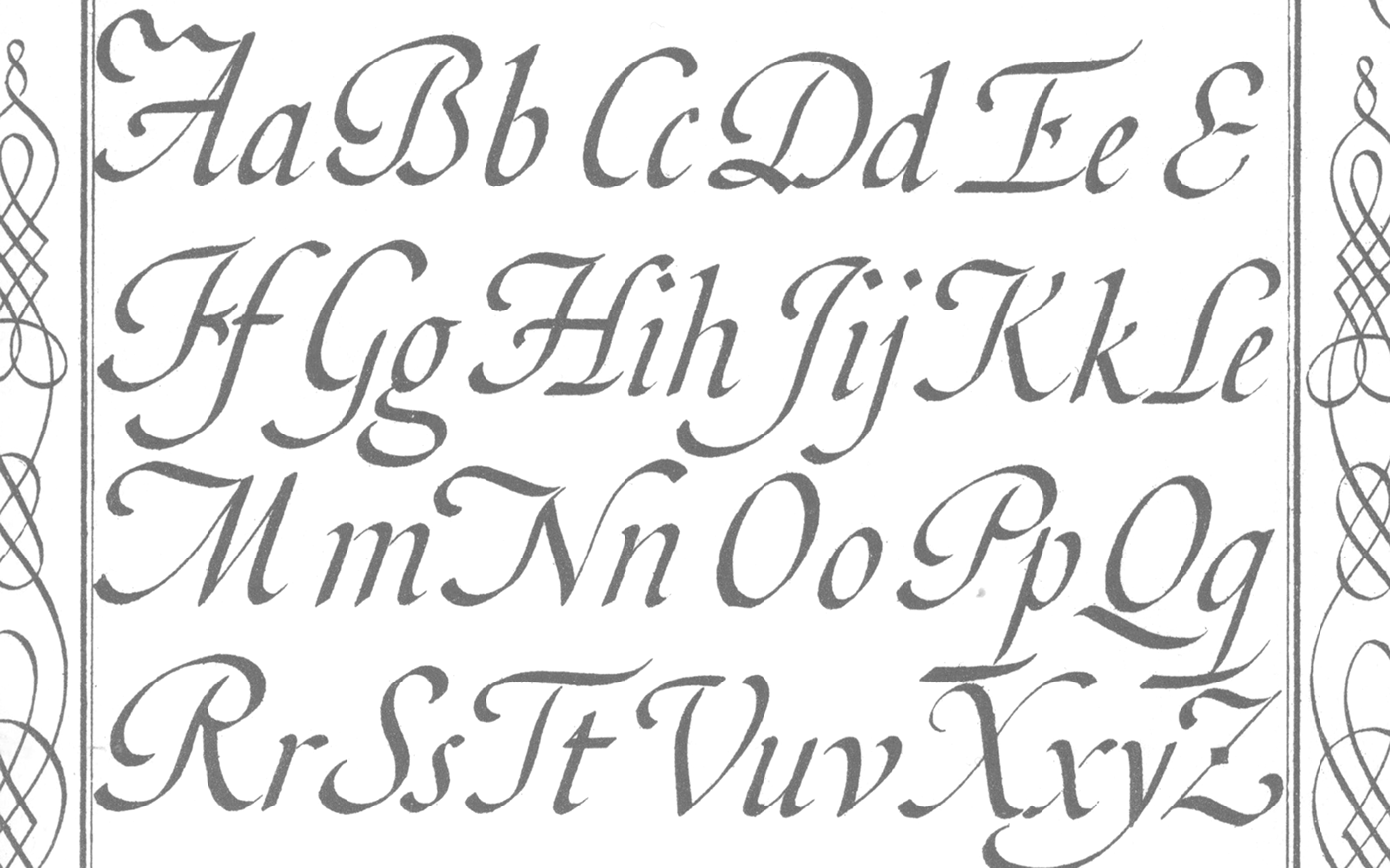
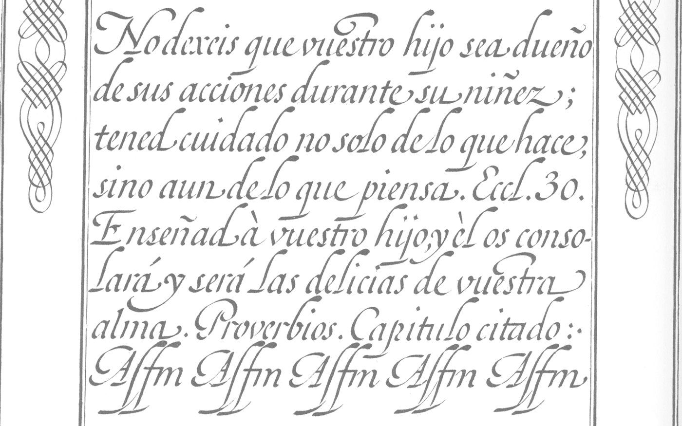
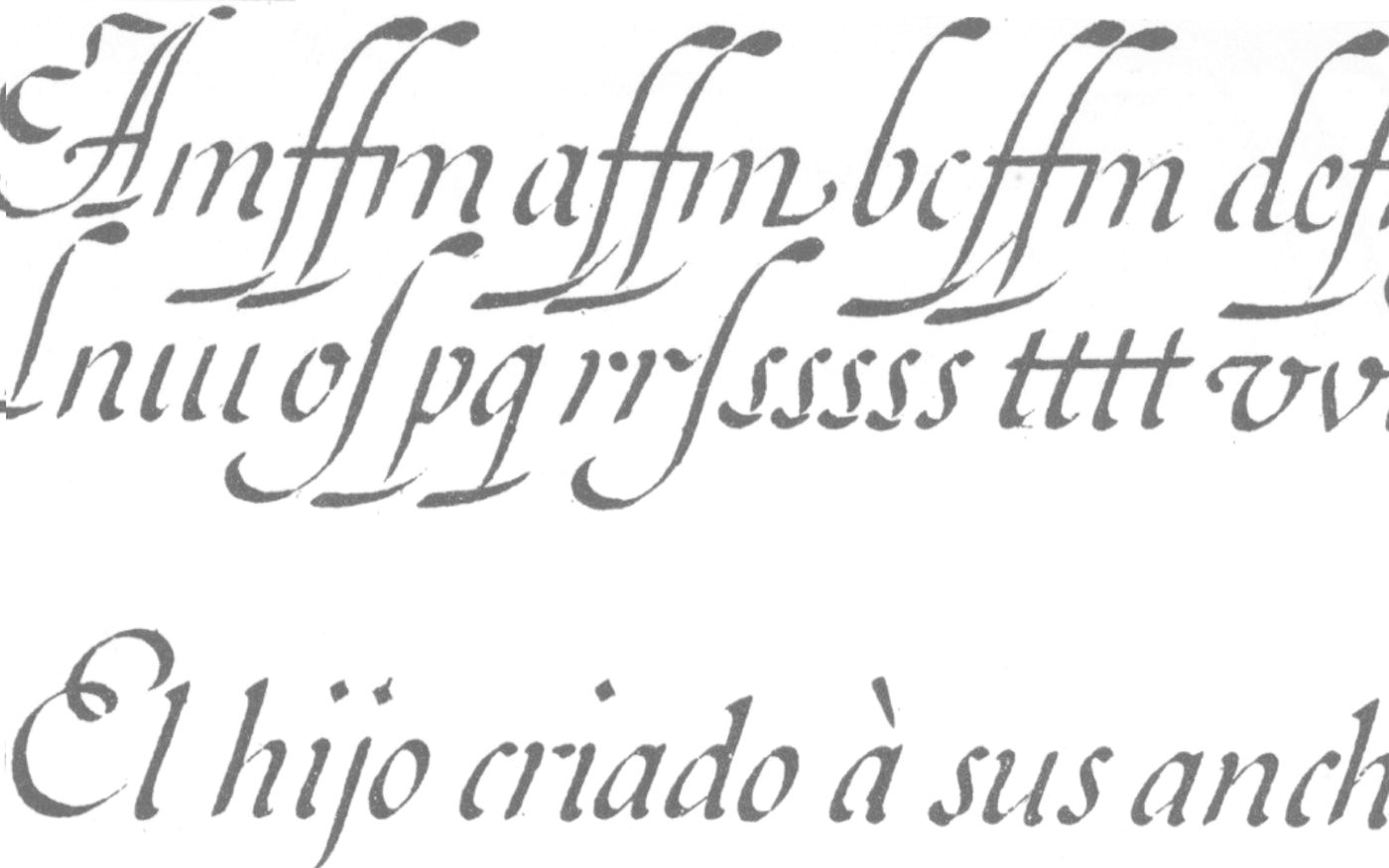
Showings of D.Francisco Xavier De Santiago Palomares: “Arte nueva de Escribir” 1776
I found some engravings in “Meermanno” Dated from 1776, they are part of the book “El Arte de Escribir”.
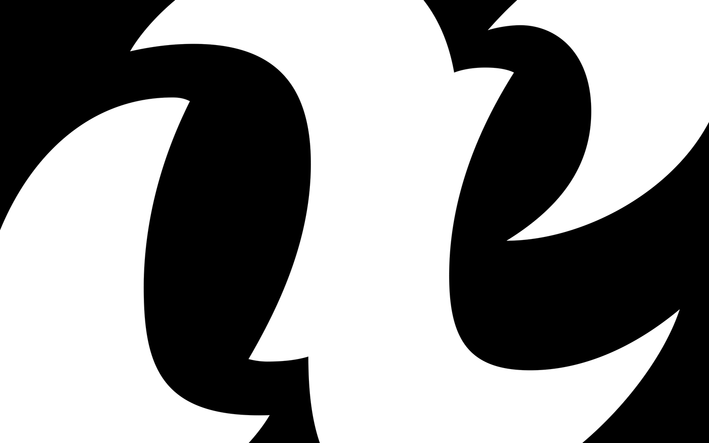
I found those calligraphic sheets of an incredible beauty, combined with very distinctive and odd shapes. The thin parts in the engravings are
very fragile and some of them disappear in these reproductions, creating very distinctive stencil shapes.I was particularly amazed by the lowercase s.The way the bottom stroke connect to the next letter creates an unexpected stencil shape. The thin parts not only breaks but also twists. I spent one week and a half trying to use some of the inspiration found here and make it more personal.

The idea:
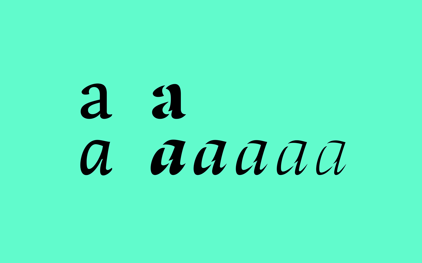
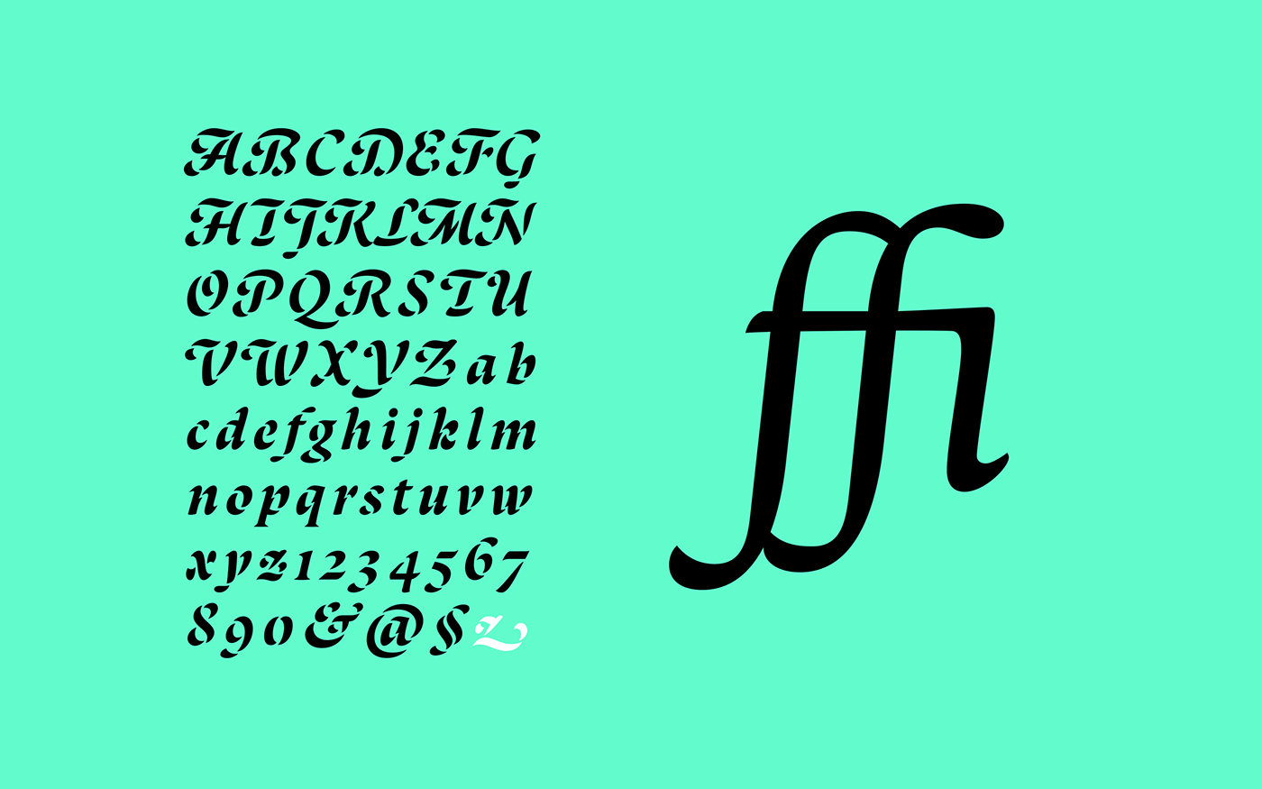
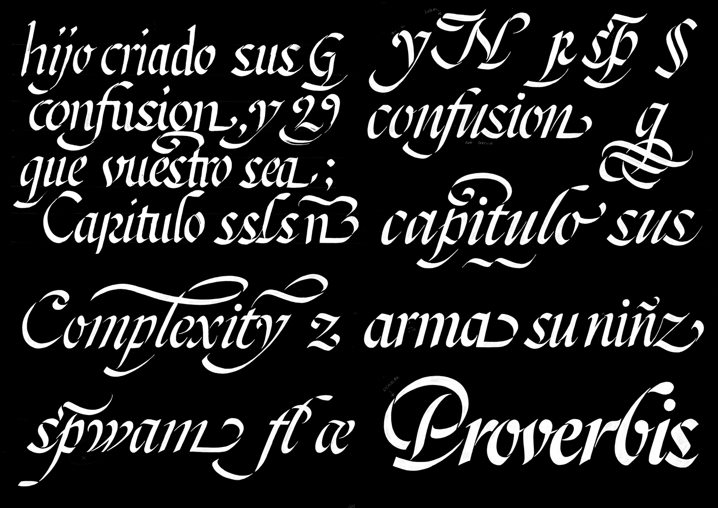
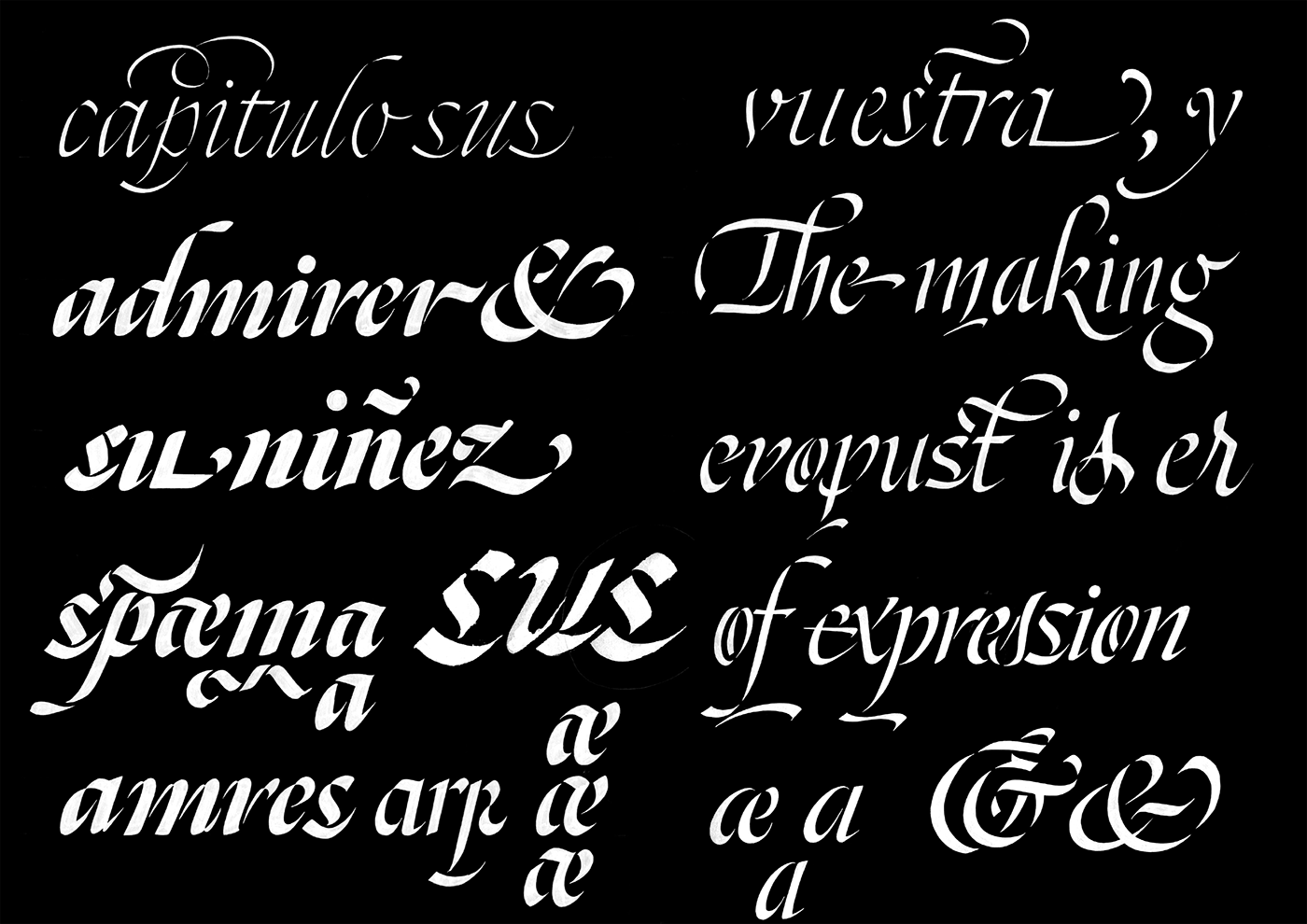
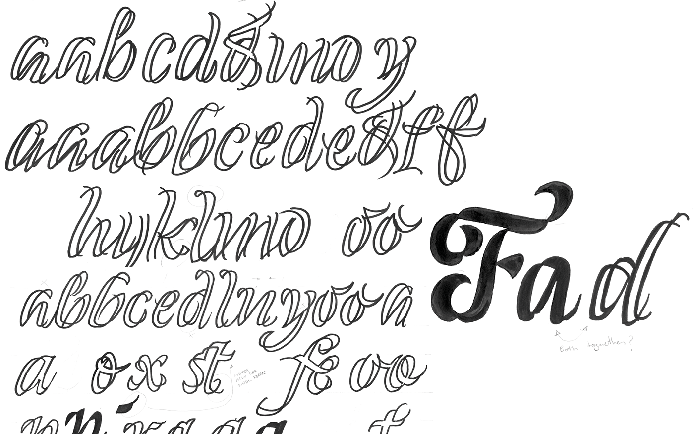
In an attempt to find something different, I drew a version made only by continuous strokes on top of my brush script. In that exploration I drew a capital F that I really liked. It kept a brushy taste with nice twisted connections. What really caught my eye, was my ability to make a “filled” version and one stroke based with the same concept. At that point, I felt I finally had something exciting to explore!
The idea was to make both versions “inline” and “filled” with the same shape as a starting point. Soon, I began to play around those shapes and elaborate variations.
I tried first a normal stencil, following my previous drawings, but they did not match with the “inline”. It was actually this version which inspired me the twist or shift that I would finally apply in all my lowercases, and would be the most important, characteristic detail of my stencil.
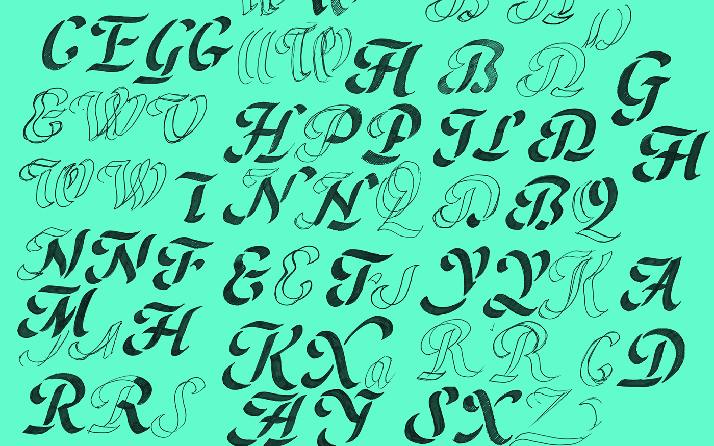
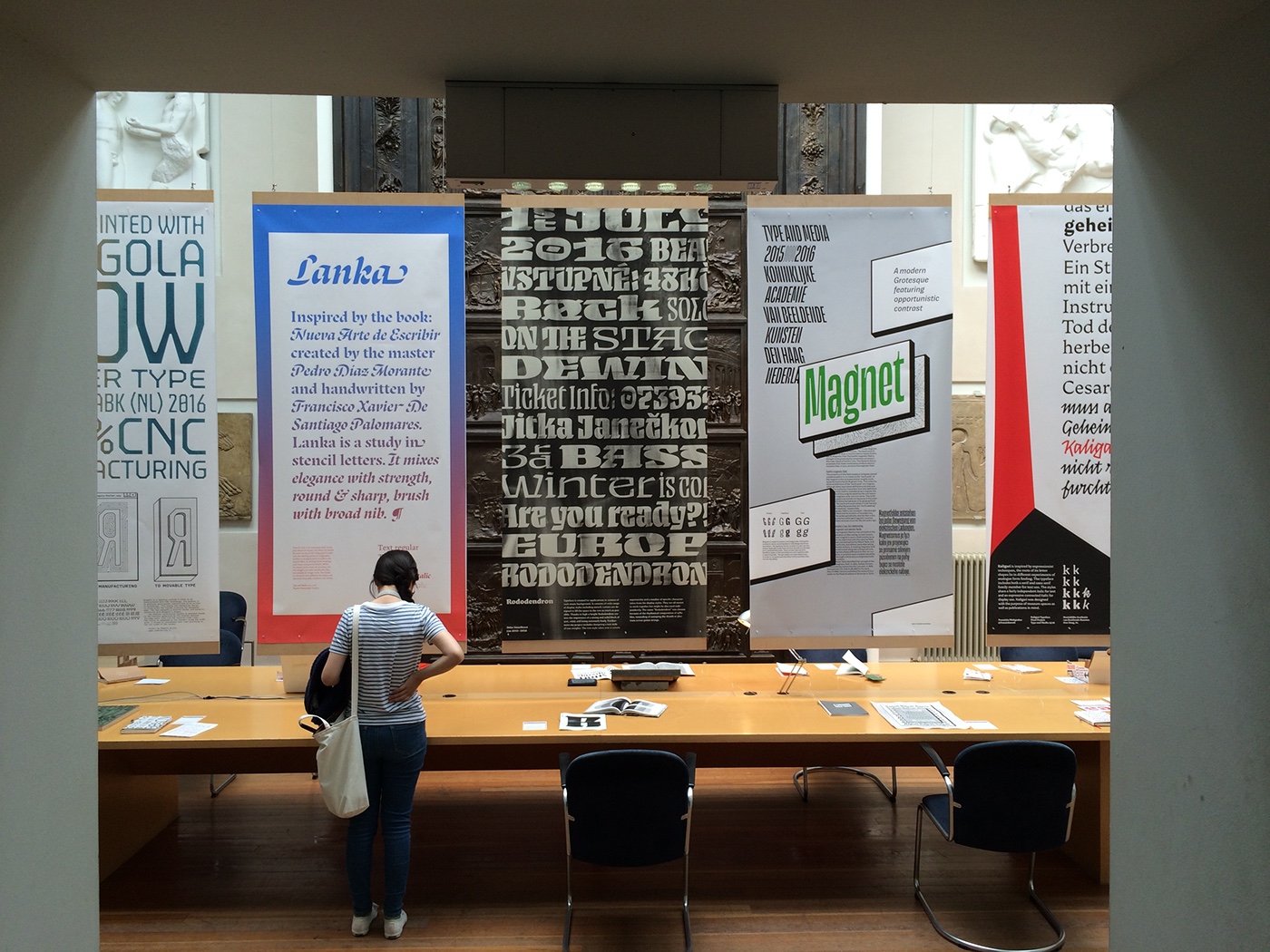
Photo by Franziska Weitgruber. Exhibition in July 2016 at the KABK.


