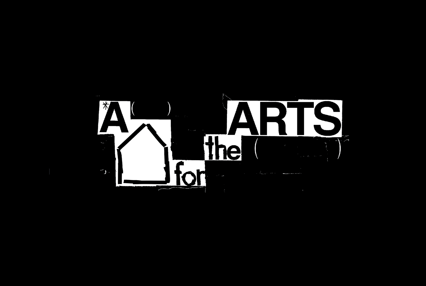
A Home for the Arts, 2016
The Substation
Designed by Currency
"Oddly enough, people thought we had that look but actually it was to save money!" – Chris from Brainhook, on The Substation's early designs. (Source: The Design Society Journal)
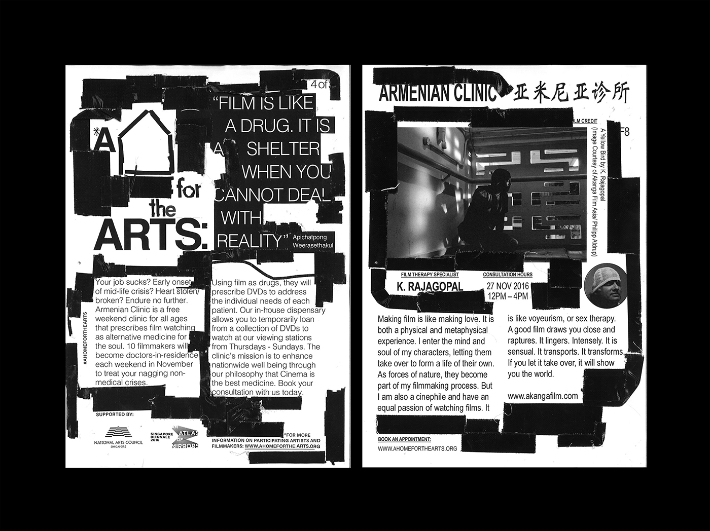
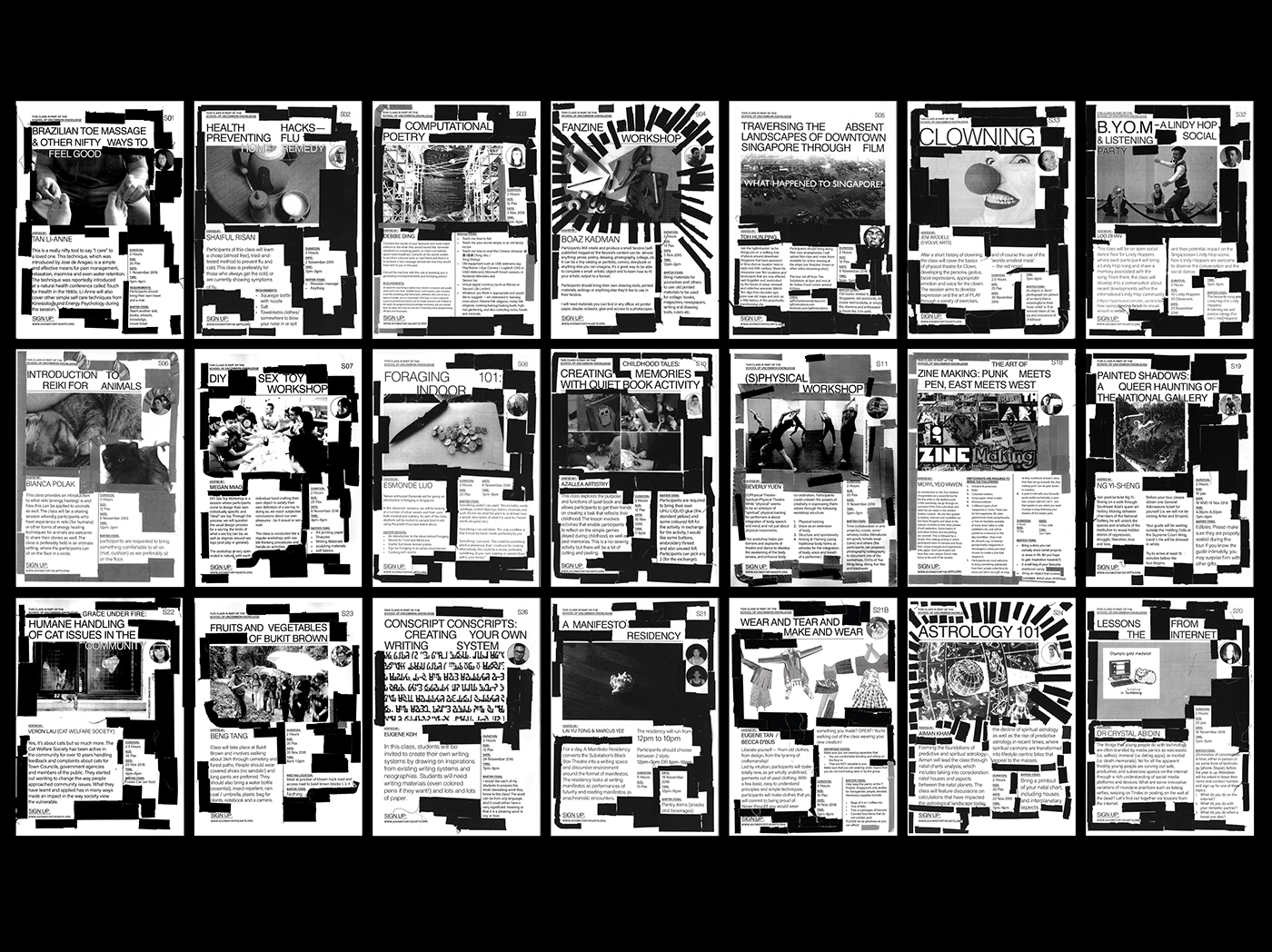
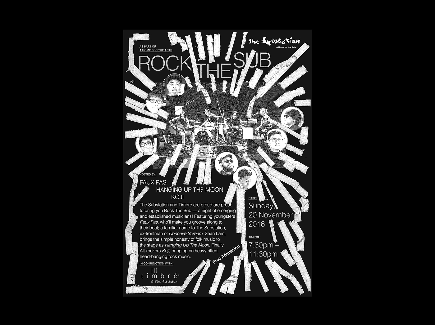
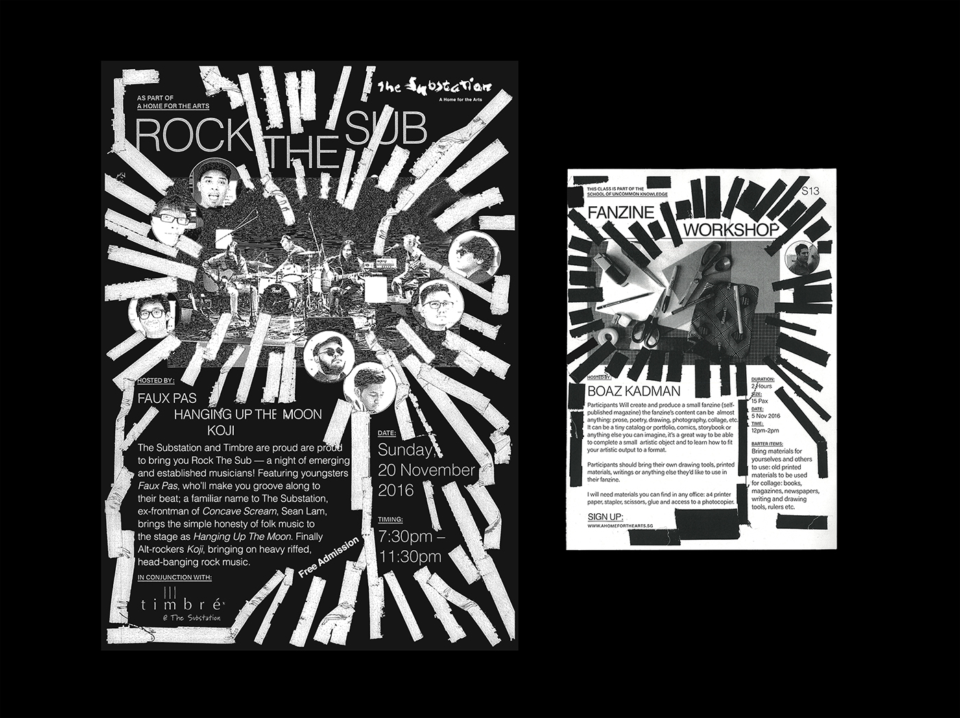
A Home for the Arts recalls the "90s era Substation look", collaborating with the Substation team to arrive with many xerox printed brochures for their programmes with just gaffer tape, any sans serif available and their xerox machine.


