
”TakeWay” FooD packaging
TakeWay is a chain of healthier food restaurants. All the dishes here are made only from the ingredients which match the strict requirements for high quality. The dedicated work and good food soon made these products very desirable for the guests of TakeWay. That is how a demand to have them at home and a necessity to put them on sale was born.
Being special is an obligation to go an extra mile in all fields, including the look, of course. After all, it has a significant mission – to highlight three cornerstones of this tasty diet’s temple: uniqueness, healthiness and high quality.

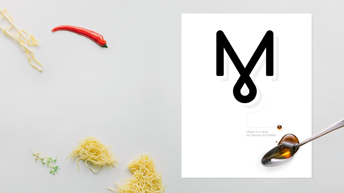
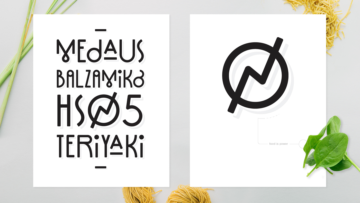
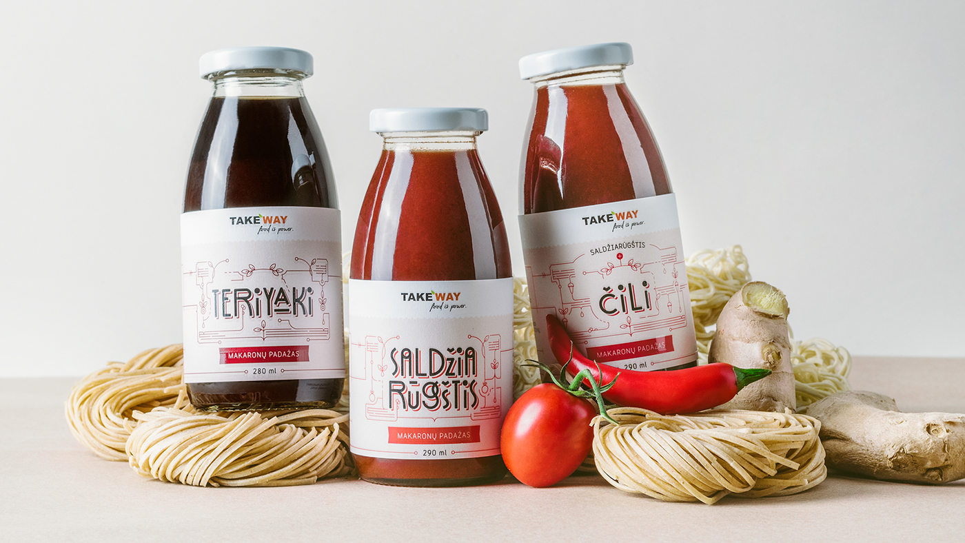
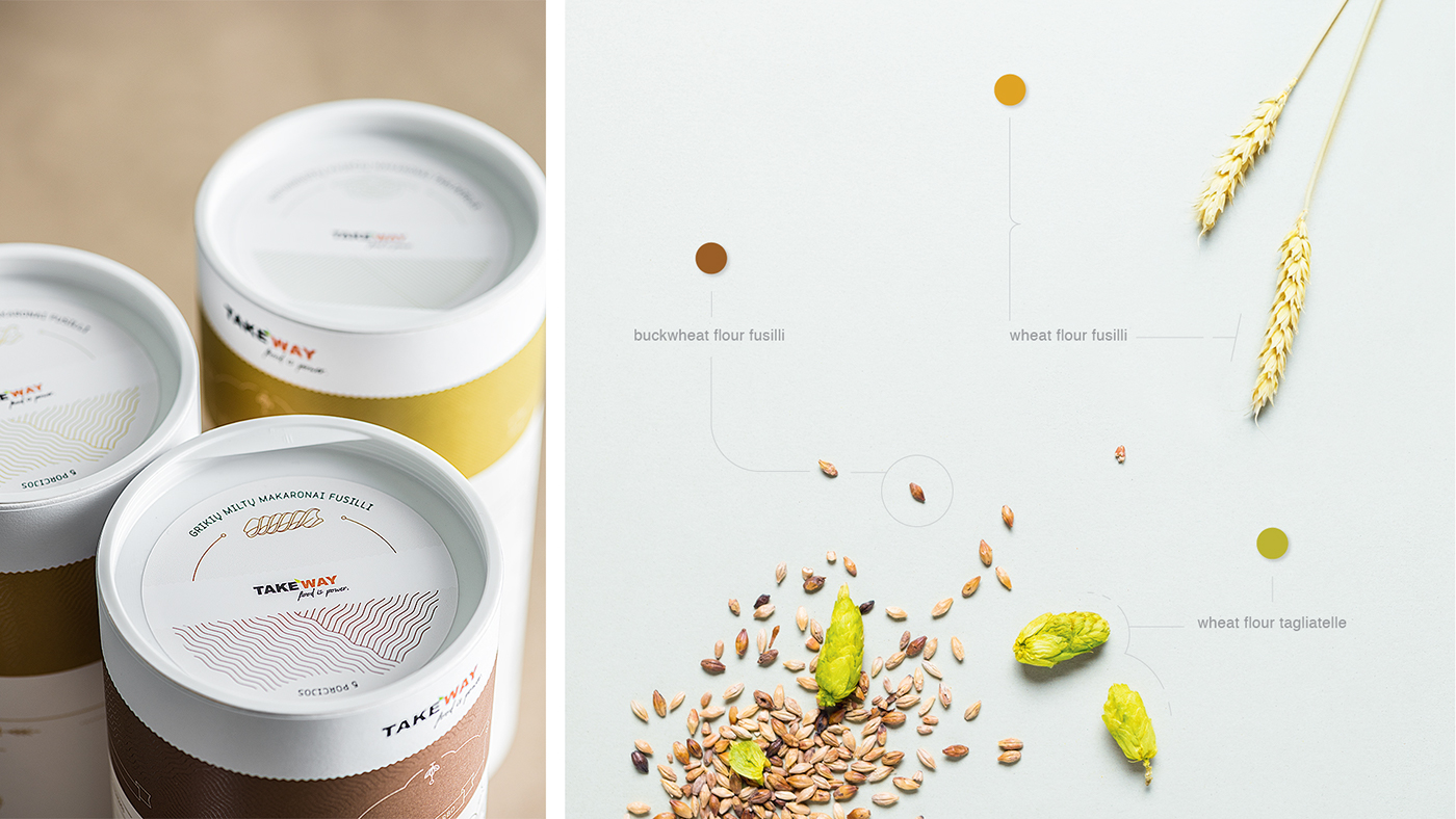
Particular graphic elements and illustrations of ingredients became a part of design. They create an emotional link between a customer and a product. Lines trailing from the ornaments are for the “flavour notes” – a symbol of each product’s magnificent taste.


Each group of products was differentiated by organic pastel colours – to represent healthy features they hold. More vibrant colours were used to distinguish different flavours of the products.


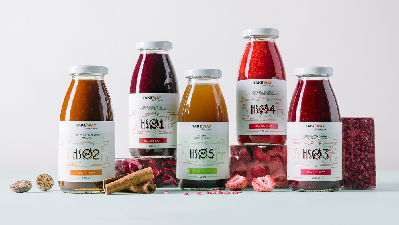

A specific lettering of stylised, modern bespoke typeface was created. It makes this packaging truly extraordinary.


Client: Take Way
Photography: packshot.lt
Year: 2016


