Index Exchange website redesign
Brief: To redesign the look and functionality of the current website using the aesthetics of the brand identity. Solution: Index Exchange’s new logo is their interpretation of evolution and collaboration. The interaction between each square symbolised openness and continuous evolution. Much like cells, the Ad tech industry is always evolving, moving and changing. Both also hold endless amounts of information with the power to dictate behaviours. I’ve used the idea of cell multiplication as a way to emphasise the meaning of the logo in an interactive way.
"The interaction between the tiles symbolizes the collaboration, and openness that we share with our clients and partners. As the tiles create movement, they display our continuous growth and evolution as a brand."

Current vs concept
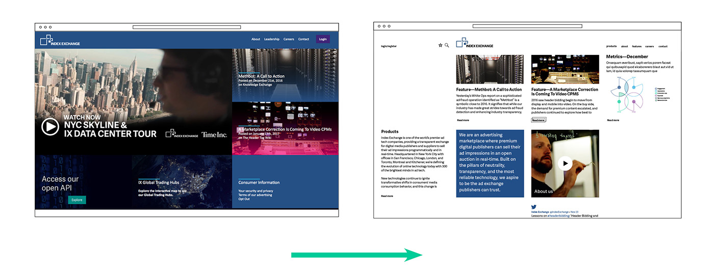
Wireframes

Homepage desktop + mobile
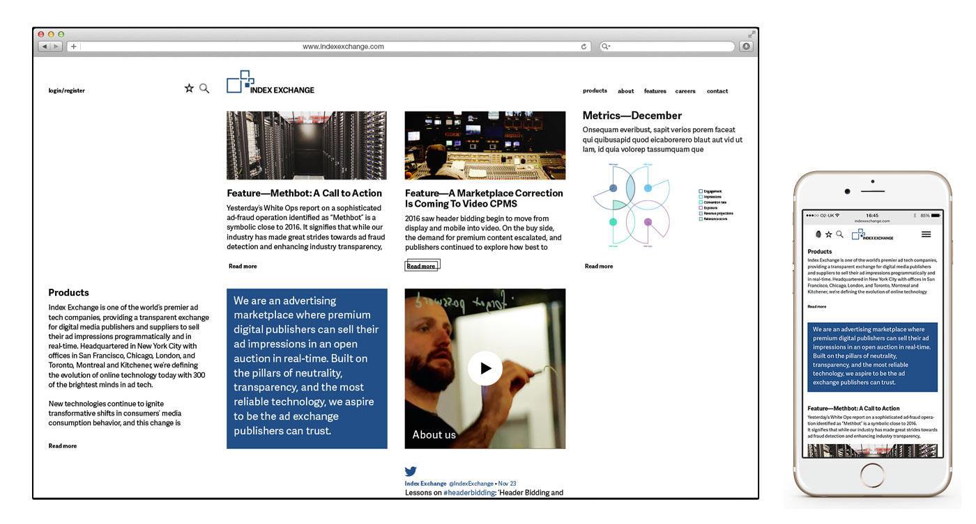
Homepage functionality

Article page functionality

Style for Ad Metrics

