Cafe Osage
Menu Design/Typography/Concept
Menu Design/Typography/Concept
Objective
Redesign of logo and menu for an existing restaurant. Considered price and audience when developing the concept. (Student Work)
Redesign of logo and menu for an existing restaurant. Considered price and audience when developing the concept. (Student Work)
Logo
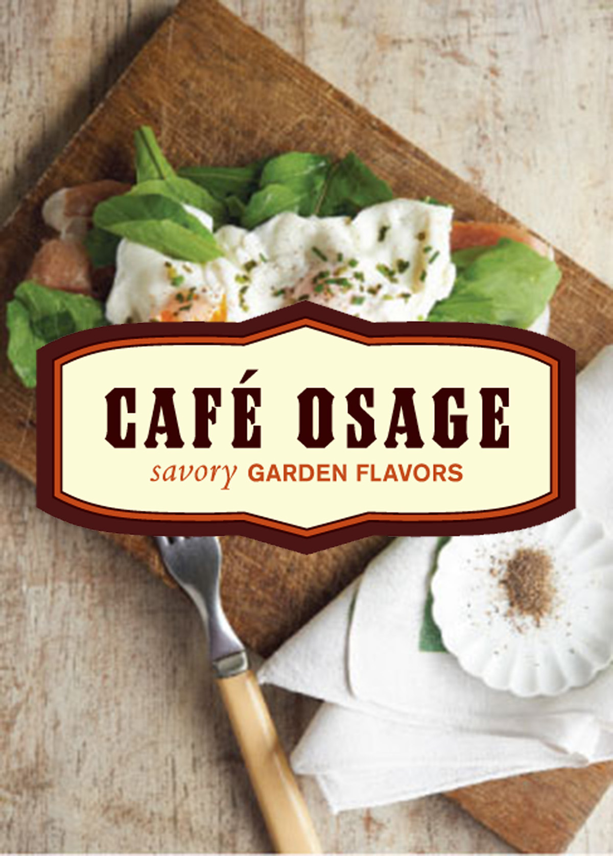
For the logo I used a blocky emigre typeface and a heavy border. I wanted the logo to have an old, traditional feel with a modern update. For the subtext I used a sans-serif and accented the word “savory” with an oblique serif typeface to draw peoples’ attention to a word that is associated with taste. The subtext also sets the ground for the typographical treatment of the menu.
For the logo I used a blocky emigre typeface and a heavy border. I wanted the logo to have an old, traditional feel with a modern update. For the subtext I used a sans-serif and accented the word “savory” with an oblique serif typeface to draw peoples’ attention to a word that is associated with taste. The subtext also sets the ground for the typographical treatment of the menu.
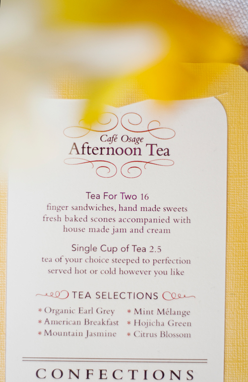
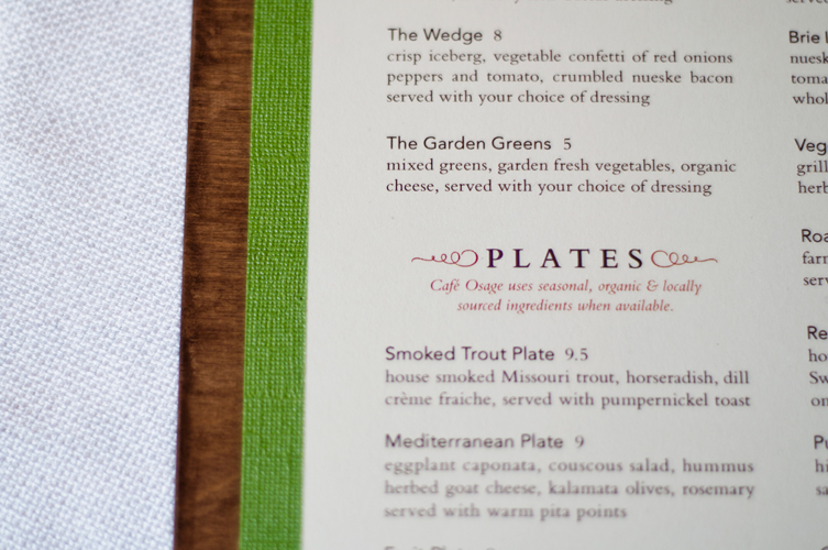
Menu
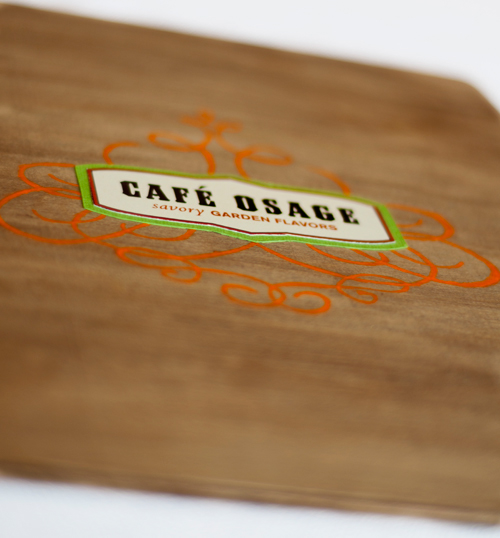
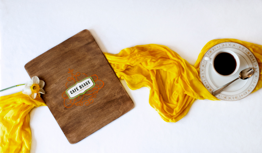
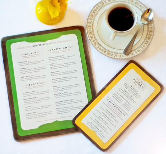
I stained birch wood boards to hold the menu and hand painted filigree on the back for the logo to be placed on. I continued the mix of old and new with my typefaces. The text on the lunch menu is justified to hint at classical typography. However, to add variety, the “Tea” menu employs a single column design and center-aligned type. Function was also important, so I designed the menus as inserts so they can easily be updated as offerings change
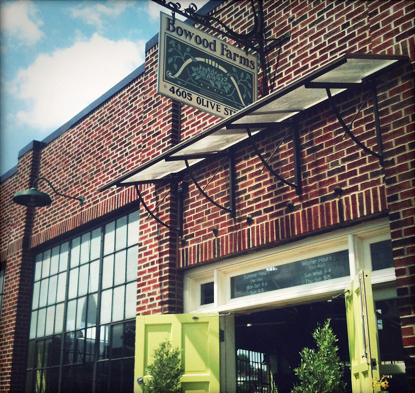
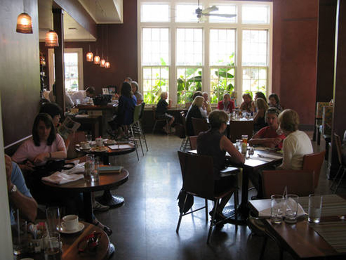
The Place
Cafe Osage is an upscale brunch/lunch restaurant. The restaurant is located inside Bowood Farms plant nursery, a lavish environment to shop for plants. The establishment evokes a high-end garden club feeling, where ladies would like to “lunch”.
Cafe Osage is an upscale brunch/lunch restaurant. The restaurant is located inside Bowood Farms plant nursery, a lavish environment to shop for plants. The establishment evokes a high-end garden club feeling, where ladies would like to “lunch”.


