SITUATION
Krupnik is a well known quality product with a very dated image. Its target audience consists of two types of buyers - the first type see Krupnik as a favourite drink, the others treat it as a souvenir representing traditionally crafted beverages.
The name Krupnikas is considered a common word and cannot be copyrighted. Any manufacturer could release their version of the drink, and call it Krupnikas.
-
TASK
To create new packaging to make the product stand out and better represent its quality, taste and craftsmanship.


SOLUTION
Taste
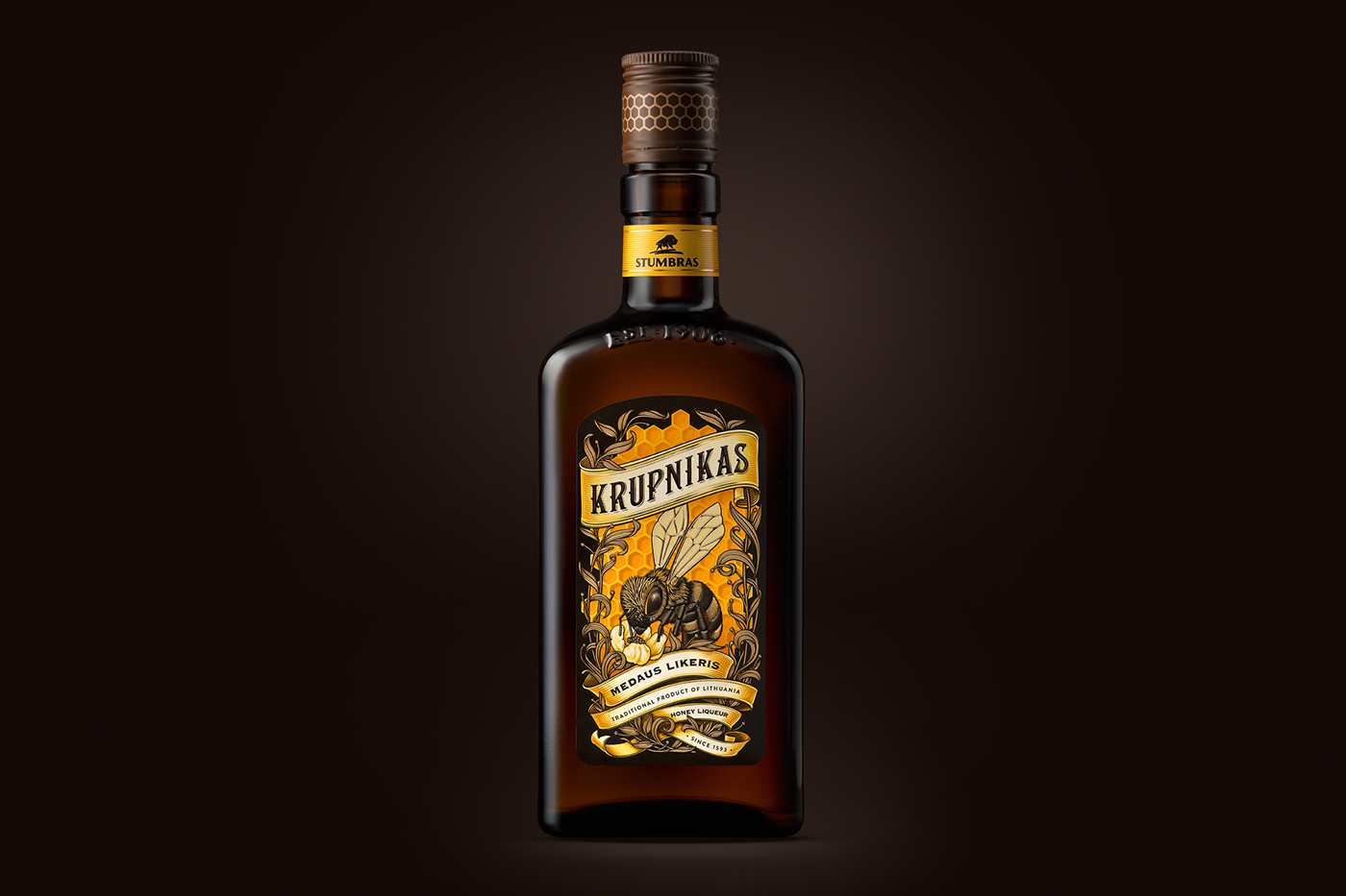
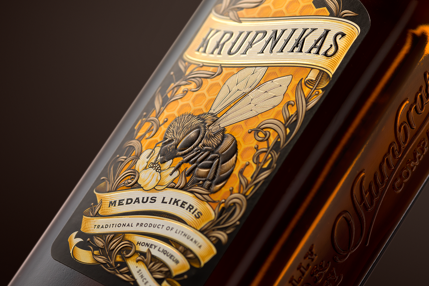
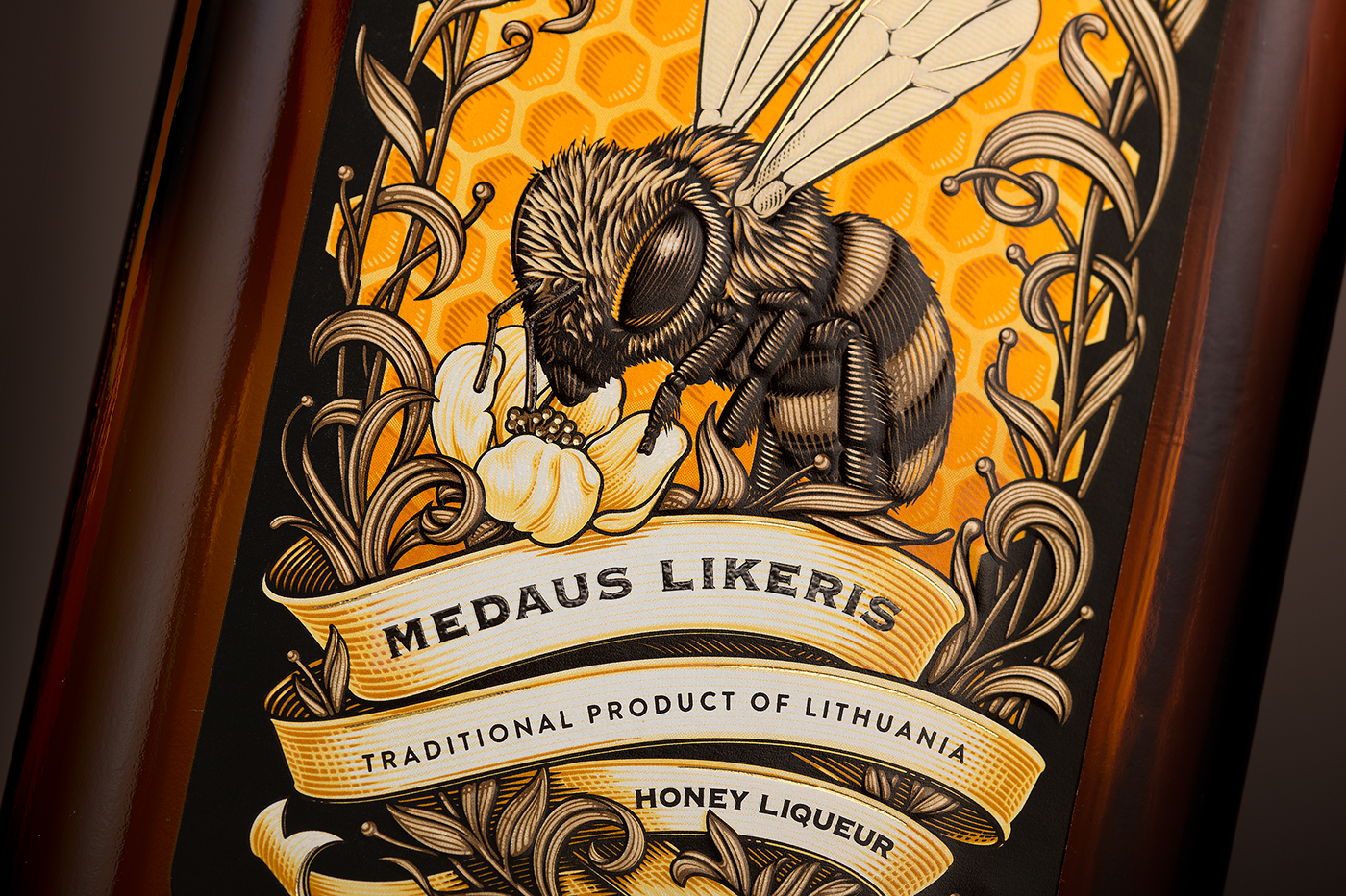
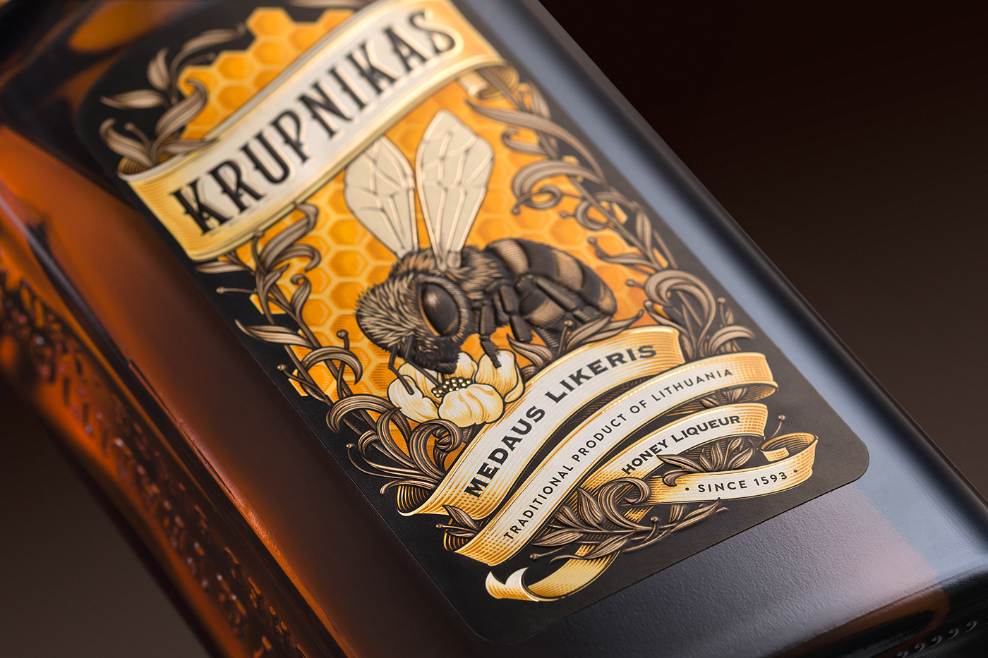
Honey is the base of the drink, and was chosen as a key element to convey its great taste for the drinkers.
Brand personality
An illustration of a bee serves as the main element of the design. This makes the product instantly recognizable, and distinguishes it among a sea of other krupniks.
Tradition
The highly detailed illustration is a modern interpretation of ancient litography techniques. The fonts are carefully selected to suit the artwork and brand's heritage.
Premium feel
Finishing effects such as tactile UV varnish, gold foil and embossing makes the composition elements stand out and makes the product more credible as a souvenir.-

CREDITS:
Client: Stumbras
Packaging Design: Valerija Žilėnienė, Algirdas Orantas, Irmantas Savulionis étiquette
Illustrations: Olexa Andryuschenko
Product Photo Shoot: Audrius Tuleikis
-
-


