


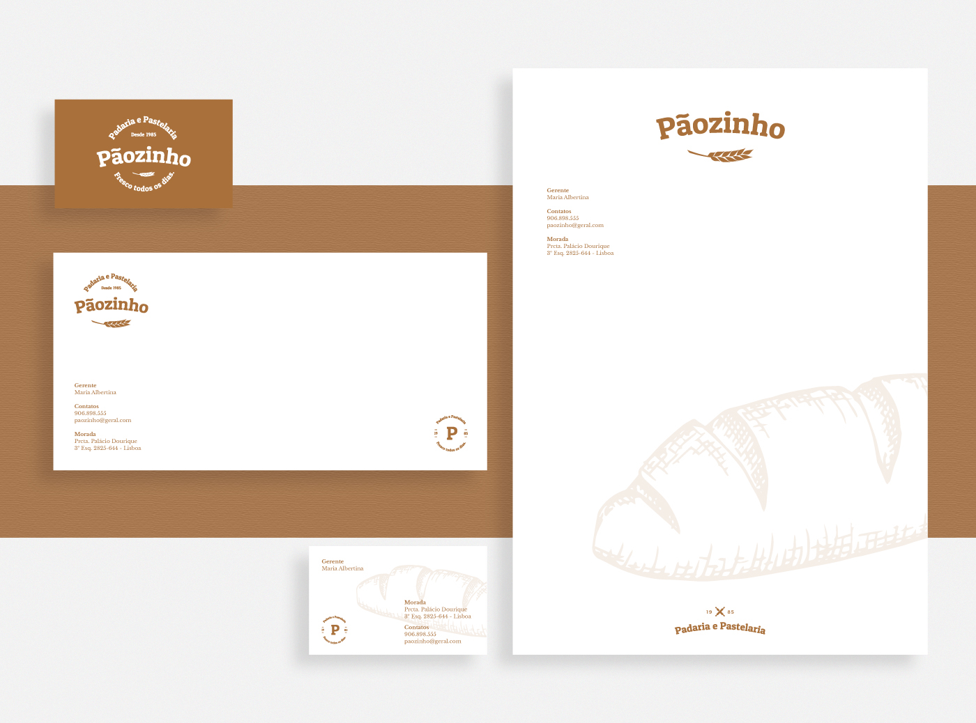
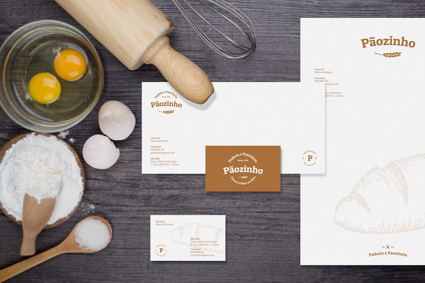
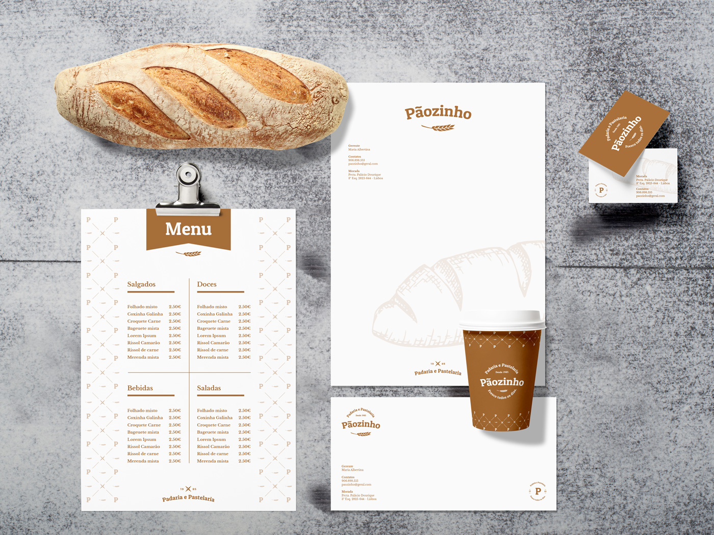
Established in 1985, bakery and pastry Pãozinho (means bread in a cute way of saying) keeps the traditional production of bread and derivatives.
The graphical language communicates a story, a warm welcome, the simplicity of the boutique and purity in its homemade products. The visual communication also transmits their participation in the harvest (organic wheat symbol), never losing the quality and proximity in the observation of their products.
The graphical language communicates a story, a warm welcome, the simplicity of the boutique and purity in its homemade products. The visual communication also transmits their participation in the harvest (organic wheat symbol), never losing the quality and proximity in the observation of their products.


"From the wheat to your table"
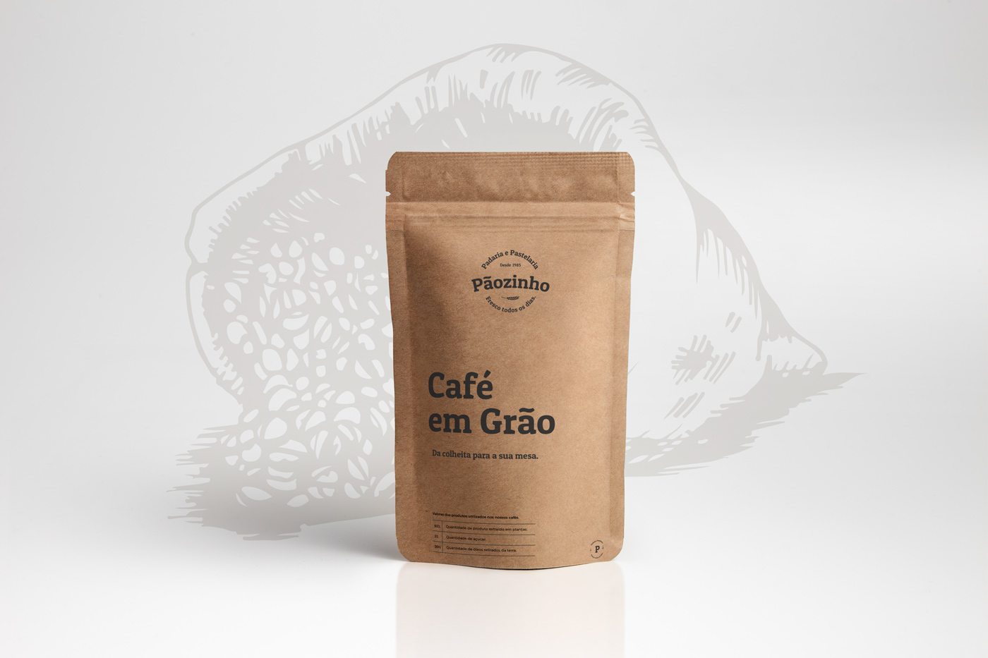


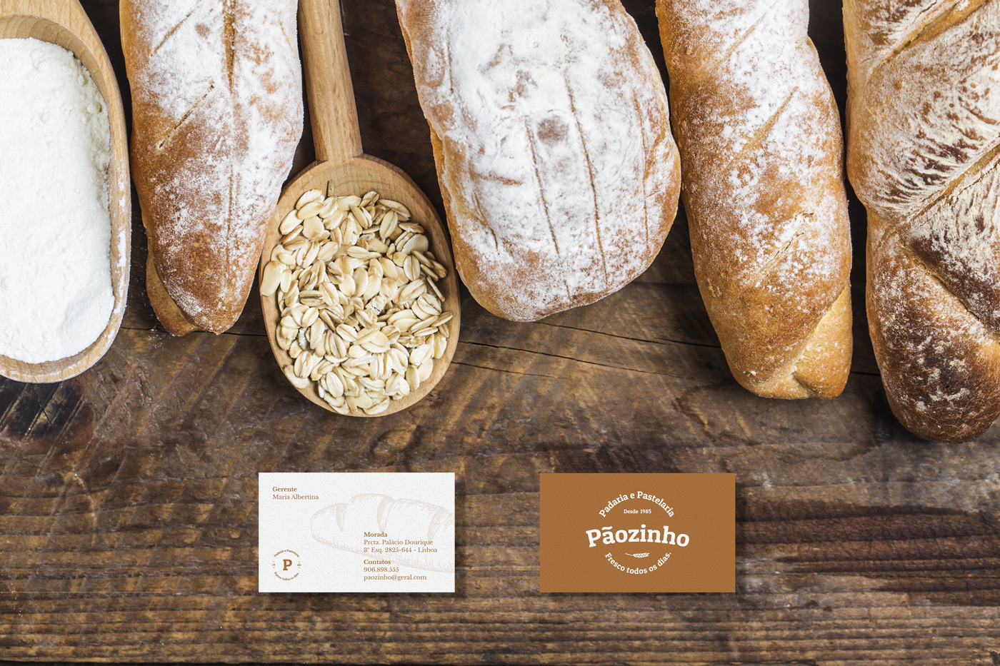


"Fresh everyday"


Brand design developed by: Pedro Almeida
Contact: pedro.workdesign@gmail.com
Contact: pedro.workdesign@gmail.com


