Giorgio Sans was created in 2008 by Christian Schwartz (Commercial Type) for Christopher Martinez, art director for the New York Times’ style magazine, T. The heaviest weights were added a few years later, bringing power to the family.
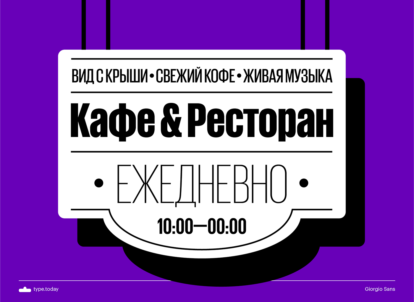
Rather than drawing from the high-fashion Art Deco influences seen in the serif, Giorgio Sans was inspired by everyday sources, such as French enamel signs and generic straightsided American sign lettering from the early 20th century.
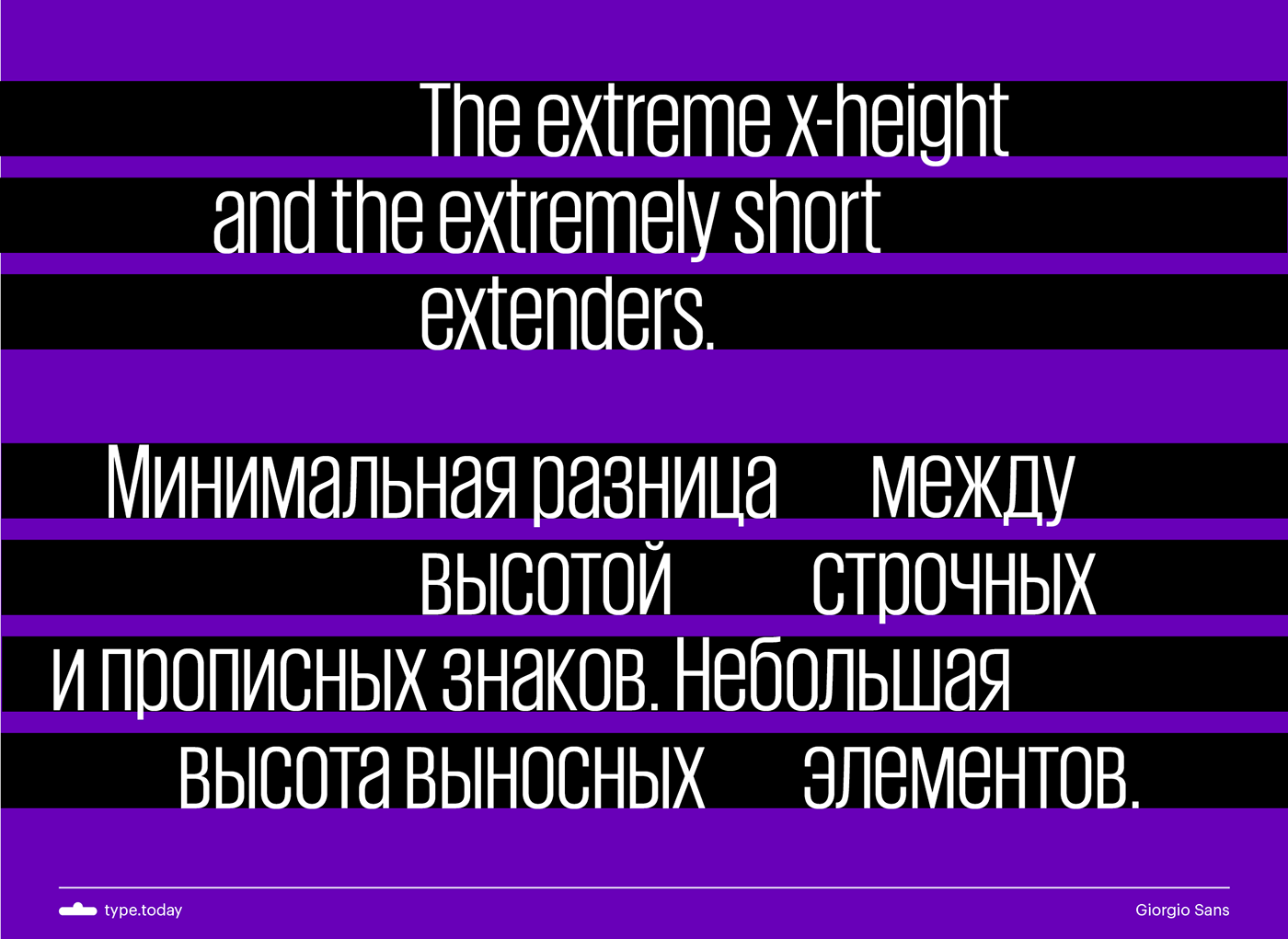
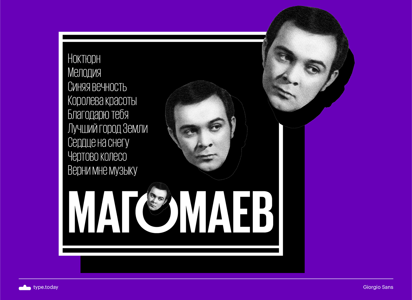
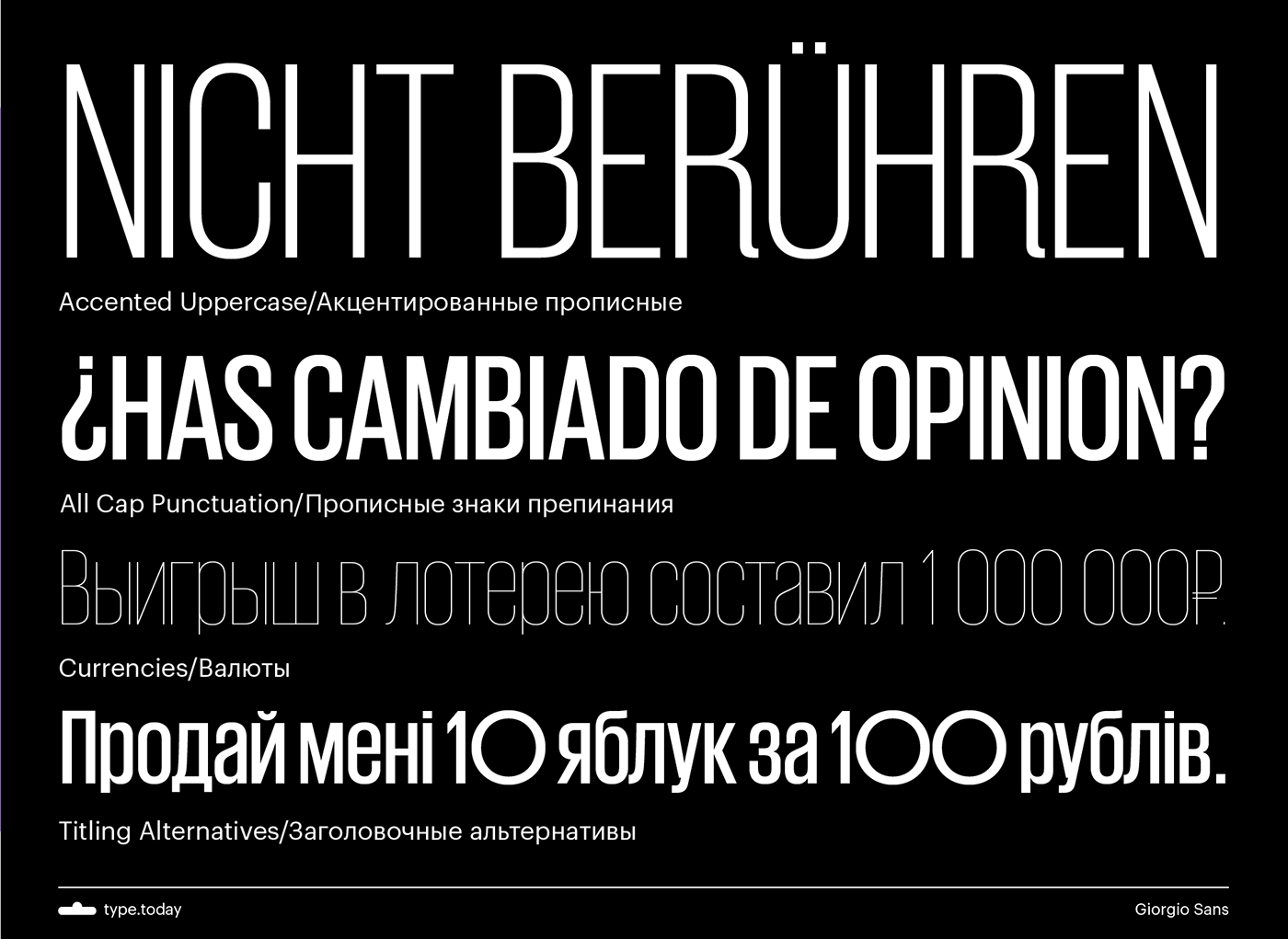
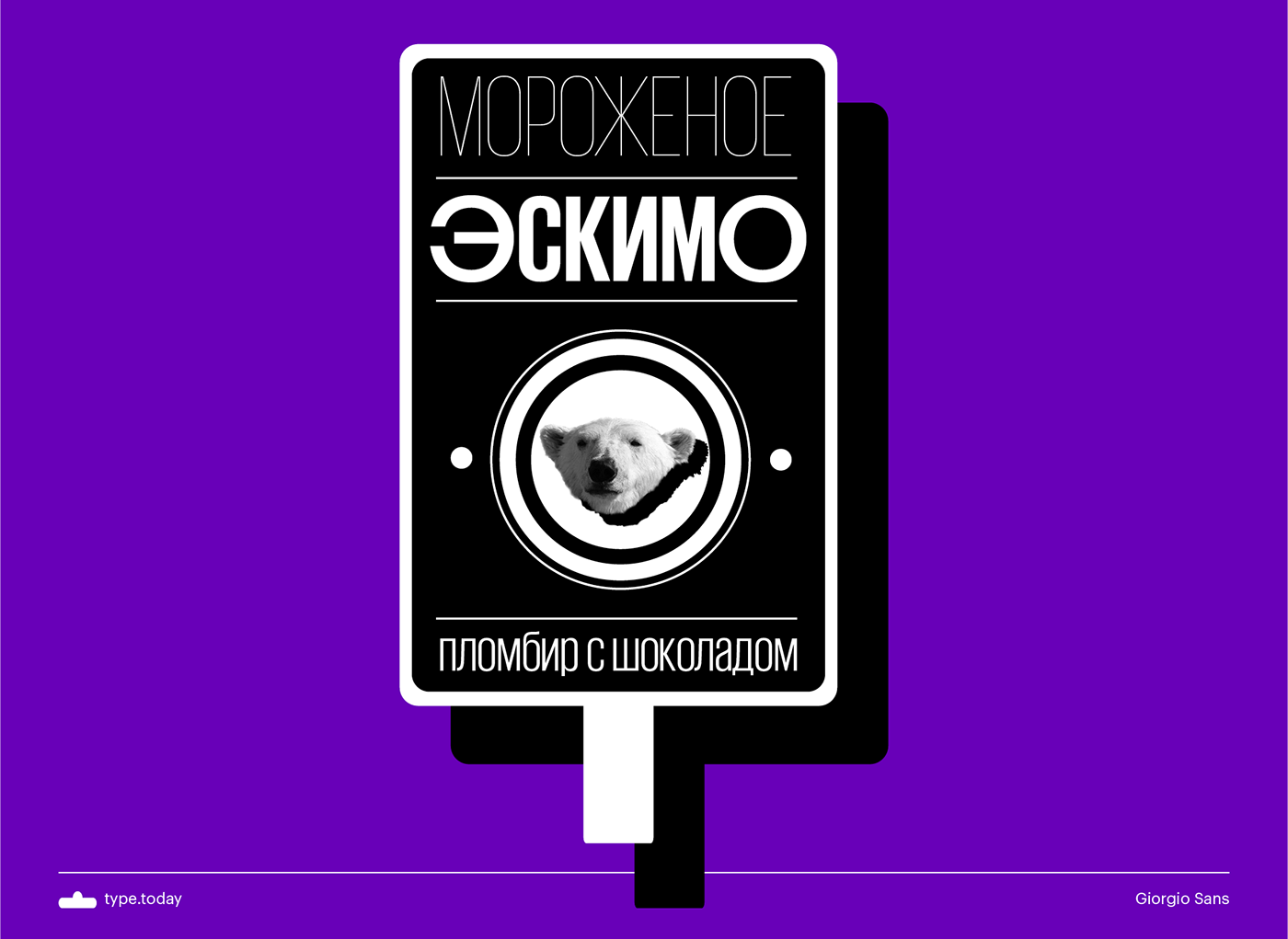
The distinguishing feature of the typeface is the extreme x-height and the extremely short extenders. With the help of an alternate set of perfectly circular round caps, charming rhythms and textures can be created. The typeface is available in a wide range of weights, all with matching obliques.
Ilya Ruderman (CTSM Fonts) designed the Cyrillic version in 2016.
Check Giorgio Sans Cyrillic at type.today