


The logo has been derived with a small yet pensive idea of a food industry entering into the well placed Giant Group.
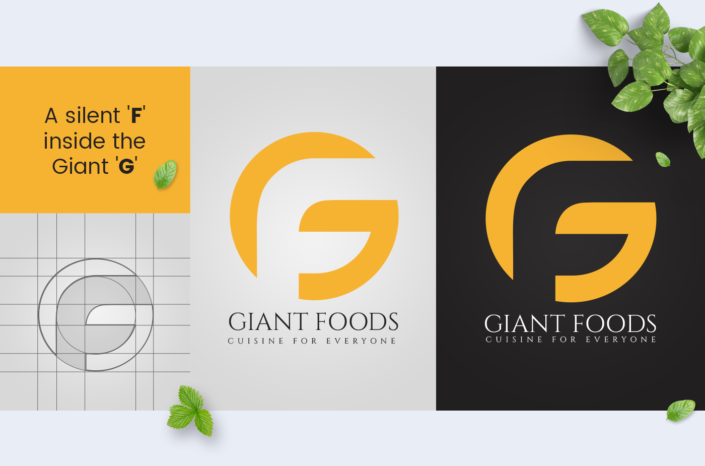
You could see a silent 'F' inside the Giant 'G'.
The bold type face expresses the company's strength and capability in the industry. We clearly understand that the
logo is a symbol or an avatar of the business as a whole and we strongly believe that this logo shall support the
brand as a whole.
You could see a silent 'F' inside the Giant 'G'.
The bold type face expresses the company's strength and capability in the industry. We clearly understand that the
logo is a symbol or an avatar of the business as a whole and we strongly believe that this logo shall support the
brand as a whole.

For Giant Foods, we have created two options. But, we recommend to go for the logo without the grain element or any other cereal as such since we believe Giant Foods shall grow endlessly to a mass each and every strata in the food industry. Hence, we haven't restricted the logo with any single element, but kept it open to assemble the whole food industry within itself.


