TAI
TAI is a university art school with more than forty years of trajectory. Its prestigious structure and academics, as well as its intense artistic production and the multidisciplinary character of its education program – unique to Spain – should have made it an international reference point. With this goal in mind, the institution approached Erretres to carry out the repositioning of its brand, on both a strategic and visual level, as well as its communication.

ANALYSIS
Despite the great value of its educational platform, the analysis carried out prior to the rebranding process yielded various strategic conclusions: the school itself was cold, technical, anonymous and standard, and the students lacked a sense of community and belonging; surroundings that failed to transmit the creativity of the people who inhabit them, and that don’t inspire or encourage imagination, surprise or the creative experience.
This space needed to both seem and actually be a habitat for a creative community comprised of students (and teachers) that should feel proud of their talent and who are learning about their own creative and transformative power, as well as how to exercise it in their surroundings. The cold, white cube of the school was seen as an opportunity, like a “white canvas” on which to create a new identity.

CONCEPTUALIZATION
The concept for change needed to come from the new role of art as a motor for change in society. Innovation and creativity are values in high demand in today’s world. Specialists and institutions stand out as key elements in the educational development of artists. TAI’s educational model encourages these abilities. Its goal is to empower artists and creative minds through its transformative power and multidisciplinary education.
This transversal environment comprised of distinct artistic disciplines, the experiential and global approach to creativity and the freedom enjoyed by its protagonists, have a clear precedence (and in some way a model) in the Bauhaus.
Likewise, the project was inspired by the ideas expressed by Kandinsky in ‘Concerning the Spiritual in Art’, a book in which the artist is situated at the top of the spiritual pyramid, with the mission of using his art to guide others, whose “souls” can slowly ascend to its summit.
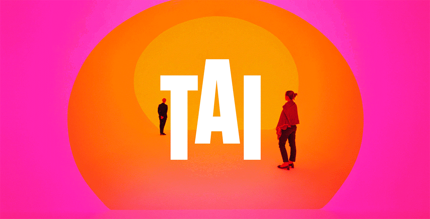
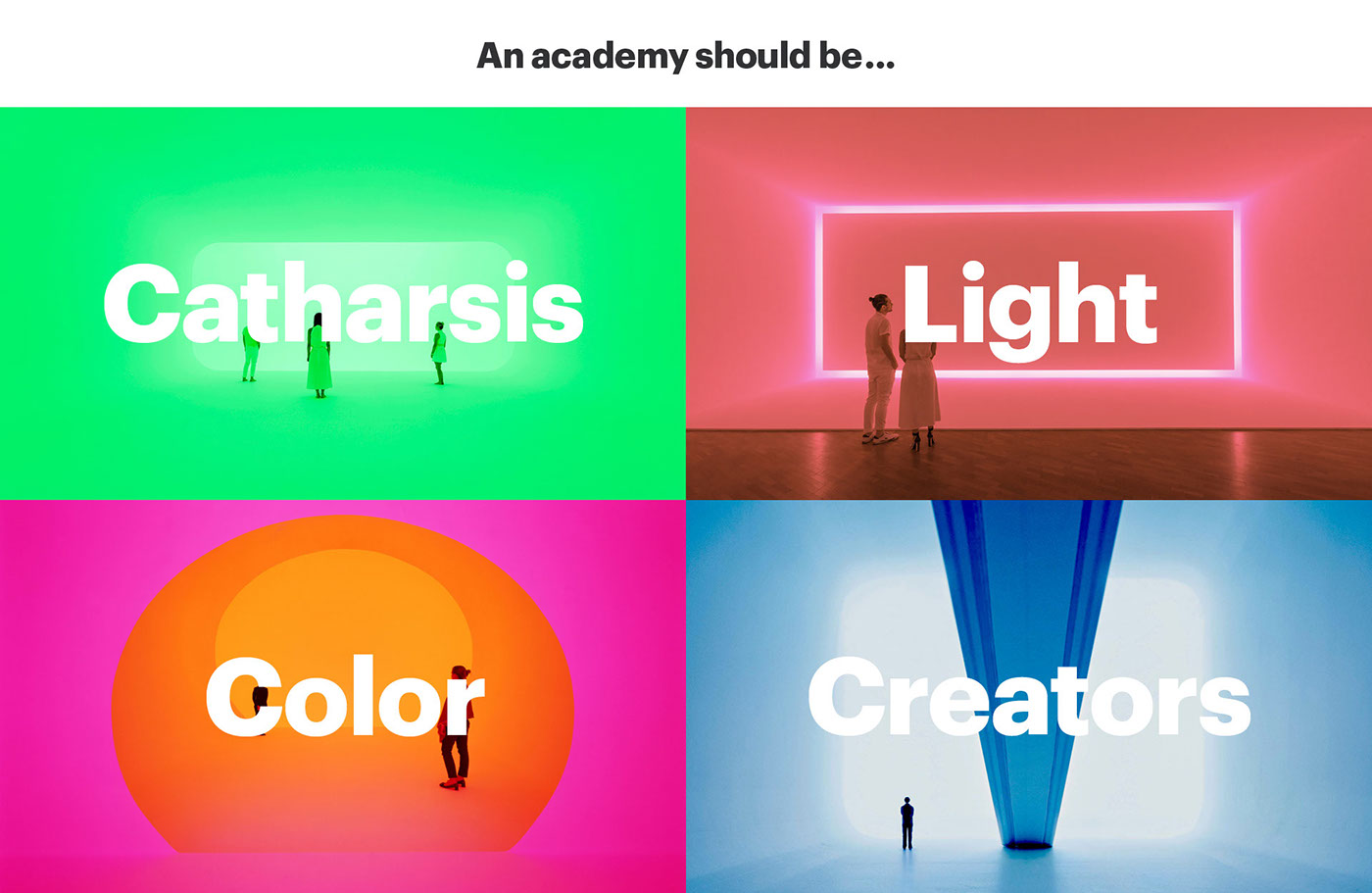
Light and color must serve as elements to fill the “white canvas” of the space and previous brand.
Claim
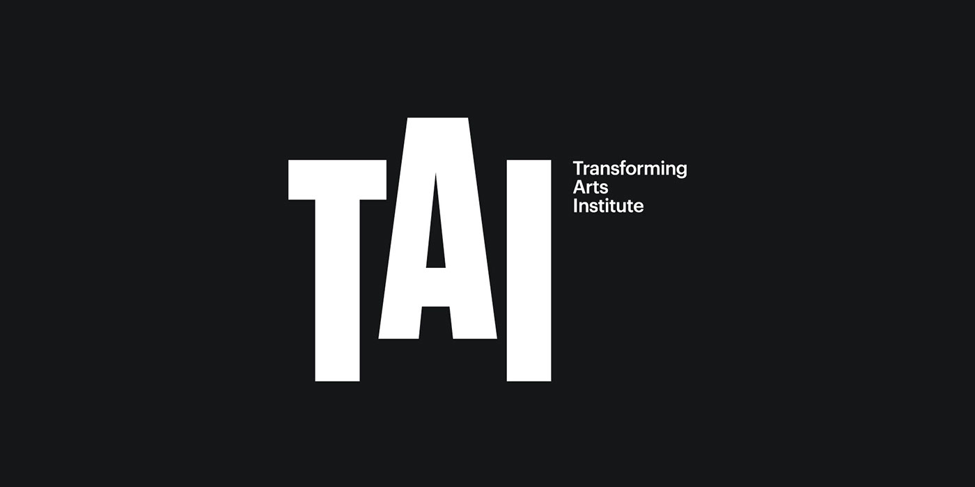
TAI had previously been thought of as a school for the arts and trades whose initials stood for “Taller de Artes Imaginarias”. We came up with the claim “Transforming Arts Institute”, which serves a triple function: to give a new and more contemporary meaning to these initials; to represent the concept of “transformation” as the institution’s main ideology; and to aspire to a more international positioning through the use of English.

VISUAL IDENTITY
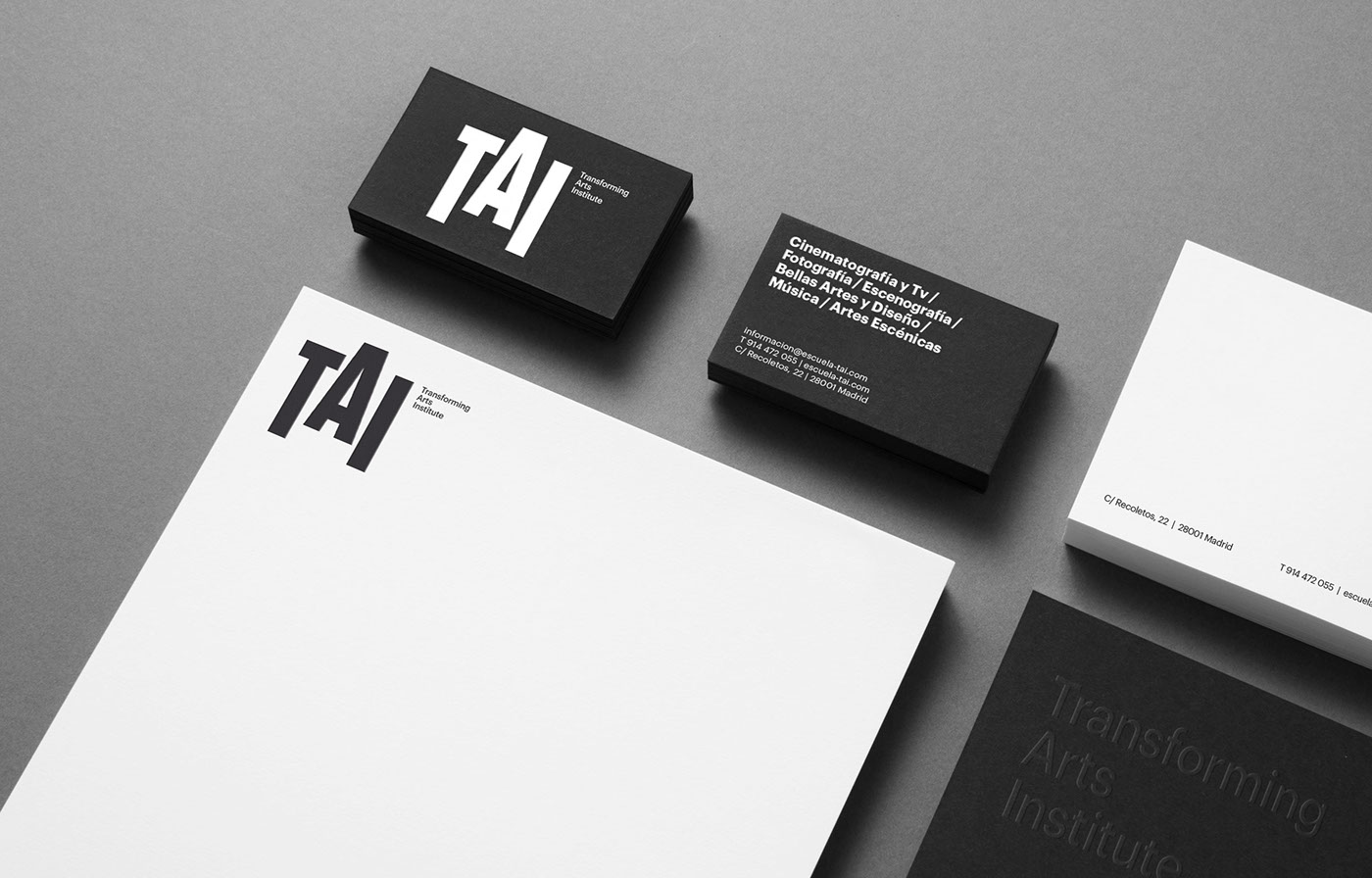
We designed the typography of the logotype with the “A” elevated as a symbol of the capacity for spiritual ascension through “Art”, and the elevated position and vision of the artist (from the summit of Kandinsky’s imaginary pyramid) as a guide for said ascension. The logotype was defined in black and white to transmit its institutional character, in contrast with the color that inundates the pieces used for the communication platform.
The brand had to respond to the requirements of rigor, systematization and definition of the disciplines required by the project. This led to the selection of Graphik, a contemporary sans serif typography that is perfect for the communication of TAI.


Color
The brand also needed to be expressive, and the use of color was key to this project. The students’ education was imagined as a journey that travels through a circle of colors, in such a way that, during the duration of their training, they travel through the chromatic spectrum, experiencing a transformation from the time of their arrival at the school until they graduate, ready to form part of the work force.
The chromatic spectrum is a metaphor for the numerous creative subjects that are taught at the school, and their transversality. Each color represents a subject matter and the student must pass through each of them in order to attain a comprehensive education. The work of Olafur Eliasson, Max Bill and Carlos Cruz-Díez served as inspirations for the development of the project’s chromatic concept.

“At TAI, students are exposed to the different areas of art with the goal of empowering their souls and converting them into forces for transformation.”


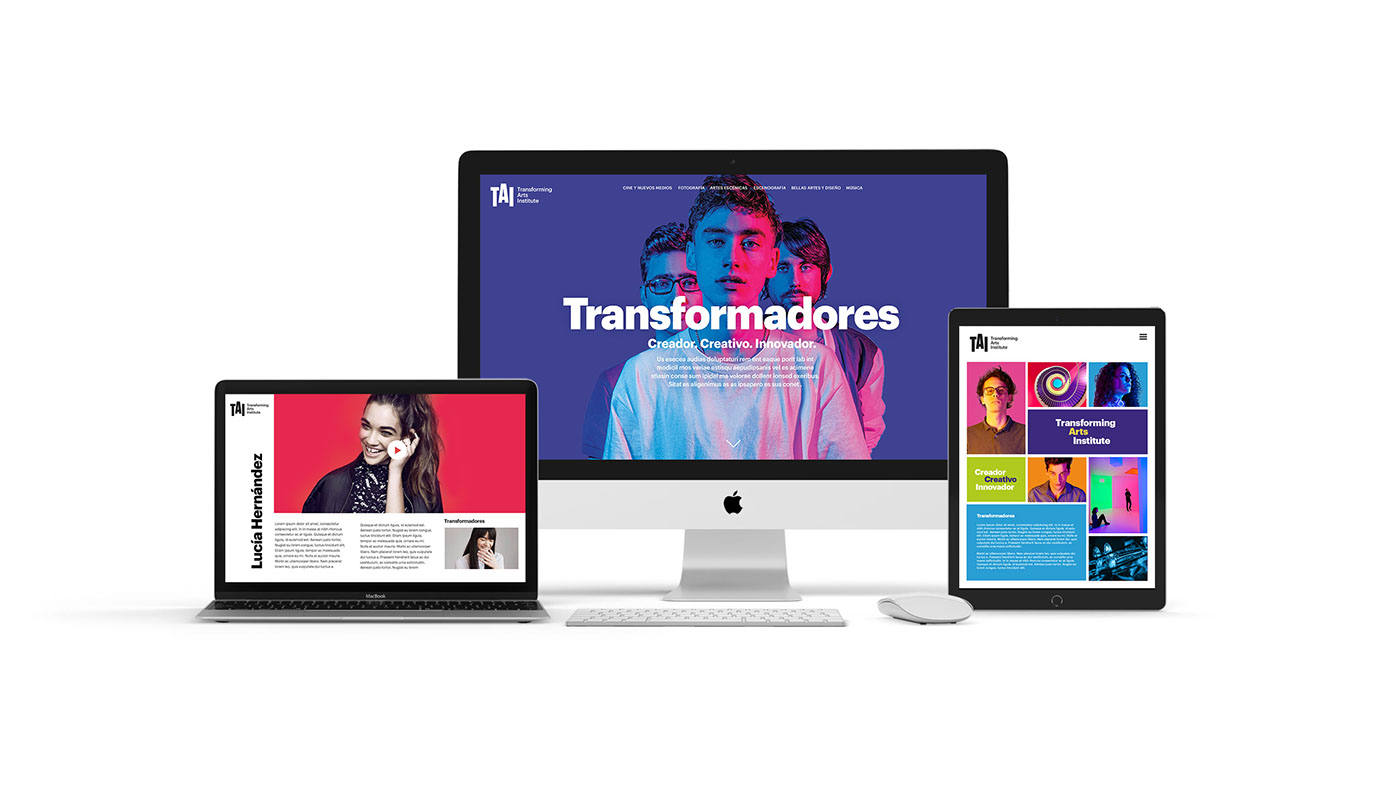
GRAPHIC SYSTEM
There are two main resources that stand out within the graphic system: on the one hand, the use of the “elevation” of each artistic subject in the context of the courses’ nomenclature, following the same idea of the “spiritual elevation” through art that is expressed by the elevated “A” of the logotype; and on the other hand, the symbolic use of color: the white background for the introductory courses, the mixture of colors for the degrees – as the student attains more experience – and, finally, the color degradation for the masters programs, when students have completed their comprehensive and complete education in all of the arts.
We worked to define the optimum color combinations and degradations for the project.


Photographic Direction
As part of the communication of what the essence of the new brand should be, we created the campaign “Transformers”, for which TAI’s students themselves became the banner for the transformative power of art – as protagonists of the same. Erretres carried out the art direction of the campaign, employing the same metaphorical concept of the brand’s color, and leaving the production of the video to the students themselves, who were thus empowered as representatives of the creative, fresh and innovative freedom that permeates all of the aspects of this school.

Campaing
The protagonists of the “Transformers” campaign are the students, their motivations, their educational experiences at TAI and their future aspirations. Their youth, freshness and freedom are the most vivid and real expression of the brand.


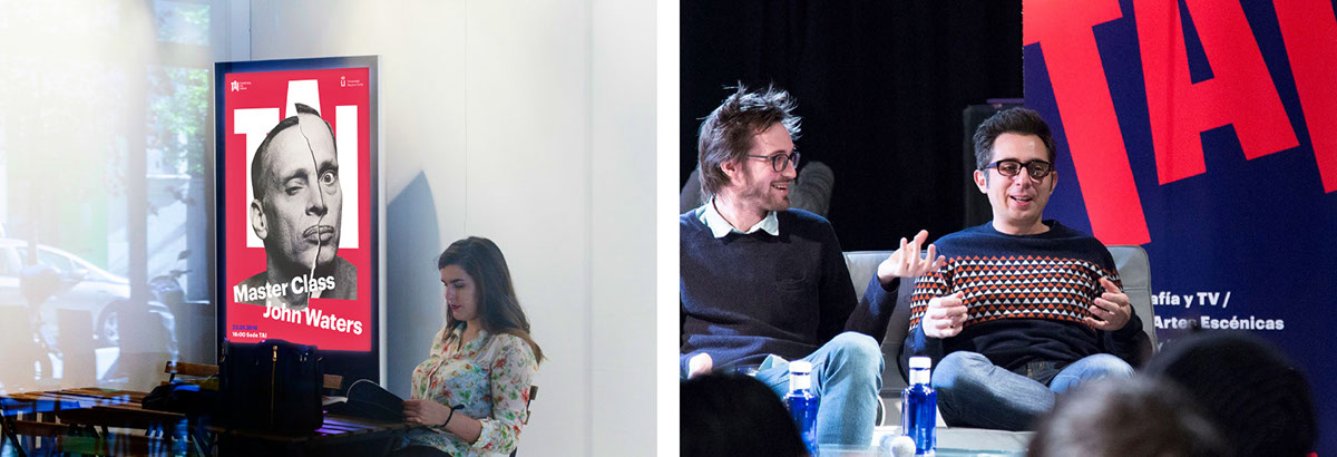
Master Class
The Master Classes at TAI enjoy both prestige and repercussion at social events. Renowned figures like David Lynch are invited to speak. For the graphic communication of these events, the portrait of the main speaker of the Master Class is highlighted over the school’s identity, in the style of a fashion magazine cover, and the text is arranged in a triangular shape that is once again reminiscent of Kandinsky’s “spiritual pyramid”.


Space
The physical space occupied by TAI was completely transformed, going from a cold and white space – a mere shell – to a space full of color, which activates the imagination, invites participation and encourages the creative and liberating catharsis.
One of the architectural elements that had great potential to serve as an identifying symbol of the building was its spiral staircase. We proposed painting each floor a different color, thereby creating a metaphor for the chromatic, ascending journey that students take through the diverse subjects, from their arrival at the school until reaching the “summit” and becoming an ARTIST in the full sense of the word – one that is capable of transforming and improving society.


REPERCUSSION OF THE BRANDING CHANGE
During the months immediately following the branding change, course enrollment at TAI increased by 40%, eventually reaching a 70% increase in diploma courses and an 82% in the Film Degree (making TAI the education center with the largest number of students studying a first official degree, on both a regional and national level). The students had a very positive response to the new brand, and were proud of their role as protagonists in this change.


