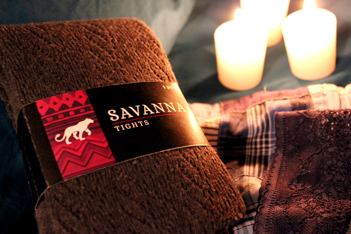
As a diverse intimates clothing company, Savanna strives to provide men and women with a unique shopping experience. Since 2004, we have developed a fresh, new take on undergarments and loungewear. Our clothes are made with the finest quality materials available for purchase... because our customers deserve nothing less than the best. We encourage men and women to show a little bit of their wild side, and to trust their most primal animal instincts, in and out of the bedroom.
Portraying the majestic power of a Savanna customer was no easy task. However, this goal was imperative to creating an iconic brand design for such a successful company that will translate well into a variety of media. The target demographic of high-income men and women between the ages of 24-42 called for a classic, sophisticated look that was unique and innovative, while still looking timeless.
Portraying the majestic power of a Savanna customer was no easy task. However, this goal was imperative to creating an iconic brand design for such a successful company that will translate well into a variety of media. The target demographic of high-income men and women between the ages of 24-42 called for a classic, sophisticated look that was unique and innovative, while still looking timeless.

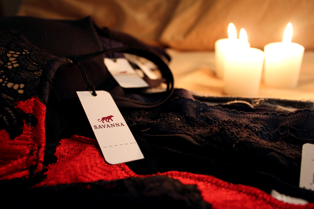
The Savanna symbol is a clean logotype identity mark, which fits cohesively with the lion and lioness symbols corresponding with the men’s and women’s lines of clothing. It takes into account the usual type treatment of designer intimates lines, which typically include serif typefaces set in all capital letters. However, while Savanna captures this classic style, important adjustments have been made to incorporate the individual style and flair of the company.
The straight-serif type has been replaced with a slightly more unique, curvy serif font choice (Alice). The type has been set with loose tracking, a device which effectively makes the overall design have a more clean, mature appearance, which appeals directly to the targetd demographic of working men and women. The primary symbol functions as a unisex logotype, which would be printed inside fabric clothing tags, merchandise, and on the front of the store. The primary symbol is designed to stand alone on black, white, or grey.
The straight-serif type has been replaced with a slightly more unique, curvy serif font choice (Alice). The type has been set with loose tracking, a device which effectively makes the overall design have a more clean, mature appearance, which appeals directly to the targetd demographic of working men and women. The primary symbol functions as a unisex logotype, which would be printed inside fabric clothing tags, merchandise, and on the front of the store. The primary symbol is designed to stand alone on black, white, or grey.

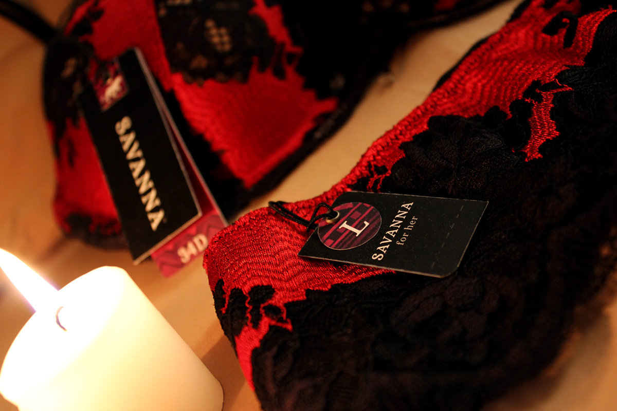
Savanna: For Her is a line that exclusively caters to the fairer species. The logotype for the women’s logo is the same as the primary symbol, but the main difference is the presence of the female lion. Strong, independent, and on the prowl, the lioness represents everything a Savanna woman could hope to be. The symbol is poised and curious, unafraid to explore new territory or join in on the hunt. She represents the inner strength and beauty that comes from inner confidence.

Savanna: For Him was designed keeping in mind the concept of power and authority. The logotype is similar to the women’s logo and also uses the primary Savanna logotype, but the lion icon is much more masculine and muscular. This icon represents the commanding power of the alpha male.