The University of Tulsa rebrand consisted of a two-pronged approach: first, remastering their existing primary script, and second, identifying new opportunities for additional marks. While Tulsa had a perfectly fine primary sport logo, their script needed some fine tuning in order to stand strong in the modern era, hold up for diverse product applications, and ultimately mirror the prestige of the school itself. We refined the Script Primary Logo typographically, improved it for various embroidery applications, and re-prioritized its usage across the brand.
Along with a remastered script, we developed several other branding elements, including two block-style wordmarks, a number system and a custom Tulsa DNA-based display typeface. We provided the athletics department with new brand standards outlining a clear approach to their consumer facing communications in order to ensure an even stronger athletics brand.
The biggest challenge throughout the project was streamlining all of the corners and outline widths to resemble the same ratio and graphic language throughout the brand. Making sure the system married as a cohesive family ensured that the new marks and typography elements felt like a natural evolution and extension of the University's already long and rich history.
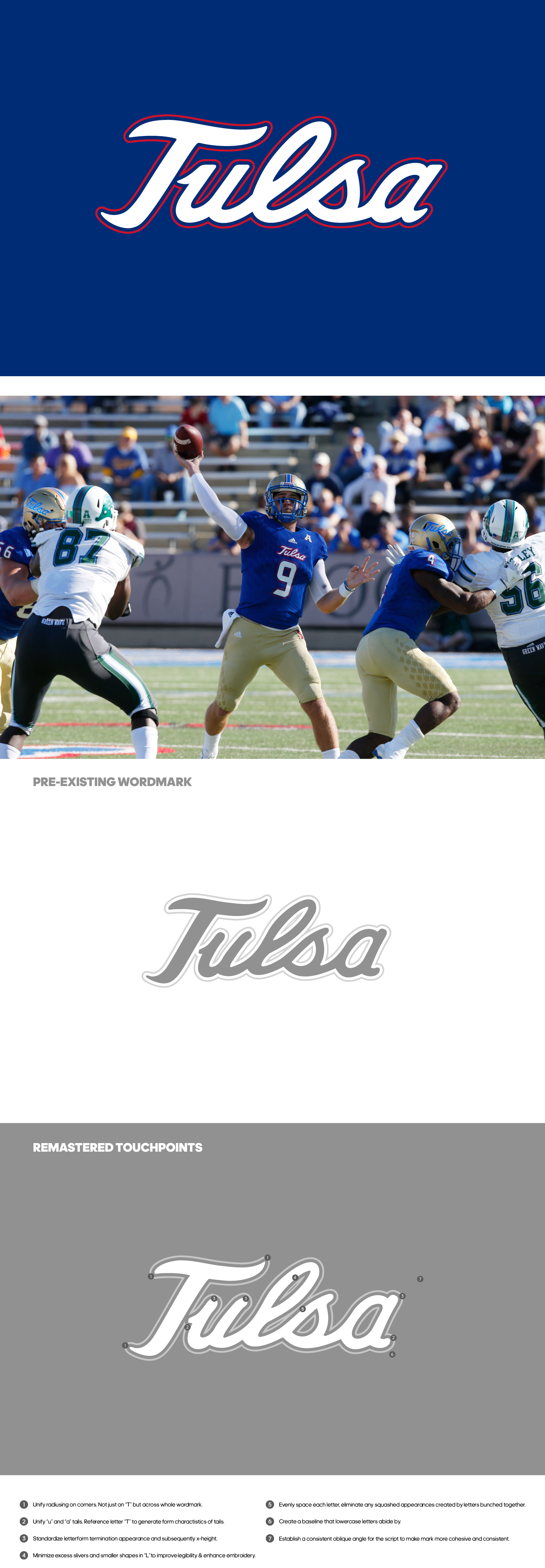

While the changes themselves are small and nuanced, a great level of detail and refinement went into the process of remastering the school's primary script. Numerous previous iterations were produced, pressure tested and reworked round after round ultimately yielding a script that feels only subtly different--but in reality contains a lot of small shifts that produce a far cleaner and concise set of lines and letters void of small spaces and intrusive outlines.
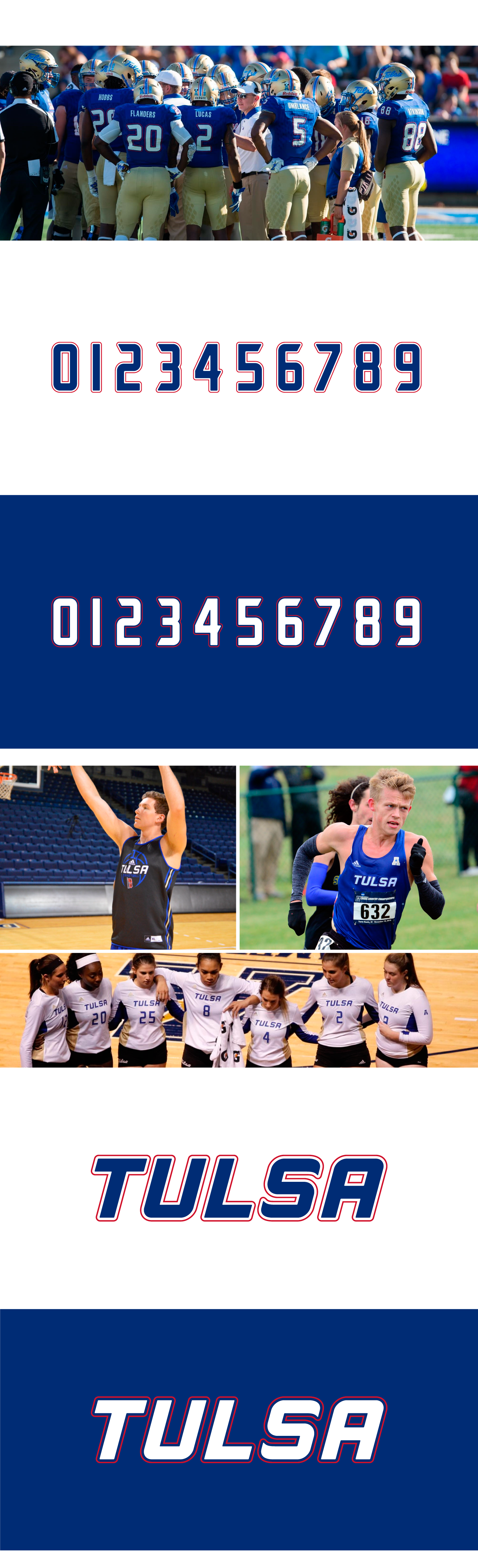


A custom display typeface was developed using the wordmarks as a benchmark. The corner radiusing and letterform weights are consistent throughout all new wordmarks, and actually parallel the weight of the script as well, creating a top-to-bottom uniformity that ensures a consistently refined look for the brand. It is evident when looking at the new uniforms across sports within the University.

Of course there was a bit of house-keeping involved, making sure to update any brand marks where the script was being used.
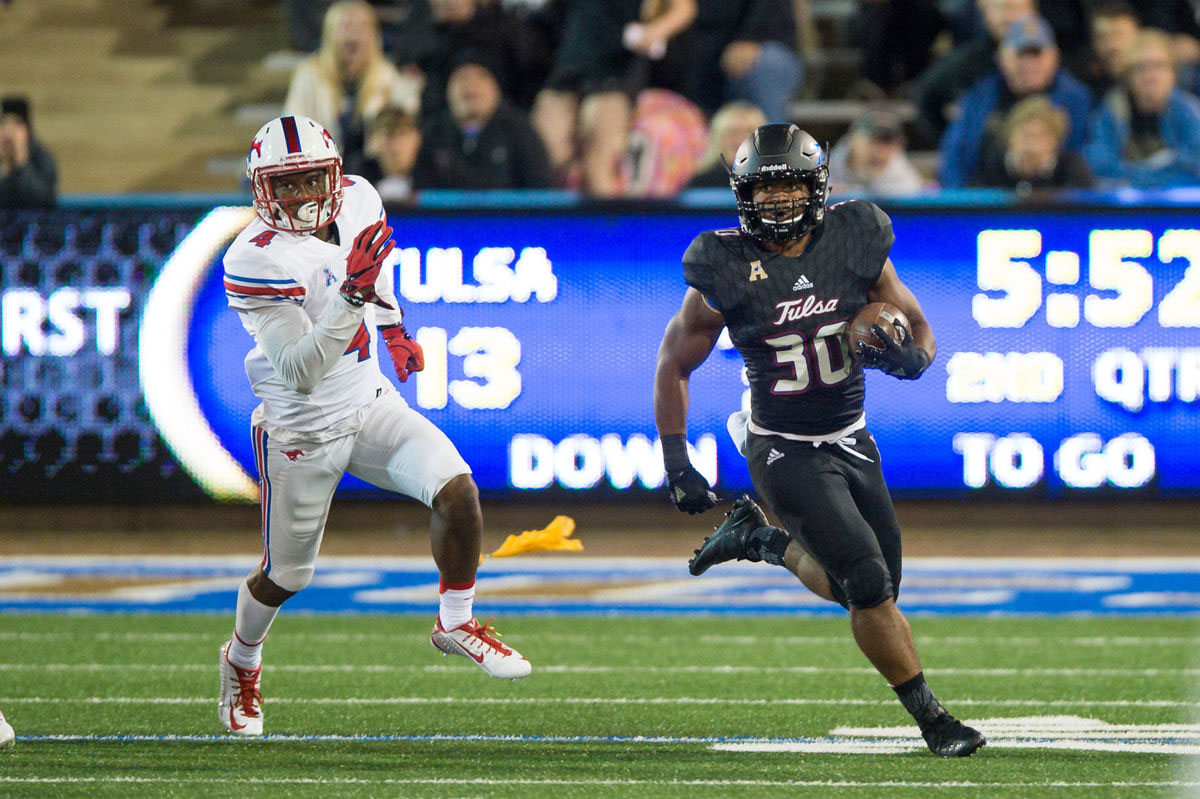


Photography courtesy of the University of Tulsa Athletics department.
