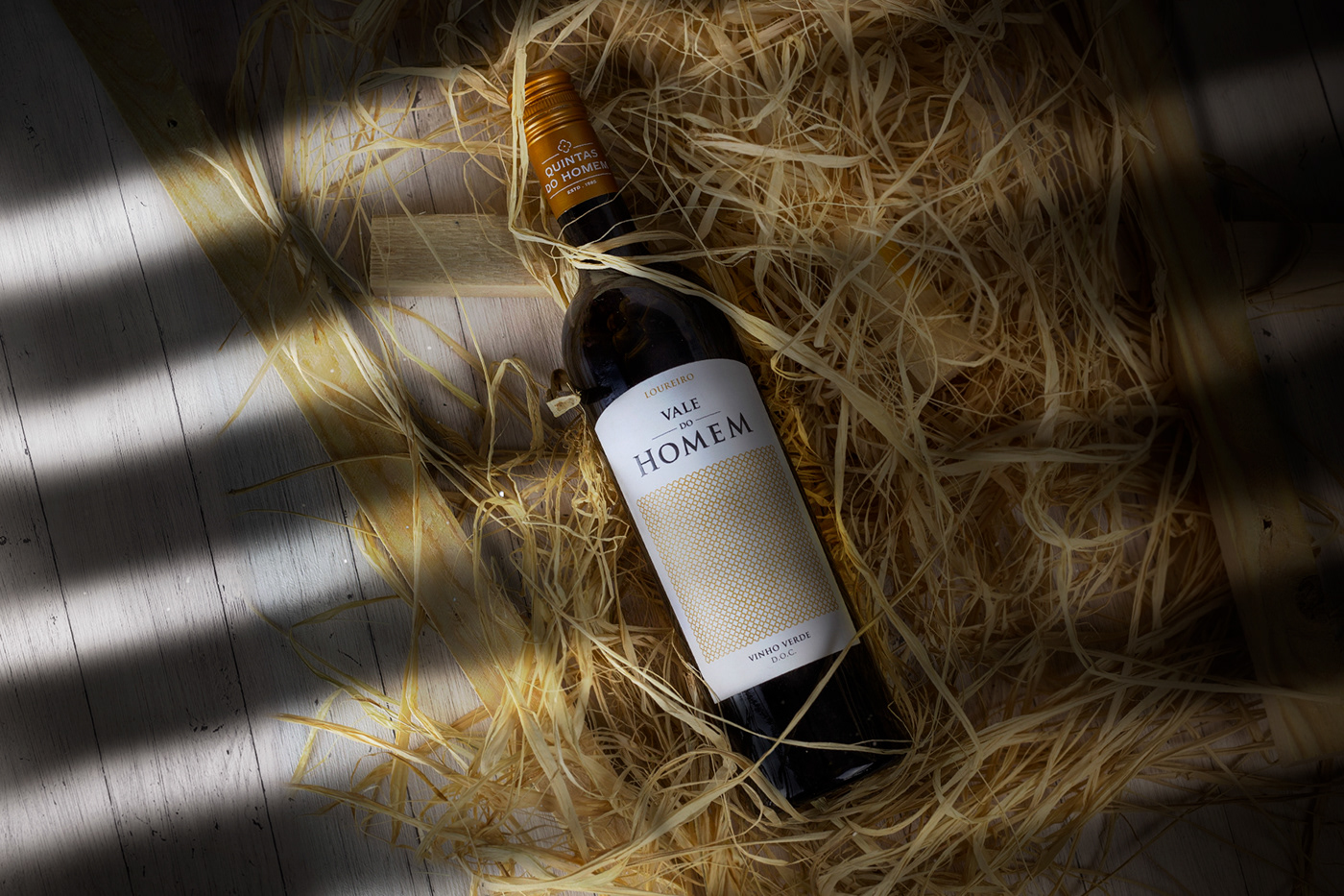

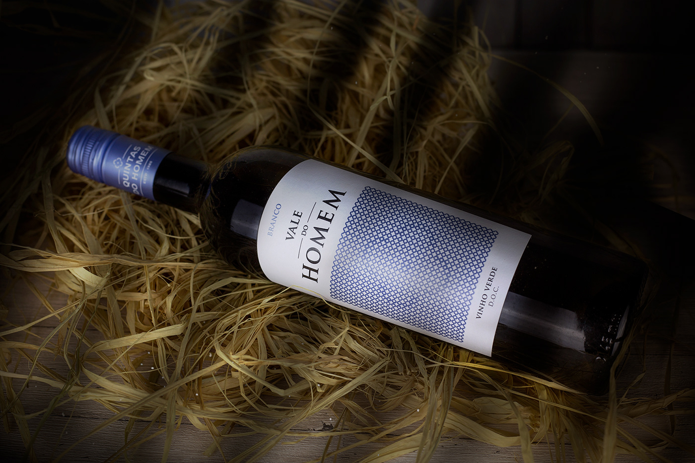

The goal was clear: to create a label where quality is reflected; the quality of the wine! Since the very beginning, Up Studio's design found in Quintas do Homem a very unique, traditional and beautiful granary with a Christian cross known as "the cross of the four evangelists". The cross itself have a powerful and positive meaning, proclaiming good news and driving away the bad ones.
The perfect design was reached with the perfect label cut and a unique cross, creating a particular texture in a beautiful pattern with a graphic illusion (depending on the viewing distance). And to have the absolute symbiosis, a proper wine-label paper was selected to preserve the graphic elements when the bottle falls down into fresh water and ice. Even the color scheme was examined; each of the colors play together in a perfect harmony, a last and precise touch to bring this label to life.