

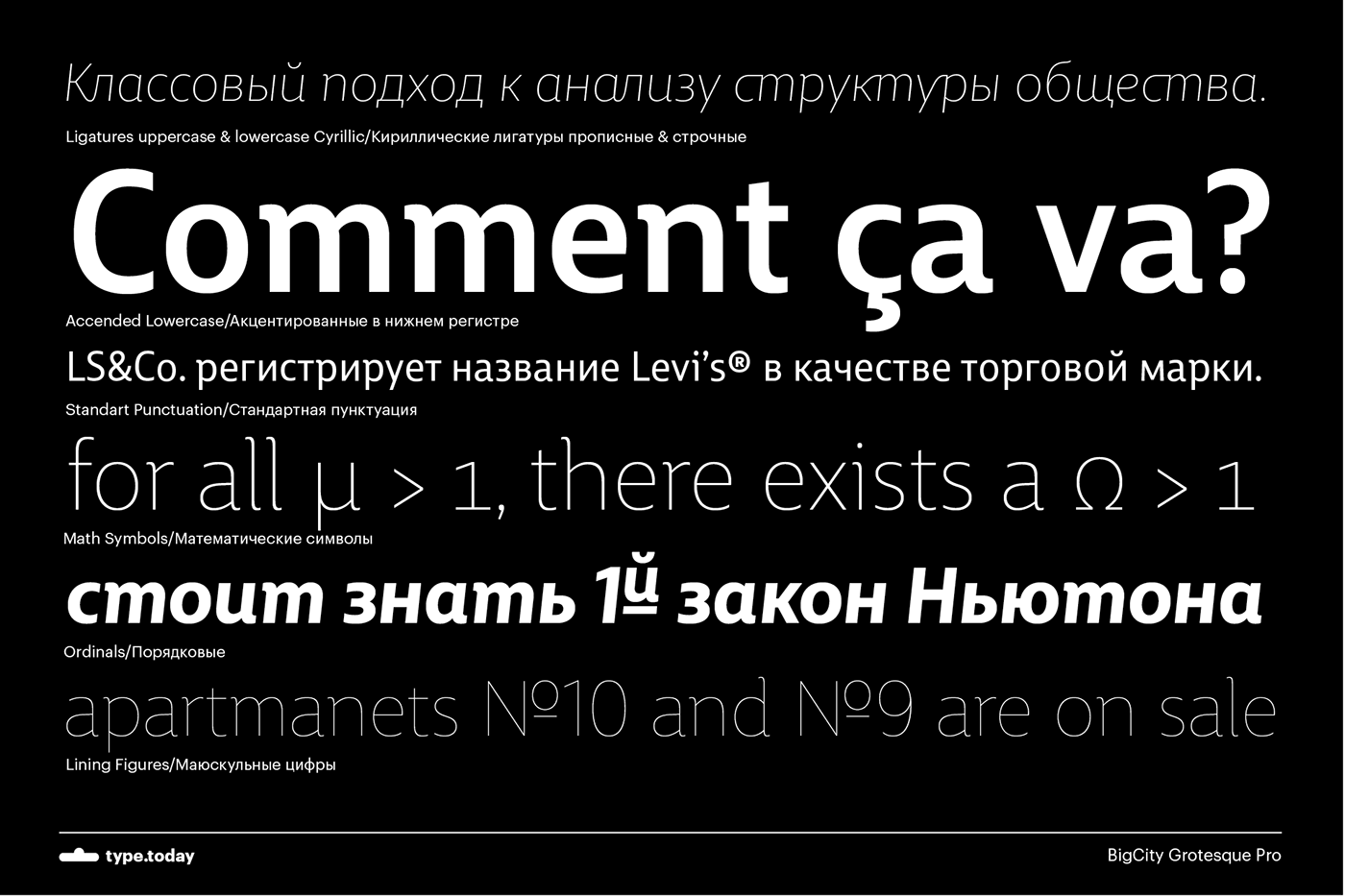
Ilya Ruderman created the first version of BigCity Grotesque for Bol’shoi Gorod magazine (Big City). The typeface, like other humanist sans serifs, is based on the structures of old-style serifs. BigCity Grotesque was the first magazine sans serif with Cyrillic ligatures. It was honored in 2009 in the international competition, Modern Cyrillic 2009.
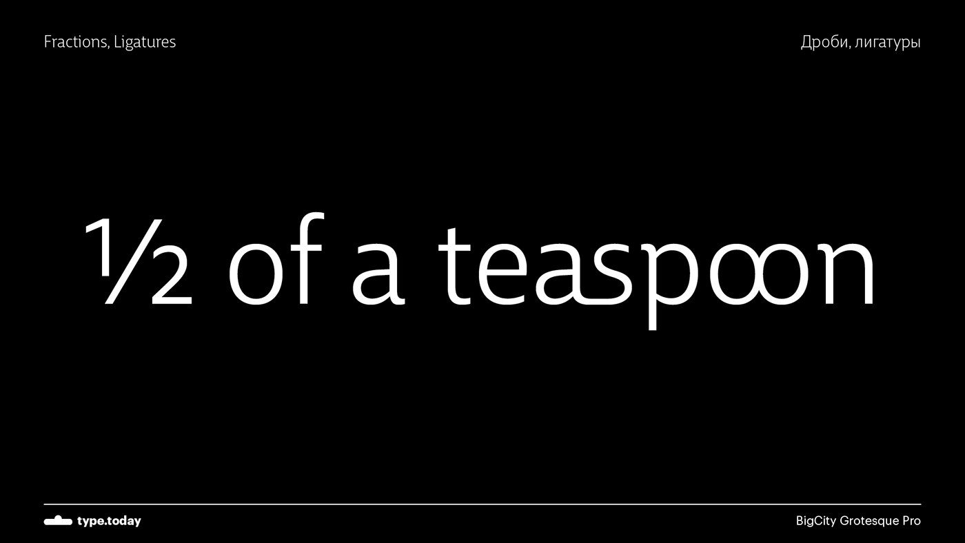
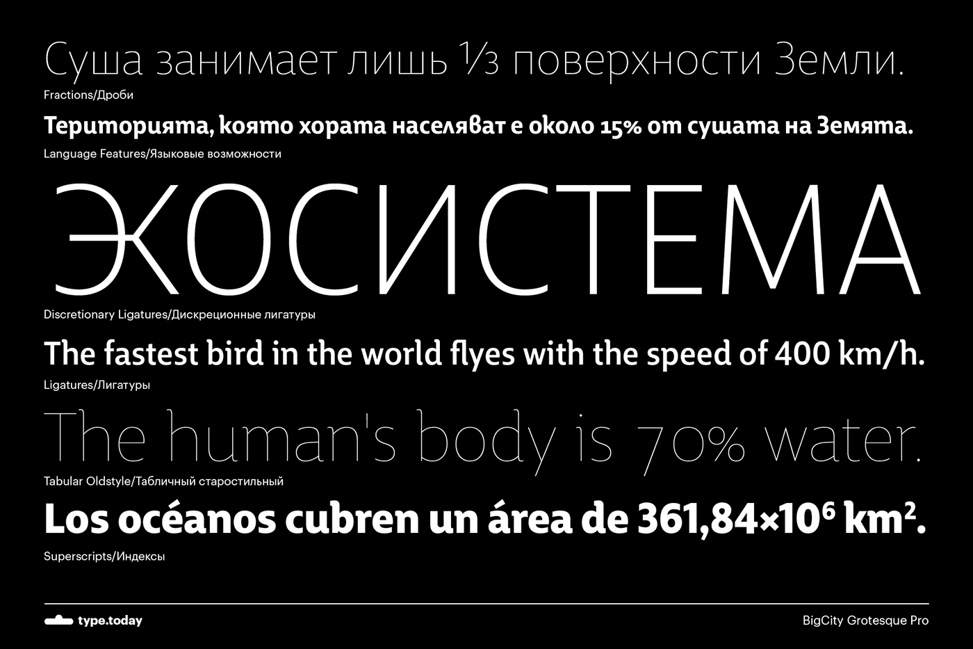
In the latest version, by Olga Pankova, the shapes of the letters have been updated, and there are new upright and italic styles, small capitals and new ligatures and non-alphabetic symbols.
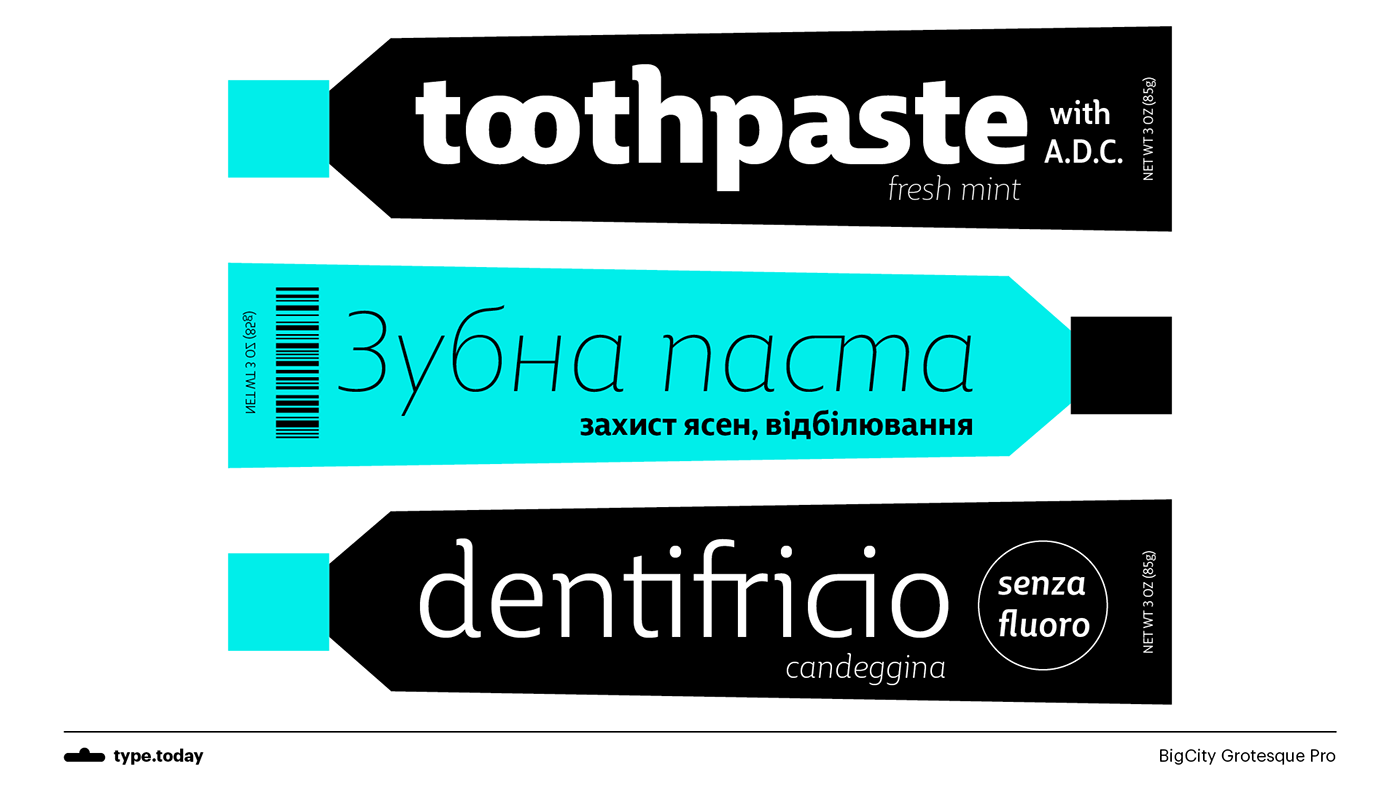
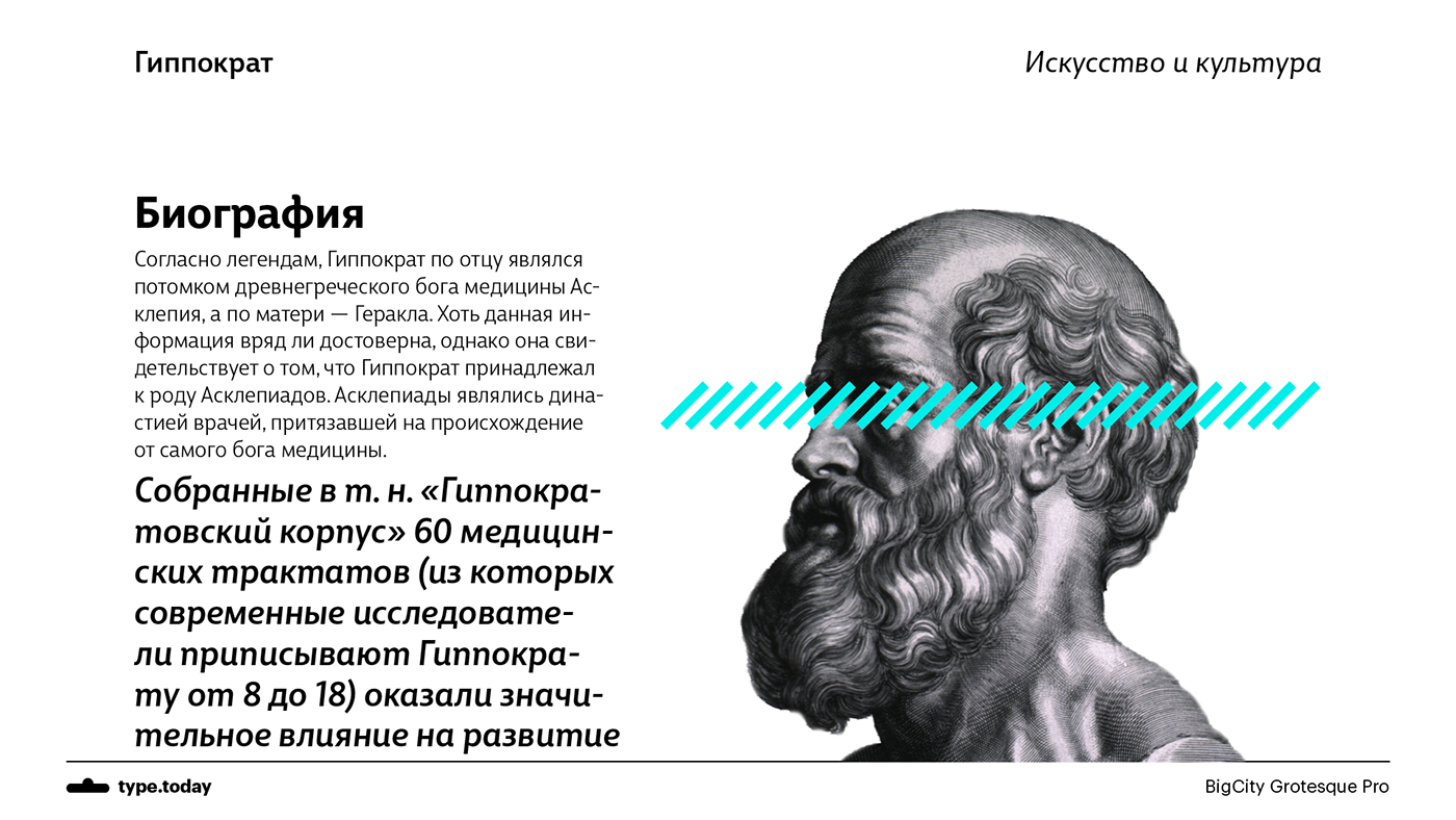
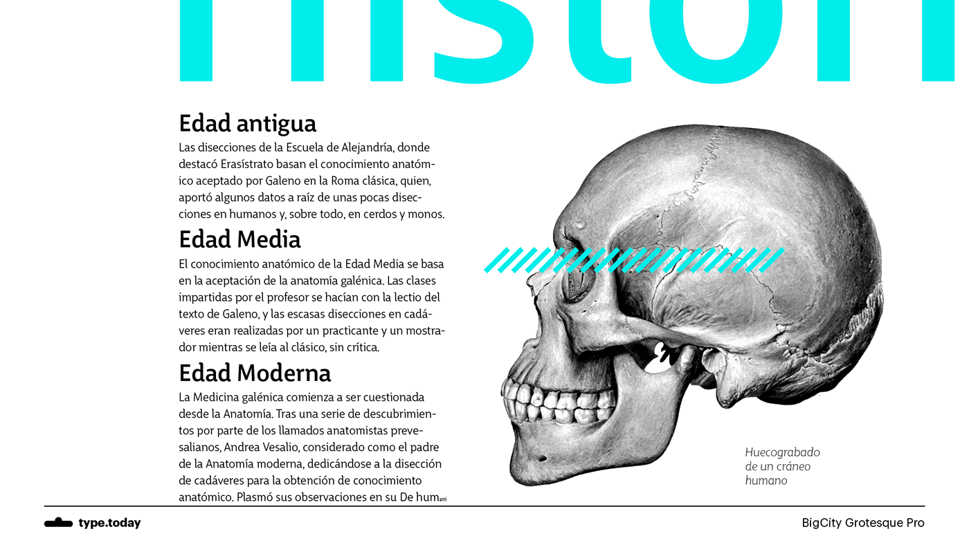
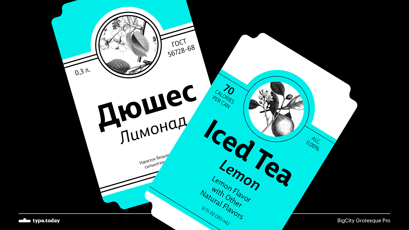
BigCity Grotesque Pro, thanks to the wide range of weights and styles that it offers, has become a serious tool for meeting all kinds of typographical demands: from large displays to the most finicky typesetting.


And one more feature,
which allows you to choose your own weight of the Big City Grotesque Pro typeface.
Interface design and video by Grigory Chemeris
Interface design and video by Grigory Chemeris
Programming by Egor Khmelev and Sergey Merkulov
Font mastering by Alexander Lubovenko
Font mastering by Alexander Lubovenko


