
Metrin Skincare
Originating in 1932, METRIN® is a trusted range of skincare products that have been formulated to cleanse, nourish and protect the skin for over 80 years. METRIN® uses the finest herbal and botanical extracts and stimulates a natural response from deep within your skin to produce the healthy, translucent complexion. We were asked to implement a brand refresh that modernised the brand, making it fit seamlessly into lives of today’s generation without losing it’s much-trusted heritage.

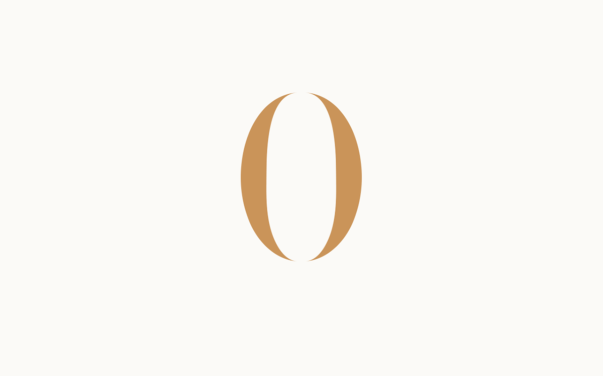
Traditional meets Contemporary
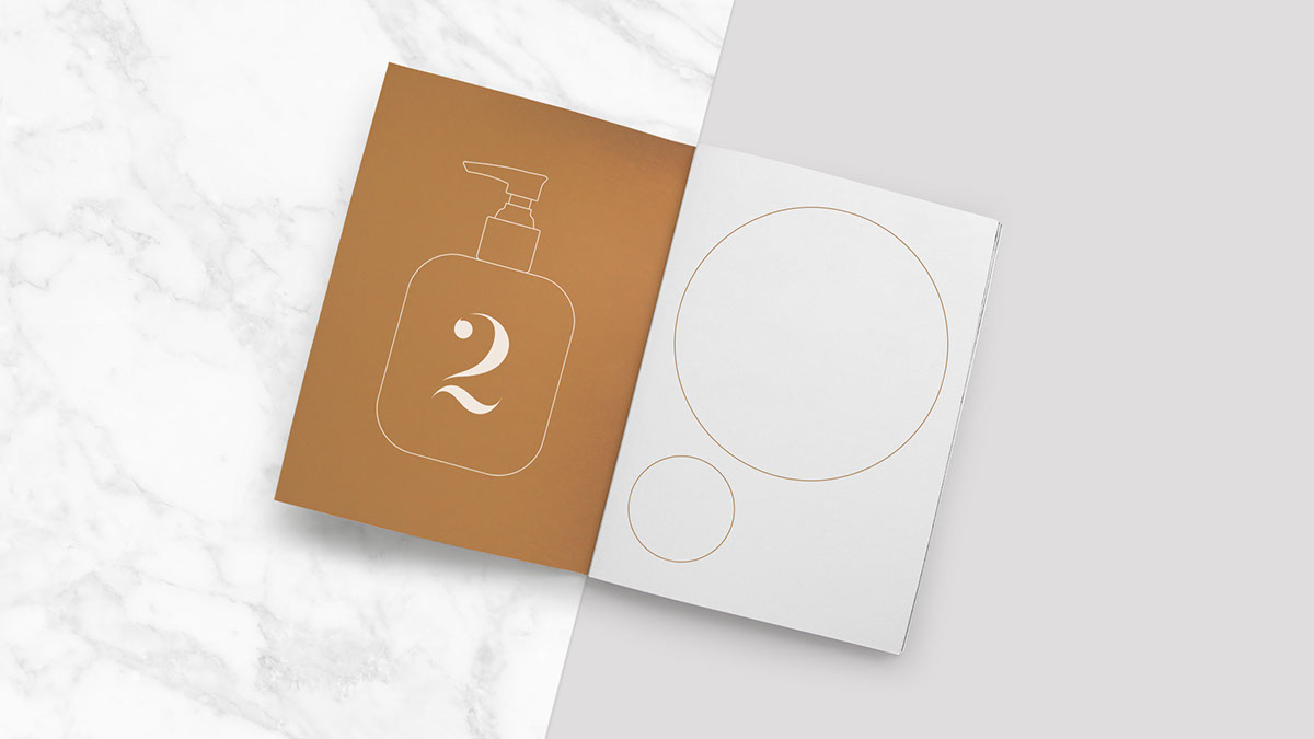
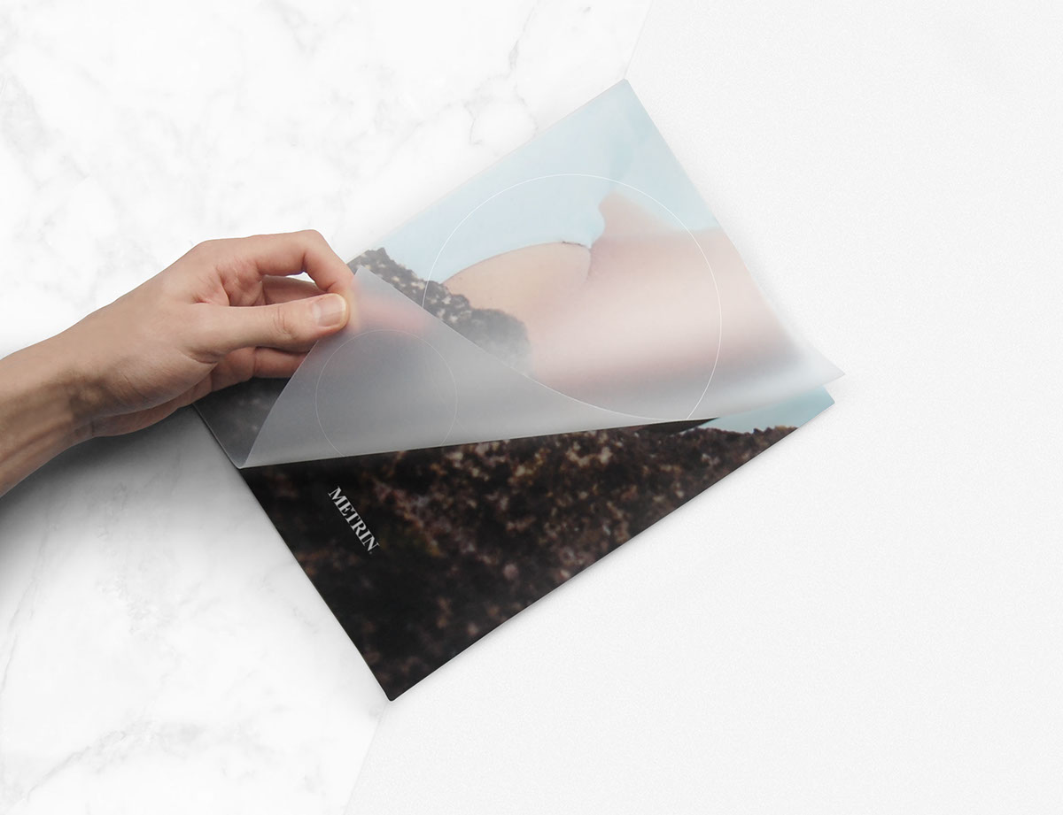
We refined the original METRIN® logo by simplifying to clarify. The previous logo felt busy and confused so we removed the taglines and circular forms whilst modifying the custom serif typeface to achieve a modern-traditional marque which would stand the test of time. The circular forms taken from the original logo were used as a graphic device for the brand to highlight key textures, imagery and typography.
Colour and Texture
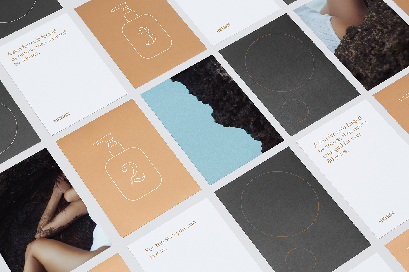
We kept the original METRIN® colour scheme of white, black and gold but applied it in a more subtle way, using key line strokes and a modern sans-serif headline font. We added a secondary texture palette that focused on raw materials; Marble, Plywood, and Dark Concrete, linking the natural ingredients with earthy, raw tones.
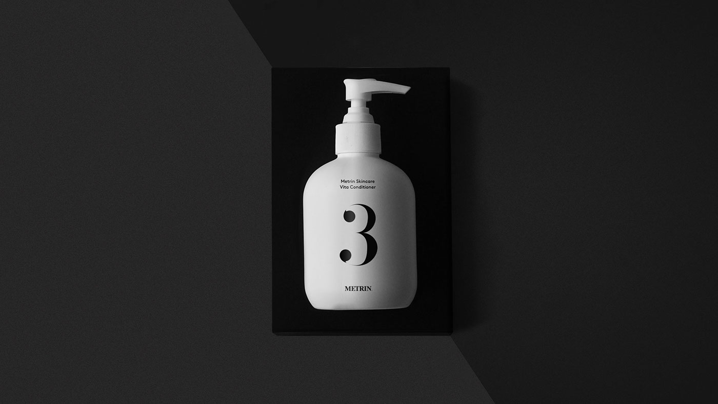
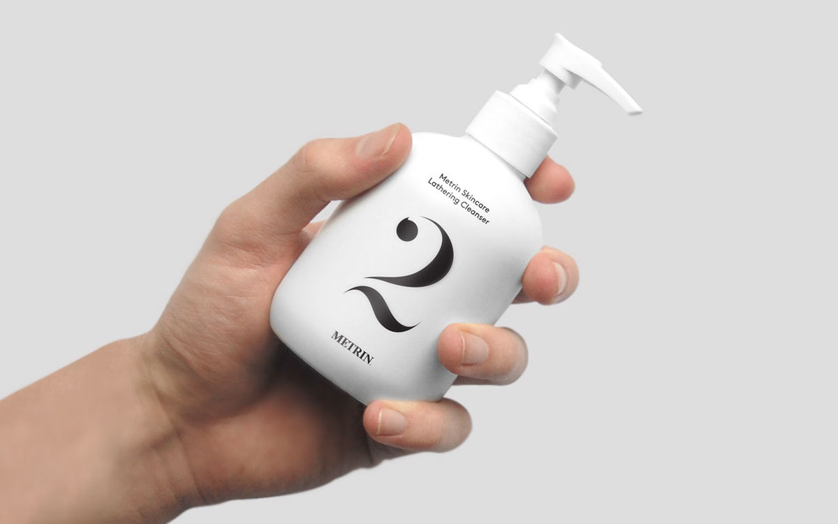
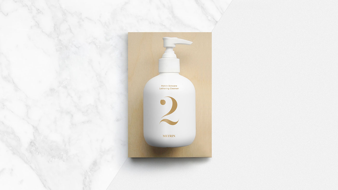

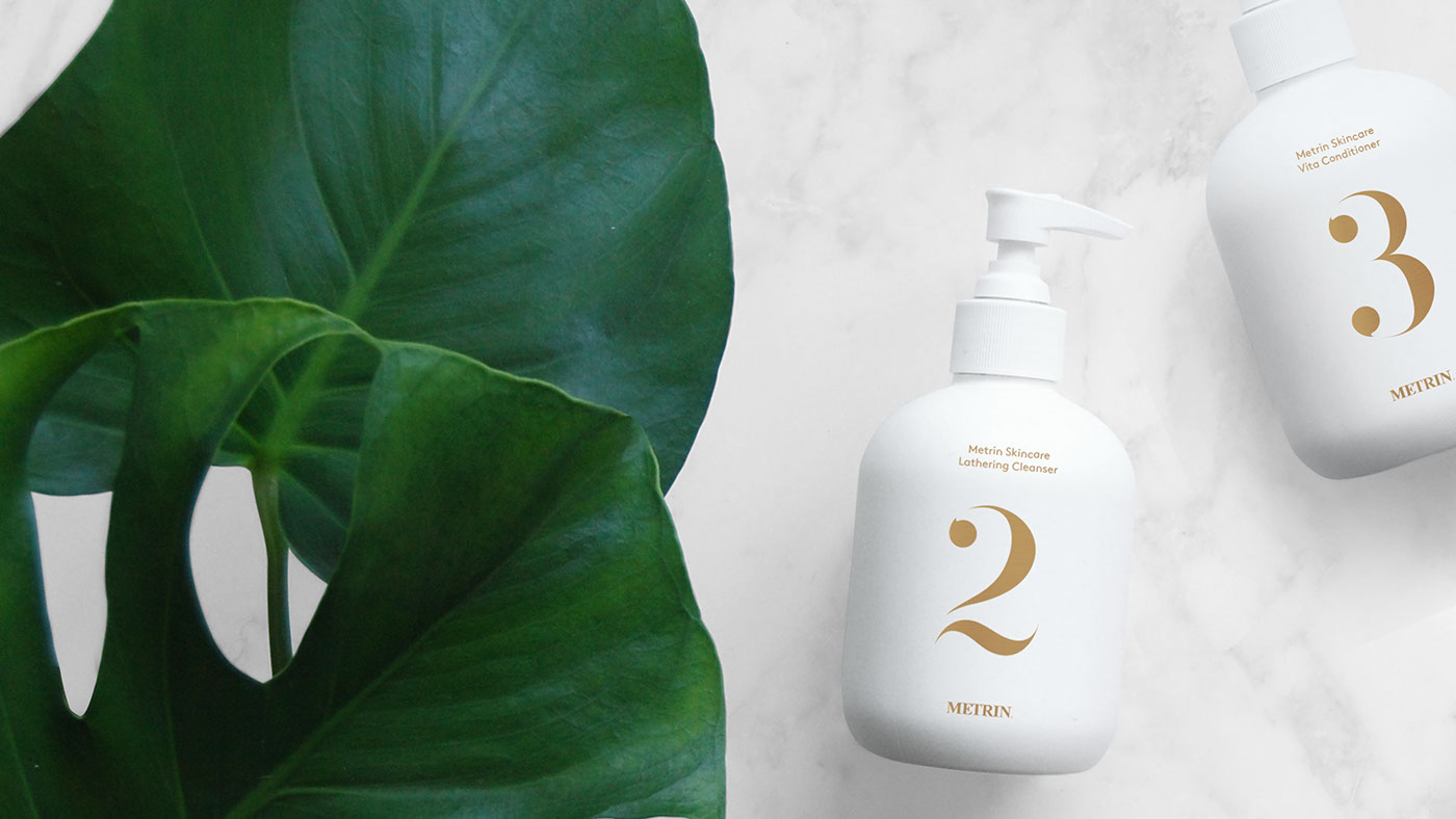
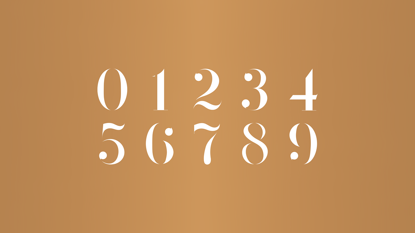
Custom Numerals
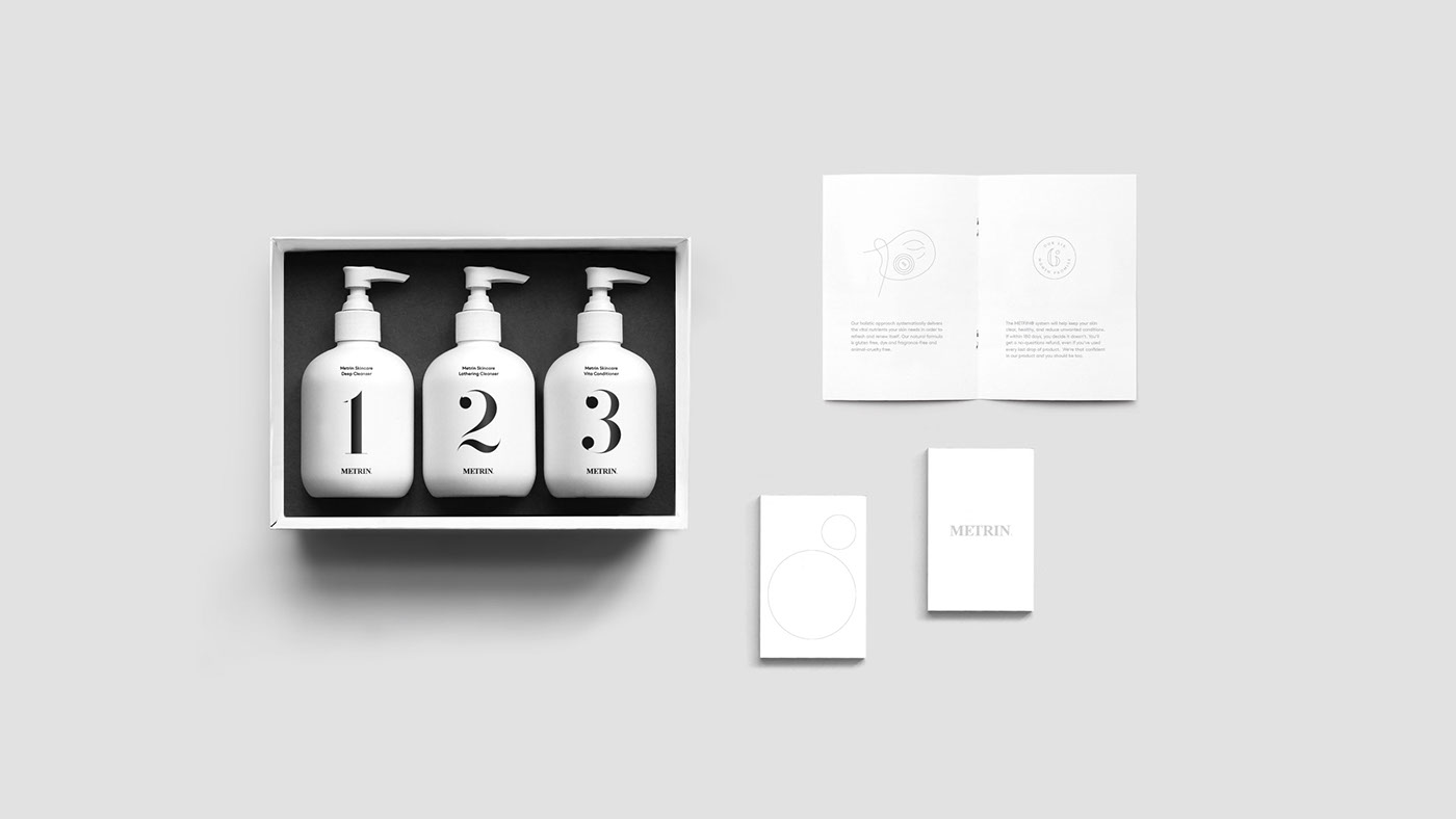
The METRIN® range of products works as a step-by-step process, using separate bottled products for the different stages of the regime. We updated the existing packaging by creating a custom set of stencilled numerals which balanced the traditional aspects of the logo with a much more modern look and feel which the new brand was aiming to achieve.
Male and Female
The formula for the products differs slightly for male and female, so we wanted to show this in a subtle yet clear way. We used gold, marble and white textures for the female packaging and photography, and darker tones for the male. This helped create consistency across both sets of products, whilst making the divide clear enough to see when purchasing online.
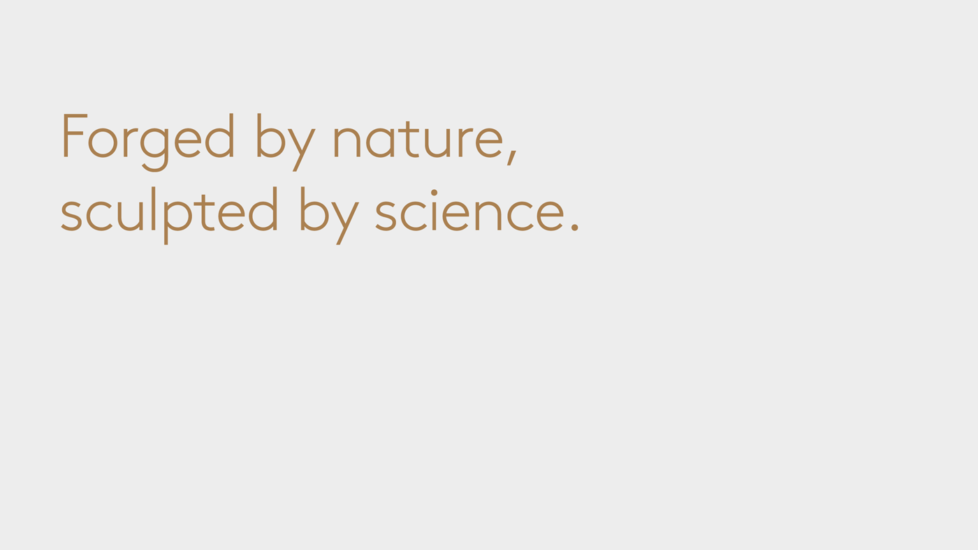
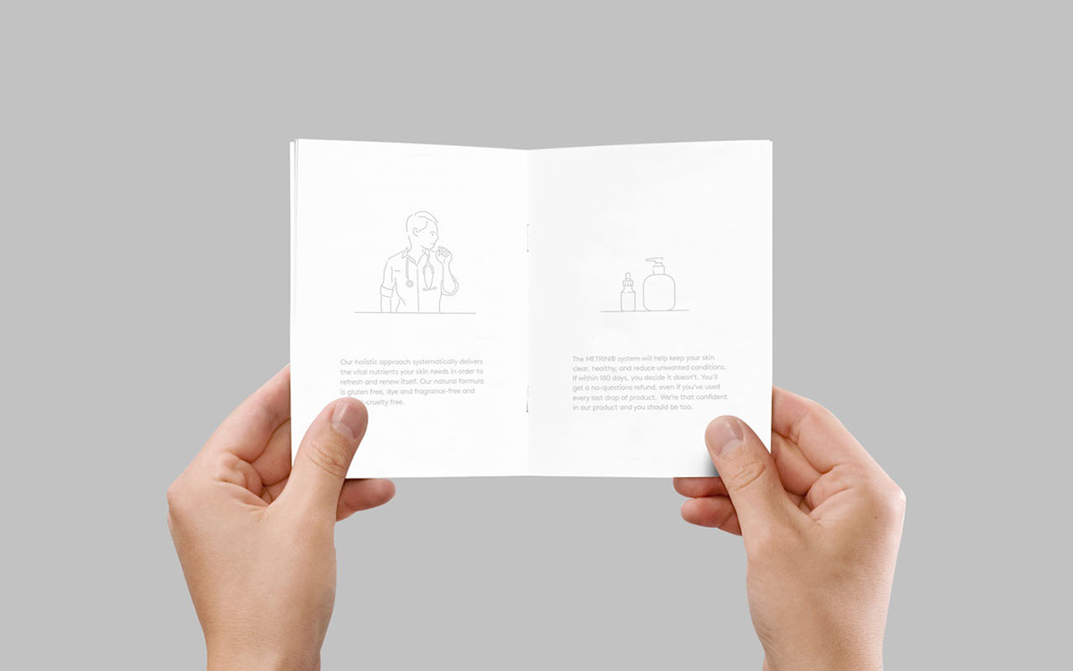
Where Nature meets Science
The messaging is focused on how the products take natural ingredients and combine this with a systematic scientific process to create a formula that delivers the vital nutrients that your skin needs. We played on this by creating clear and catchy headlines that encompassed this METRIN® philosophy.

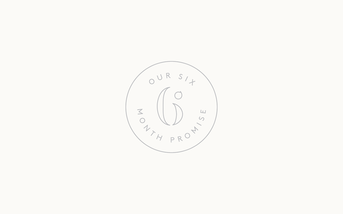
Illustration that flows
We created an illustration style that when combined with messaging would help explain the process and science behind the product. The thin keyline treatment of the illustration helped keep the brand feeling clear and clean whilst the continuous line concept aided the user, allowing them to follow the process naturally from one stage to the next.
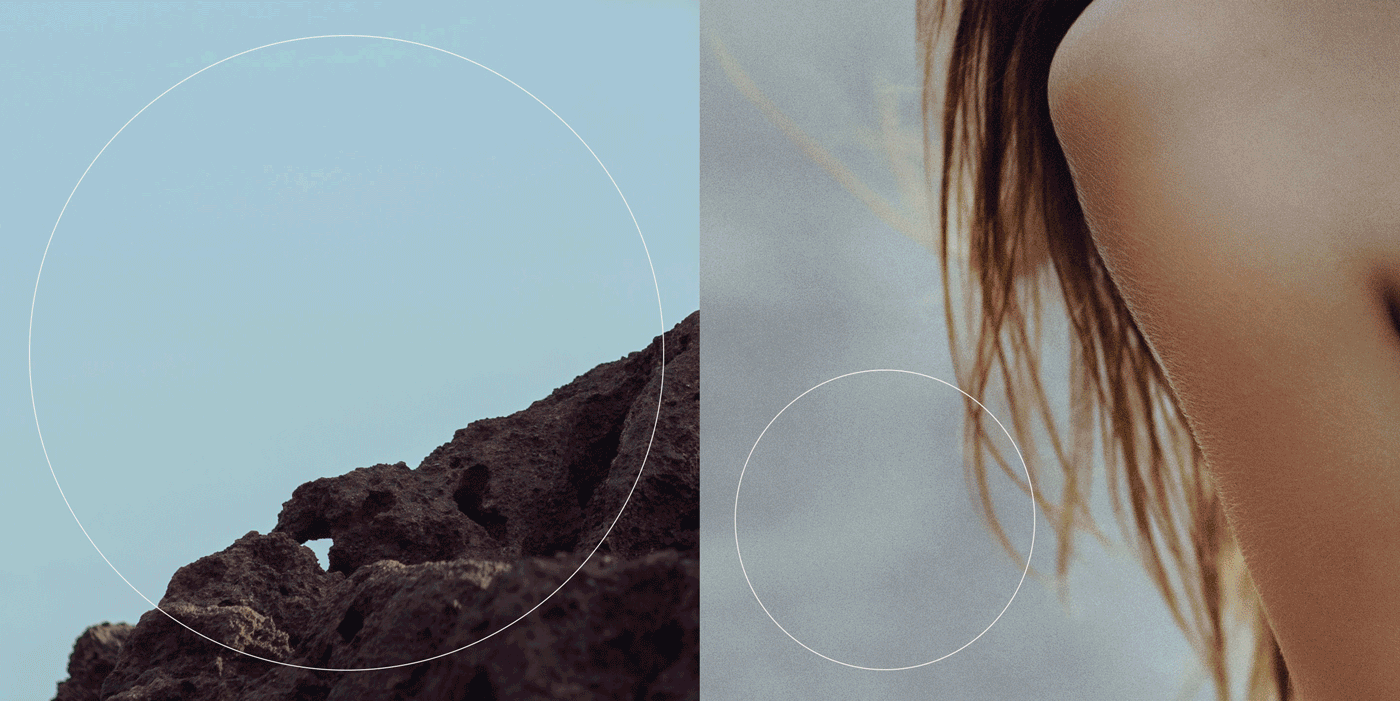
A Photographic System
Continuing the theme of using nature to help treat the skin, we created a photographic system that helped explain the process of the product in an abstract way. We used crops of natural forms alongside crops of the human body and used the circular graphic device to subtly make the connection between the two whilst staying on brand.
Bringing the Brand to Life
Using a combination of the colours, textures, illustration style, graphic device, photography and messaging, the new METRIN® brand starts to come to life as shown in the pieces of print created above.

Thanks for scrolling
To see the full case study, visit our website;
madebyalphabet.com
Want to work with us?
madebyalphabet.com
Want to work with us?
hello@madebyalphabet.com
Copyright Alphabet 2016. All Rights Reserved
Copyright Alphabet 2016. All Rights Reserved