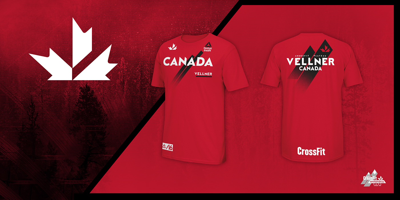
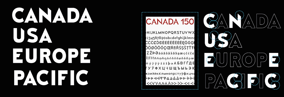
TYPEFACE
Canada 150 REG. is a modern font Canada has created to tie in French and Canadian characteristics into one typeface.
To add a more sport-competitive element, the font was modified with sharp angles to reflect the elements of Mountains in the area. Thus, giving each Region and Competitor Name a signature look.
LOGO
Due to Canadian Restriction on usage of the Maple Leaf in their flag, it gave the opportunity to tie in the trademark “slash”associated with CrossFit and The Invitational, into the new Canadian CrossFit Icon.
The Invitational lock-up also incorporates a maple leaf as snow caps to give the feel of the host nation.

JOCK TAG
The Jock tag establishes Contemporary Simplicity with the diagonal slashes tying it into the collective theme of Canada’s landscape.
The custom “16” reflects 1976 Montreal Olympic Games characteristics.

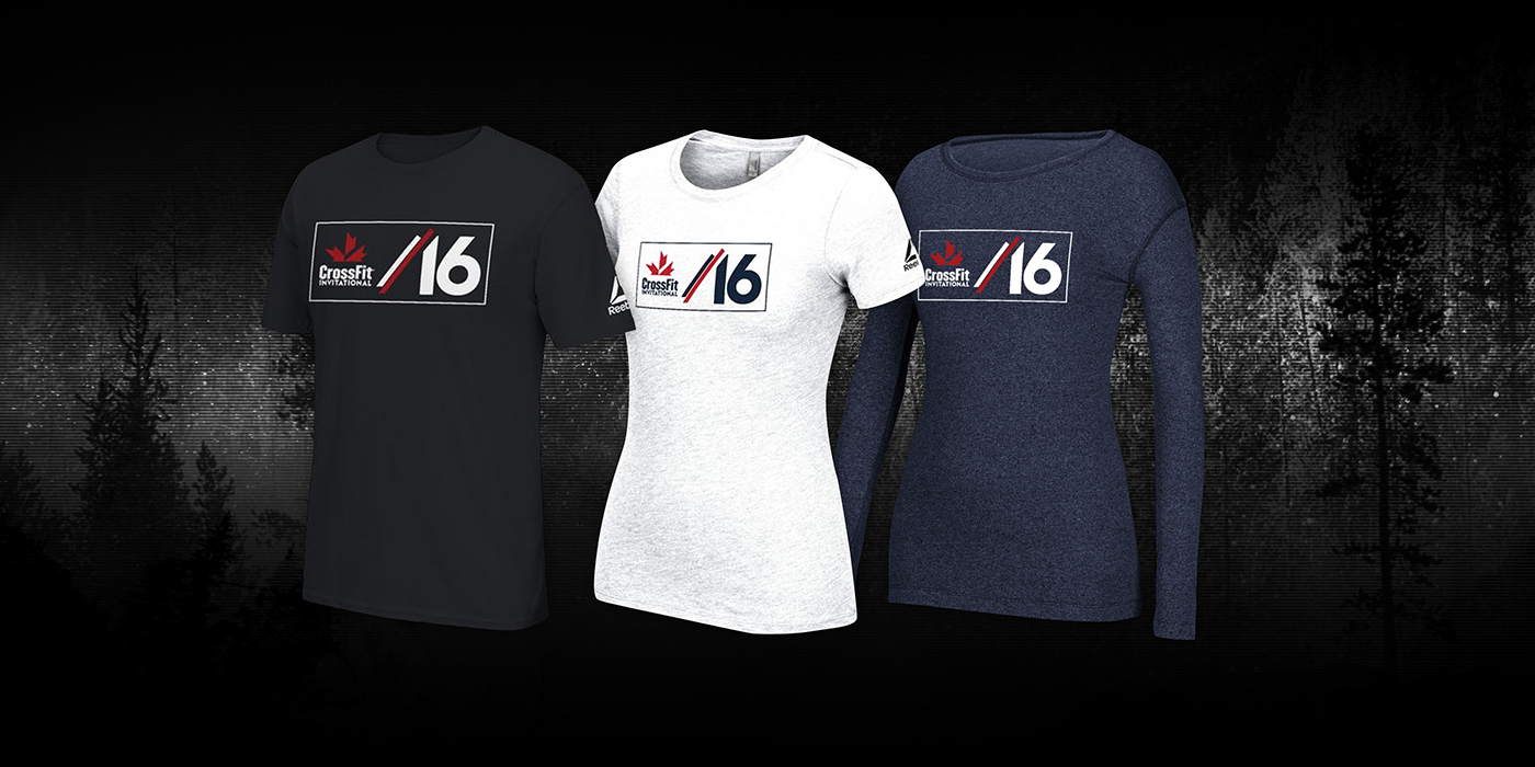
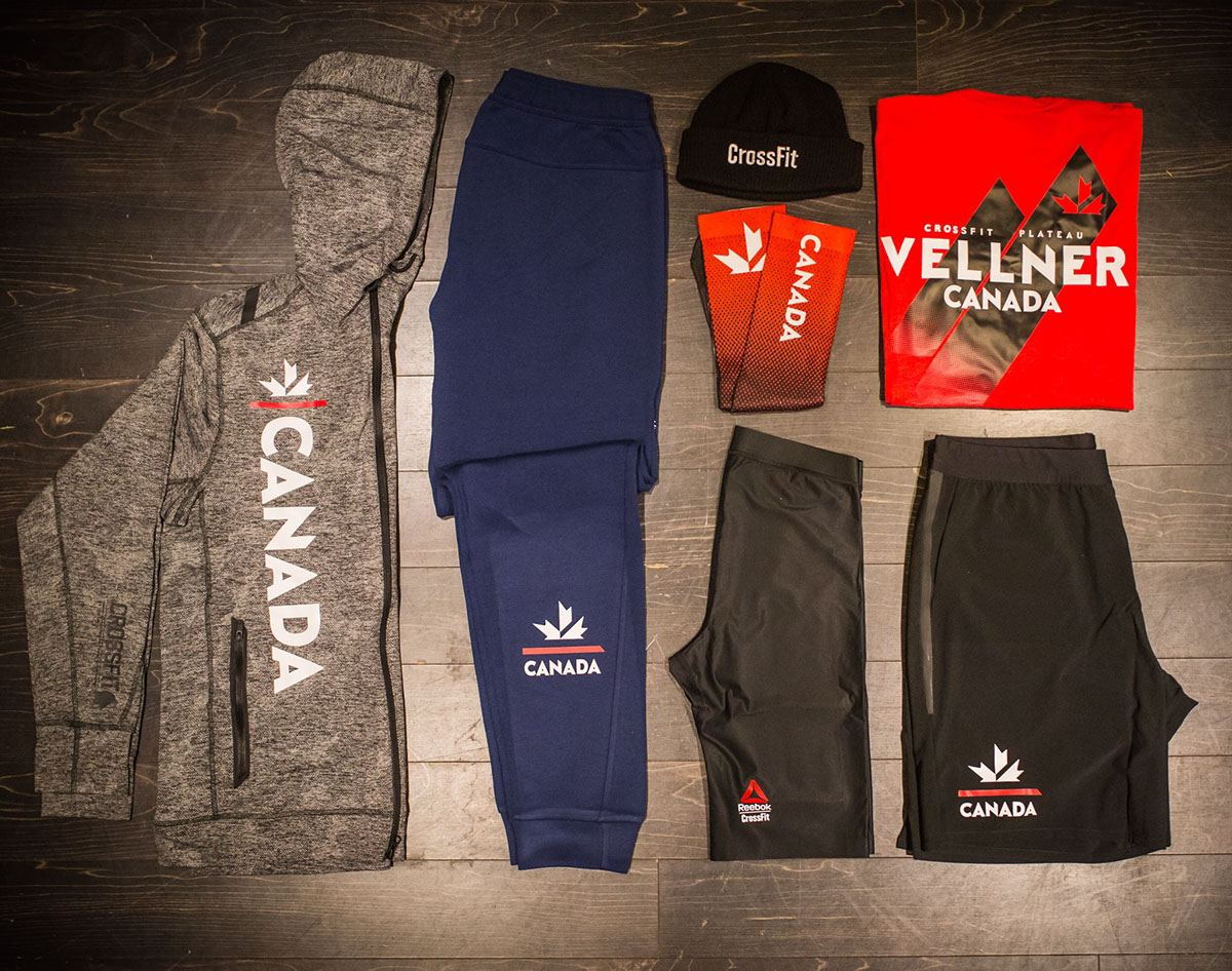
INVITATIONAL JERSEYS / APPAREL