CalArts Capstone Project: Brand Development Guide (Certification)
As part of the CalArts' Graphic Design module on Coursera, we had to choose an area our start-up company would work in, create a written (fake) history of that company, define company ideological goals and philosophy, brainstorm for naming ideas and name the company. I ended up choosing the name 'Picture Window' for a hypothetical design studio that provided design solutions involving visual communication for both print and web media. The course was roughly a month long.
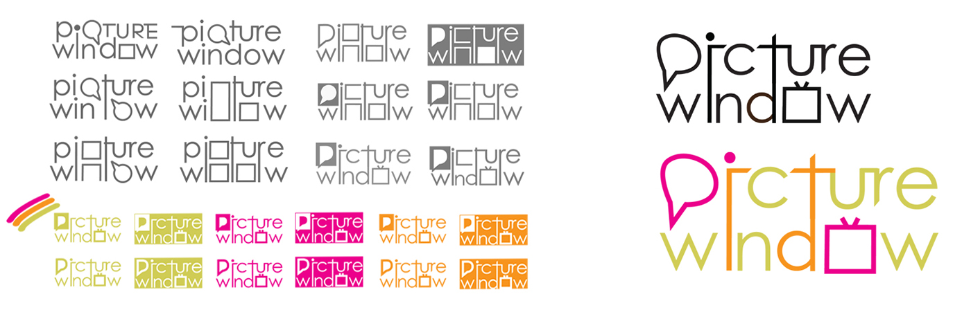
What I took away from the project: The mutability of shapes play a large part in successful mark-making. The more subtle variations (emphasis on subtle) meanings a mark can have, the more effective it can be. Of course, there has to be one central meaning that it has to project, but the variations add a shade of nuance to the mark.

After a lot of deliberation I chose a square television shape for the letter 'O' in the logotype . A lot of the work done by the studio involved work that involved panels and frames (storyboarding), and was often viewed on both printmedia and the web. This lead to the notin of the rectangle as a window that could mean the screen of laptops, mobile phones, and tablets. It could also denote the individual frames of a storyboard or a comic panel. It also put to mind the drive-thru windows where customers place their orders and are subsequently handed them.
Scroll through for best results
Mind Mapping

Logotype Explorations