"The collection seeks to embrace
contrast through the chinese
philosophy of the universal breath"
Branding, Packaging and Invite
Inspiration
The SUON collection is inspired by renowned architect Frank Gehry’s effective use of contrast, which is key to his most well known works.
A play on contrast
Contrast is the relationship of two opposites in relation to each other. The collection seeks to embrace contrast through the chinese philosophy of the universal breath. This rich relationship between the opposites can be relised in Chinese philosophy of Yin & Yang which also gives rise to the five elements called “Wu Xing” in which Metal, a material strongly inspired by Frank Gehry is studied as an element with the Yin energy, which is cold and relates the the west cardinal direction.
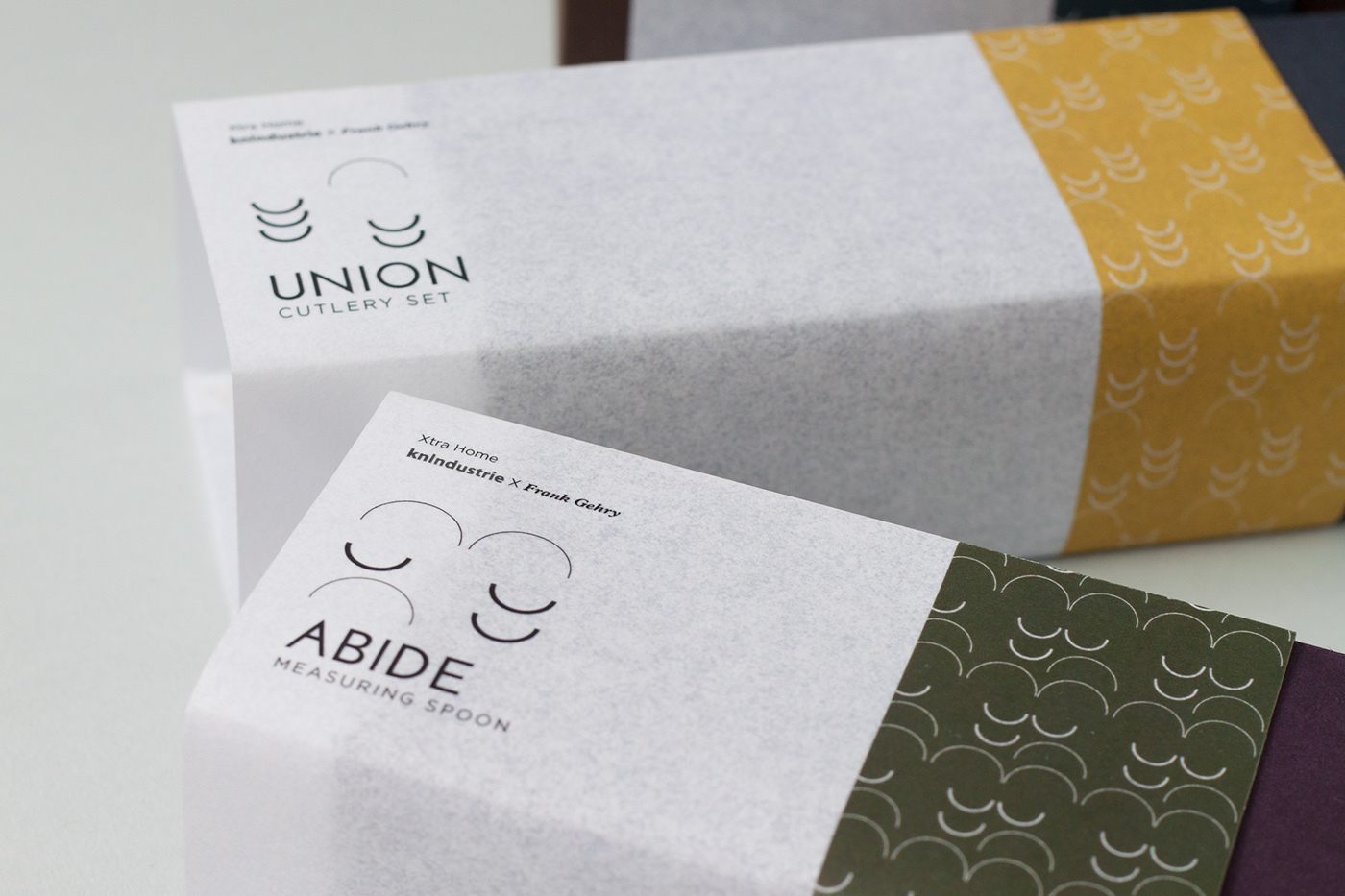
In contrast to this, the Wood element, also inspired by Frank Gehry’s play of interior wood space, is filled with the Yang energy, which is hot and relates to the east element. Both Metal and Wood comes together to balance each other. Because of their contrast, elements are form. This can be seen by the play of materials in the packaging where the wood / paper element contrast the metal utensils inside in addition to the use of complimentary/contrasting colours between the box and the cover.
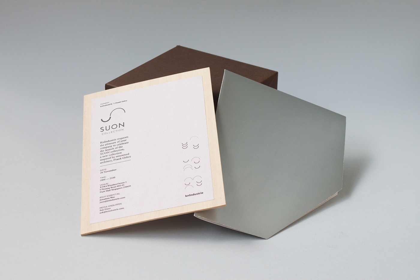
The invite to the launch event further emphasize this contrast by showing a metal-like exterior while revealing the wooden invite.
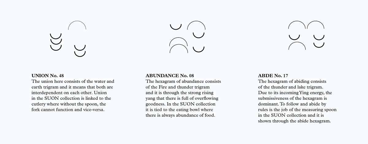
Meaning of SUON
The name SUON derives from word SUN and MOON joined together. This is in play with the concept that both the sun and the moon are in contrast with each other. One Yang and other Yin in opposite. Through the I-ching philosophy, each differing force coming together has a meaning and it is played up in this collection. The meaning of the philosophy corresponds the kitchen set of each.