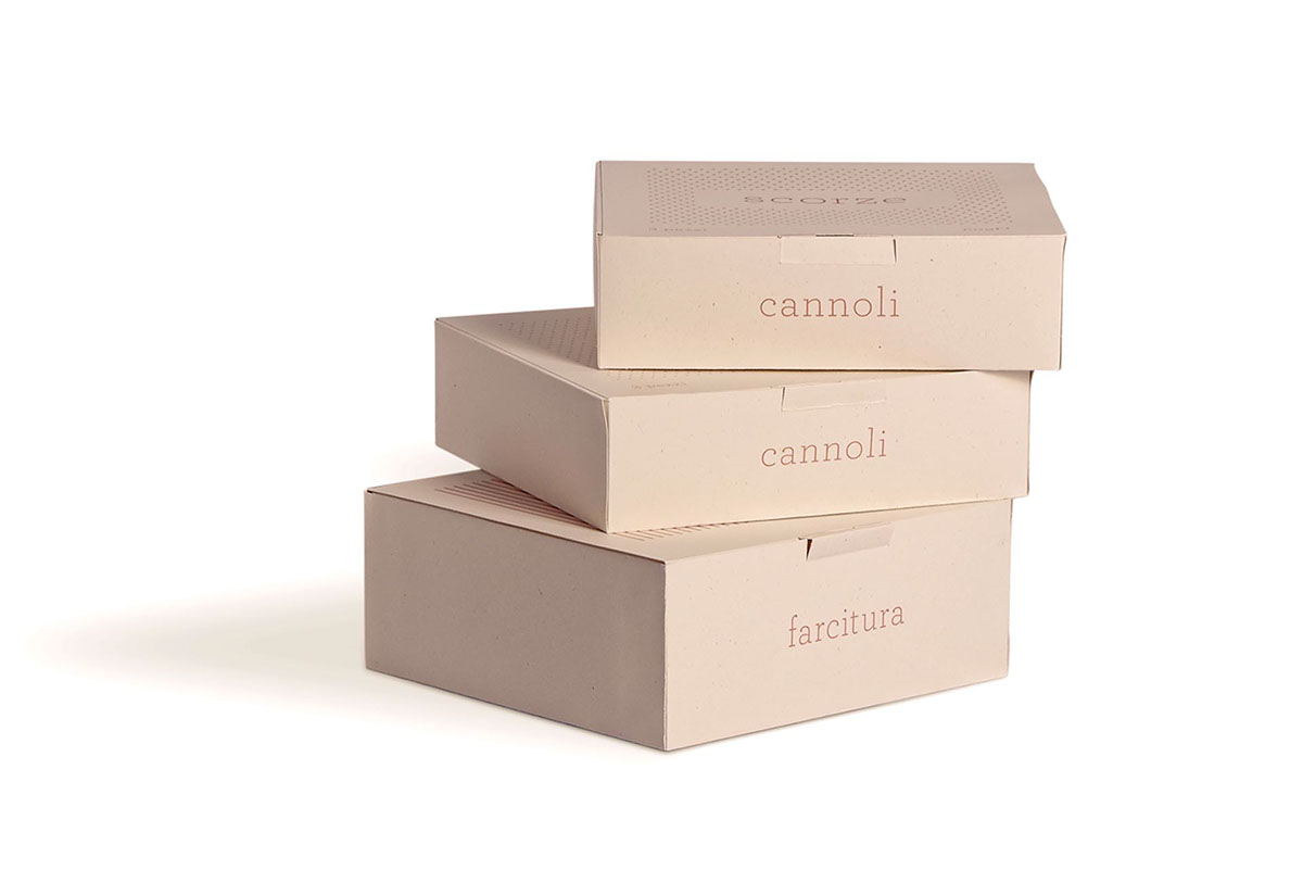
The aim of the project is to express and perpetuate, the ancient tradition
of Piana degli Albanesi and Santa Cristina Gela (Palermo), through this brand.
of Piana degli Albanesi and Santa Cristina Gela (Palermo), through this brand.
These small towns close to Palermo were founded centuries ago by a community from Albany which imported the language and the religious belief of the Greek Byzantine Catholic Church. In ancient times, for the holy Mass the sacred bread was cut into perfect rectangular pieces and each piece was marked with a stamp with geometrical patterns. Consequently, the golden and crispy crust of the Eucharesty was characterised by a special iconography.
We were inspired by tradition and used sacred symbols in order to make a brand that could describe all the features of Cannolo, this product made by this little community.
The Cannolo as emblem of Piana degli Albanesi e Santa Cristina Gela.