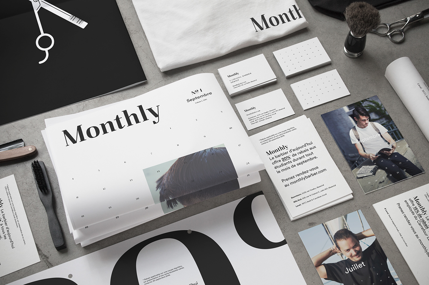
Monthly is a new chain of Montreal barber shops whose ultimate goal is to make their clients’ lives easier. To break away from the overdone “vintage” barber shop scene, Monthly has deliberately opted for a look that is sober and minimalist… and very masculine.
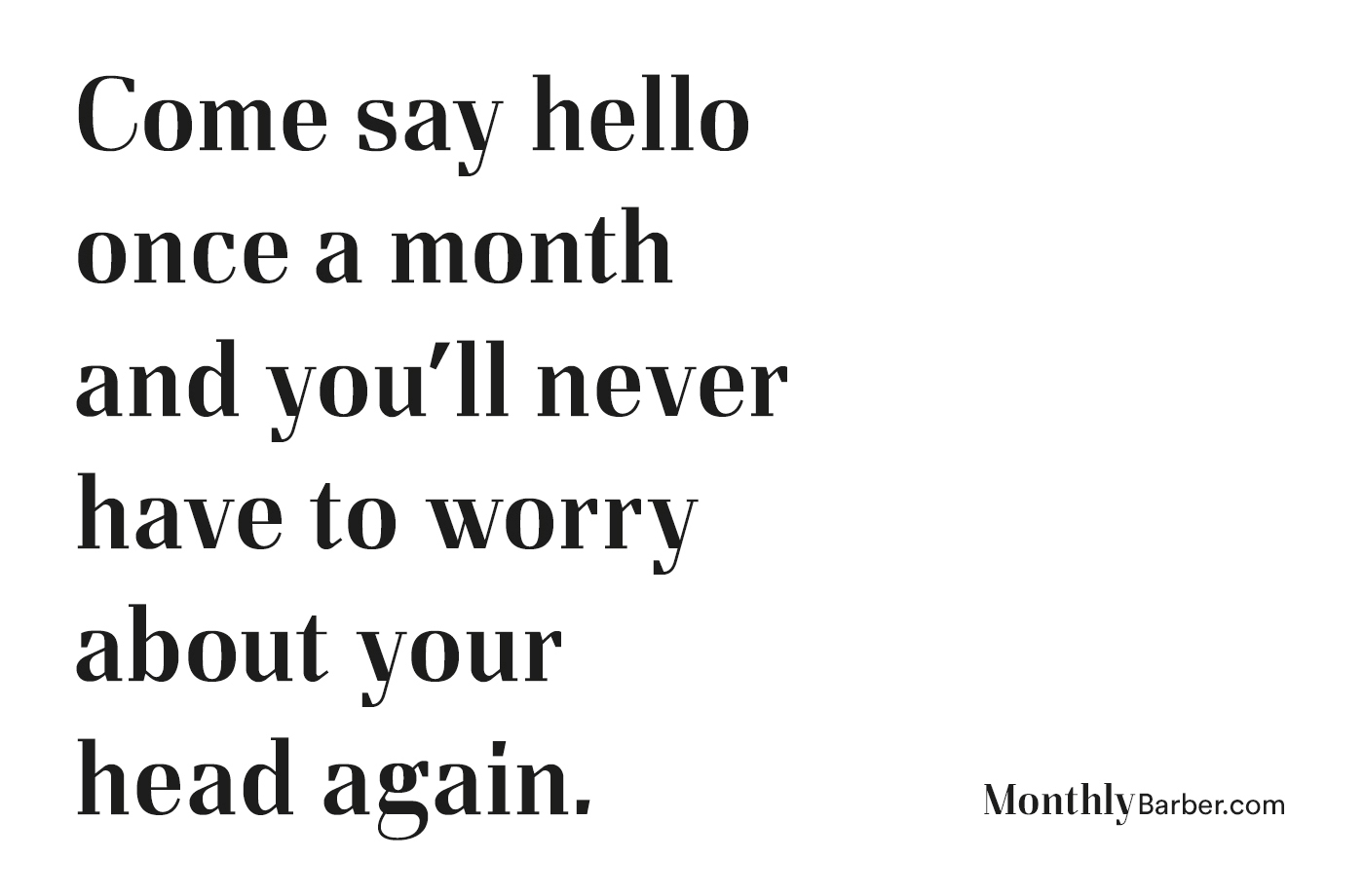
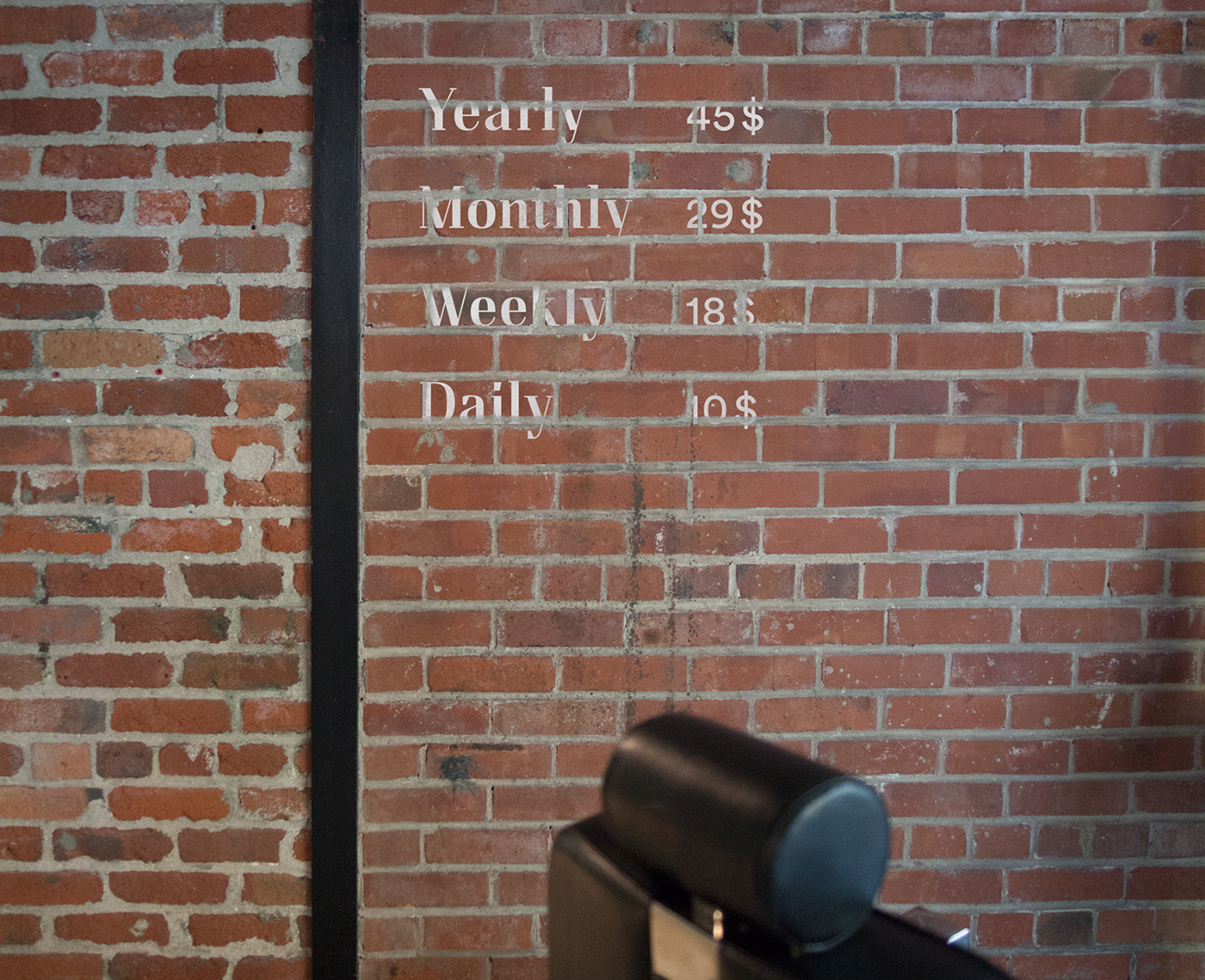
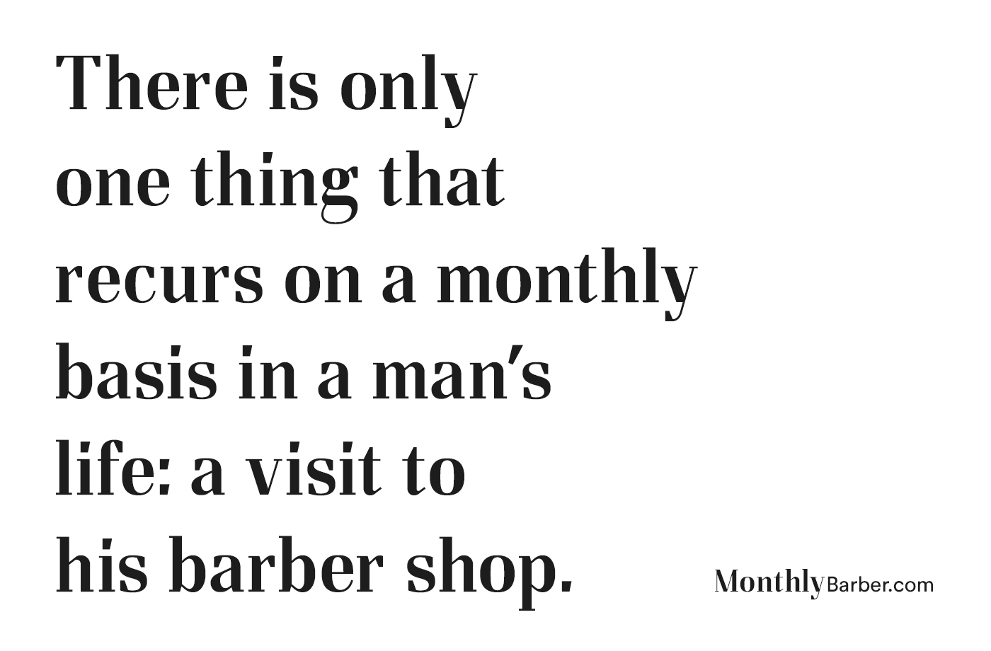
When searching for a name, we thought that “Monthly” was a clever idea, since getting a hair cut is one of the only activities that men still do on a monthly basis. The name is current, effective and memorable—just like the service clients can expect to receive at any of the Monthly locations.
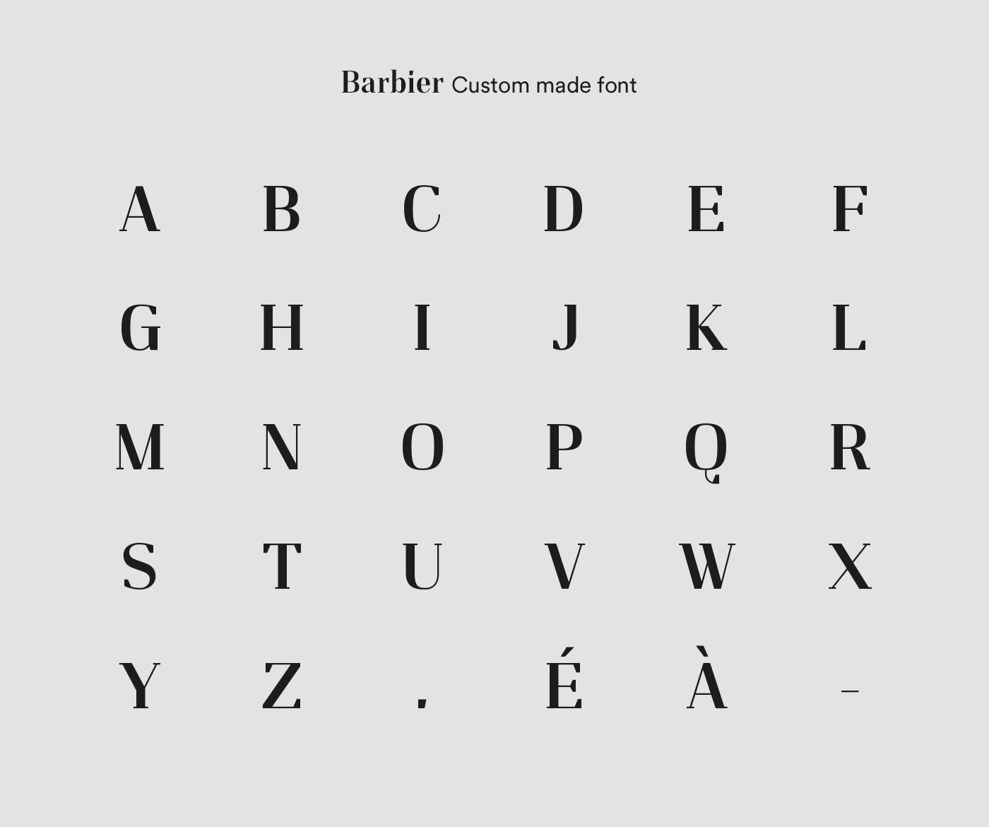
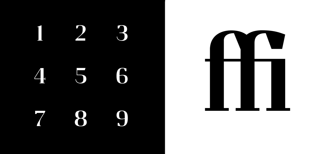
The Barbier font created for the logo and communications is razor sharp. We were inspired by the masculine look of the Felis font, but found it wasn’t a perfect match for the brand tone we were looking for. We recast the font to make it more serious, urban and refined with reduced letter sizing, a more structured, regular design and more discreet serifs. Its sharp angles were redesigned and exaggerated on every glyph, right up to the square, angular dot.
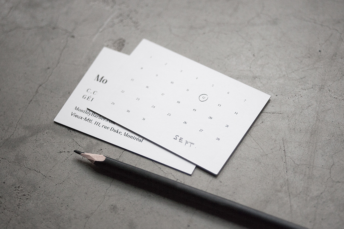
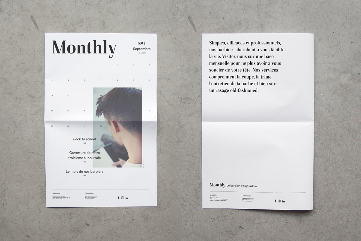
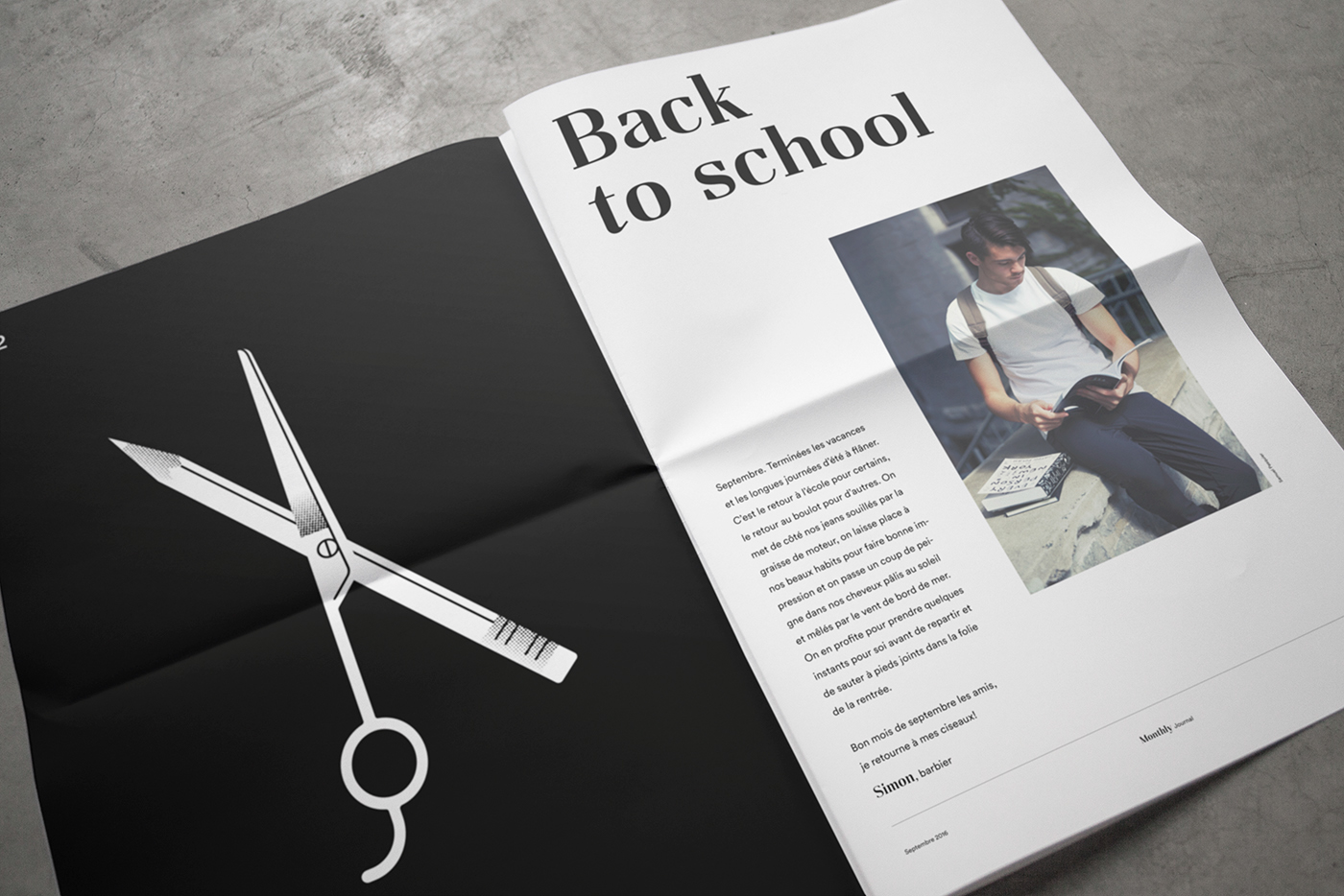
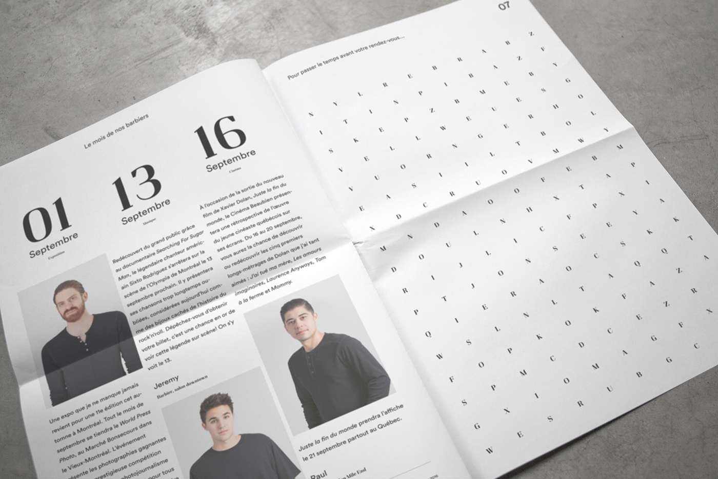
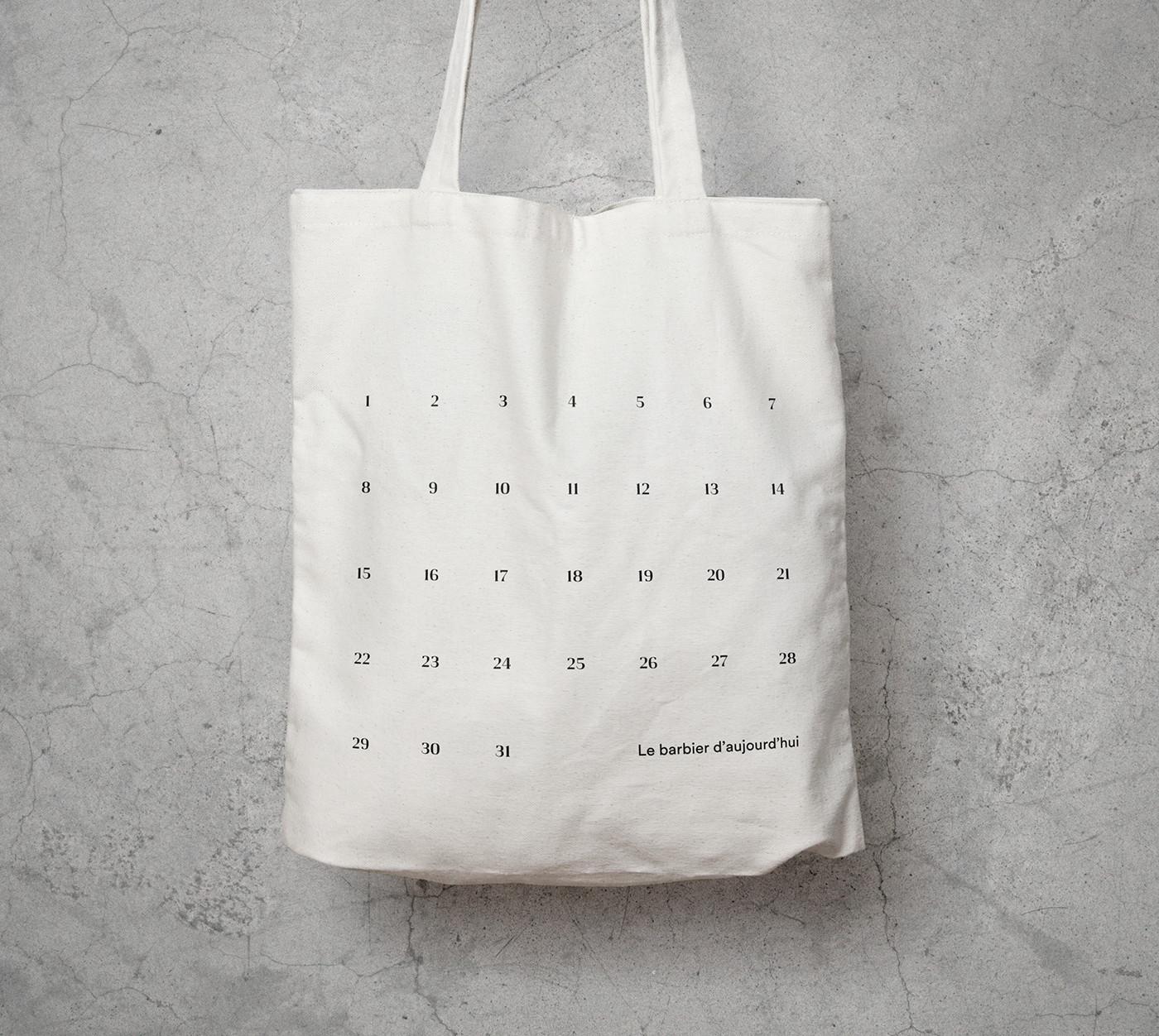
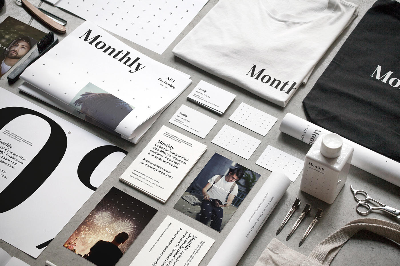
The concept of the calendar and its graphic interpretation are the key communication elements that have been adapted on all other media. For example, a calendar on the back of the business card gives clients a place to make a note of the date of their next appointment. Every month, Monthly celebrates Montreal living, with lifestyle images of new haircuts that reflect the character of the current month. The newspaper offers barbers’ picks of monthly events and news about the different shops and promotions.
These new communication elements help create a voice and recognition for the brand, while also reminding clients of their regular monthly appointment.








Credits:
Concept, Naming, Copywriting and Design: Rachel Lecompte and Gabriel Lefebvre (ethos)
Typography: Gabriel Lefebvre (ethos)
Lifestyle Photography: Samuel Pasquier
Programmation: Phillip Malboeuf
Thank you.
FOLLOW US ON INSTAGRAM


