Print products for blind and visually impaired people are still pretty rare. This situation is caused by economical reasons such as high costs for embossing Braille type and a very scattered target group. Magazines for example often print two versions of their issues — one in ink and another one for tactile reading.
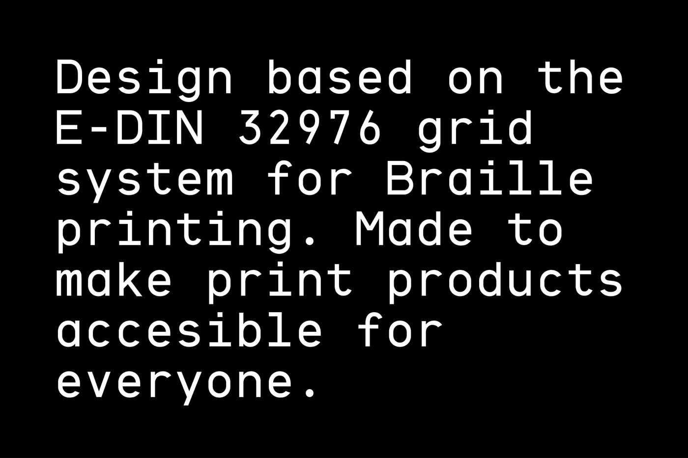
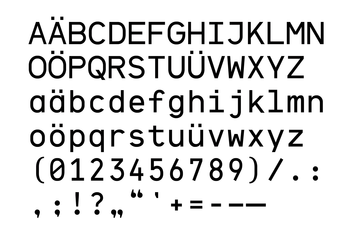
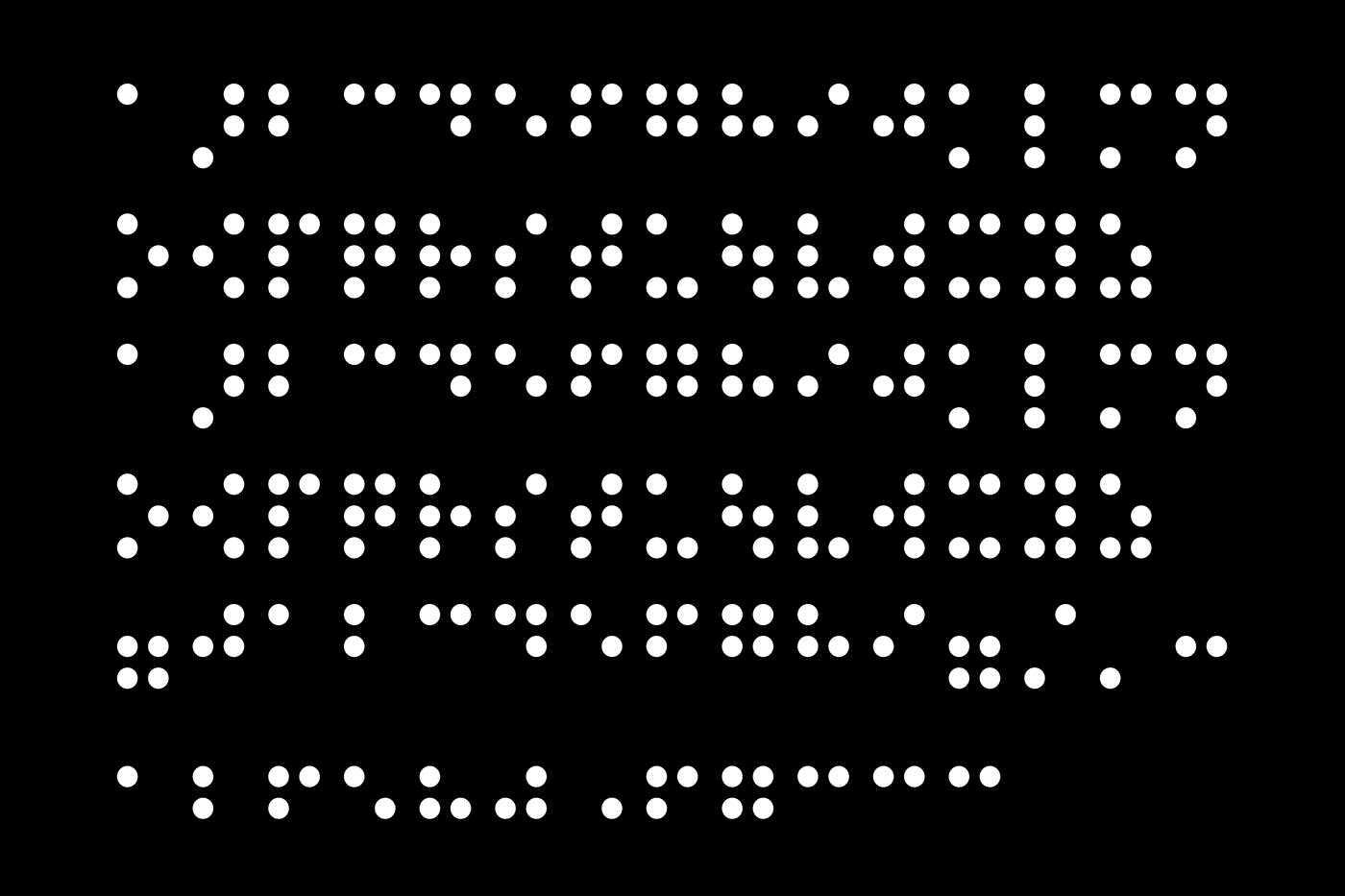
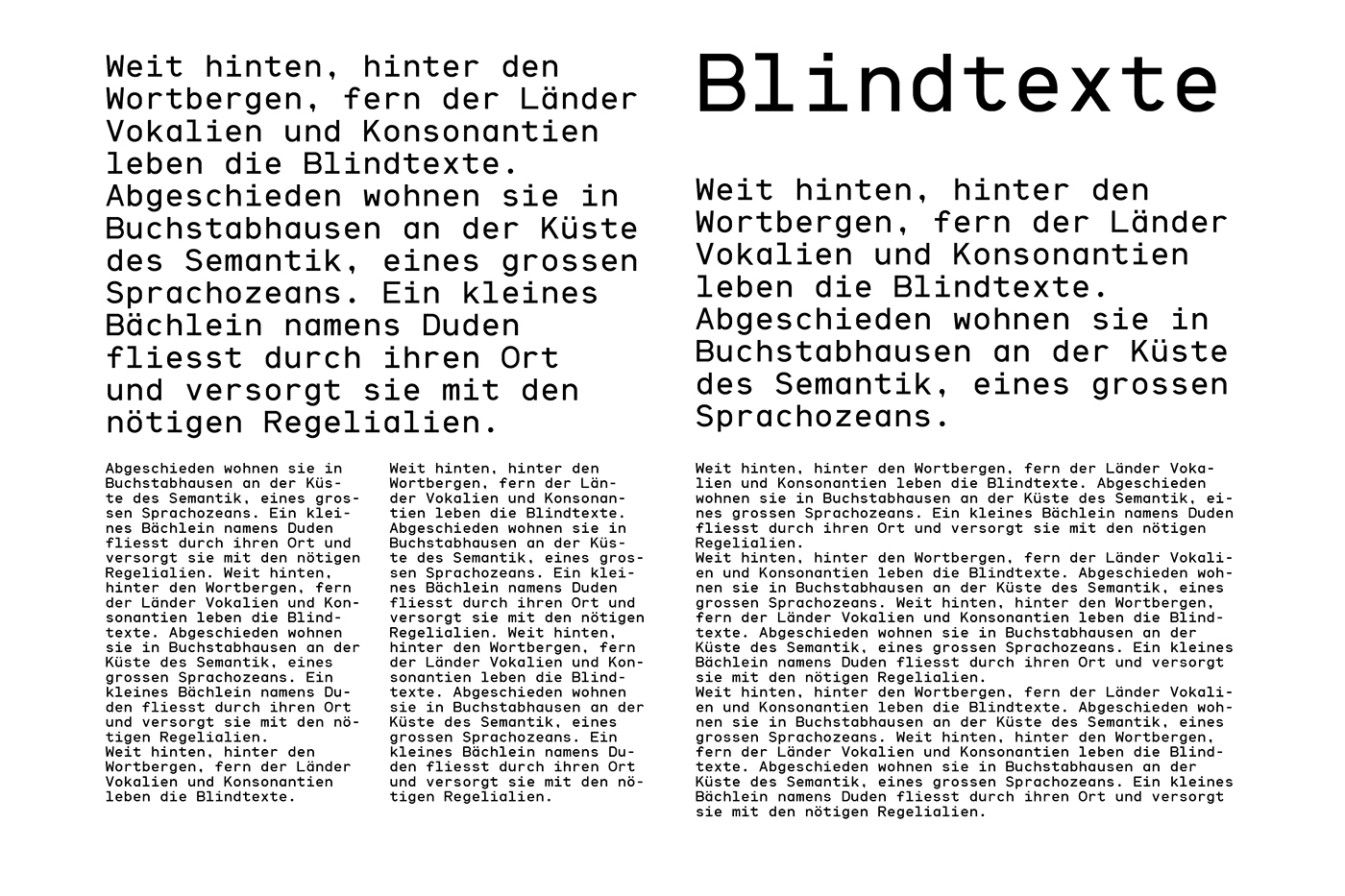
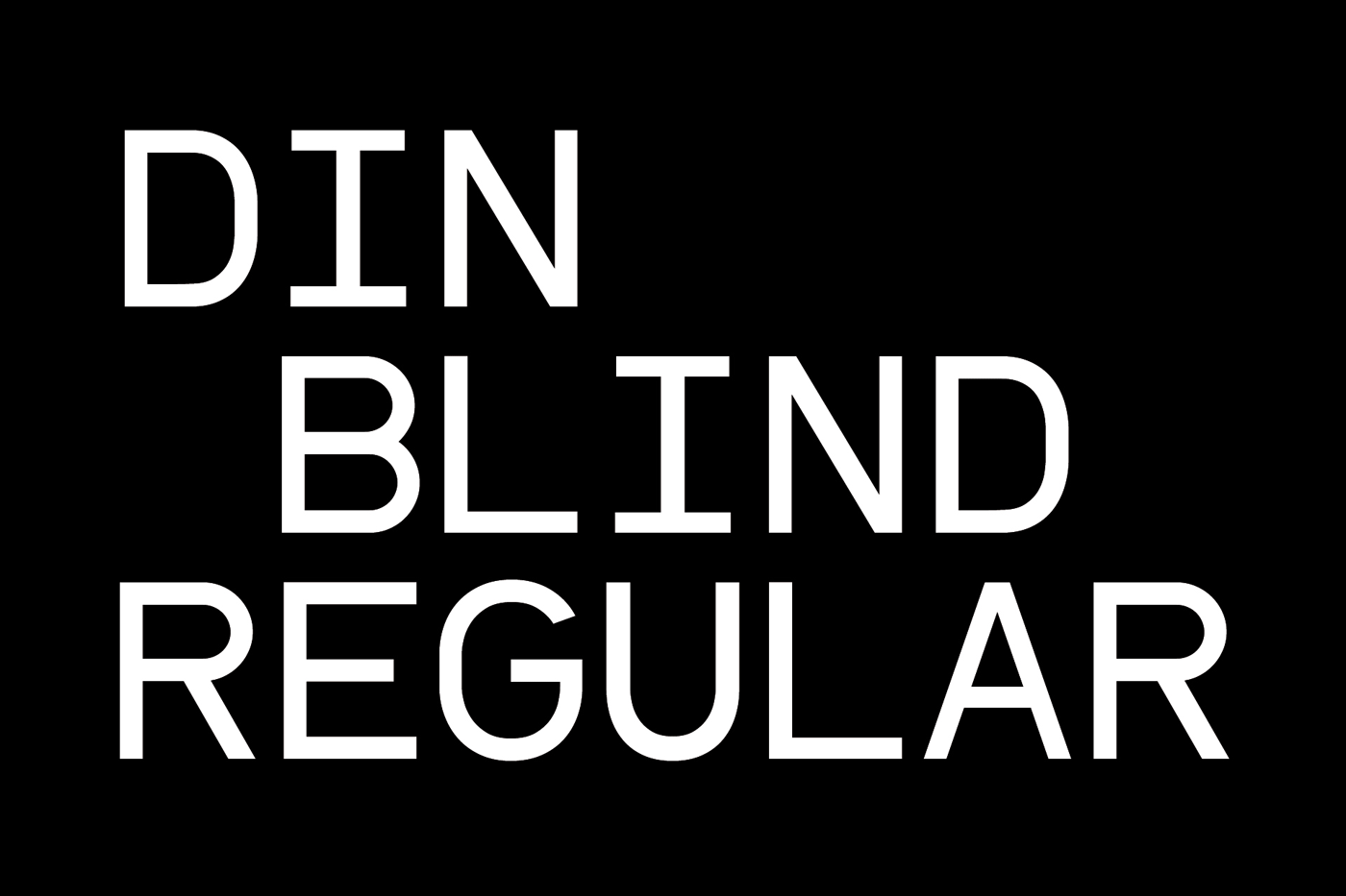
To increase the number of available print products for blind people this typeface is designed to make a combination of printing and embossing possible. Therefore every letter is fitted onto its monospaced Braille glyph. Using the E-DIN 32976 norm for tactile writing this font can be used to produce hybrid products that reduce paper usage as well as financial efforts.
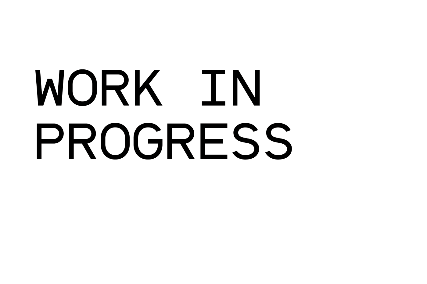
The translation from metric measurement in the DIN norm into units makes the design process difficult and requires a lot of time — this is still a work in progress though. If you'd like to test the prototype or just want to talk, please get in touch!
To increase the number of available print products for blind people this typeface is designed to make a combination of printing and embossing possible. Therefore every letter is fitted onto its monospaced Braille glyph. Using the E-DIN 32976 norm for tactile writing this font can be used to produce hybrid products that reduce paper usage as well as financial efforts.
The translation from metric measurement in the DIN norm into units makes the design process difficult and requires a lot of time — this is still a work in progress though. If you'd like to test the prototype or just want to talk, please get in touch!