


intro
The goal of this project was to create a new product that would be competitive in the marketplace. The package for this product had to be a traditional design solution that could engage the target audience, while also integrating corporate branding to form a cohesive approach to packaging.
design solution
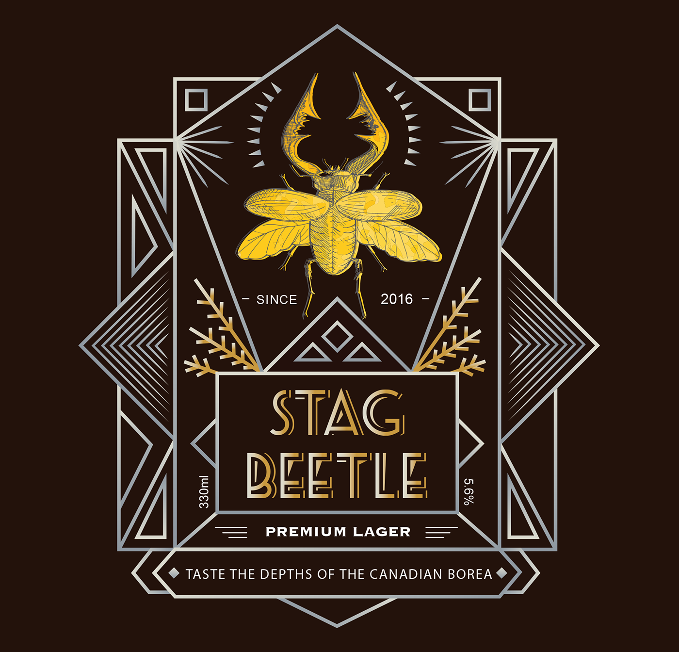
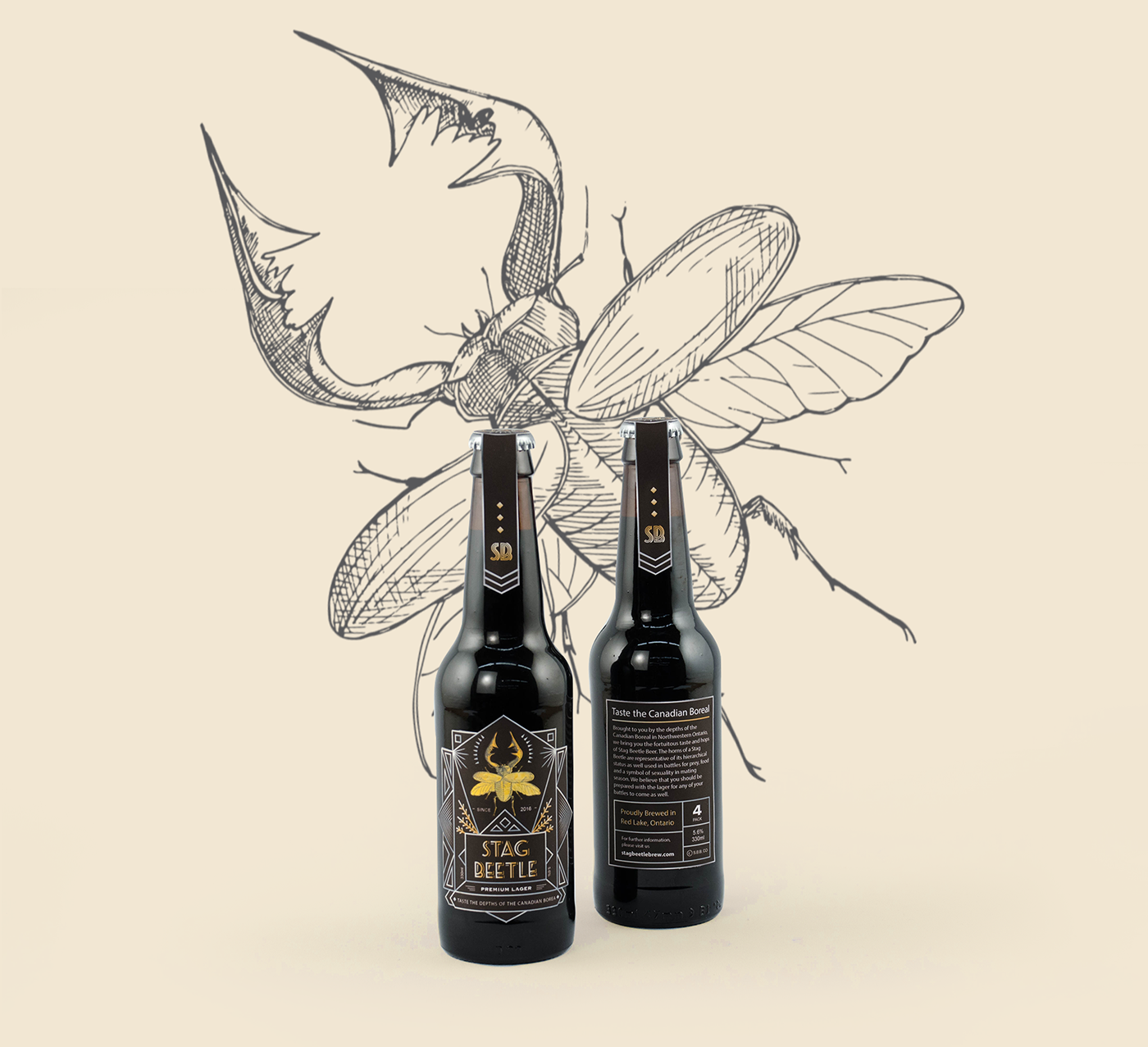
Stag Beetle is brewed in North-western Ontario. It was designed for men ages 21 to 30 years old. The horns of a Stag Beetle are representative of its hierarchical status, as well a weapon in battle for food, and a symbol of sexuality in mating season. We bring you the fortuitous taste and hops of Stag Beetle Brew and help you prepare and overcome any battles to come. Inspired by Art Deco, we decided to apply geometric lines to the overall design. Brown colour pallets were chosen to convey the wood and trees of the Boreal with a nice sharp contrast of silver and gold gradient palettes. These metallic colour palettes are to exemplify masculinity and sophistication. The front cover image was chosen to show stag beetle rising shine from the deep forest—the shapes beside stag beetle are symbolic images of pine trees.
design solution
Stag Beetle is brewed in North-western Ontario. It was designed for men ages 21 to 30 years old. The horns of a Stag Beetle are representative of its hierarchical status, as well a weapon in battle for food, and a symbol of sexuality in mating season. We bring you the fortuitous taste and hops of Stag Beetle Brew and help you prepare and overcome any battles to come. Inspired by Art Deco, we decided to apply geometric lines to the overall design. Brown colour pallets were chosen to convey the wood and trees of the Boreal with a nice sharp contrast of silver and gold gradient palettes. These metallic colour palettes are to exemplify masculinity and sophistication. The front cover image was chosen to show stag beetle rising shine from the deep forest—the shapes beside stag beetle are symbolic images of pine trees.


Thank you


