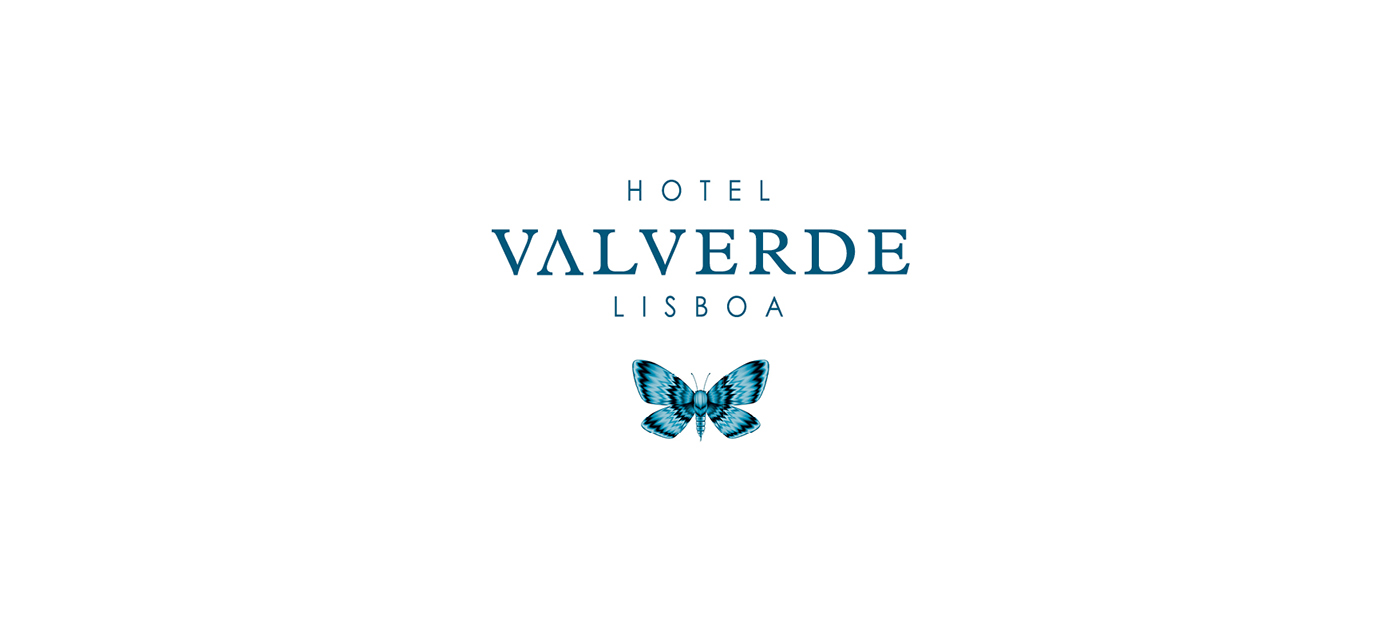
VALVERDE HOTEL
Branding
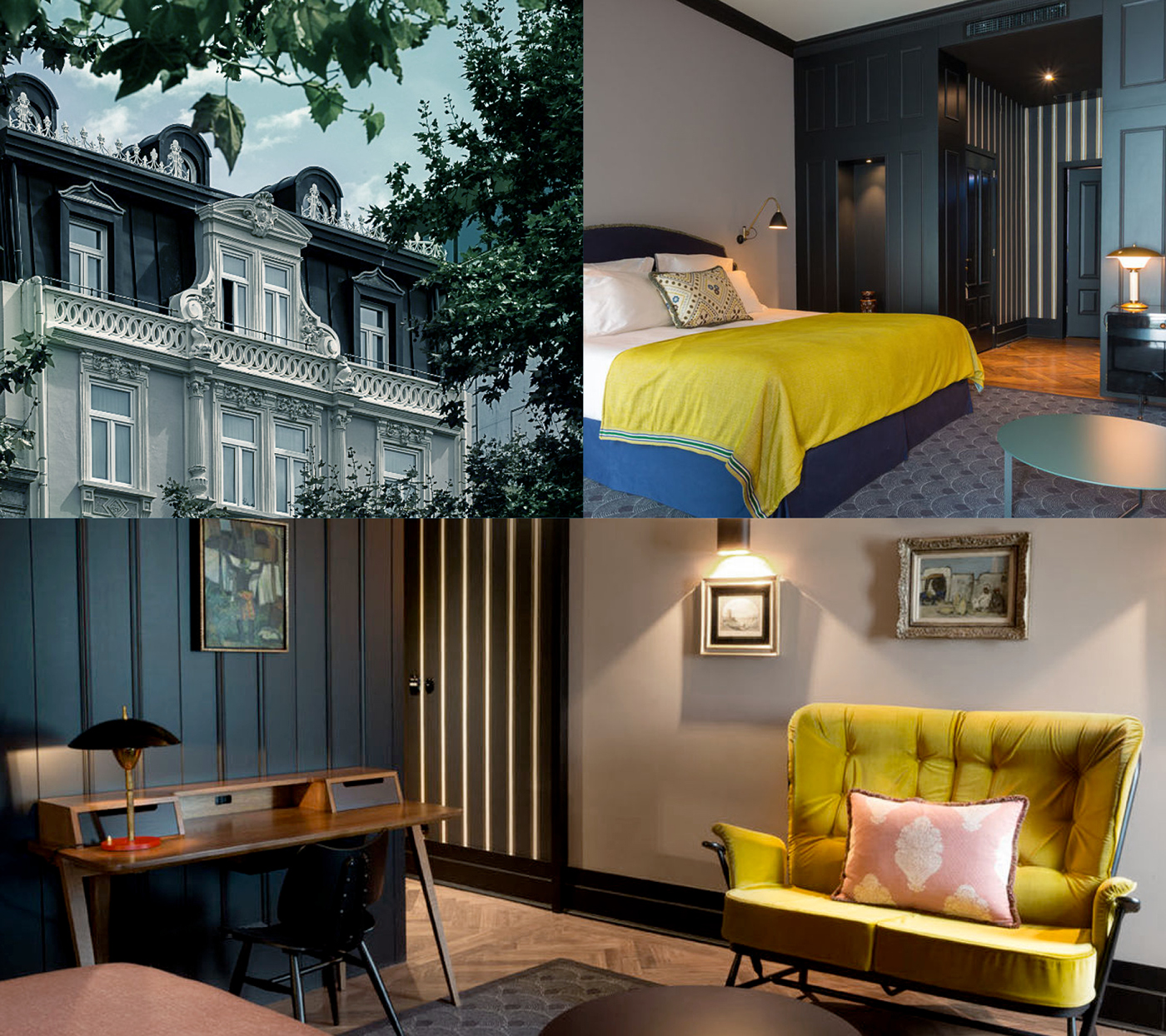
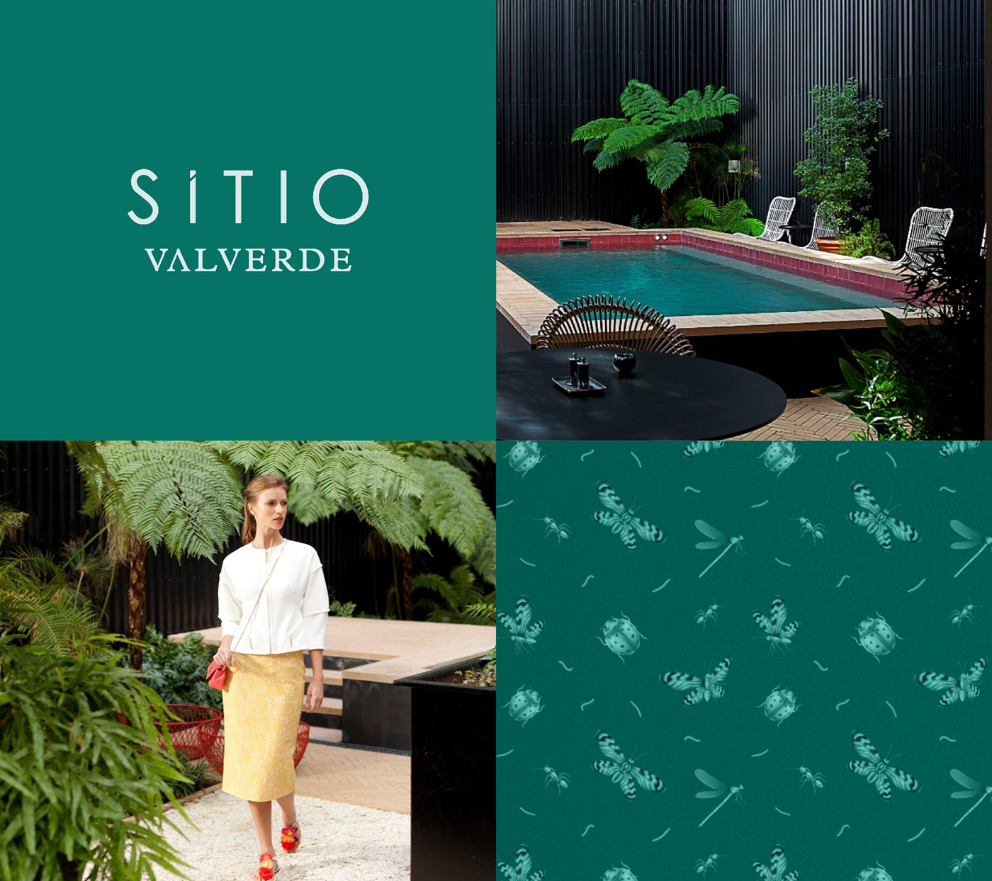
Located in the Avenida da Liberdade, in the most noble of Lisbon, Valverde Hotel opened its doors in September 2014. It reminds us of London and New-York Town Houses, with its classic and elegant style, it's contemporary furniture, works of art and antiques. Its colours and patterns, the comfort of its fabrics and materials, its homey arrangement of space, are what distinguishes the Valverde Hotel from any other hotel in the surrounding area, an "Oasis of comfort and discreet luxury."
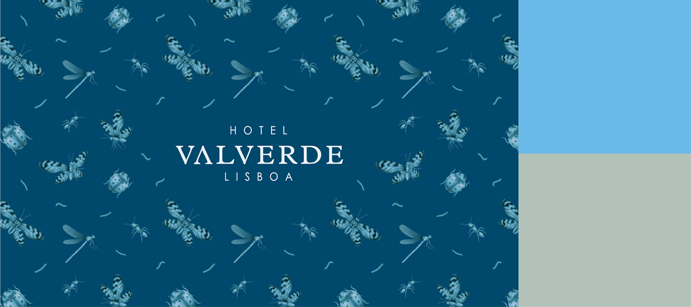
Logo stands for the classic attitude that portrays Valverde Hotel, featuring an original pattern that represents its original location, as Valverde means "green valley" the butterflies, earthworms and ladybugs represent that garden feeling in a intriguing and luxury way, referring to the hotel's ancestry.
© sara palaio
+ FUEL LISBOA + BASTIR Arquitectura e Design de Interiores


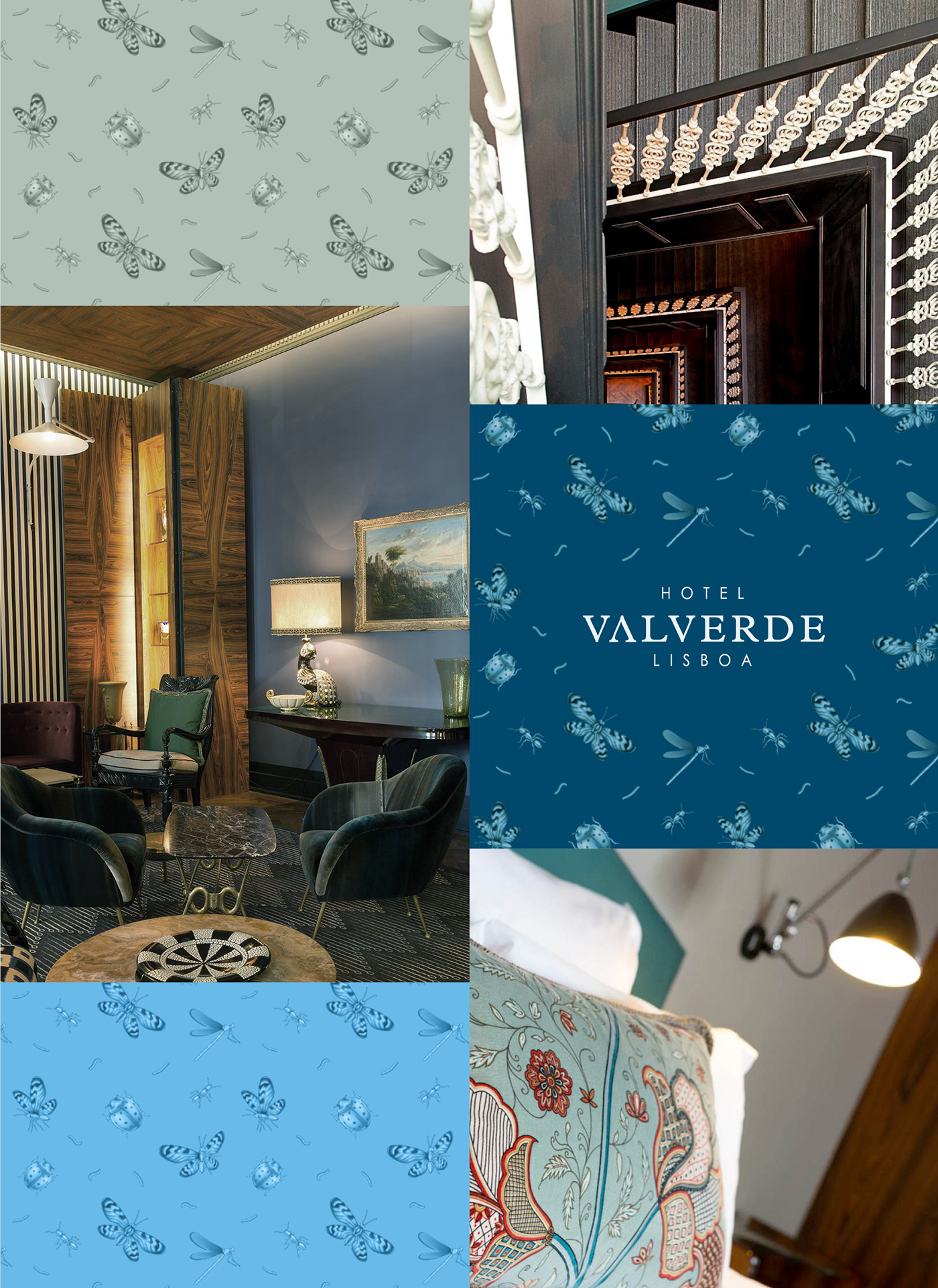

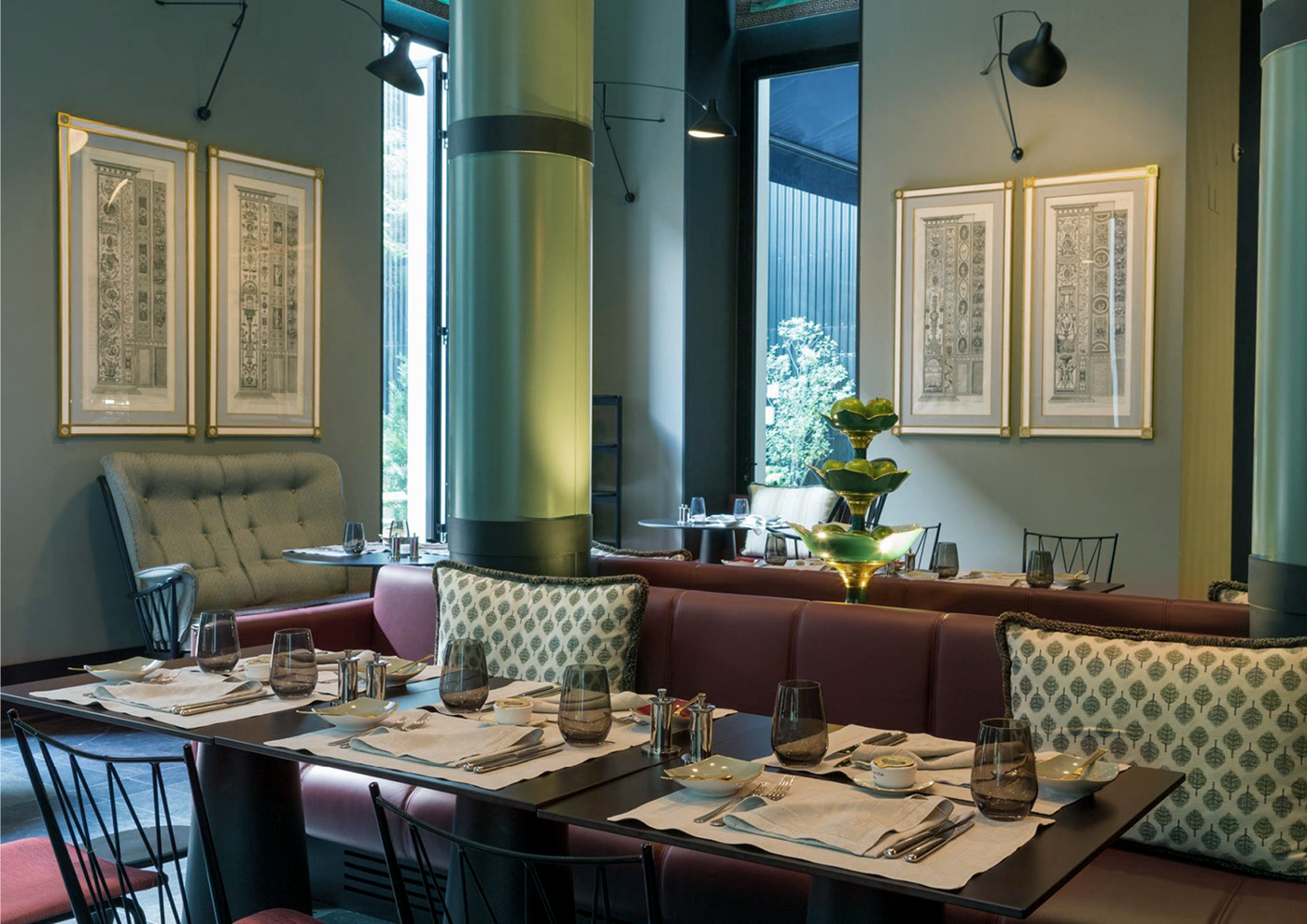
Facing the courtyard, Restaurant / Bar Sítio Valverde, with its very high ceilings, is a unique space where clientele can come to lunch, dine or have snack at any time of day.
Keeping in line with the aesthetic of the logo, it uses the same distinctive pattern in a deep green colour that enhances the restaurant environment.


© sara palaio
+ FUEL LISBOA + BASTIR Arquitectura e Design de Interiores


