
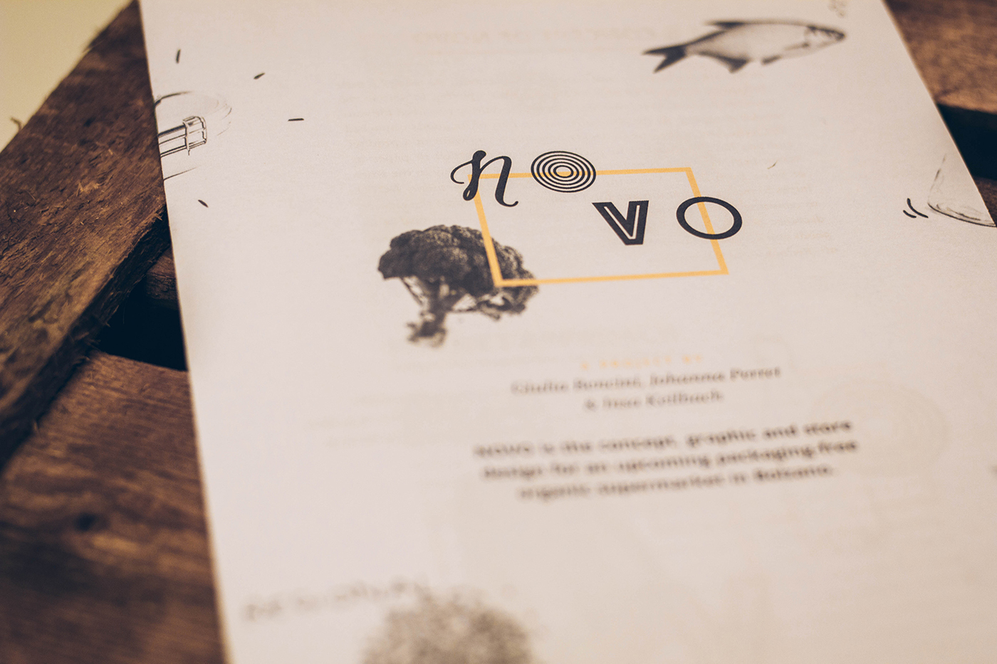
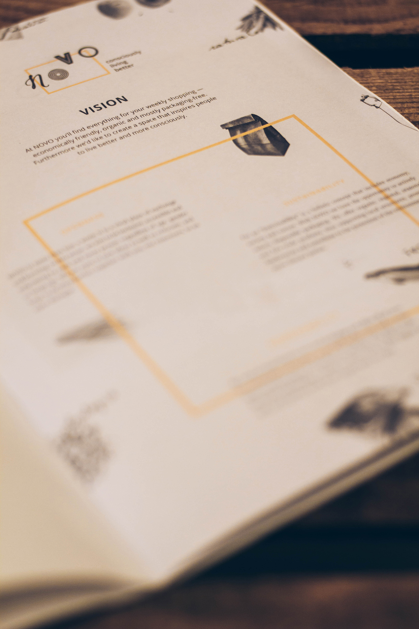
NOVO means “new” — and new always means to do things a little differently. NOVO is an organic supermarket, opening in 2017 in the center of Bolzano, that provides you with everything you need for your weekly shopping. As the store offers a big part of its goods unpacked and loose, you’re the one to decide how much you want of a product and you have the chance to pack it more ecofriendly: in paper or textile bags, in glass jars or bottles that you can either buy in the store or bring from home. Following the “zero waste” movement, NOVO hopes to reduce packaging and food waste and give people the chance to consume more sustainably and responsibly. The overall goal is to decrease people’s carbon footprint by offering regional and organic goods and decentralization of the food market. It’s all about the concept of: “Reduce, Reuse, Recycle”.
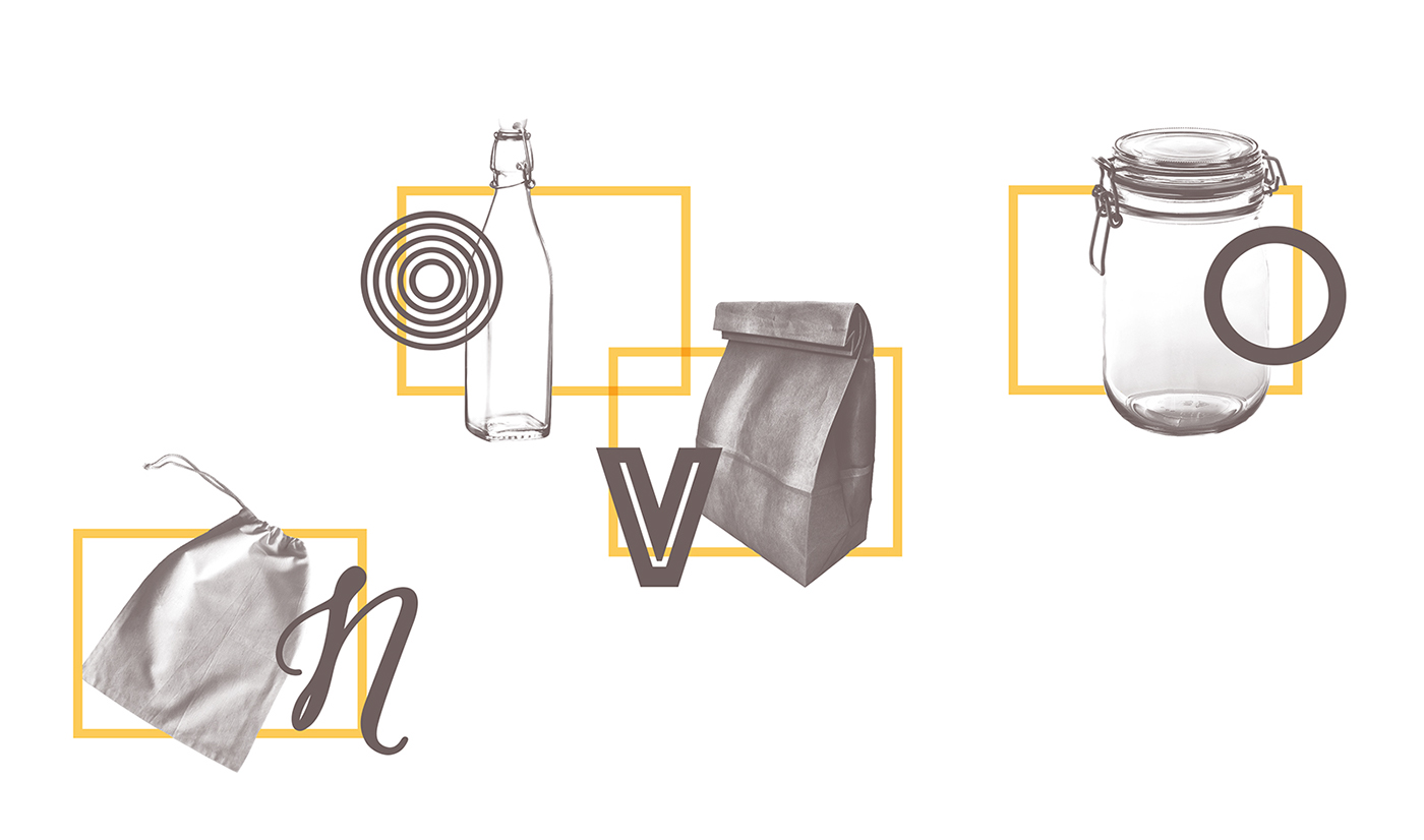
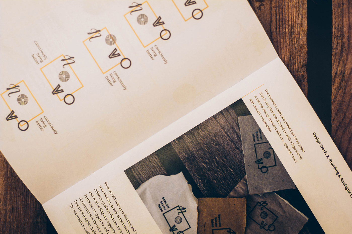
Since NOVO aims at re-framing and re-shaping current conditions in the food and consumption system, the store interior, as well as the branding, takes up this idea visually. The word mark “NOVO” is compiled of four different typefaces that can move on a pre-defined grid. Through those dynamics the brand promotes an active and vivid feeling and supports openness and flexibility. Digitally, the logo can be used even as an animation. Furthermore, typefaces and colors have been de ned to strengthen the natural appearance. Both the logo and the structures in the store are based on the same open source measurement system. The slogan exists in three languages (English, Italian and German) and is placed respective to the versions you can see on the left side.
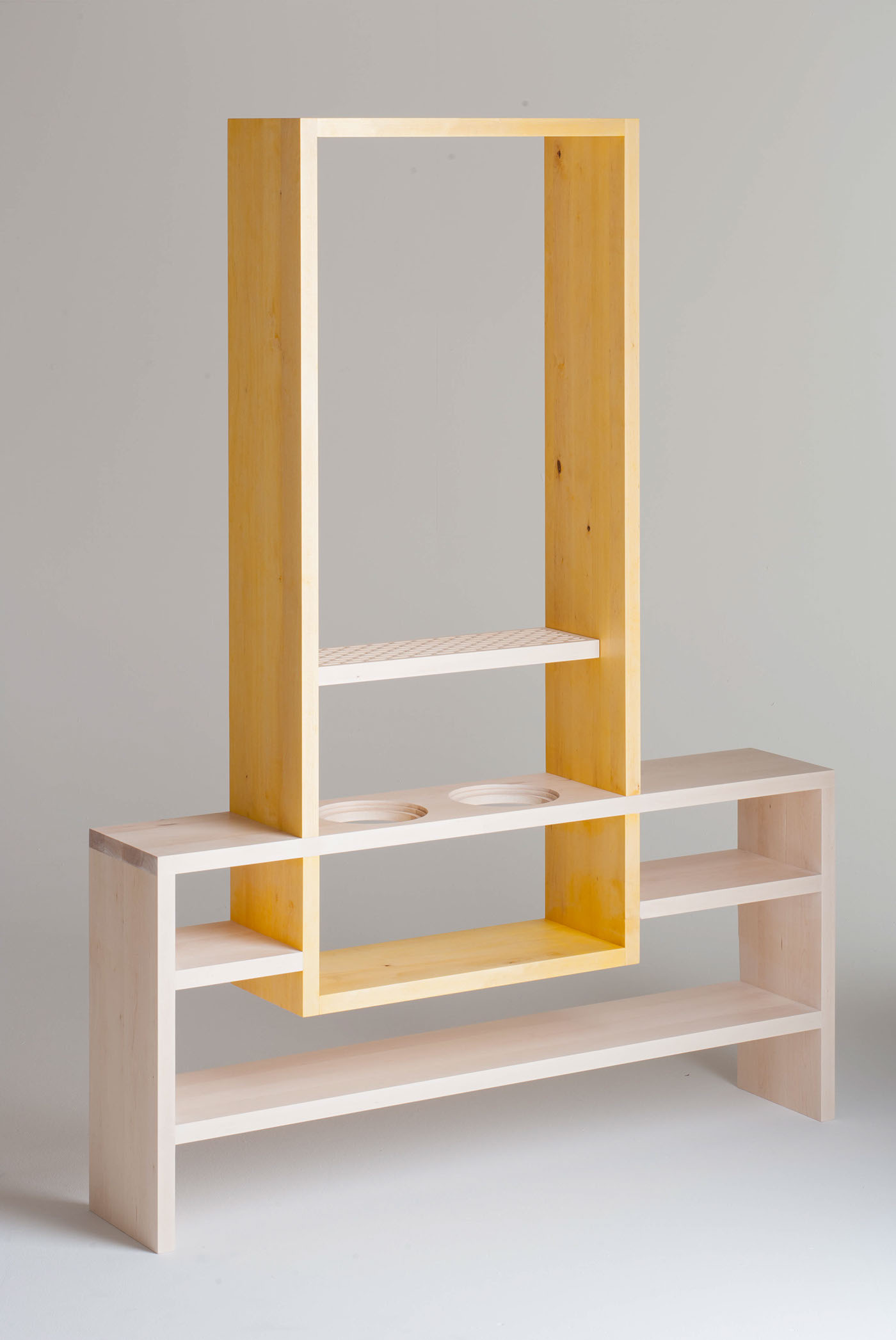
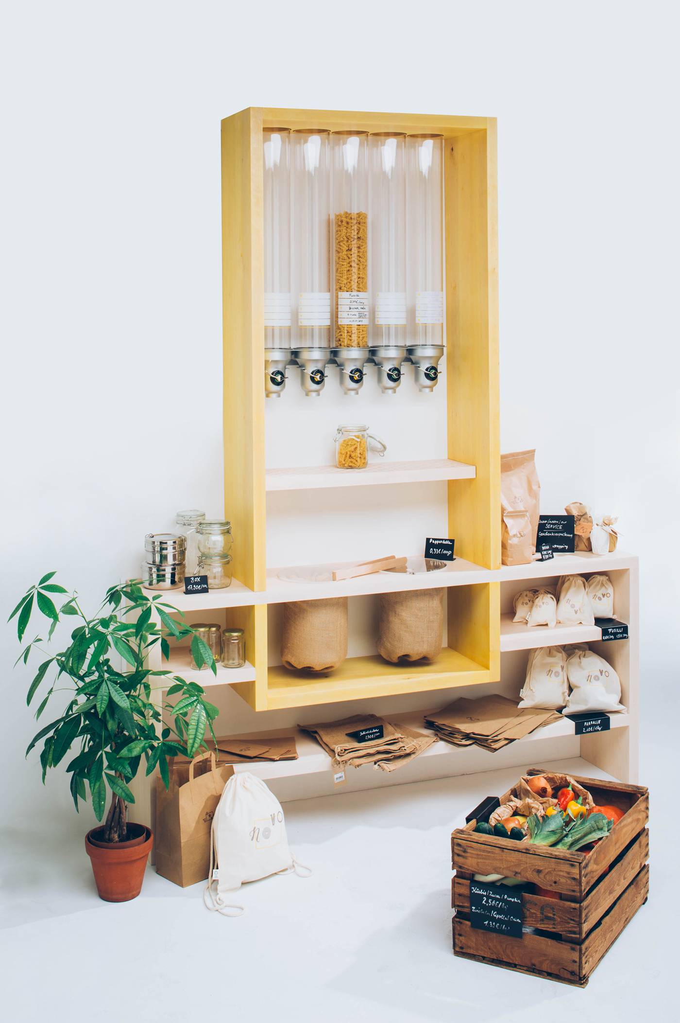
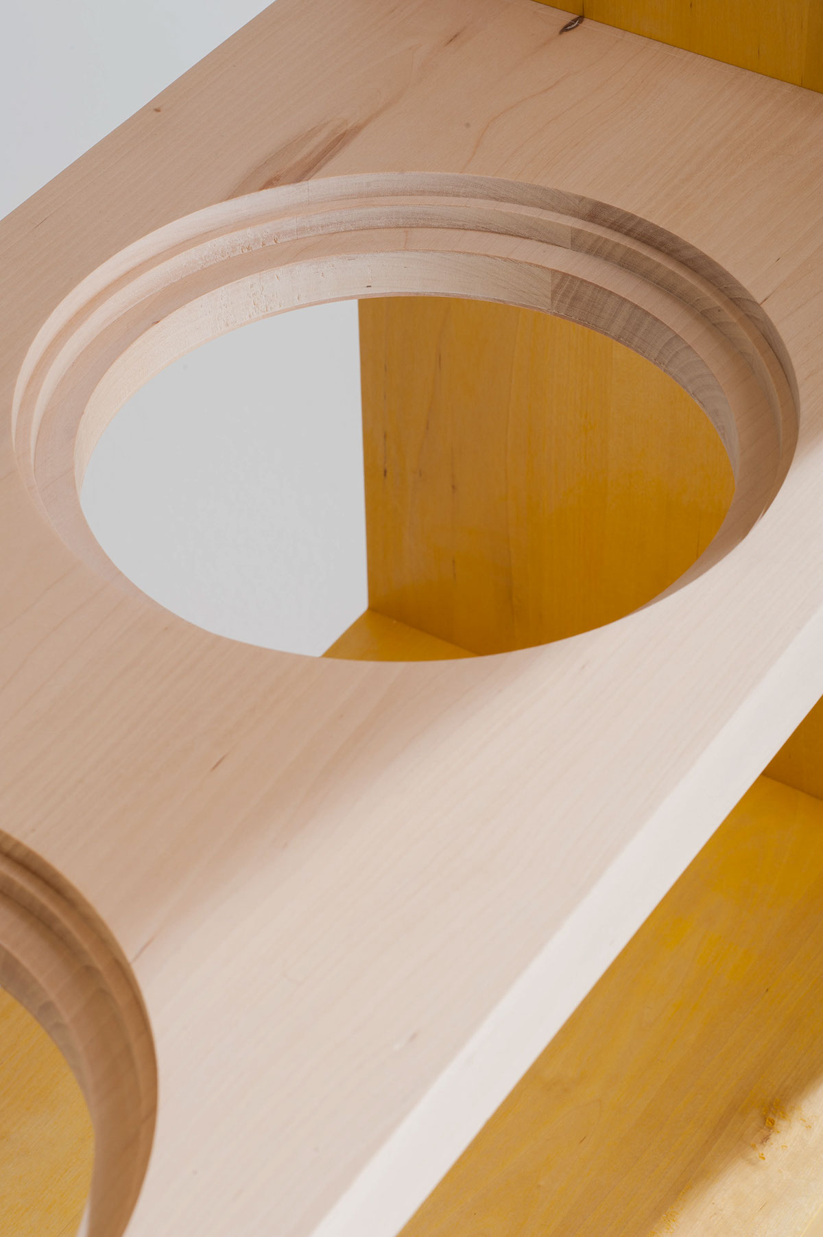
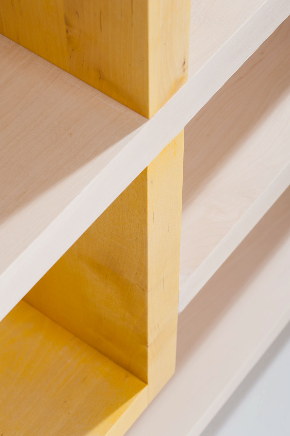
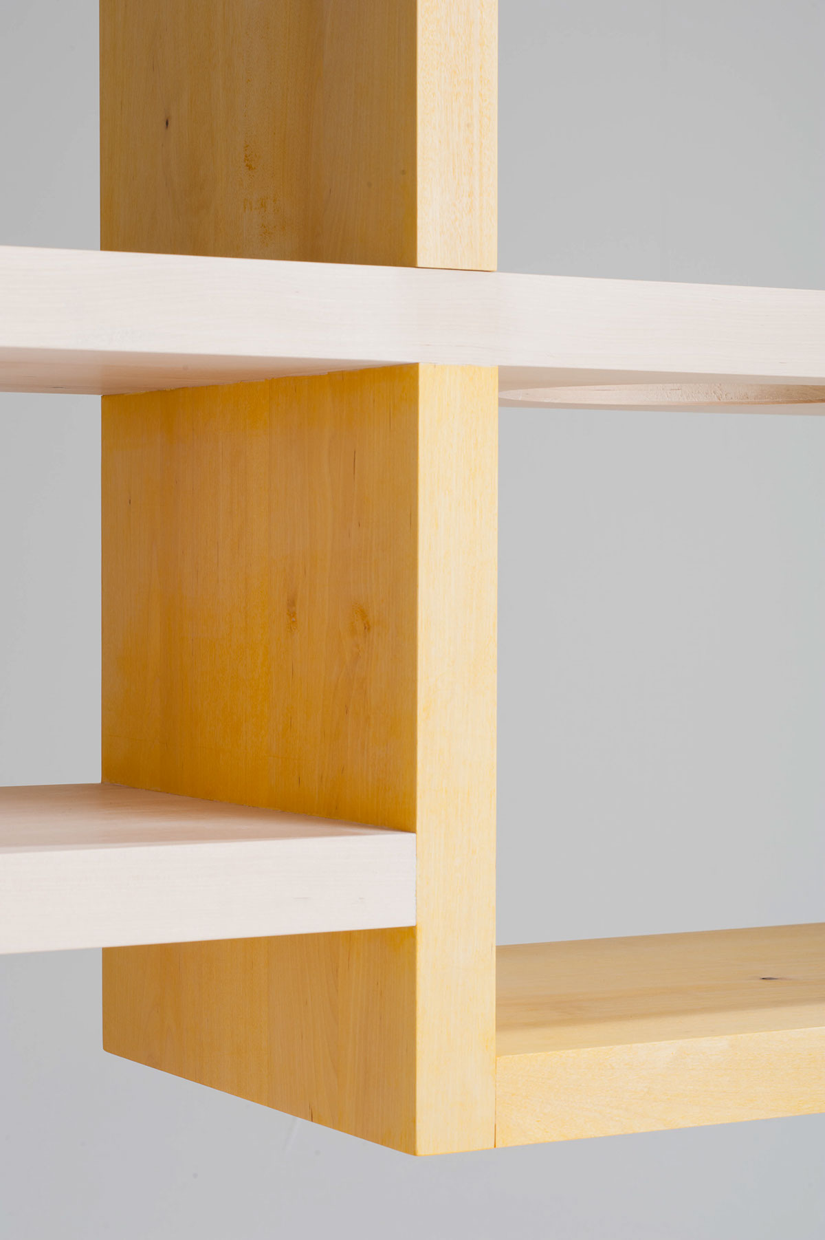
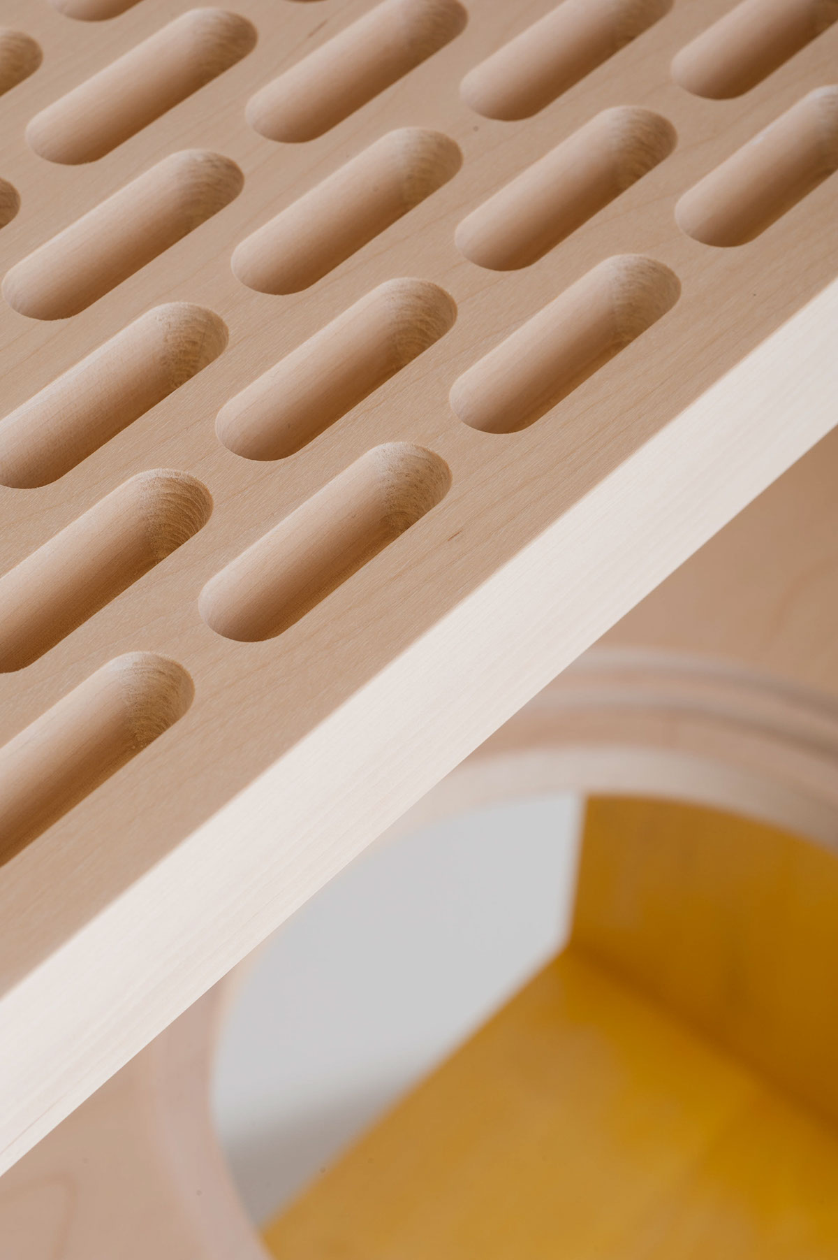
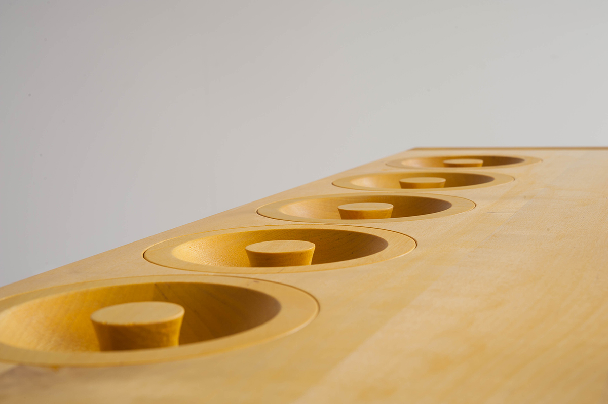
The shelf construction itself is based on the idea of a yellow frame that puts emphasis on the products. Inside the shelves, the products are given space to breathe, which supports a feeling of quality. For each product group the shelf slightly varies in size and dimension as each group requires different segmentation and use of space. The material choices are — of course — plasticfree and natural, using untreated wood, with a layer of natural white and yellow oil.
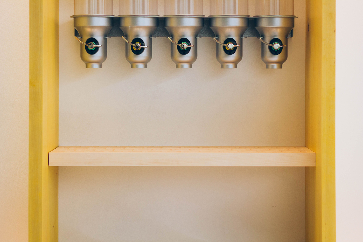
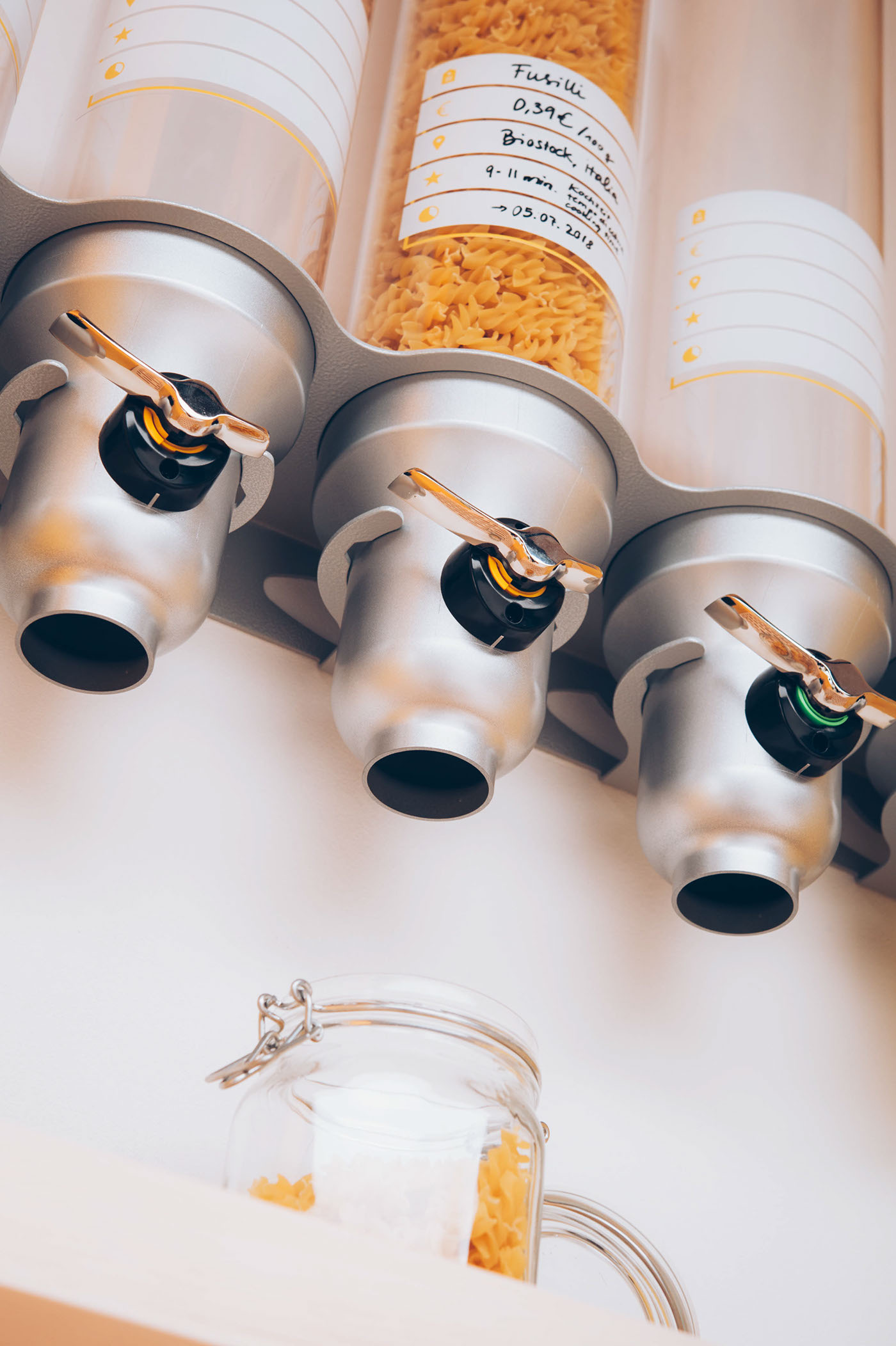
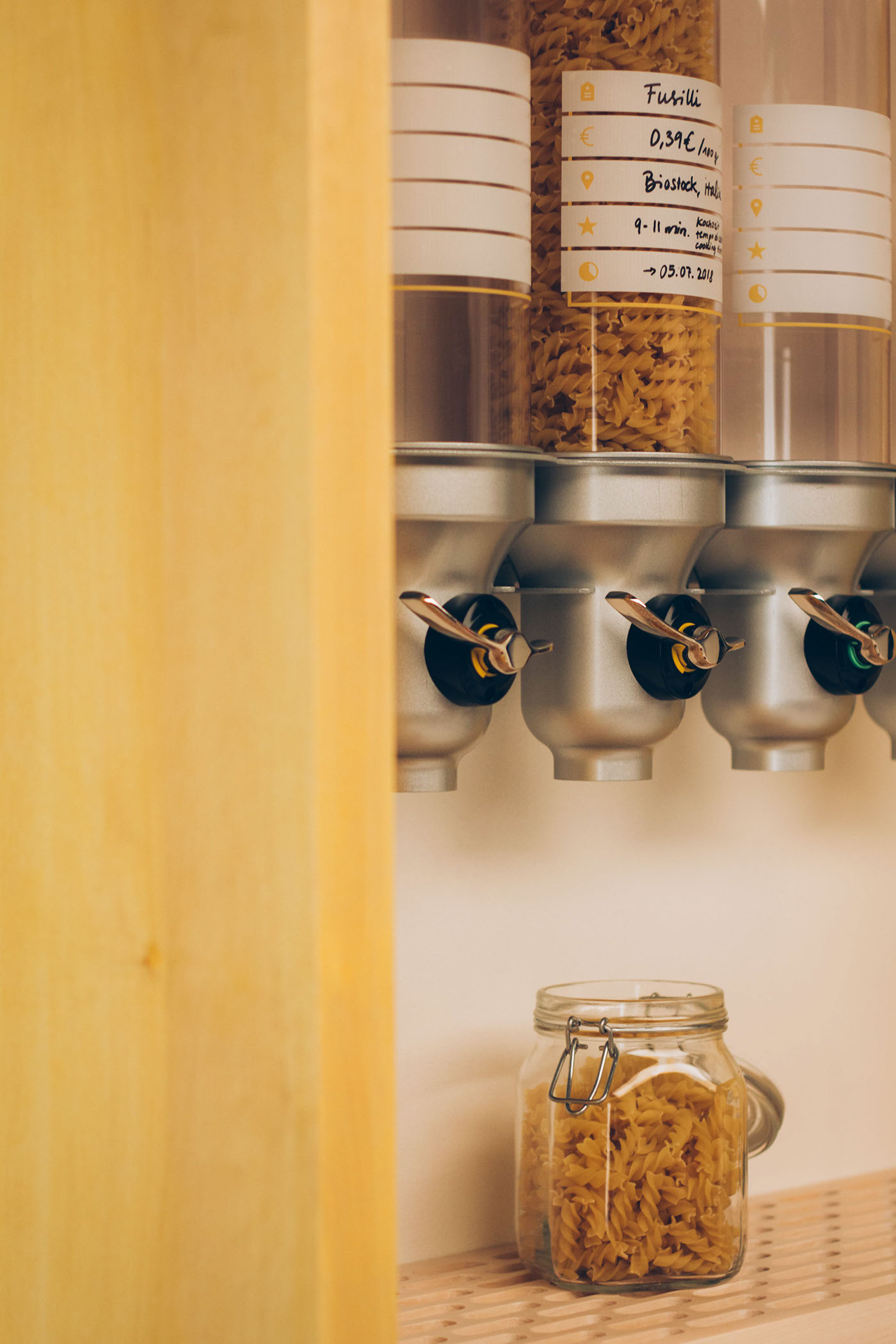
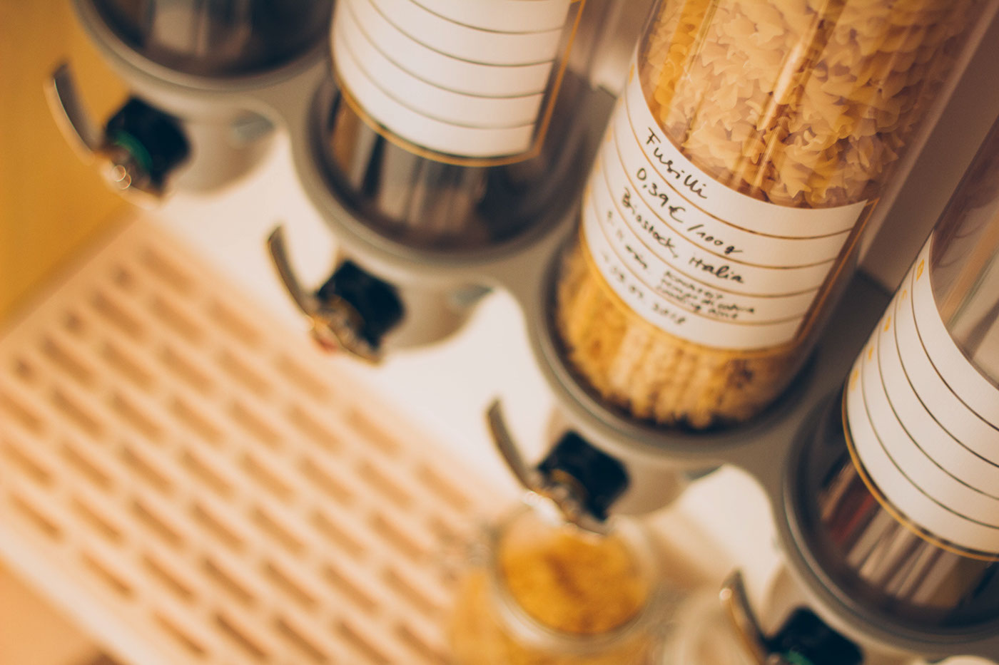
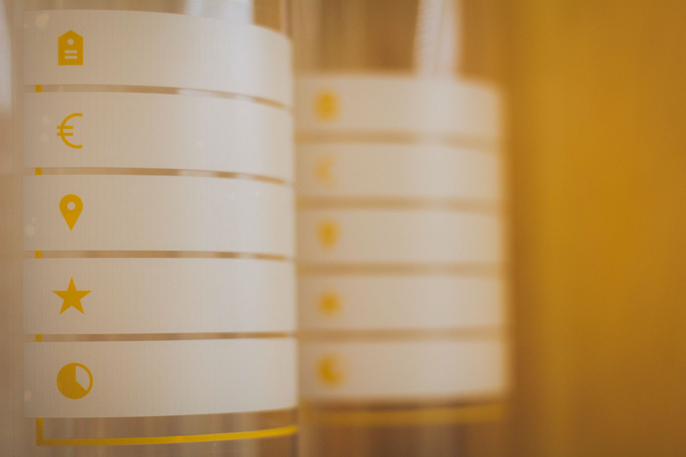
The cylyndric dispensers are made out of metal and plexiglass and can be fixed to the wall or the structure itself. A variety of products can be filled into them, so the customer can choose the amount he or she wants or needs.


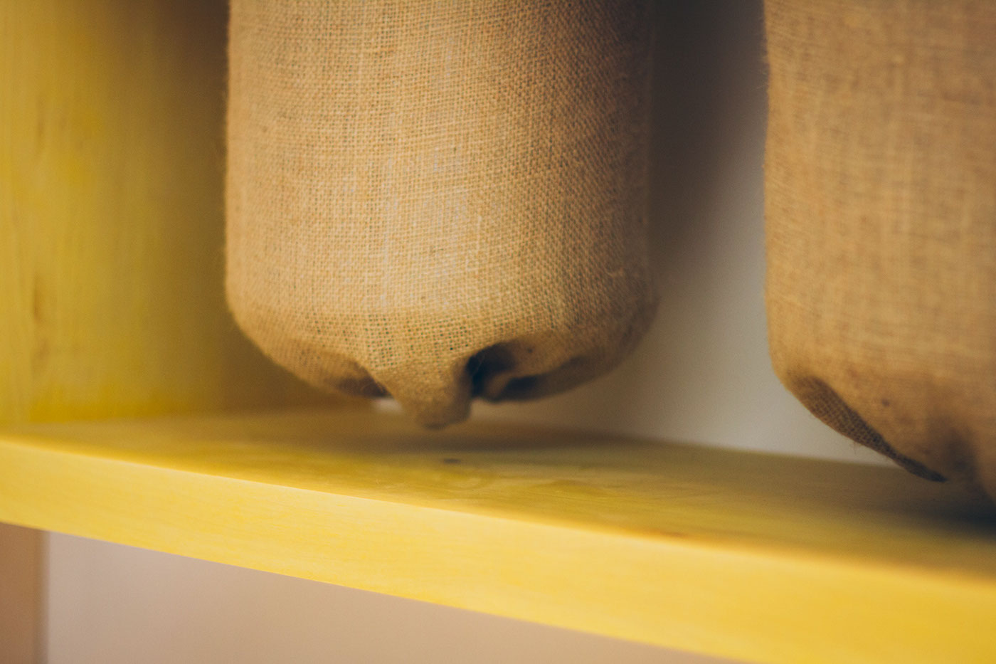
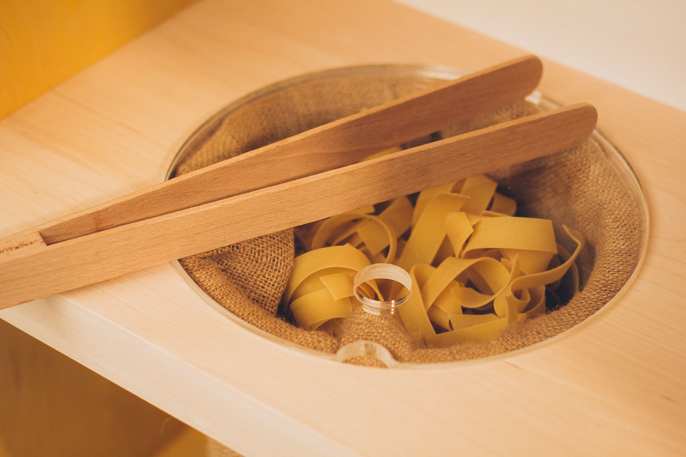
For the products that can't go into dispensers (like spaghetti), we included metal bins, covered with jute and provided some wooden pincers to take out and package the product.

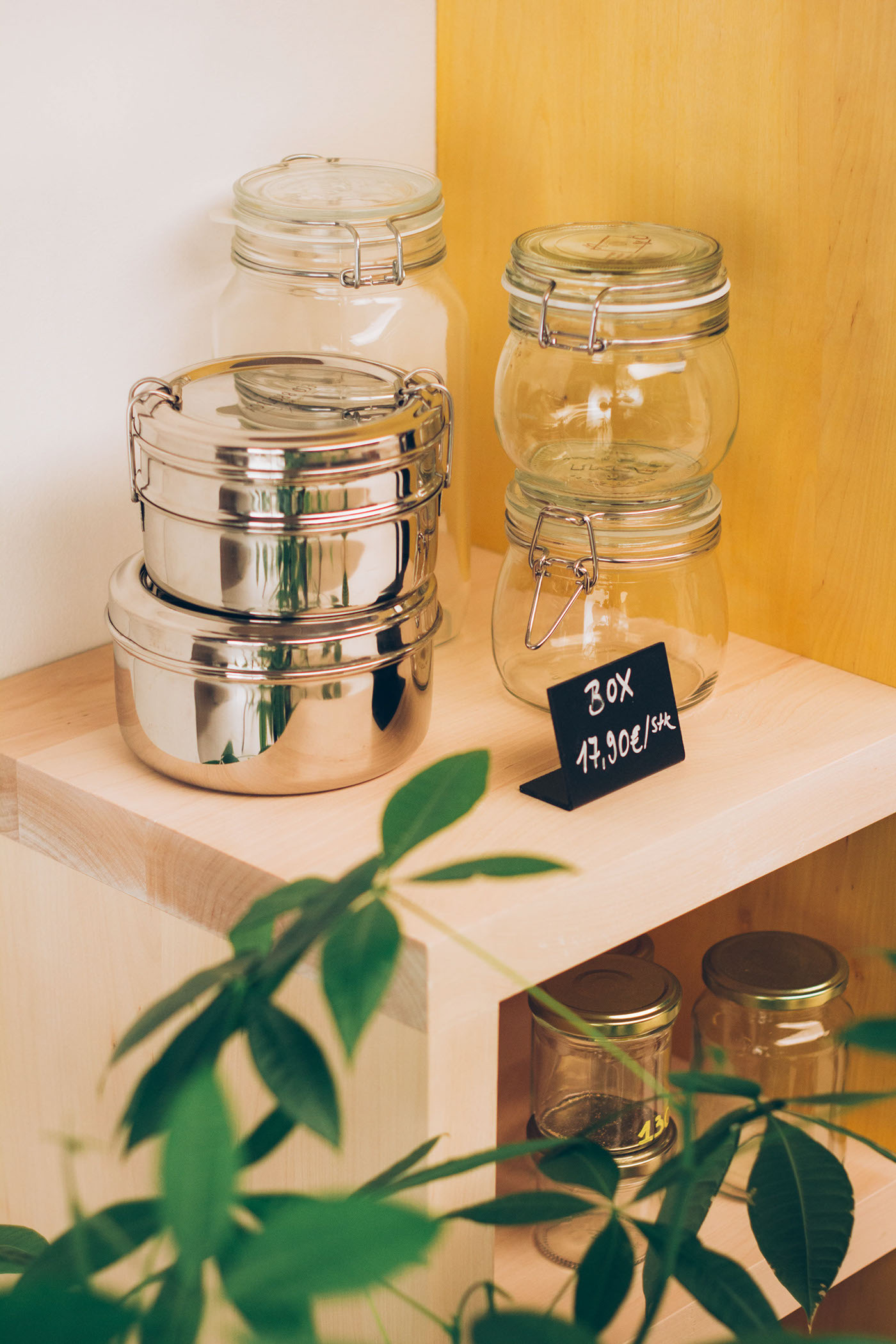
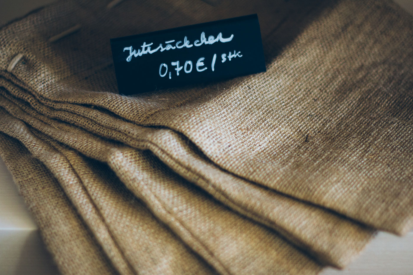
In order to shop at NOVO you either have to bring containers from home to fill in your products, or you can choose between metal or glass containers and textile or paper bags that are up for sale in the store.
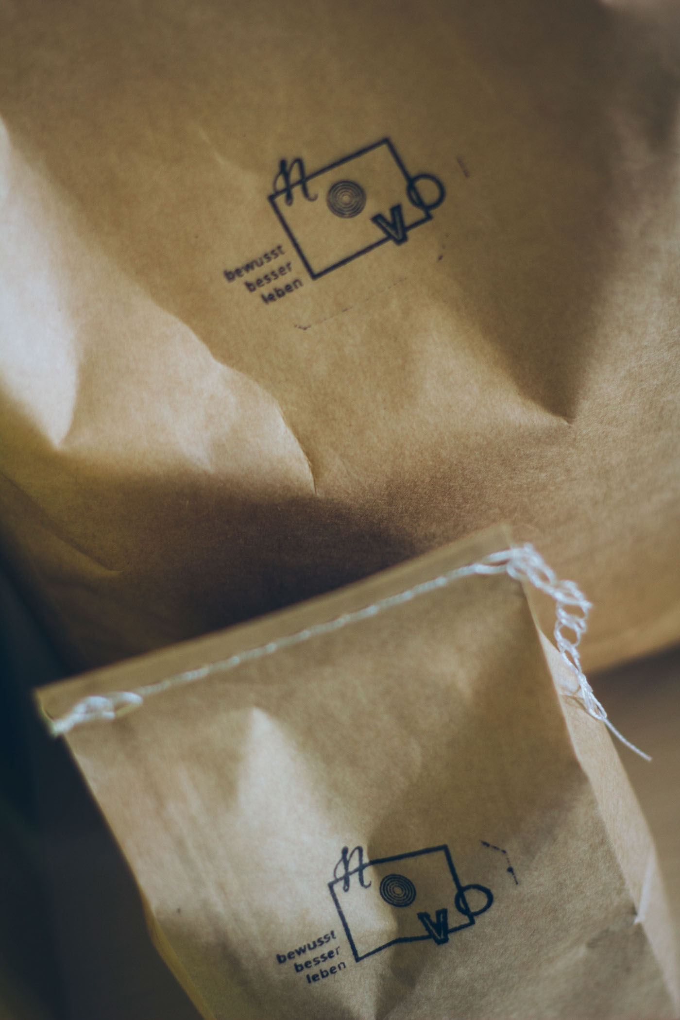
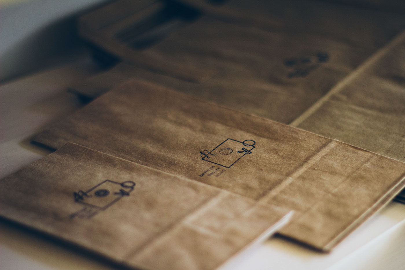
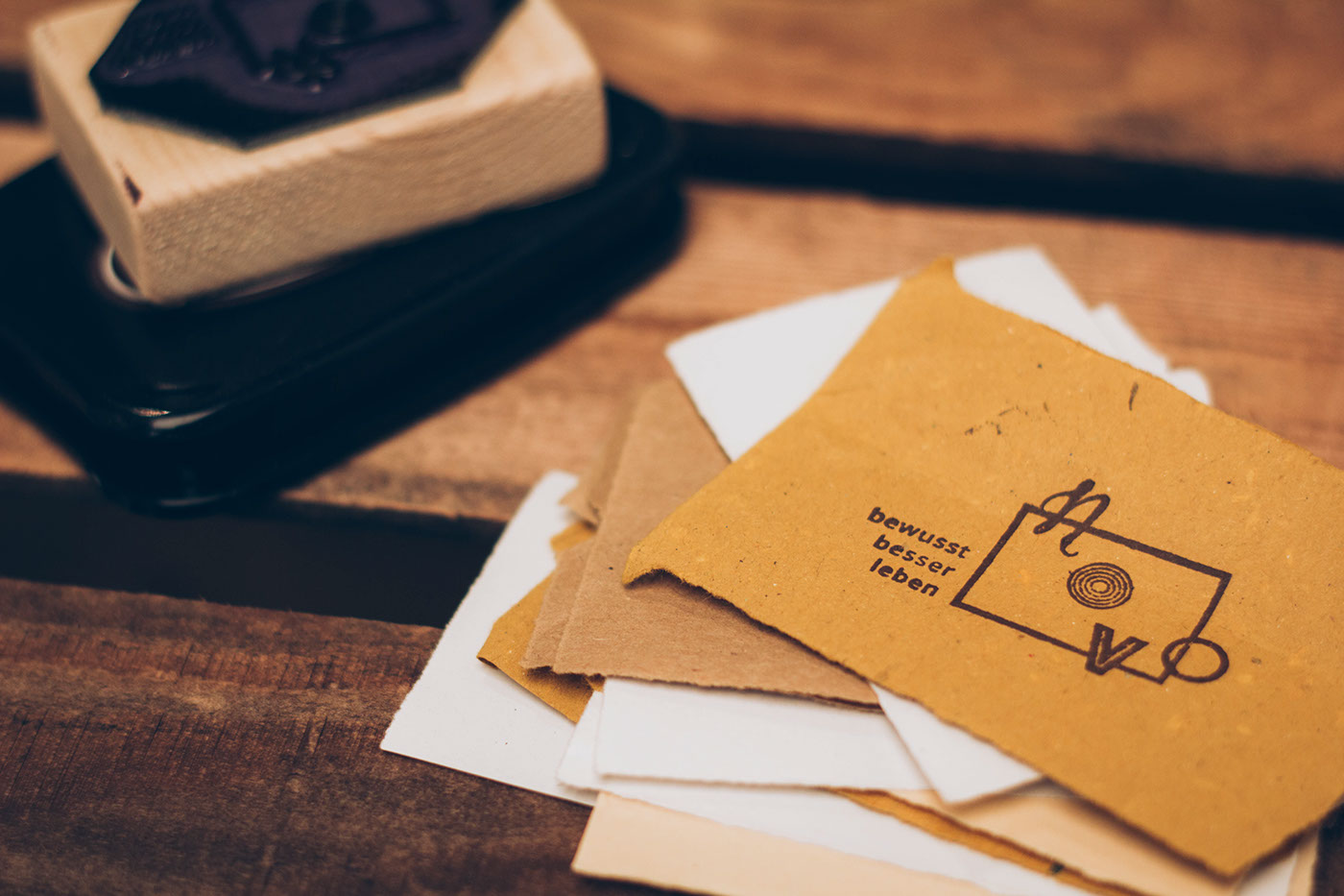
Following the principle of "Reduce, reuse, recycle" the packaging paper in which the goods are shipped to NOVO are re-used for packaging products as gifts. At the same time, business cards are also made out of recycled paper, using a simple one-colored stamp to print the logo on the cards.
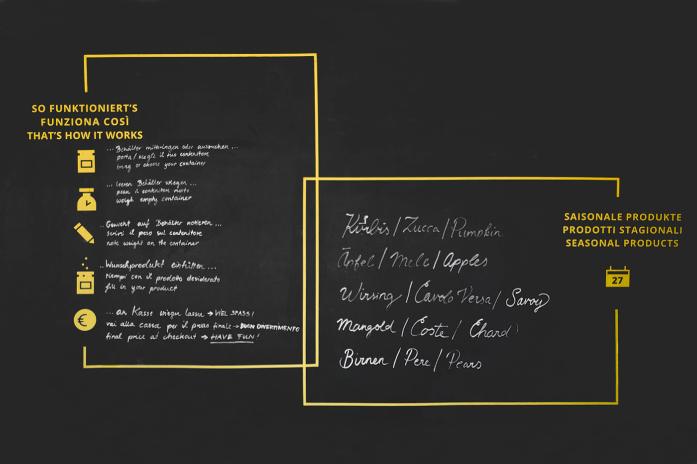
By defining permanent and temporary information in the store NOVO wants to be able to reduce or even completely avoid waste: Pre-defined grids are printed on the dispensers and can be written on with a black water-soluble pen. In case dispensers change products, the respective information is easily changed. Same goes for information on the walls: Seasonal information or a description how shopping at NOVO works are — again — divided into the permanent and the temporary part. A yellow frame, in combination with the headline of the section make the permanent elements that are plotted on foil and put on the chalkboard wall. Then, temporary information can easily be added by hand with a chalk pen.
A sketch drawing of how the store interior might look shall give an idea of the architecture and layout of the store space.

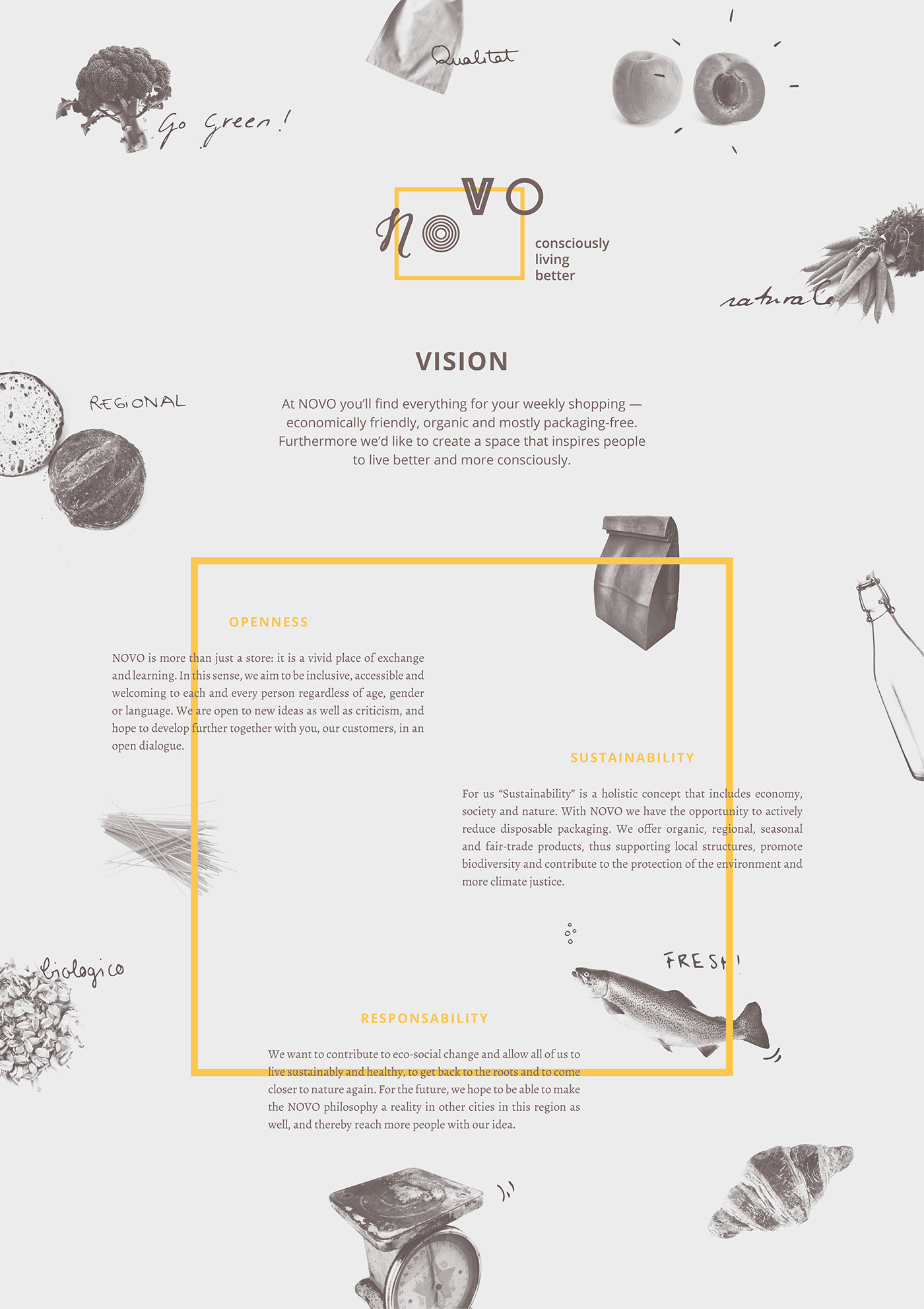
Together with the owners of NOVO we defined the 3 core values that will serve as the base for NOVO in an extensive brainstorming session: Openness, Sustainability and Responsibility. From then on we looked for ideas of how to translate those values into the reality of the store: A coffee and reading corner for the customers to have a break and rest for a while, multi- lingual store signs to include people of all nationalities, the connection to a vegan/vegetarian restaurant in order to create synergies regarding the use of food, a rent-a-bike service so people can easily transport their goods home, product signs providing important background info on the products, recipe-baskets and -cards to inspire people in how to use the products offered at NOVO, workshops — and many more ideas.
Taking into account the Open Source concept we decided to radically use Open- Source files and software during our process, but at the same time share all the knowledge we gathered throughout our research. We conducted a survey among packaging-free stores around Germany, Italy, Switzerland and Austria to get first impressions on what is important and notable when starting a zero-waste store. Furthermore we visited (in real life but also online) some of the already existing stores and gathered inspiration and concept-ideas on store interior, containers and packaging options, branding and visual appearance and communication strategies. For sharing this knowledge and supporting future packaging-free stores, we created an Open Source Project Timeline and a Wiki with all the gathered information.
A NOVO landing page was developed in order to start communicating publicly about the future store. There, the user can find some info on the basic idea behind the shop and the story of its owners, and has the chance to sign up for a newsletter. That way NOVO can start building a customer base and communicate more directly to people. The webpage is fully responsive and thereby accessible and barrier-free: it can be viewed on mobile devices as well as on tablet or computer screens. The site is multi-lingual and available in Italian, German and English.
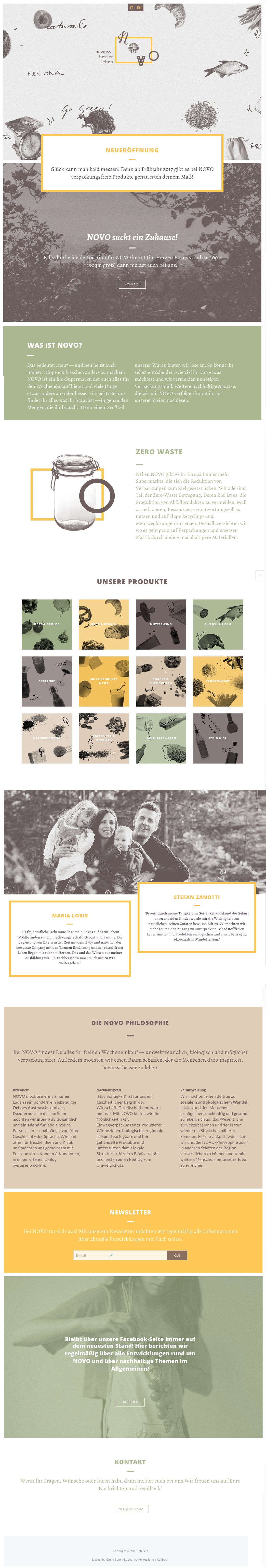
The visual language is based on four main colors: yellow, green, brown and beige, which can be used in different opacities. Other graphic elements include realistic, open-source photographs of products, in combination with handwritten and handdrawn elements. Together with the defined typefaces "Alegreya" and "Open Sans", we decided to use openly available typefaces as well.

A lttle booklet summarizes the project and gives people an overview of the scope of the entire project.


For its Kick-Off in 2017 we wish NOVO all the best!
Feel free to get in touch if you have questions on the topic or our design work!


