

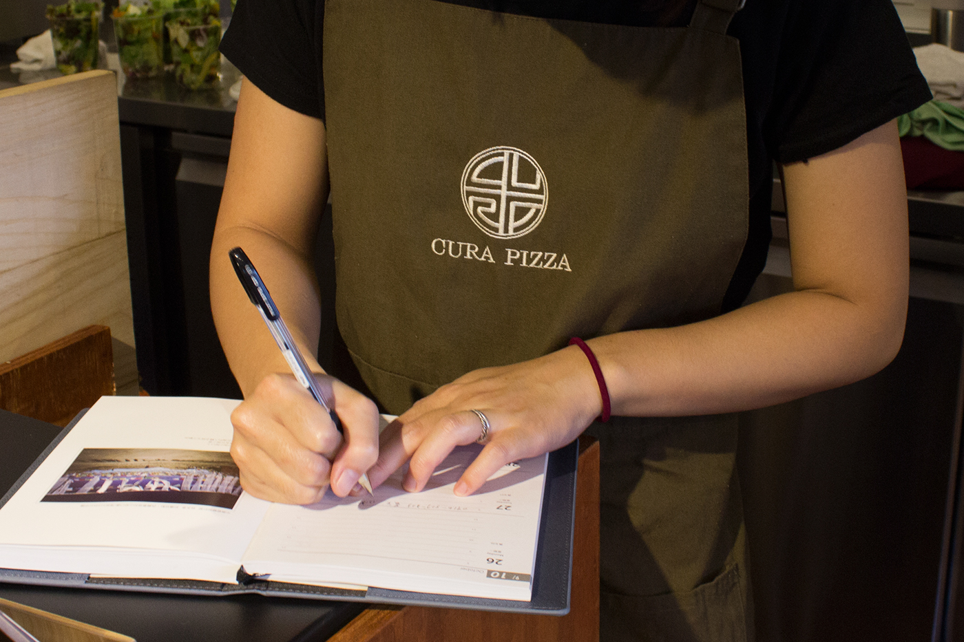
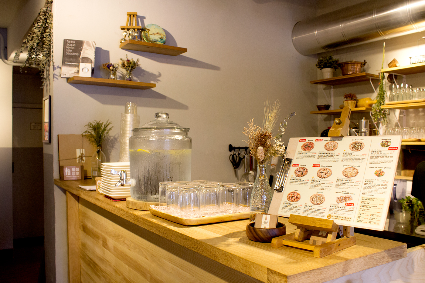
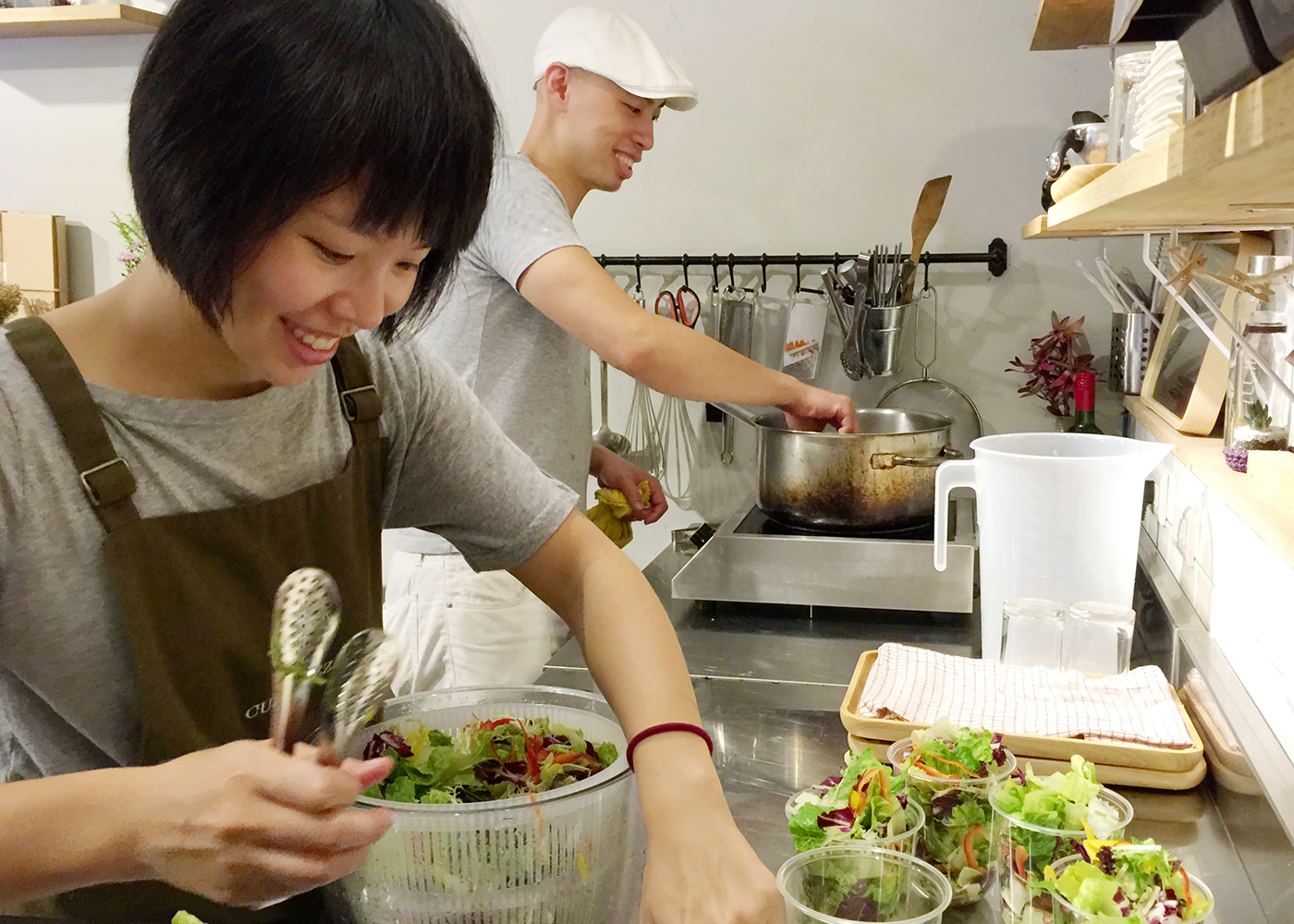
CURA PIZZA, Taipei
Art direction:Bohan Shih
Design:Bohan Shih
Menu Photography : Nathan Chen
Client : CURA PIZZA, Taipei
-
August. 2016
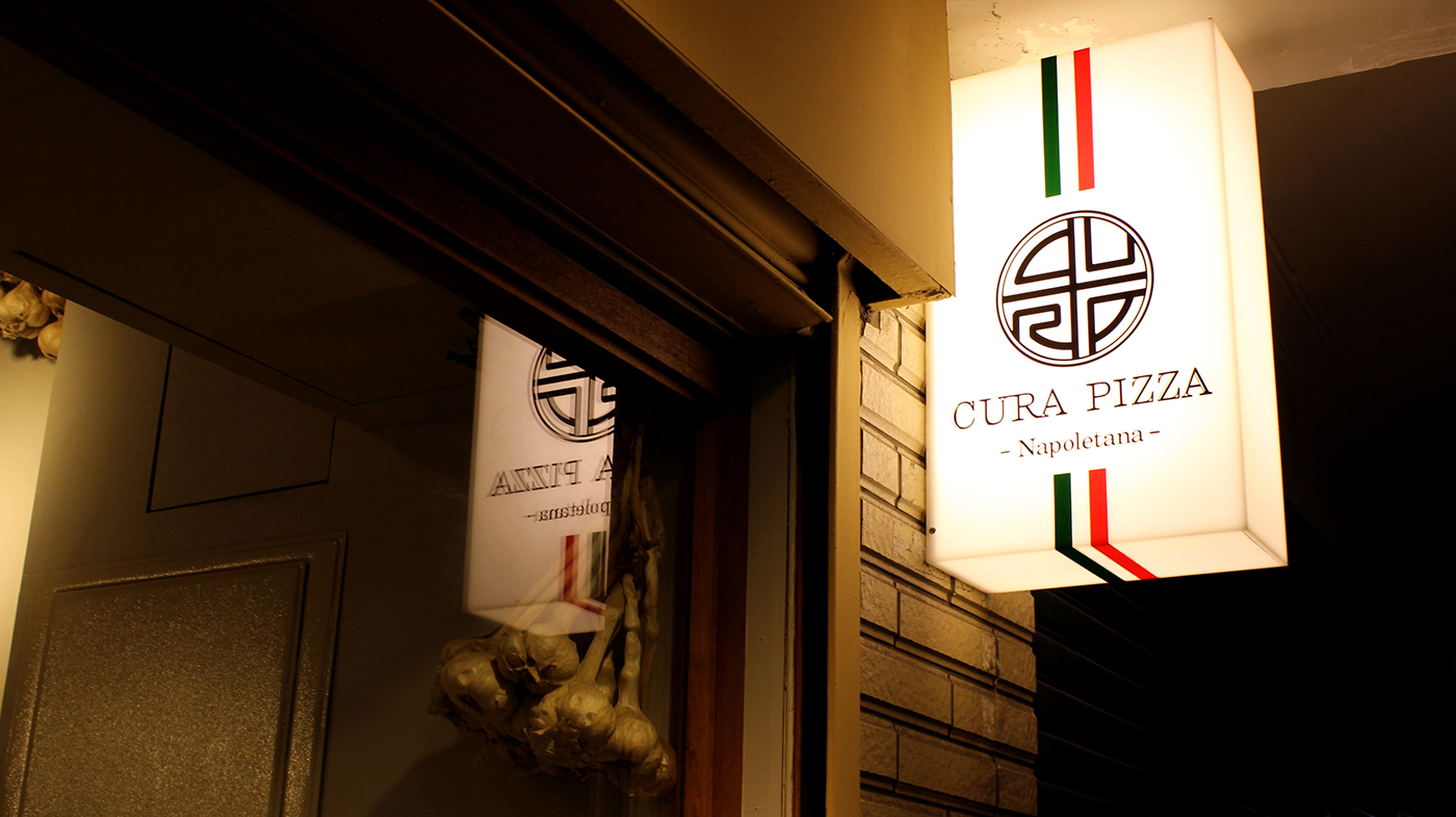
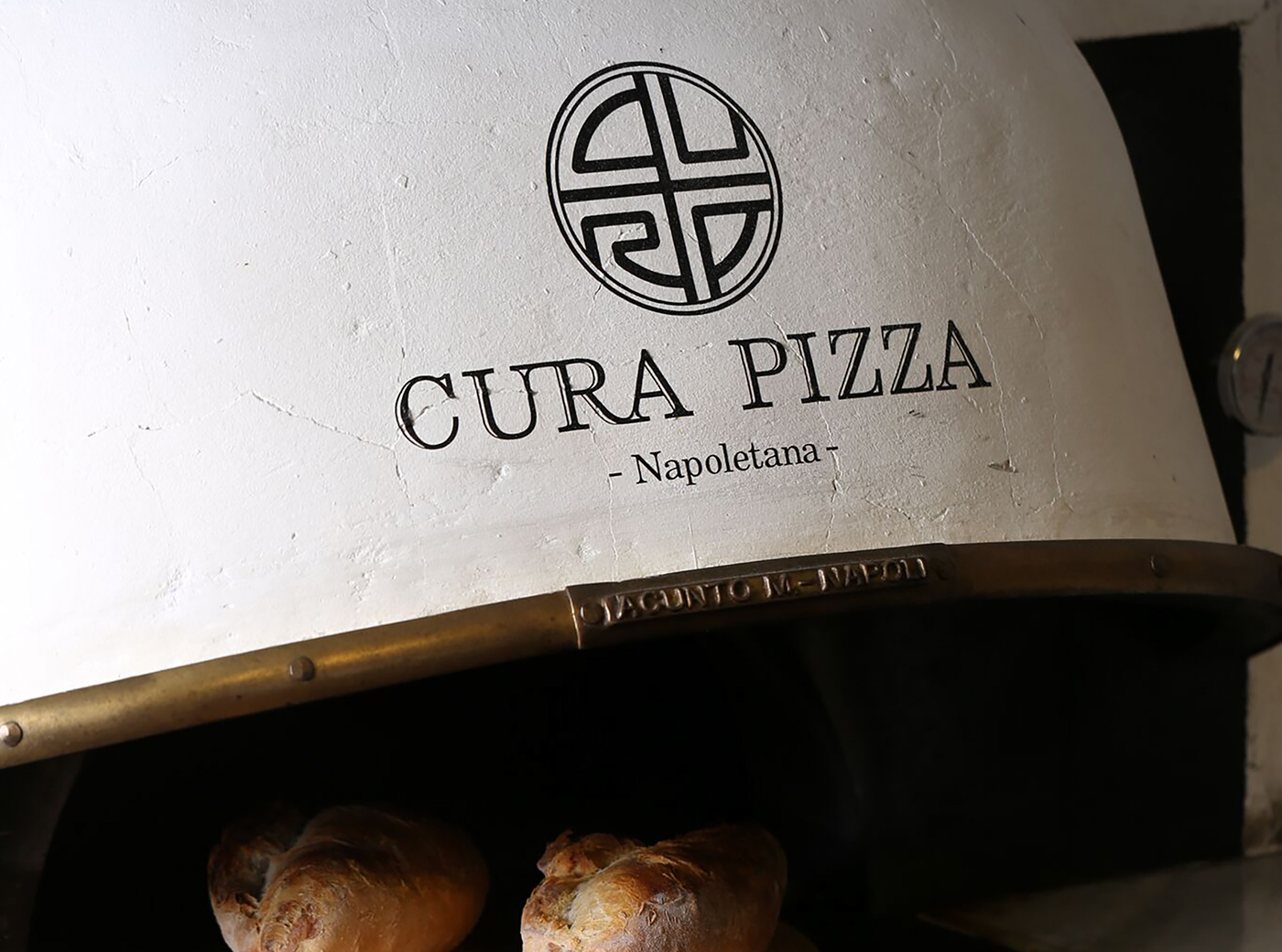
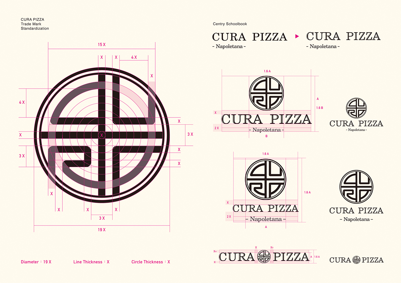
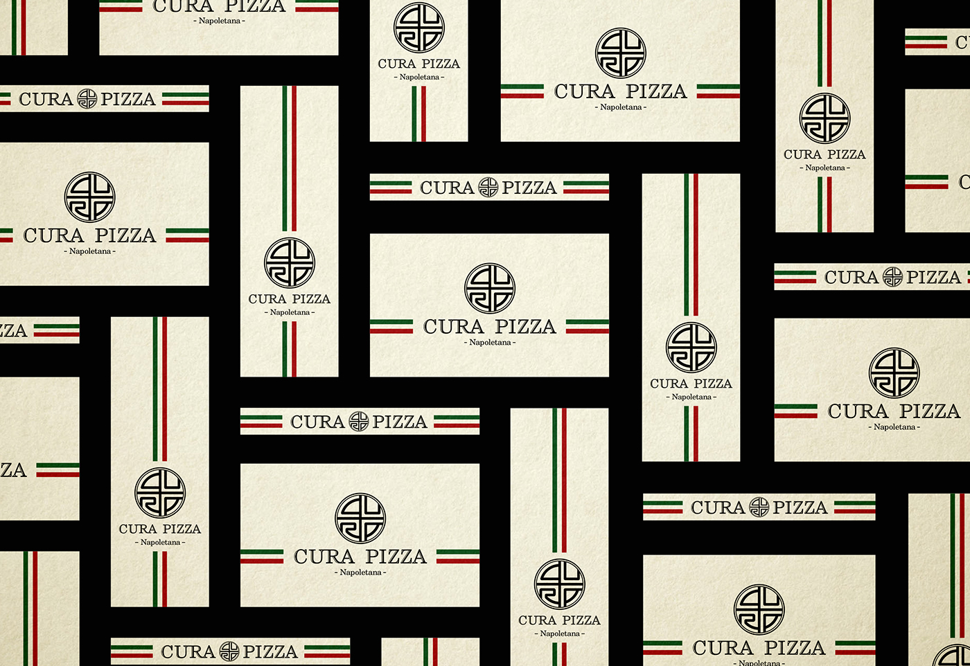
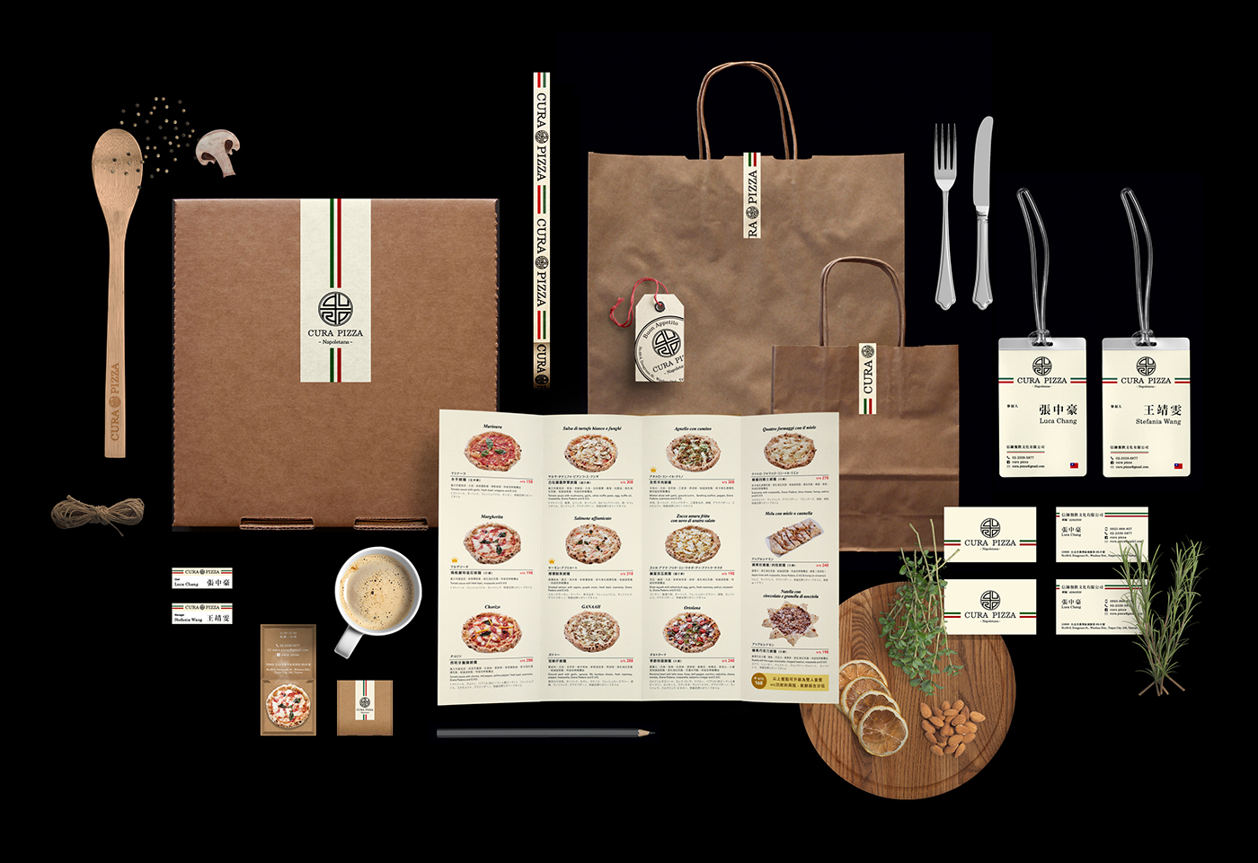
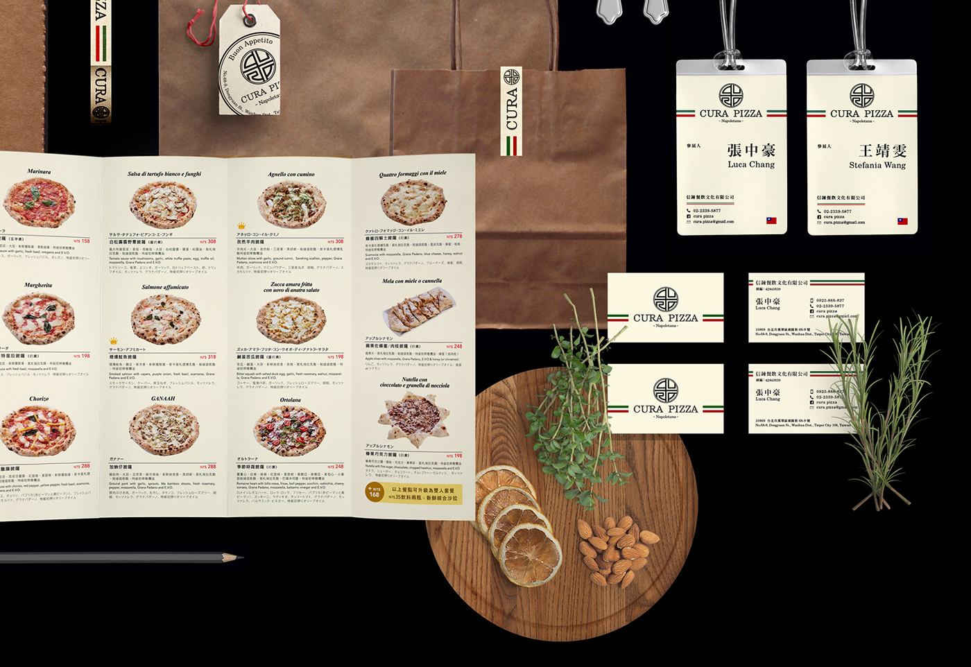
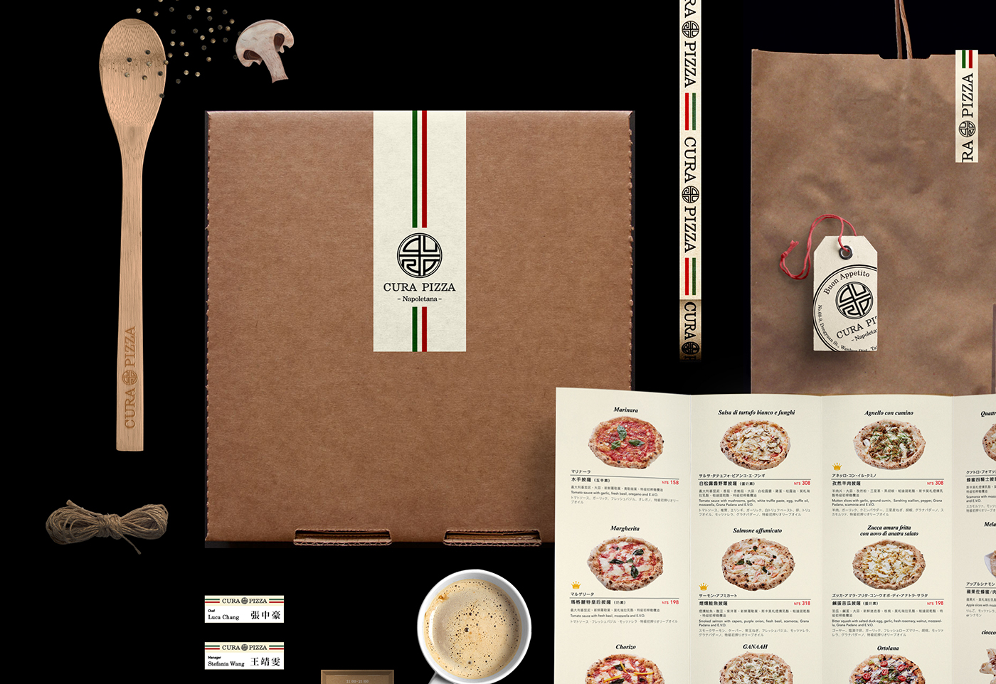
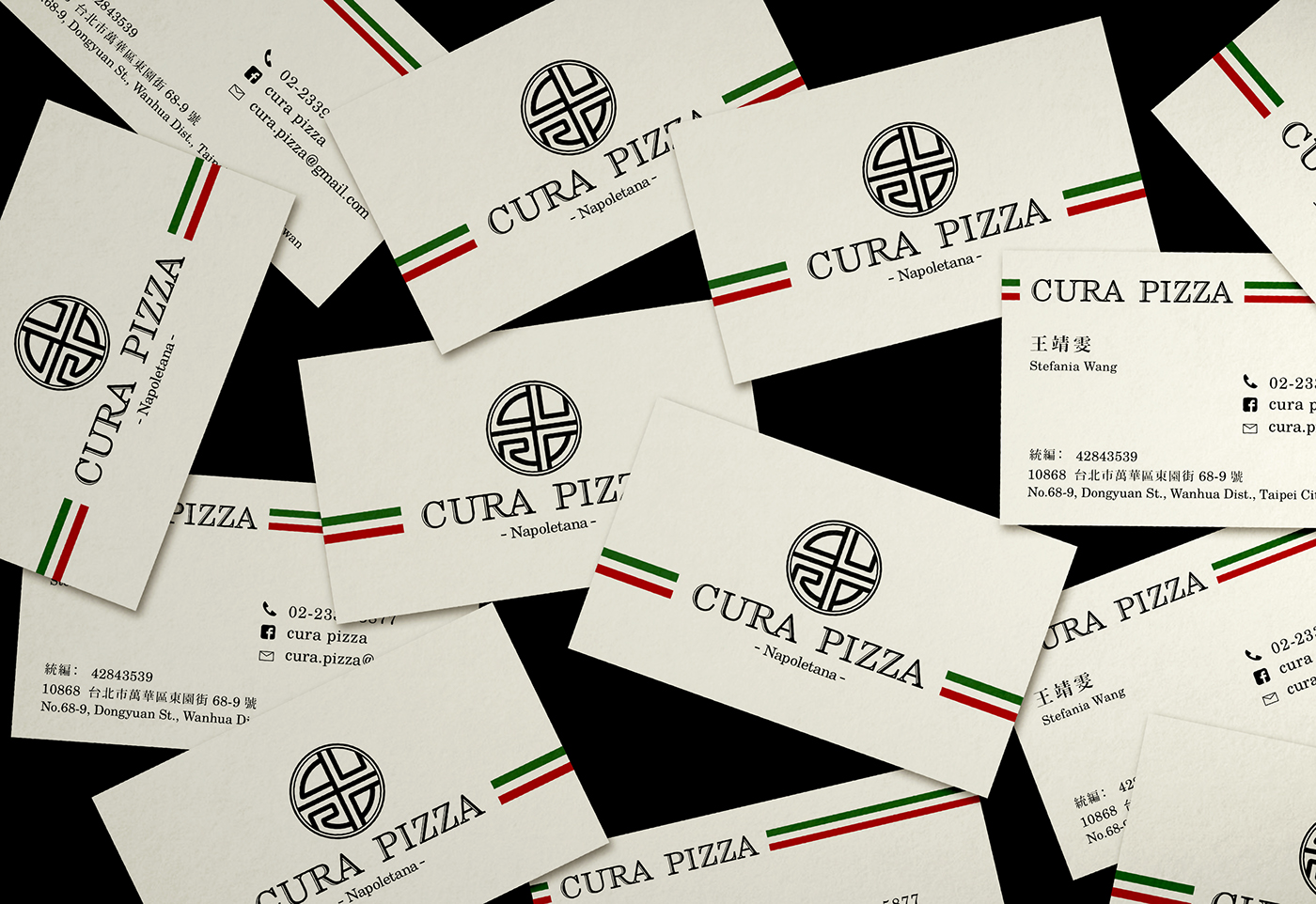
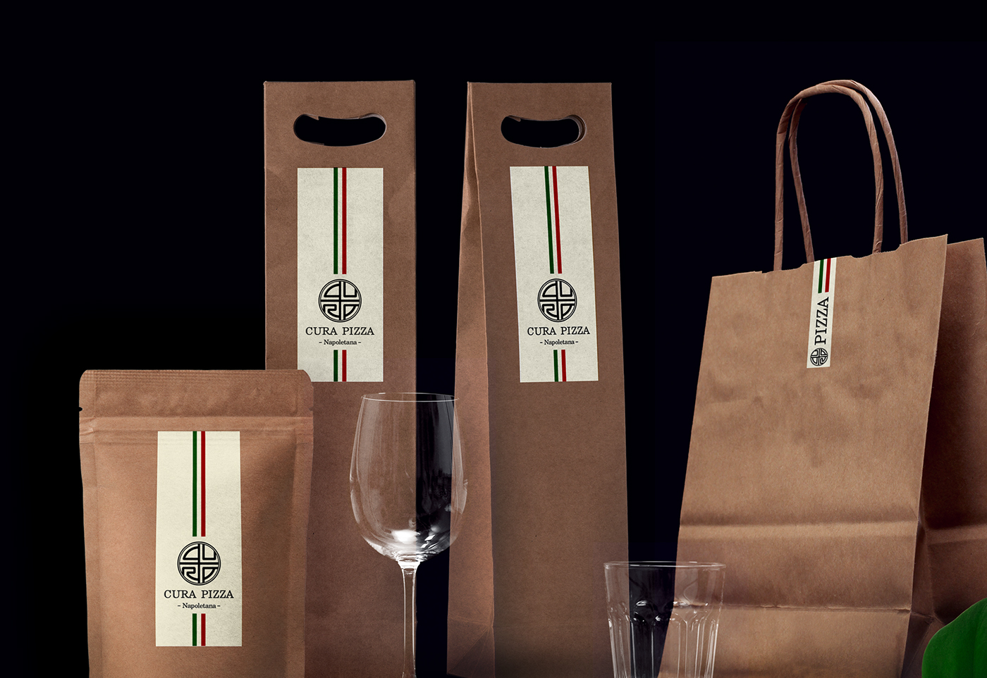
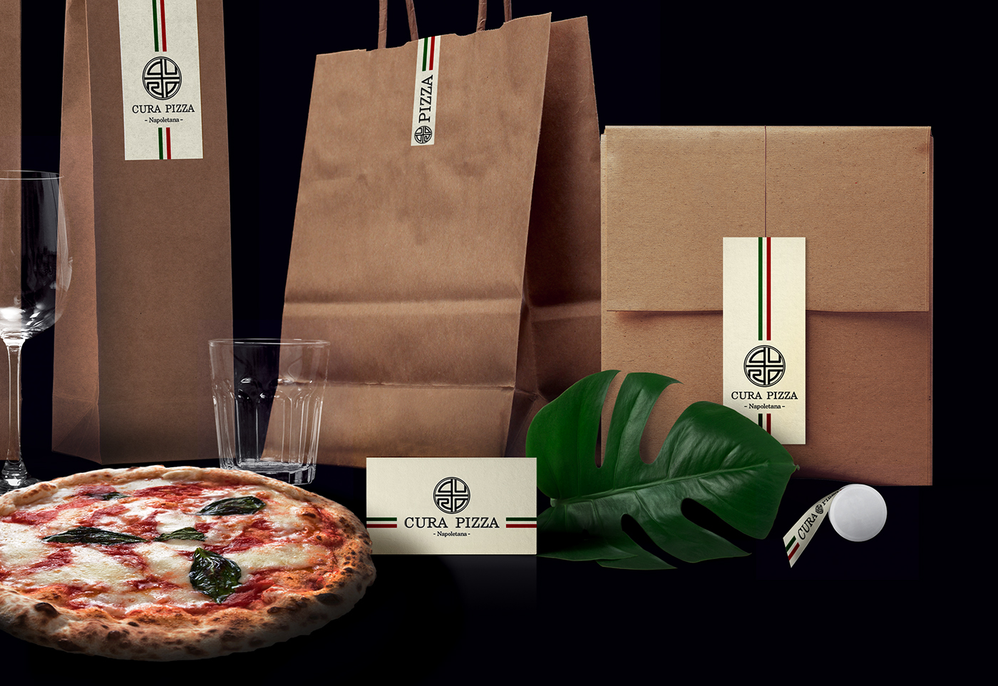
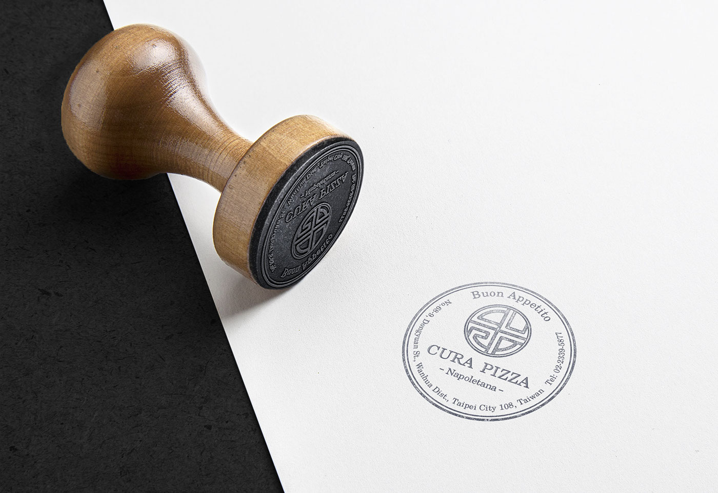
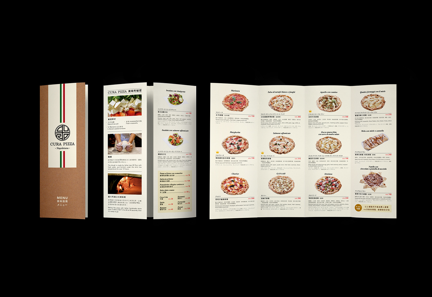
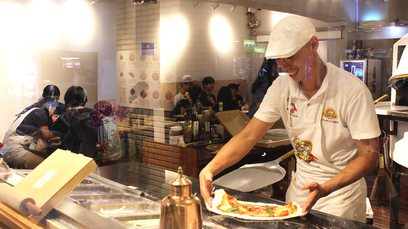
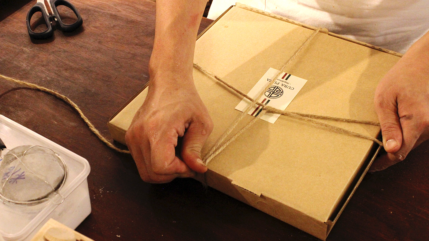
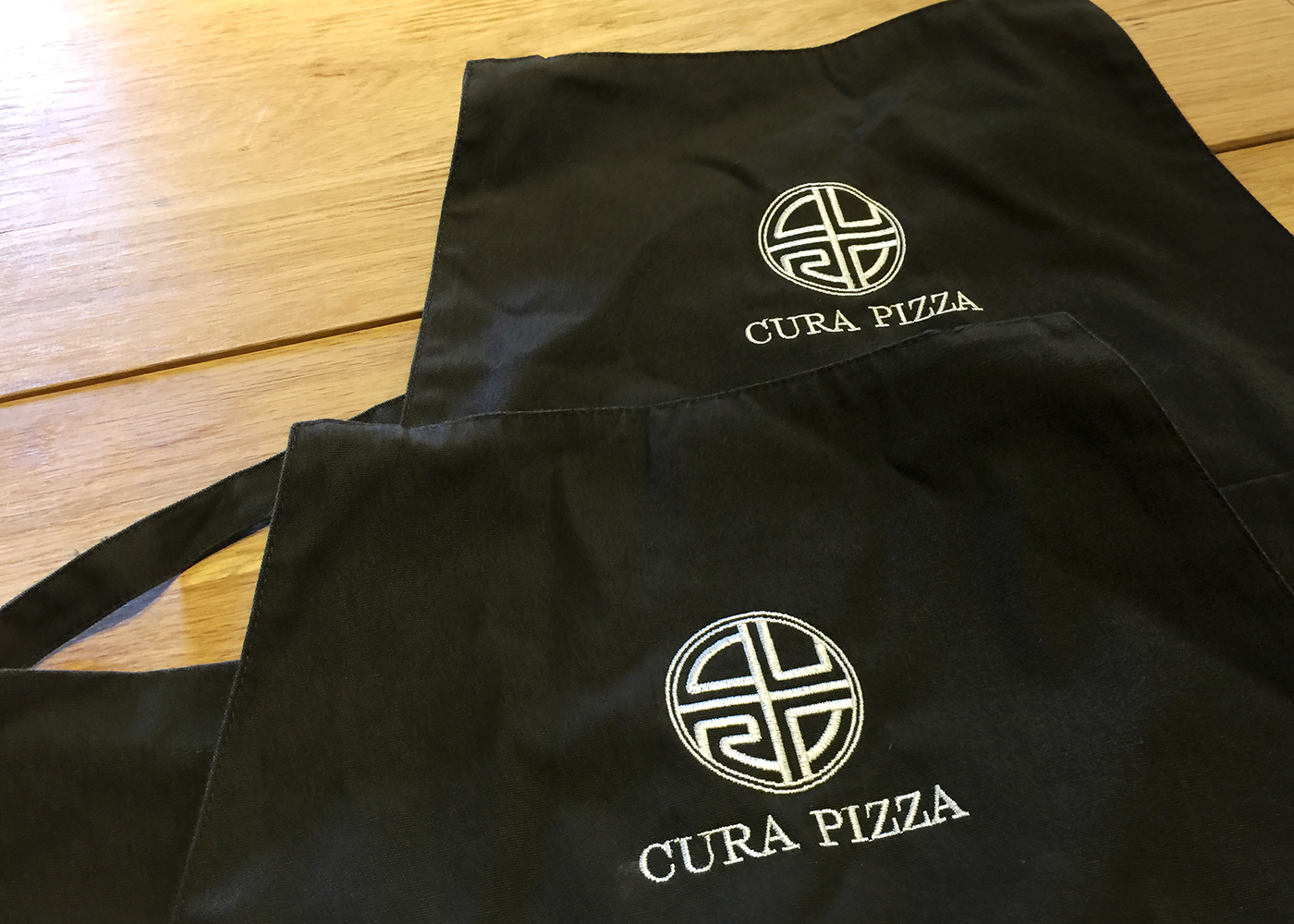
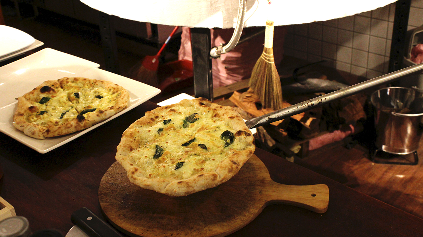
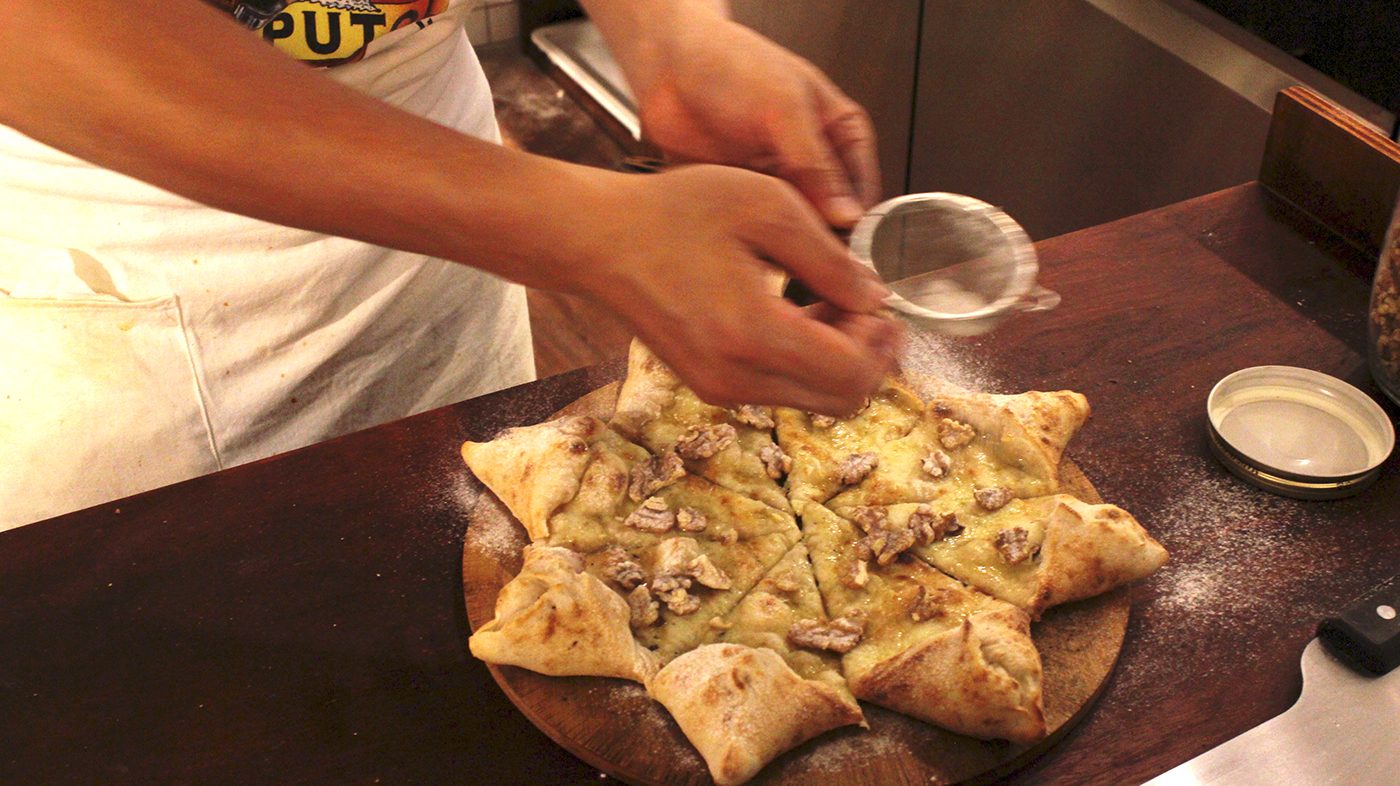
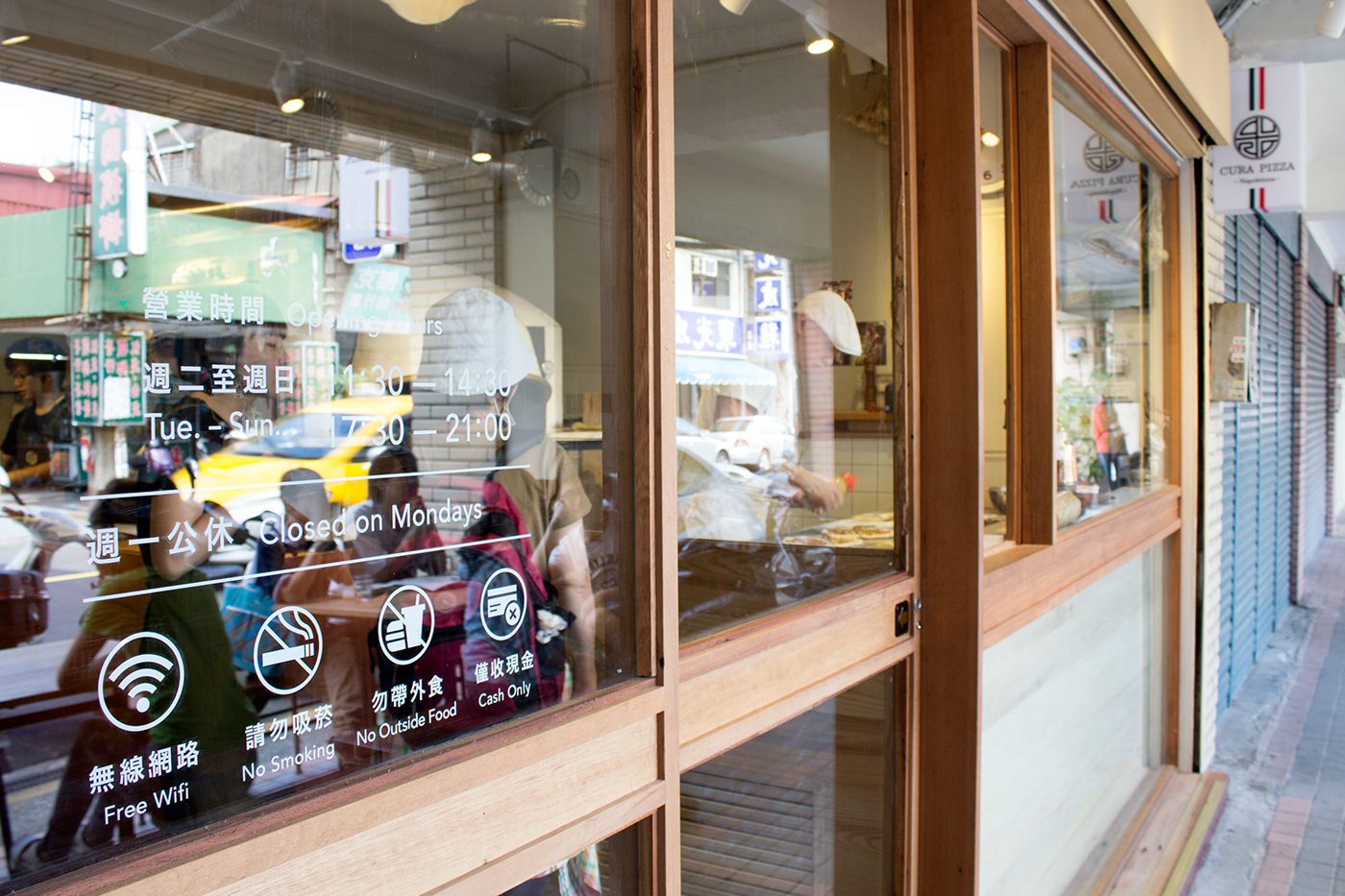
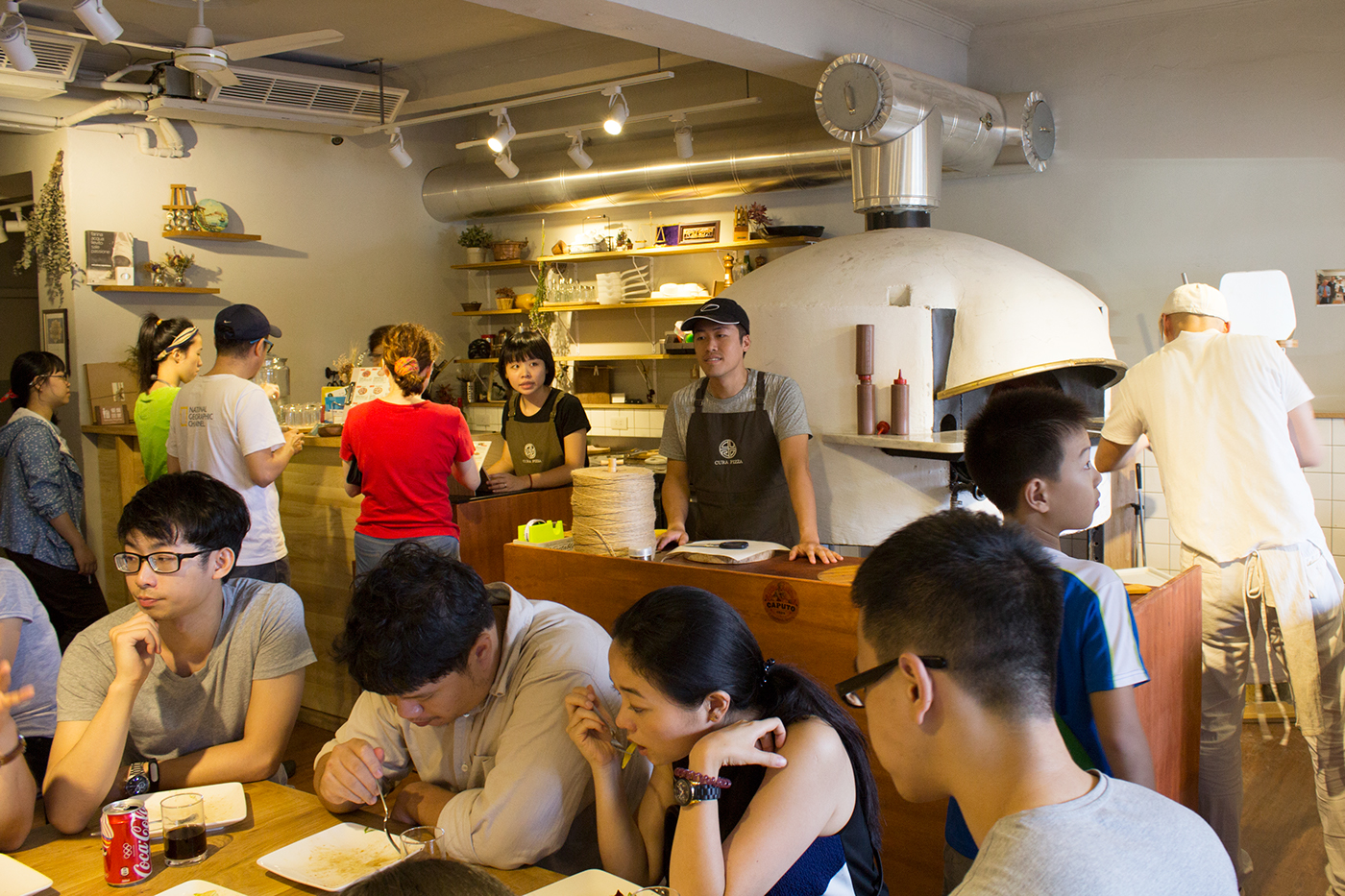
CURA PIZZA 位於台北萬華的東園街,此地舊名「加蚋仔」,有別於大家熟悉的「艋岬」地區,這裡早期以出產茉莉花與麻竹筍曾繁華一時,創辦人經歷了自己家鄉由繁盛逐漸沒落的過往,決心回到當地為這個舊社區注入活水,而「CURA」為義大利文「關懷」之意,代表著創辦人對於自己家鄉的關懷。識別圖像將CURA四個字母與「東方漏窗」的意象做結合,體現出異國文化同時也融入在地風情。創辦人曾遠赴義大利與日本研習進修,並引進義大利進口百年品牌石窯,以龍眼木柴燒,將南義大利拿坡里式的道地美味完美重現。
Cura means “care” in Italian, it’s the central idea of the founder’s business philosophy ( Cura è l'idea centrale della filosofia aziendale del fondatore ). The four letters CURA combine with the image of eastern lattice window in order to reflect the exotic culture and merge into the local customs in the mean time. The founder has been to Italy and Japan to improve his techniques, and imported the Italian hand-made wood fire oven of the brand over 100 years. Using the Longan wood to light the fire, Cura Pizza reproduce the authentic Neapolitan flavors.
CURAはイタリア語で心遣いという意味、これは創立者の経営理念である。シンボルマークはCURAの4文字と東洋の透かし彫りの窓で組み合わせ、外国文化及び地元文化を実現する。創立者はイタリア、日本へ研修、イタリア製の百年ブランド石窯を導入、サカキを焼き、ナポリ本場の美味しさを完璧に再現した。


Thank you.


