


It all started one fine day,when our door was knocked by ... Robin Hood. Yes, that you can call Letyshops CEO. The service that work to return the money to the people who make purchases on the Internet. We have worked with them to create advertising infographic, but now the much more serious problem was standing in front of us.
The fact that the pace of growth of the number of the service users began to rapidly decline, which caused management’s worries. Therefore, we were instructed to identify the causes of this trend and eliminate them.
A cursory analysis of the industry confirmed our expectations: users simply began to end. As it turned out the audience services, like ours, is very limited. That’s why we got the question: how can we attract new audiences, where it would seem no audiences left?
A little thought, we decided just to ask the users. At the same time, we could make a person, which, as practice shows, one way or another will come in handy in the future. Problem, as always was on the surface and it is a set of activities:
— firstly, we could not avoid the attention of users of mobile platforms, who were unable to use the service,
— secondly, we had to take care of those who already have been with us. We decided to do so, so that they never forgot about us and about the use of cashback. To do this, we have made an extension for Chrome, or developed new email templates.
But first things first.
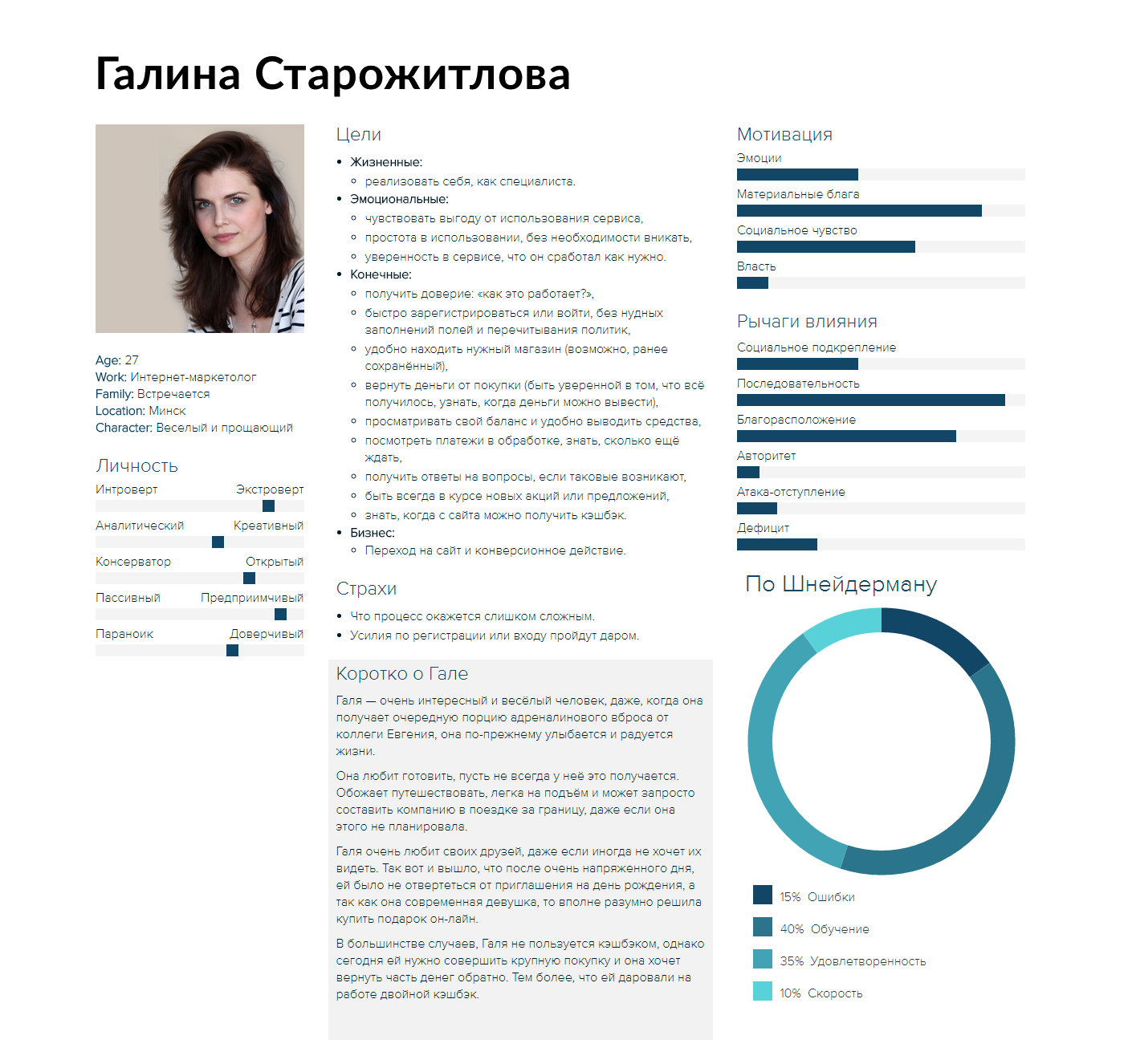
As I mentioned, interviewing users of the service we have received not only an idea of what we need to do, but also decided on those for whom we do it.
Meet Galina.
Mobile version.
When we decided we need to embrace the mobile market segment, we faced a choice: how to do?
Of course, we did not know anything about the progressive web apps, so the choice consisted of a mobile application, the current design alterations to make it responsive or creating a standalone mobile version. Each of the variants has both advantages and disadvantages:
— Mobile application would work quickly, could use the platform capabilities (geolocation, file storage),but at the same time would have cost a lot of time and money, both the development and the support. And it’s need to be installed on device, so it’ll cost much more user attention and motivation.
— Mobile version would cost less because the number of platforms would be reduced to two: all mobile and all desktop users. At the same time, the possibility and speed is also limited by web.
— Finally, the responsive design was one of the most desirable options for us, because then we would be able to alter not only the mobile part, but also the current design to make it more convenient and better meets the goals and objectives of the users. Of course, it’ll cause a budget blow, as this would mean the redesign of the entire service. But cost of support would be minimal.
We presented all of these ideas to the customer, we were surprised by how strong he was attached to the current design and a result was needed as soon as possible. As you might guess,a variant of the mobile version has been selected.
Well, it's time for some paper prototypes :)
Paper-first approach guaranteed, that you'll not put too much affords in things that will be thrown in a trash bin.

When we thought, that service formed its shape, we began a b/w prototyping phase to test navigation and main concept. This test showed us main problems, that need to be solved, before we began to make a colorful detalization.

So, even within that limit frames great work on the mechanics of the current adaptation for the mobile platform has been done. See for yourself.

Of course, the pictures may not reflect the mechanics in action, so we have prepared for you an interactive prototype.
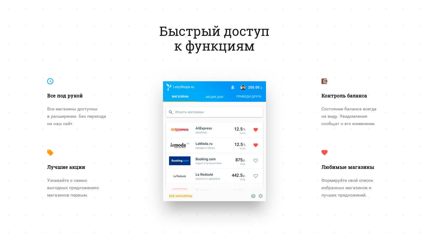
In addition to the mobile version, we have proposed to focus on the people who are already using the service to make their lives easier and their attitude to our service more loyal.
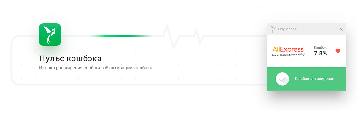
It is very handy person that we created on the basis of an interview, she told us what to do, where the service has problems. In particular, the main purpose of extension became one of the ultimate goals of the user: you always know whether you can get a cashback from site.

Modification was not over. As it turned out, when the layout was almost ready to work, we found annoying limitation: it turned out, using a given height of extension was very hard (had to use ingenious hacks, that do not always work), because the extension had to "enter" in the dictated google height. As you can imagine - it has entailed reworking all extensions screens with the new standards.

Actually, this is what we have in the end. We believe, all the goals of users are considered, so that problem is solved. Here you can find a prototype.
Creating an extension - that's fine, and at the same time, it is useless as long as the user does not install it. And get him to do this difficult task, because no one lift a finger unless he is convinced that the benefits justify the time spent.
In fact, to bring the major benefits of the extension, we have created a special Landing-Page, which would inform users about them. Сreating it, we did not want to get a dry feed, so we try to guess the sequence of questions that may arise from the user. That we could get some kind of a dialog between him and site. So we do not insist on the installation, but help user to come to this decision himself.

Landing is aimed at people who already know what the cashback, but also those who saw it for the first time will be able to learn more. Landing had the old version, needed to rework to solve the above problems.
It was necessary to develop a new way to make this theme clear for user without losing the main benefits of the old version - comprehensibility. The extension is focused on ordinary people, not professionals. Therefore we need to make it as understandable as possible.
On the Landing we tried to focus the user on the most important things. To do this, we use the large and exaggerated image.
Visual effects, such as divergent circles, the centers of which reinforce the emphasis on the most interesting things.
For clarity and demonstrating modes of expansion (which are its advantages), we used the animation, they are also a powerful tool for attracting attention.
We came up with an apt metaphor for the creation of interesting and clear presentation of the working conditions.
Another important advantage — the basic functions of the service aggregated in the extension, it is an important point, because users no longer have to remember to visit the site. We still used the above techniques and metaphors to demonstrate it.
And of course block with feedback from chrome-market, in the case of browser extensions is a very important element, important for people to know the real responses (this is key, since they are loaded directly from the chrome-markets) on the usefulness or uselessness of the fact that they are offered to install . We know that our extension helps people, so do not be ashamed to show and rating.

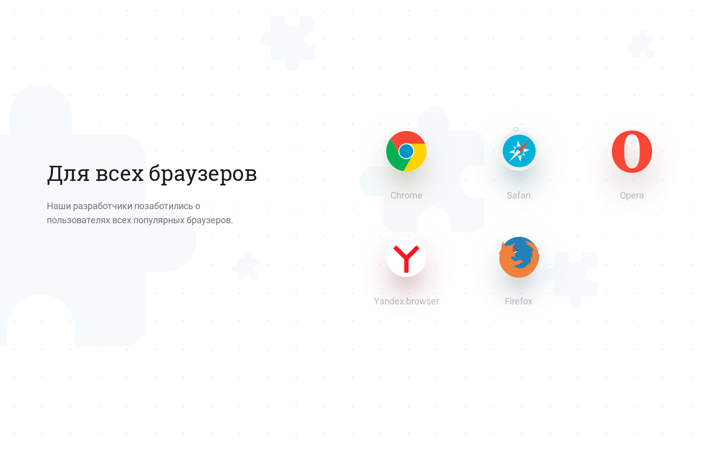
We display the number of extension installs, which gives even more clear understanding that reviews are not a hoax. Few technical (but not less important information), giving to understand that the extension is universal.
And the final CTA unit for users who just have "ripe" for installation.

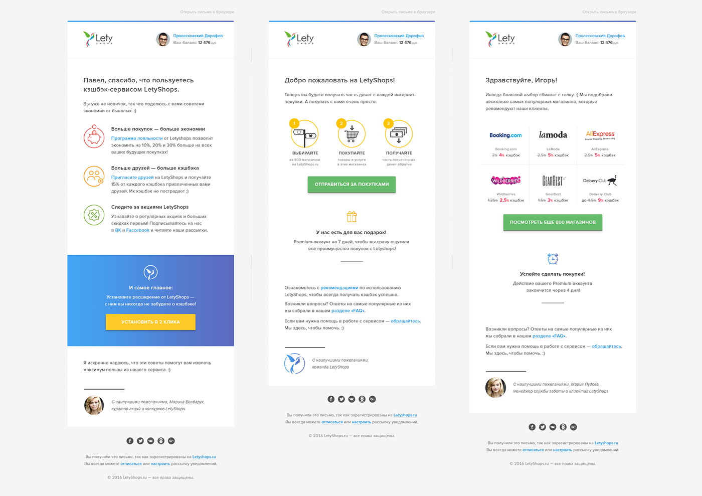
Last (but not least), what I would like to stay — it's a new email templates that have been designed for the project. The fact, the letters are the main way to communicate with service users, to inform them about the new stores are connected and motivate then for further use.
Quality use of such a powerful tool as e-mail delivery was simply impossible without alteration patterns because they were just awful. The lack of intelligible structure disregard all the rules of registration and unpresentable appearance deterred users so that they are added to our address in the spam.
The situation had to change, and urgently. So we born to the light completely new patterns in which the main focus was exclusively on useful information.
What I would like to say in conclusion?
Probably the most important thing that we have learned from this project: sometimes redesign is not a panacea for the problems facing you. We must look at things from a different angle, and then the solution seems simple and elegant.
Thanks for watching and for reading to the end.
PS at the moment the mobile version is not implemented because the customer review its decision on the redesign of the entire site and the creation of its adaptive version. Maybe next time we'll have a progressive web apps.
Good day :)


