Occulus is a Singapore based coal trading company, which is continually looking forward to opportunities which enables them to venture into new domains that can bring profit to the company, and a positive change to the society.
Brief
We were required to develop an identity which embodies the entrepreneurial nature of the owner and the company. A logo which stirs up curiosity and becomes a memorable talking point but holds no connection to the coal business or any specific domain.
Solution
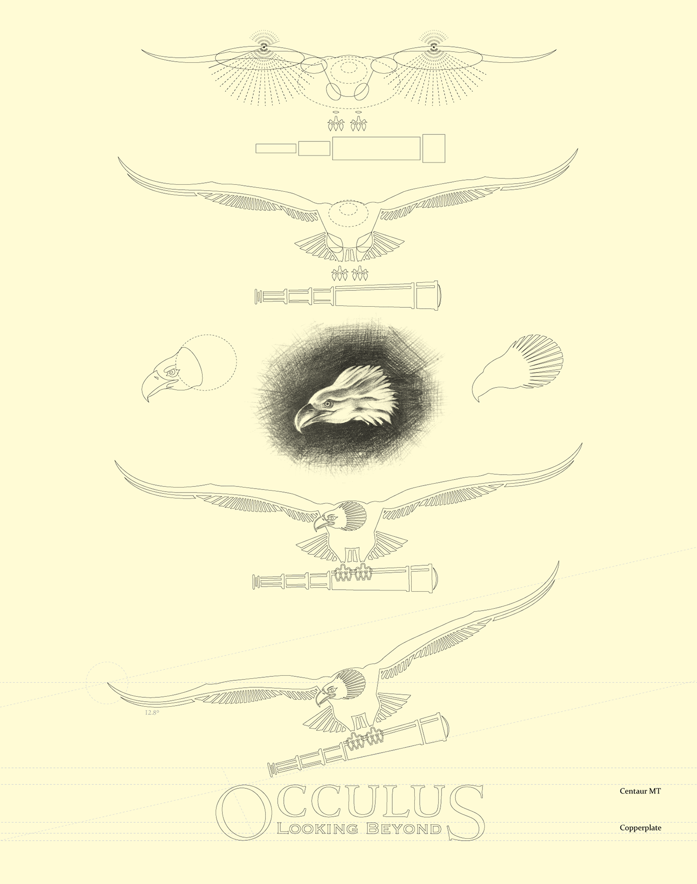
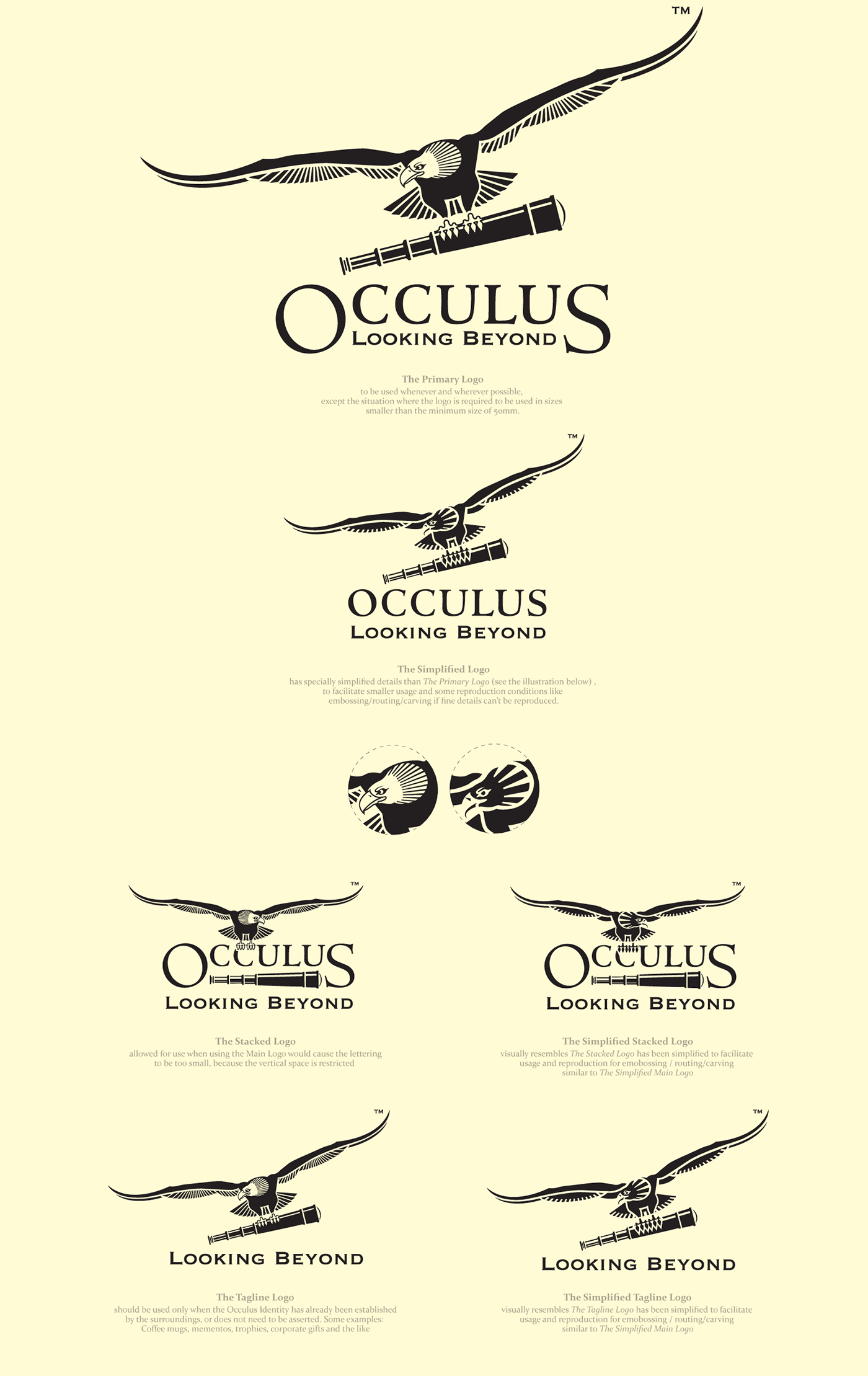
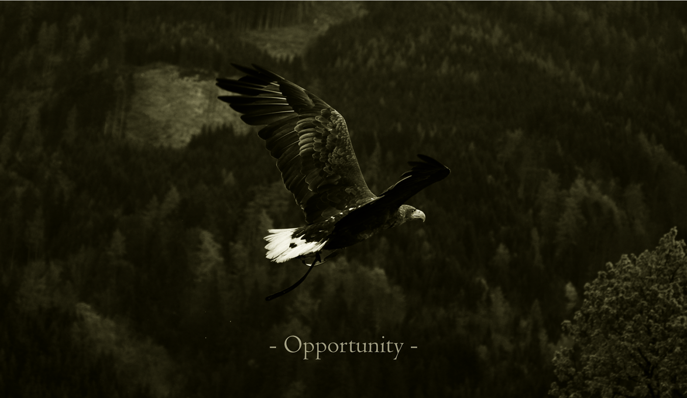
Occulus is an altered spelling of Oculus meaning a round or eye-like opening in particular a circular window or an opening at the apex of a dome. The name encompasses the promoter's belief in the strength of the holistic vision. I chose “The Flying Eagle” as a metaphor for the ongoing lookout of opportunities across the horizon while the telescope adds to the metaphor of a broader vision. The amalgamation of these two symbols embodies the entrepreneurial nature of the organisation and established the brand idea of "opportunity'' or rather "seeking opportunity"
Team
Work done for Itu Chaudhuri Design in 2014
Creative Direction : Itu Chaudhuri
Design : Kshitij Tembe