Overview
Tradevale is an online trading platform with over 80,000 growing user base and millions of trade volume daily, and on track to double by 2017. Tradevale manages their entire business operation using 2 different backoffice system to handle reporting, risk management, CRM, and accounting. The goal is to redesign the backoffice system’s overall user experience to reduce time spend managing the operation.
I was the lead designer for this project, overseeing the design process from start to end. From running the research, facilitating workshops, designing the information architecture to the final user interface.
The Challenge
Tradevale BackOffice system desperately needed a redesign to address a long standing problem of vast disorganised information, broken workflow and lack of visibility in the business to cope with their exponential growth. These issues resulted in long working hours for their employees and additional cost done by human errors. The 4 big guiding questions were:
• How can we Increase work productivity?
• How can we better organise accounting and content?
• How do we incorporate business intelligence into the product?
• How can we design less evil UI tables?
Research & Design Principles
Desk research: As I was new to the business, I started with desk research to build my domain knowledge of the online trading business before going down for in-depth user interviews, to ensure the sessions cover key topics.
User research: The user research objectives were to understand their vision, business goals, behaviours & painpoints and lastly the data we will be working with. One of the key artefacts from our research was the 4 key design principles, which we constantly used to guide our design decisions:

Empathy Mapping
After the research, I facilitated an empathy mapping activity to help synthesise the research observations and findings. Ultimately, by running this activity with the team, it gave them a better understanding (behaviour, emotion, experience) of our users through an easy to digest visual reference.

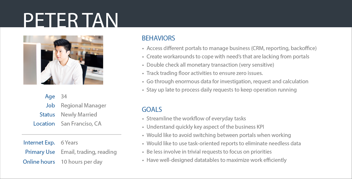
Persona Development
Based on the research and empathy map, I created personas to cover the perspectives of users in greater details. I often use personas to put people at the heart of the of my design process so that the product features would aligned with user needs and painpoints. Meet Peter Tan: Peter is a manager at Tradevale. He is frustrated with the work tools he uses daily, spending long period of time working around it to get things done.
Content Audit
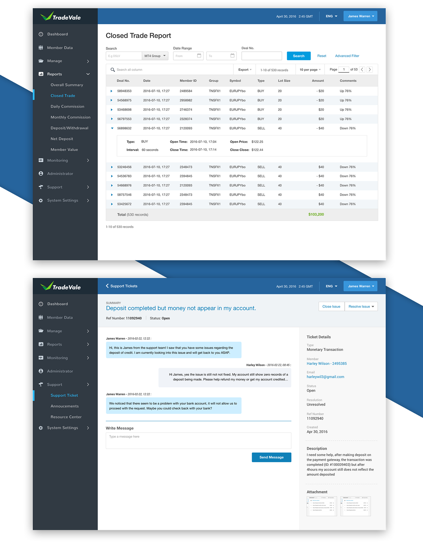
One of the main challenges was to turn the vast amount of data/reports into digestible, meaningful content with a clear structure. To learn about the true content needs, I looked at how the content was being organised and how each data is being used. By capturing key information and carefully designing the information architecture, we eventually reduced 18 different types of reports to 7 unique reports.

Heuristic Evaluation
An internal heuristic evaluation (Jakob Nielsen’s Usability Guidelines and W3 Web Accessibility Initiative) was done to identify most of the usability issues against established heuristic usability frameworks and best practices as the existing baseline was low. By identifying these issues, I was able to come up with different ideas to resolve them.

Task Analysis
By observing how our users go about doing their task on the existing platform, it helped me to understand what are the different steps they do in order to achieve their goal. I visualised this via a task analysis diagram to map out interactions, which surfaced problems and opportunities for improvements.

Envisioning The Ideal Flow
After analysing the current flow, I recreated the flow to depict how the user would seamlessly interact with the system by removing/automating steps to complete their goal. This diagram was shared extensively to the stakeholders for their inputs and we went through several iterations until we were satisfied with the ideal flow.

Whiteboarding Session
It was important to involve the product team in the ideation process, so we could cover different perspectives and create shared understanding. This also ensured that the solution we came up with are technologically feasible. Hence, I ran multiple whiteboarding session to explore potential solutions for all key interactions and user tasks. With constant input from the team, I was able to iterate and build on the ideas before spending more time to focus on a particular solution.

Sitemap
After gathering the “requirements” from the ideation phase, I began to map out the high level site structure via a top-down approach which I believed would satisfy our personas’ goals. I organised the structure (and pages) in order of usage frequency and workflow, and at the same time considering the whole system at once. The sitemap was also very helpful during the implementation phase as a tool to communicate with developers.

Sketching Multiple Direction
This is where the fun begins. After I have the elements defined (i.e. IA, data/functional elements), I started sketching to explore different layout and interaction variations. Sketching is also very essential to collaboration as I’d bring them out in front of the team to get their feedback.

Mid-Level Fidelity Wireframes
With the assurance from previously selected design sketches, I went on to create digital wireframes. These wireframes would represent the flow and elements for each screen in greater details. Due to time constraint, I opted to use these wireframes for user testing, hence we added real copywriting (no lorem ipsum!) and data to keep things as realistic as possible for our users. This level of realism would make the progression to visual design a lot easier because it allows me to focus on the design language.

Rapid Prototyping: Wireframes
We used the already designed wireframes to test our design with the end users. The process was similar to paper prototyping (complete X task, talk out loud, etc..) but with mid-fi wireframes it enabled us to drill down to ask more details.

Final Design
I synthesised the findings we got from user testing and came up with design fixes for the issues found. With the list of design fixes, I jumped straight into visual design to avoid wasting time adjusting the wireframes.
The outcome: The redesigned BackOffice system provided a highly efficient workflow and better organisation with content available in a well-maintained archive. By streamlining the reports from 14 down to 7, the users could quickly and easily access to important data. The visual design combines consistency and beauty. Using repeatable patterns allows users to recognise familiar experiences, and the modern appearance purposefully balances high information density with readability.