


Scope:
Naming | Logo Design | Brand Identity | Art Direction | Packaging Design | Web
Project Overview
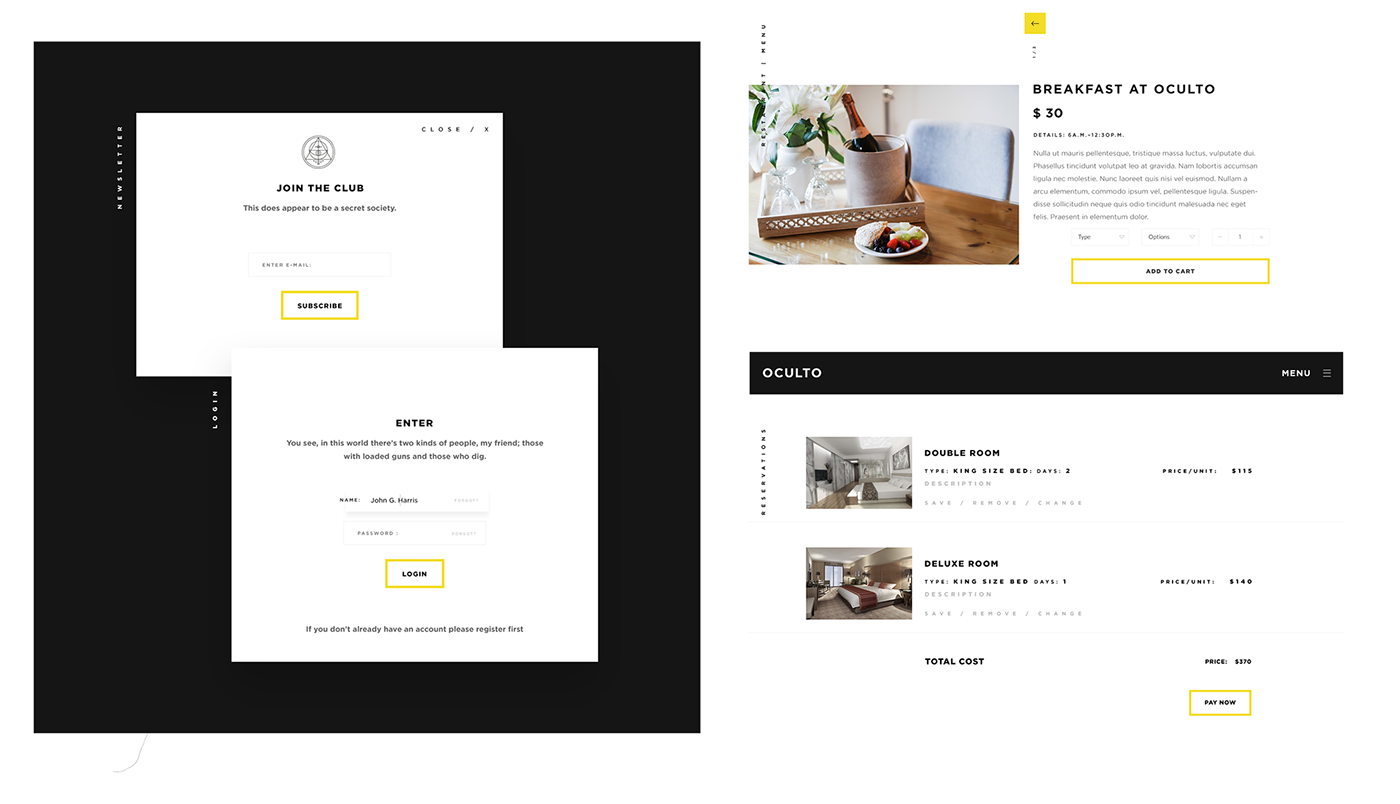
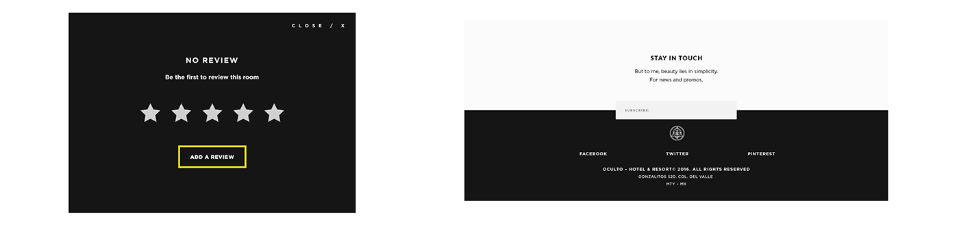
The main objective of the project was to create the Brand Identity and visual communication of a small Hotel Boutique located in the heart of Mexico City's most vibrant district called La Condesa. The challenge was to communicate the refined and exclusive feeling of staying in a hotel boutique rather than a chain one. It was essential for the brand to convey an experience of luxury in every single detail, from the web to the packaging.
Research
For this step, it was extremely relevant to recognize who was the main audience, define the market and stakeholders and categorize key characteristics, in order to be able to create a striking and appealing identity.
To understand the challenge’s objectives, an extensive research based on secret societies was conducted. A secret society can be defined because of its exclusiveness, its claims to own special secrets and a strong inclination to favor its own (Axelrod, A.). The main keywords for this project revolved around the concepts of mystery and sophistication and how both words complemented each other. Keeping this in mind, I took the most important elements of secret societies, such as emblem, membership and an air of secrecy.
All these developed into the creation of “Oculto”, which means hidden in spanish, an exclusive space where one is invited to unlock all of its secrets.

Concept
Inspired by the mystery and exclusiveness in which secret societies are based on, Oculto excels among others hotels and offers its clients an unforgettable experience of luxury and extraordinary service.
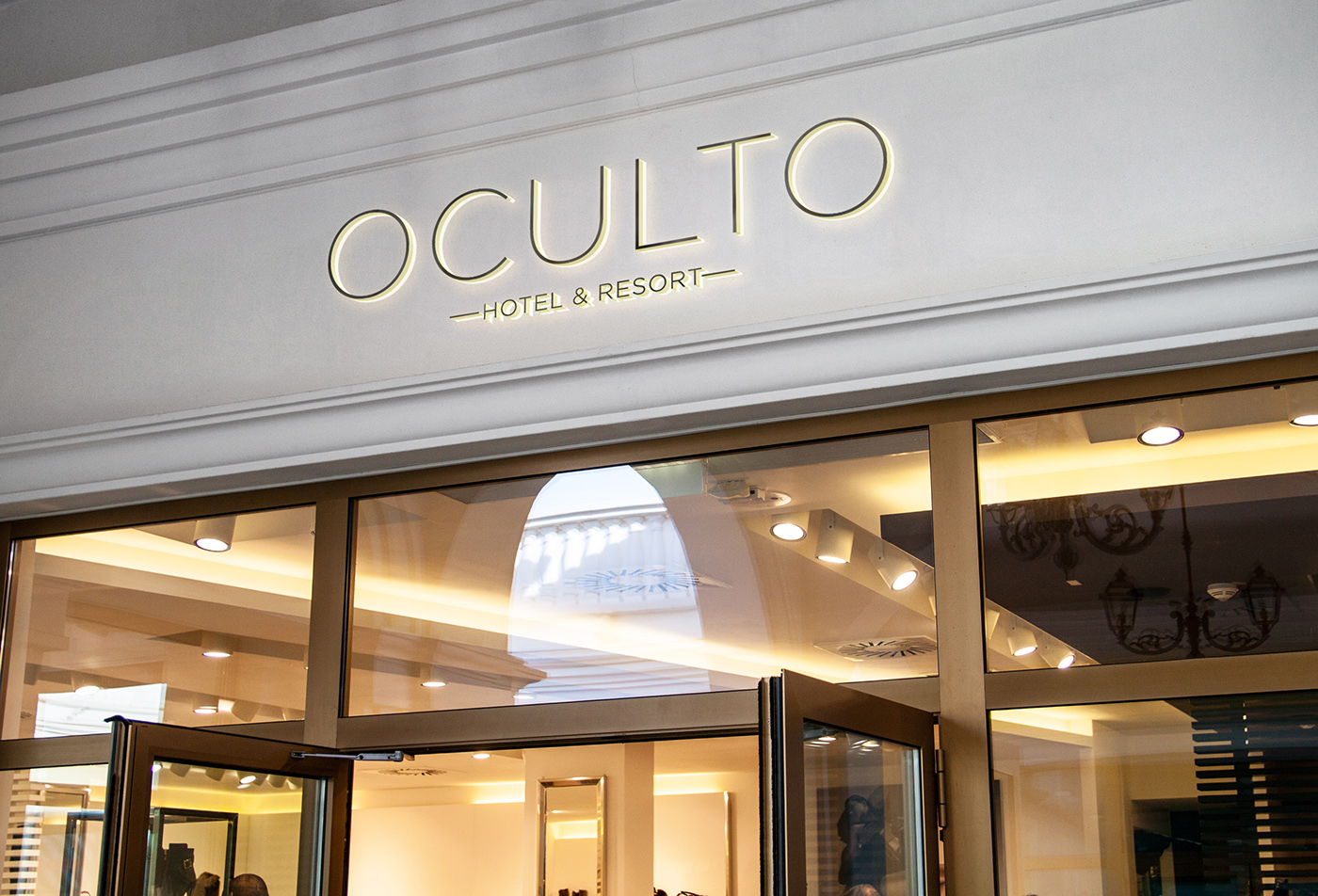
Design Identity
The logo resembles the old and enigmatic emblems. Its thin lines create a harmony between the hidden and the cryptic, and it allows the guests to feel part of a privileged club. This sort of versatility is what captures themes of magic and wonder.
The color palette was kept simple: black and white with a touch of golden foil to highlight details. This combination of color can be seen through the whole visual identity and interior design material. Embossed details, such as a the emblem, were added to the letterheads and print material to give a sense of secrecy and create a palpable feeling in our hands.

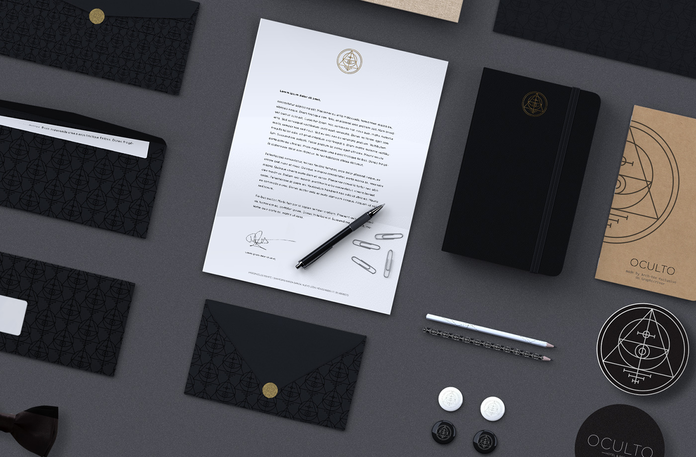


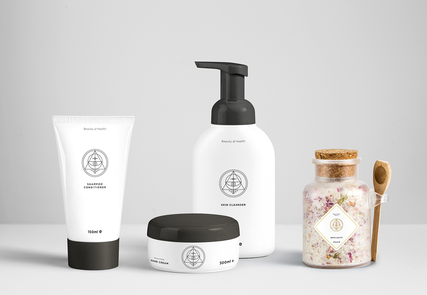
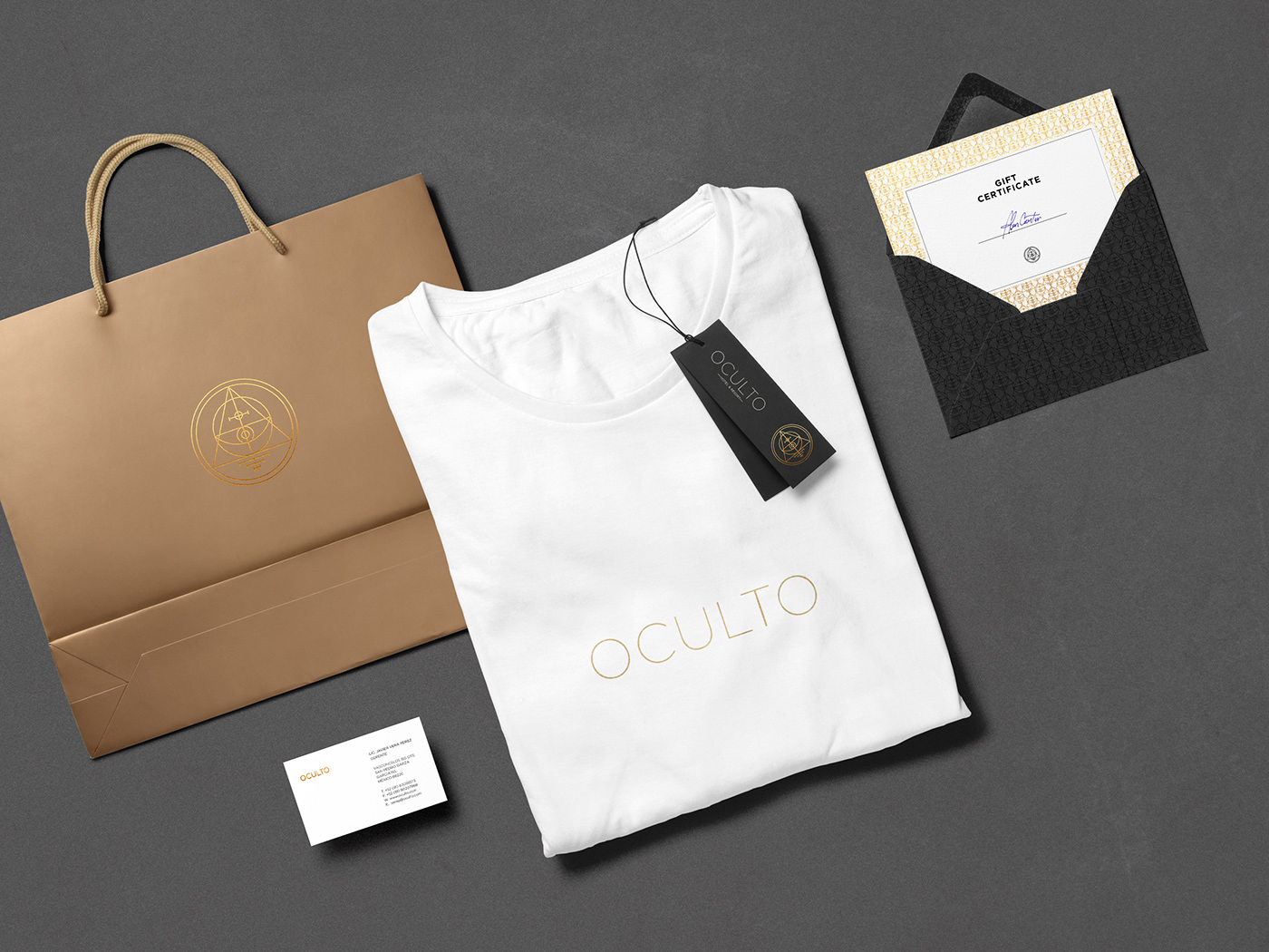
Packaging and merchandise
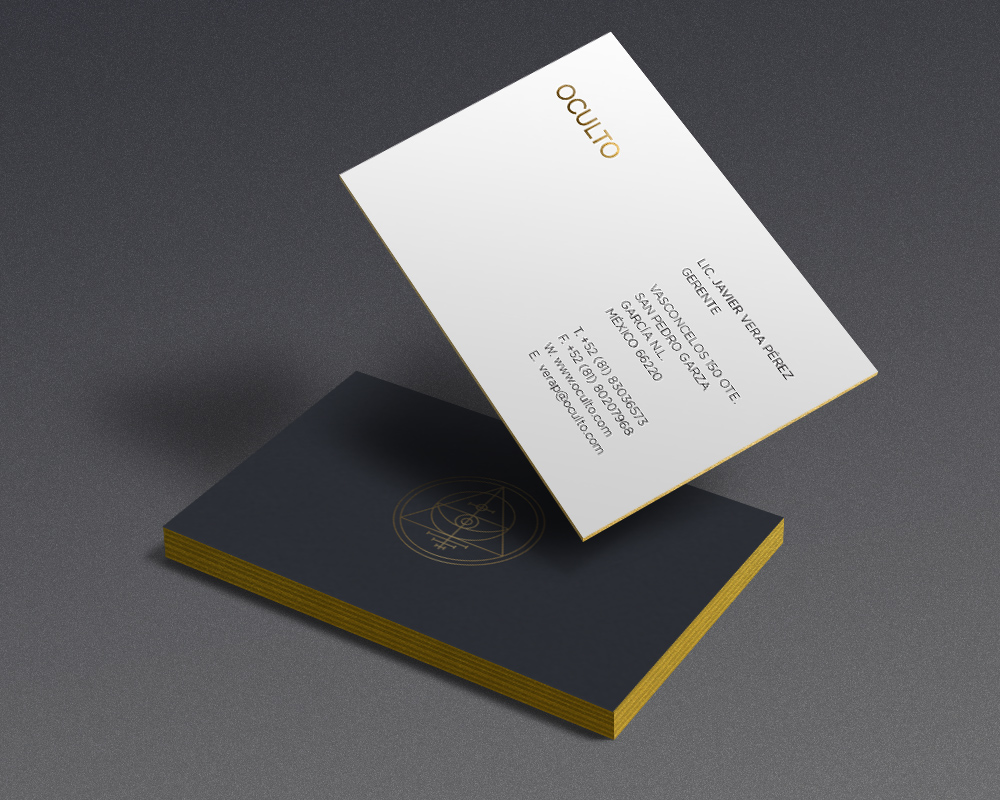
Business cards

Web Interface