Briefing
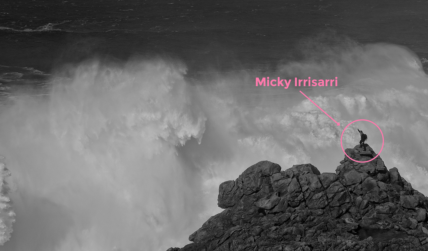
The client, Micky Irisarri, came to Erretres with a strong conviction that would lend the project a clear vision and a weakness for canned and bottled foods that is contagious.
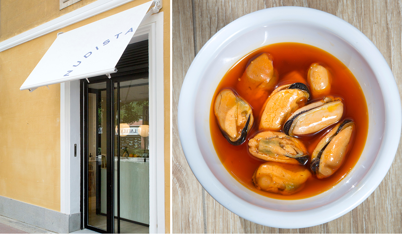
His project consists of a gastronomic proposal in the form of a tapas bar that seeks to position canned food products as a healthy, simple and, above all, extremely appetizing option. The only ingredients necessary are the finest products on the face of this earth, the maximum respect for how they are prepared and the minimum interference possible by man in their presentation (everything is served straight out of the can or bottle without cooking).
This is a project with a 360° dimension which takes into account everything from the “Naming” exercise to the development of its visual identity and the systematization of the products’ labeling and final placement in the chosen space.

Naming
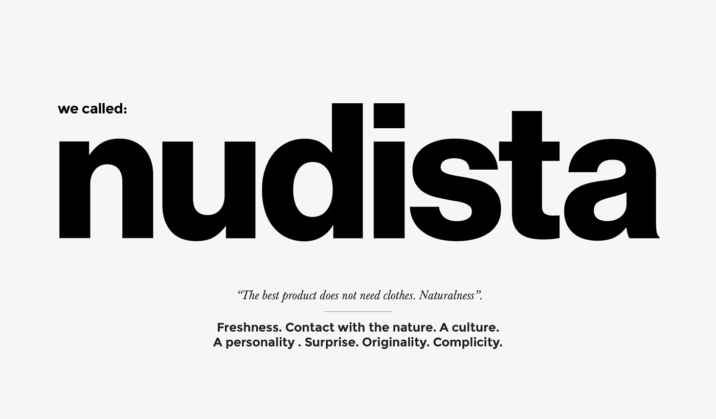
The Naming exercise aspired to achieve the project’s 3 basic pillars: product, irony and impact, while also reinforcing the idea of a “naked” product, without artifice.
After long sessions, “Nudista” was chosen as the name that would carry out the project’s objectives and inspire new horizons for the brand.
Concept
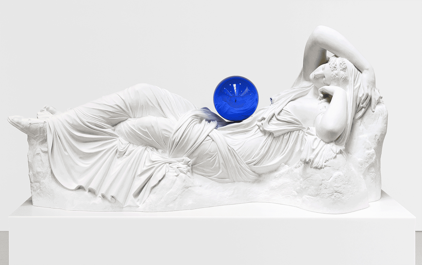
The brand concept was developed by researching the nude in the history of art and classical mythology.
Renaissance art was used as the imaginary basis from which to begin, because it depicts the nude from a pureness of forms, lacking in sin, and, above all, linked to the liberation of pleasures. In The birth of Venus, by Botticelli (who, curiously, owned a tavern), the nude is something engendered by the sea, the light and the earth. It is paradise.
The idea of the canon of beauty, the golden section, is vital to this project, without forgetting that all of this classical beauty is frozen in time, in the interior of a can or bottle, an element that is in complete contrast with all the aforementioned. A can is a mundane, industrial, cold and, above all, “POPular”.
The perfect tension that exists between these two worlds – the canonic ideal and popular art – in the series “Gazing Ball” by Jeff Koons, served as the inspiration for the visualization of the new brand.

Identity
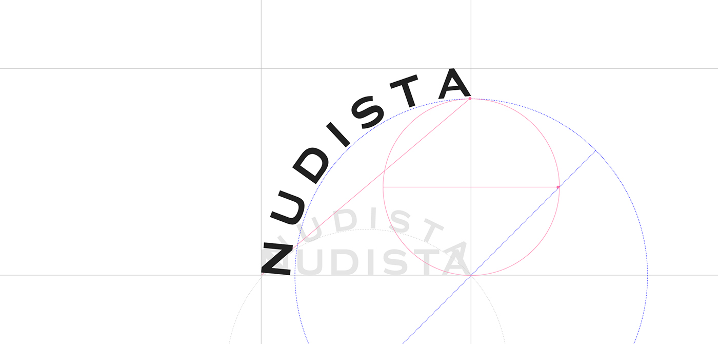
Once the brand’s energy had been focused, the concept was adorned with distinct graphic elements that comprise a single visual language.
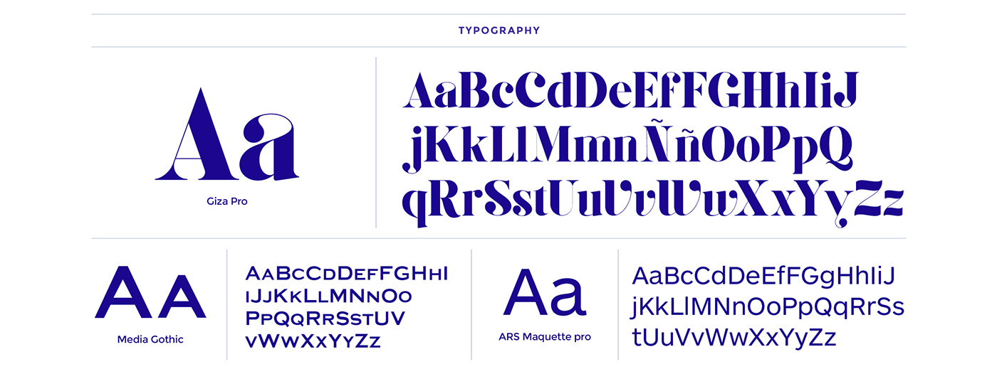
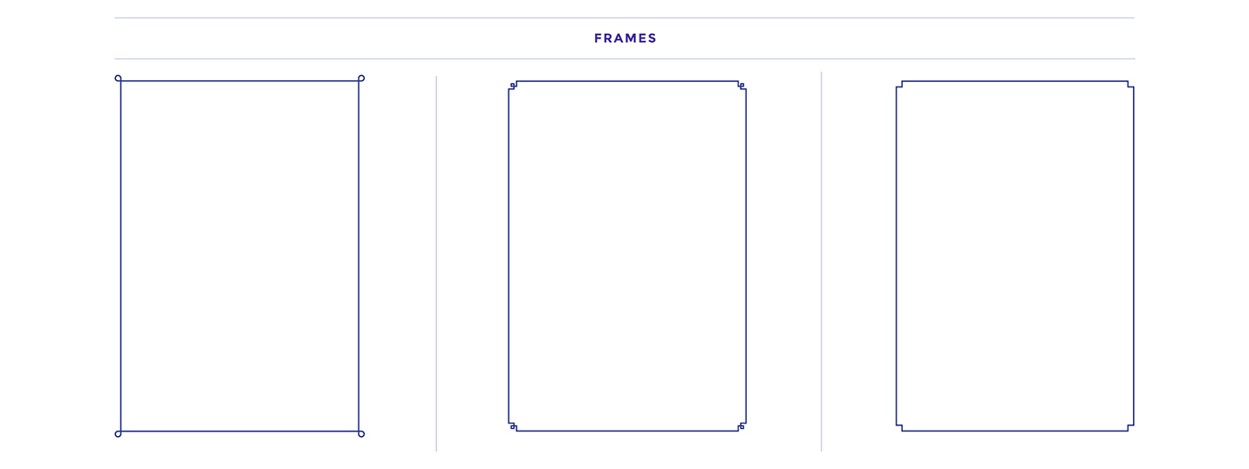
For the identity, a pure typographic family was chosen, one that is typically linked to the luxury sector, but which, in this case, is associated with the values of this novel product, giving it a slightly renaissance and popular touch through the use of an oval shape that is equally reminiscent of the corners of a can or the beginning of the golden spiral.
The typography is accompanied by a very POPular symbol in Spain: that of two diamonds, which, decades ago, was used on television to indicate that the program to follow was not recommended for minors or the fainthearted. (Incidentally, the client also works in the audiovisual industry).

Graphic System
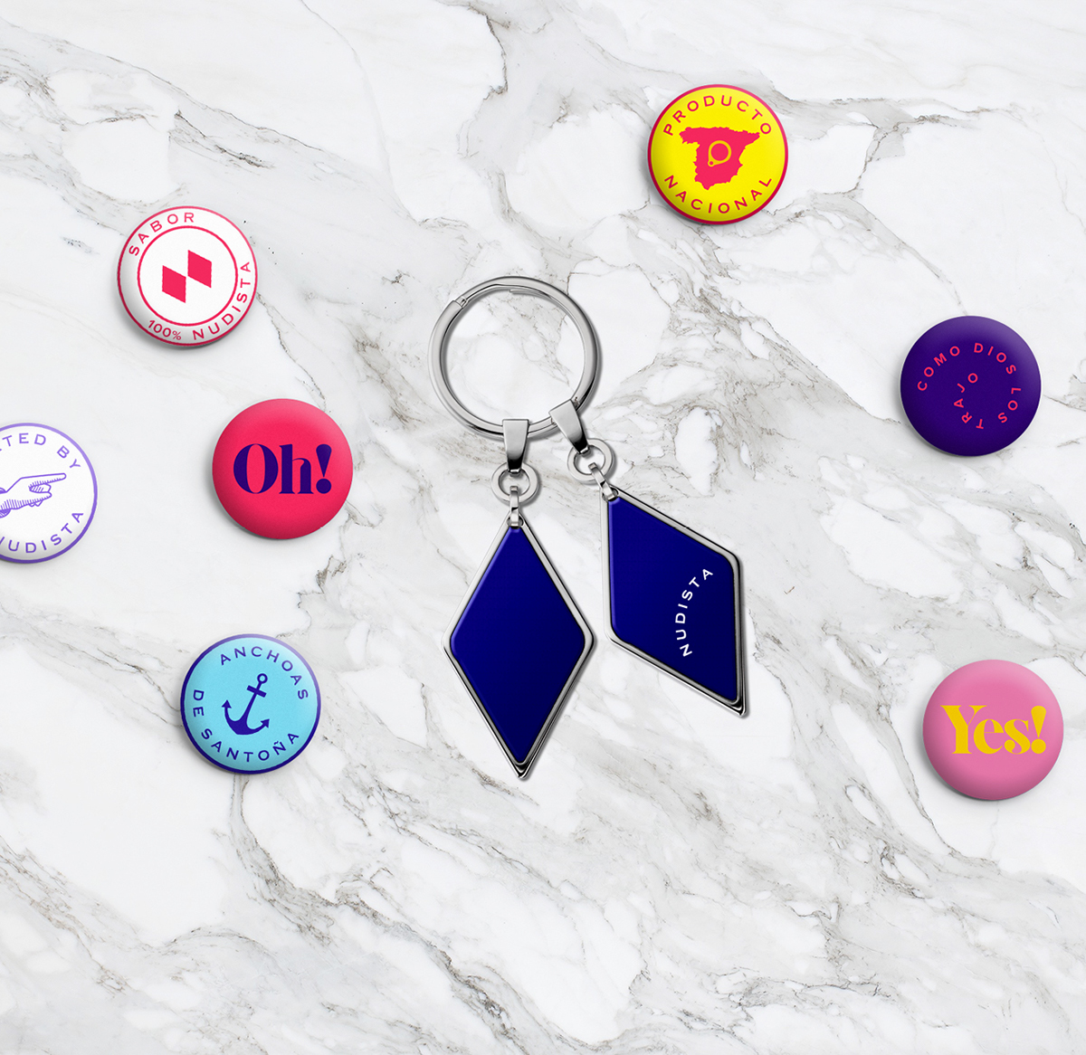
The use of ambiguous messages (“Yes!”, “Oh!, “Um…”), a sinuous typography family, a saturated and energetic chromotherapy, a system of symbols that are at once rich and ironic, a framework of constructive imagery, and a brand language closely tied to art, all come together to shape different visual languages that lend richness to the communication of the new brand.


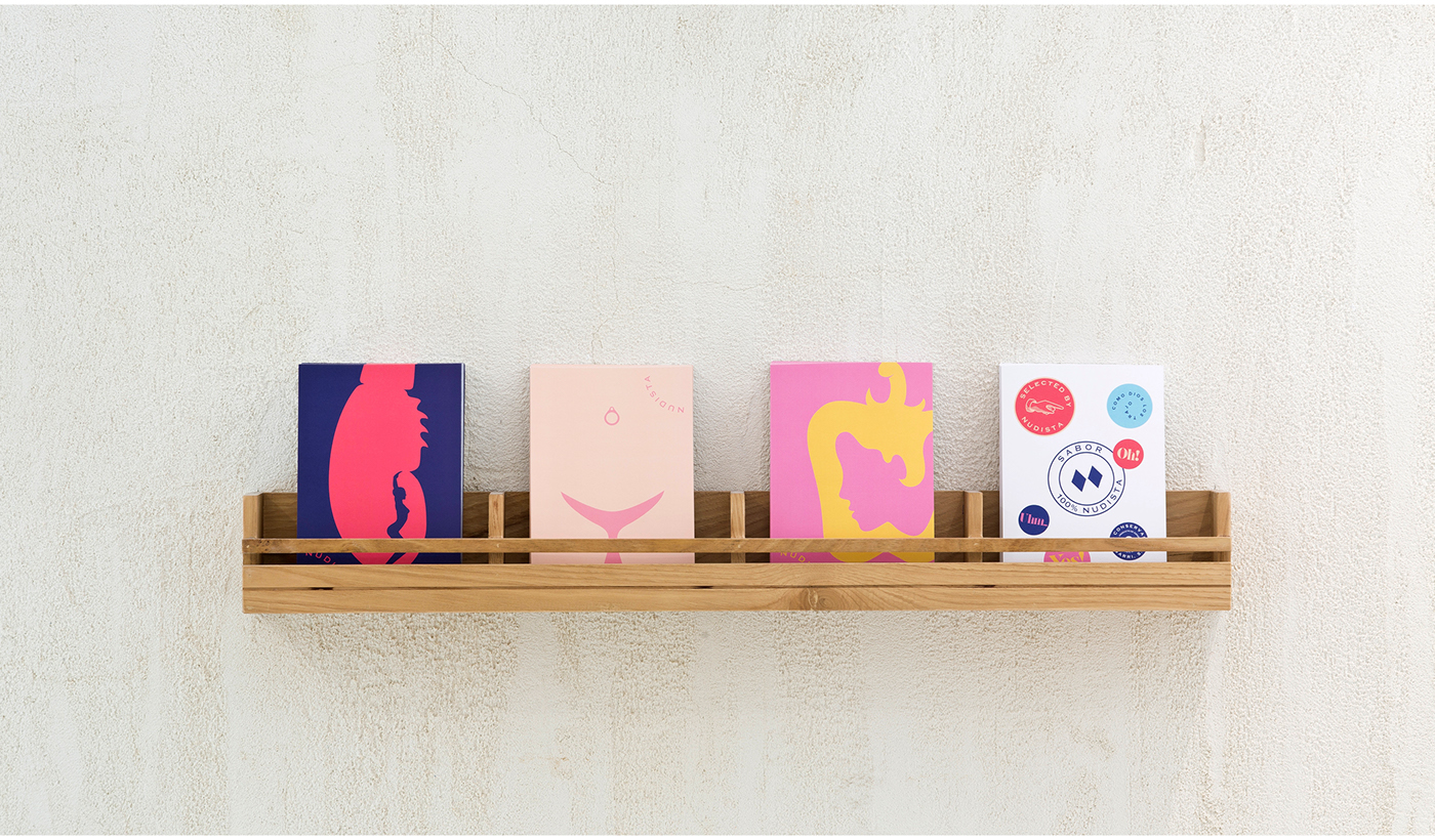
Illustrations
To make the most of the tavern’s communications potential, we designed three “flat” illustrations that bring together two images in one, thereby combining the product and concept of nudism with all of the chromatic energy of pop art.
These illustrations, which were created specifically for the project, seek to name the three categories of preserved foods that are served in the tavern: fish, shellfish and vegetables; and of course seduce and amuse with their double meanings.

Photographic Language
The product appears “nude” outside of the container and in all of its splendor, inundating an empty background with flavor.


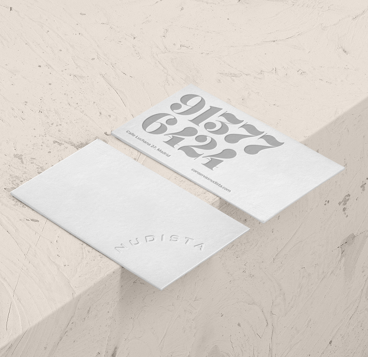
Contact Points
The projection of the brand makes three fundamental points of contact that affect the establishment’s operations: communication, service and packaging.
The graphic system is reliable and resounding on all of the brand’s contact pieces. All of the establishment’s basic elements clearly convey the brand philosophy, turning the pre-visit, visit and post-visit into a unique and memorable experience for the public.


Service points


Merchandising


Labeling


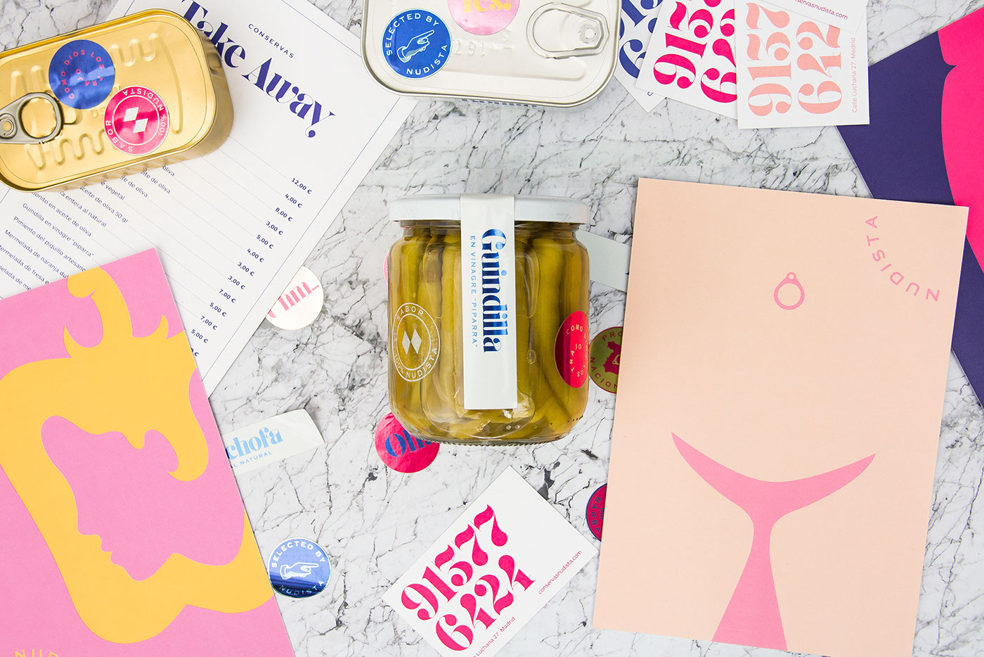
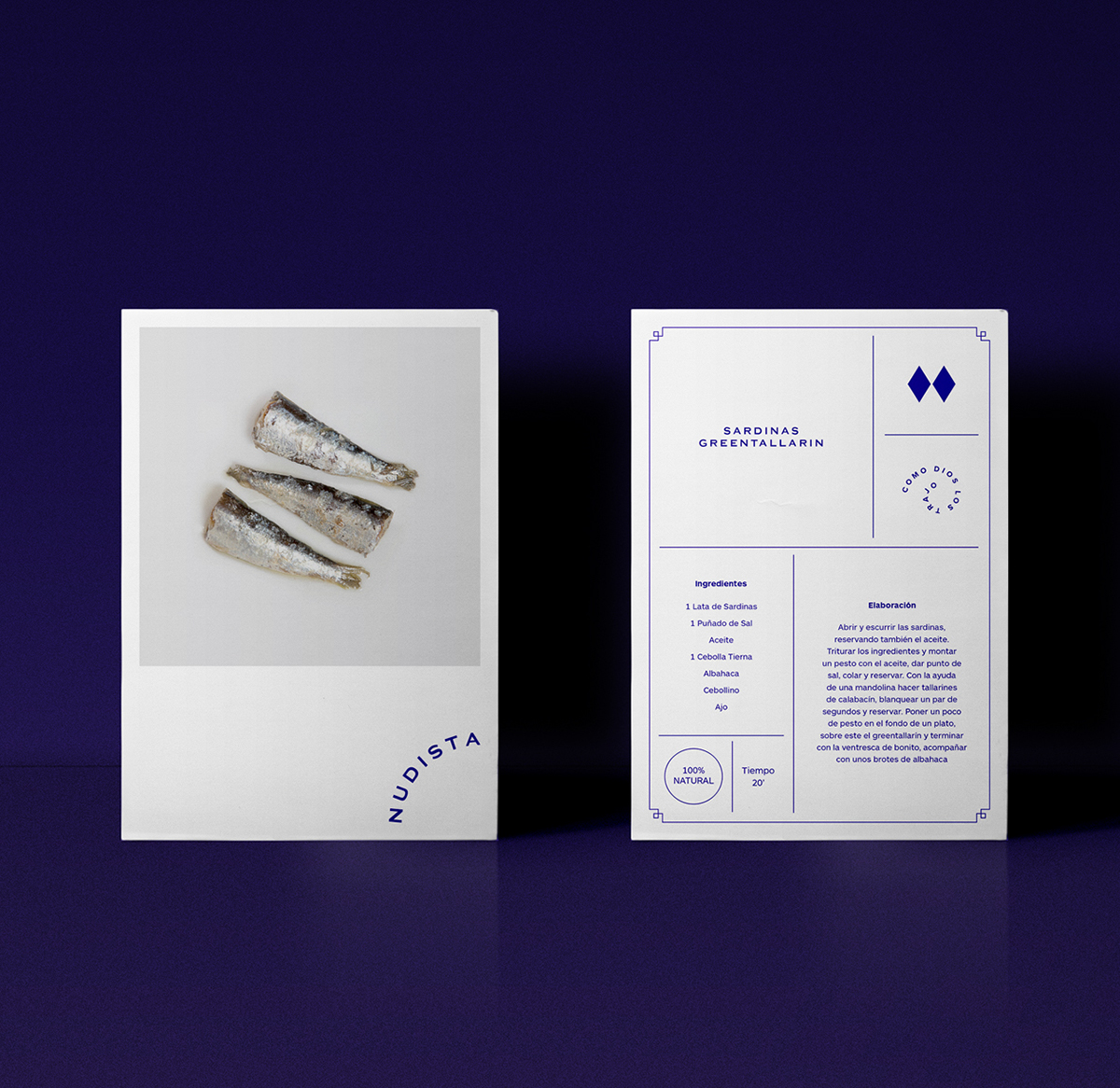
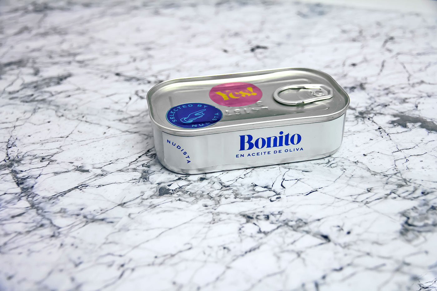
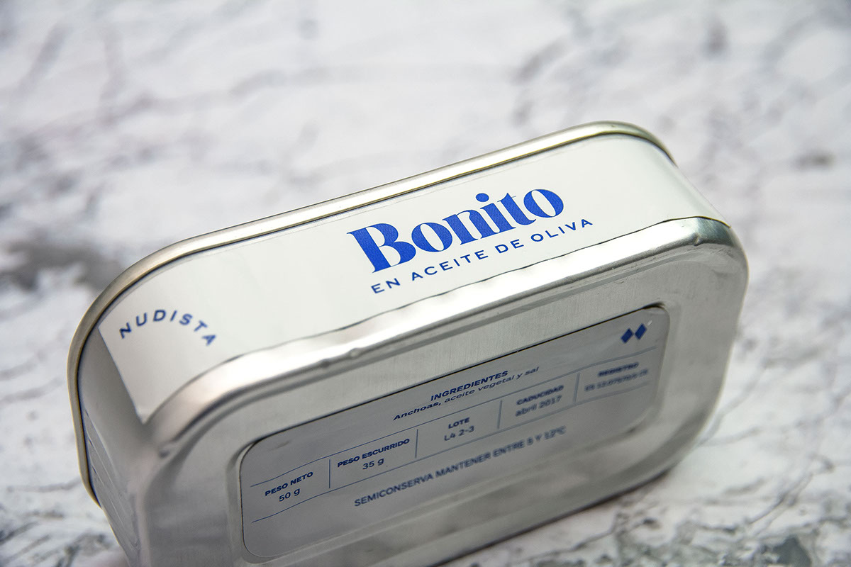
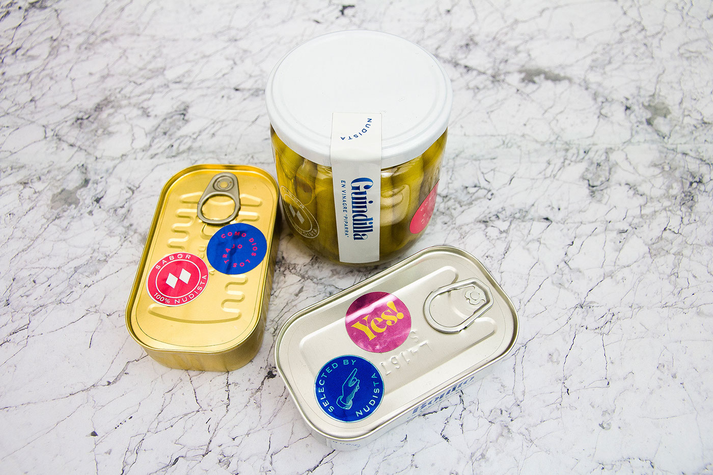
Packaging
One of the project’s greatest challenges was the development of the packaging. As a bar-delicatessen, Nudista offers the possibility of purchasing the preserved goods that have just been sampled in the dining room. This is an added value service, offering products that are very diverse in terms of content and size; a fact which made the development of a simple packaging system impossible.
The products hail from the best protected denominations of origin in Spain. The idea of the cans and bottles circulating from one place to another, going through customs, passing export inspections, getting stamps on their passports like those suitcases of old – covered in stickers from the places they travelled – was the key to solving this problem.
The graphic result is a system of adhesive labels that provide a description of the product, the PDO, the quality seal and “brand reinforcement” messages. This made it possible to carry out both an organic and economic service, while also providing the freedom to personalize the packaging in accordance with its contents.


Space
Given the strong link between the brand and art, the space is set up like an art gallery that plays off of the colors of the naked products and the chromatic energy of the brand: a white cube in which the selection and exposition of such exquisite products seems to have been carried out by an art curator.
Typical tavern elements like marble and wood stand in contrast with white tiles and walls, thereby turning the establishment into a singular and contemporary space.