MEGA Glass & Sashes
(Re)Branding Brooklyn's Mega Glass & Sashes
(Re)Branding Brooklyn's Mega Glass & Sashes
—
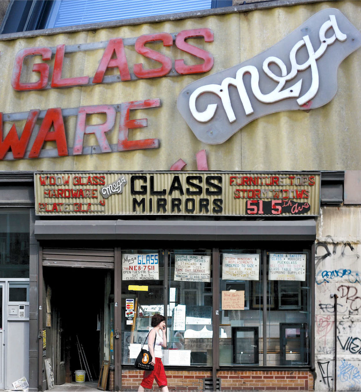
The focus of this SCAD, Print Studio I project, was to rebrand an existing company. For this, it was necessary to gain working knowledge of the company, do market research and create mood boards based on my desired design direction. While at first I thought, it would be interesting to look into local small businesses around my neighborhood, I ended up focusing on a glass business that has been in my family for over 40 years and in Brooklyn for over 75 years.
—
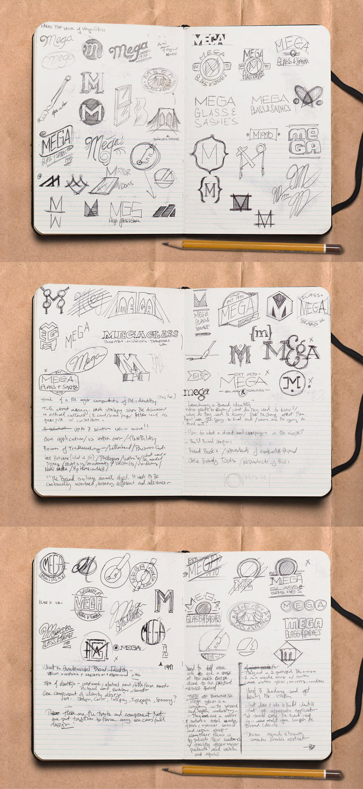
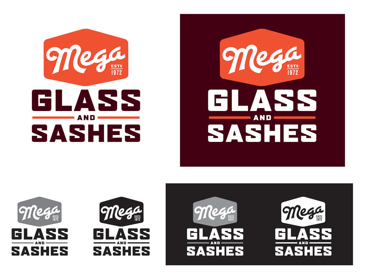
It was harder than I anticipated because not only was I going to be judged by classmates, but also family. With the first round of sketches done, my classmates were able to steer me closer to a design direction. I knew my sketches would come to life once they were translated digitally. So I began to crank out digital variations of my sketches, using my type choices and colors from my selected palette. My focused was on three looks. First, was to create a custom “M” based off of the original sign from the shop; It was created by my grandfather, the original owner, and it seemed a proper way to add history to the brand. Second was to create a vintage-inspired lockup that could merge both the visual and historic aspects of the shop with new typography. The last option was to include a holding shape that would give the logotype the vintage vibe that I felt was needed for this brand identity.
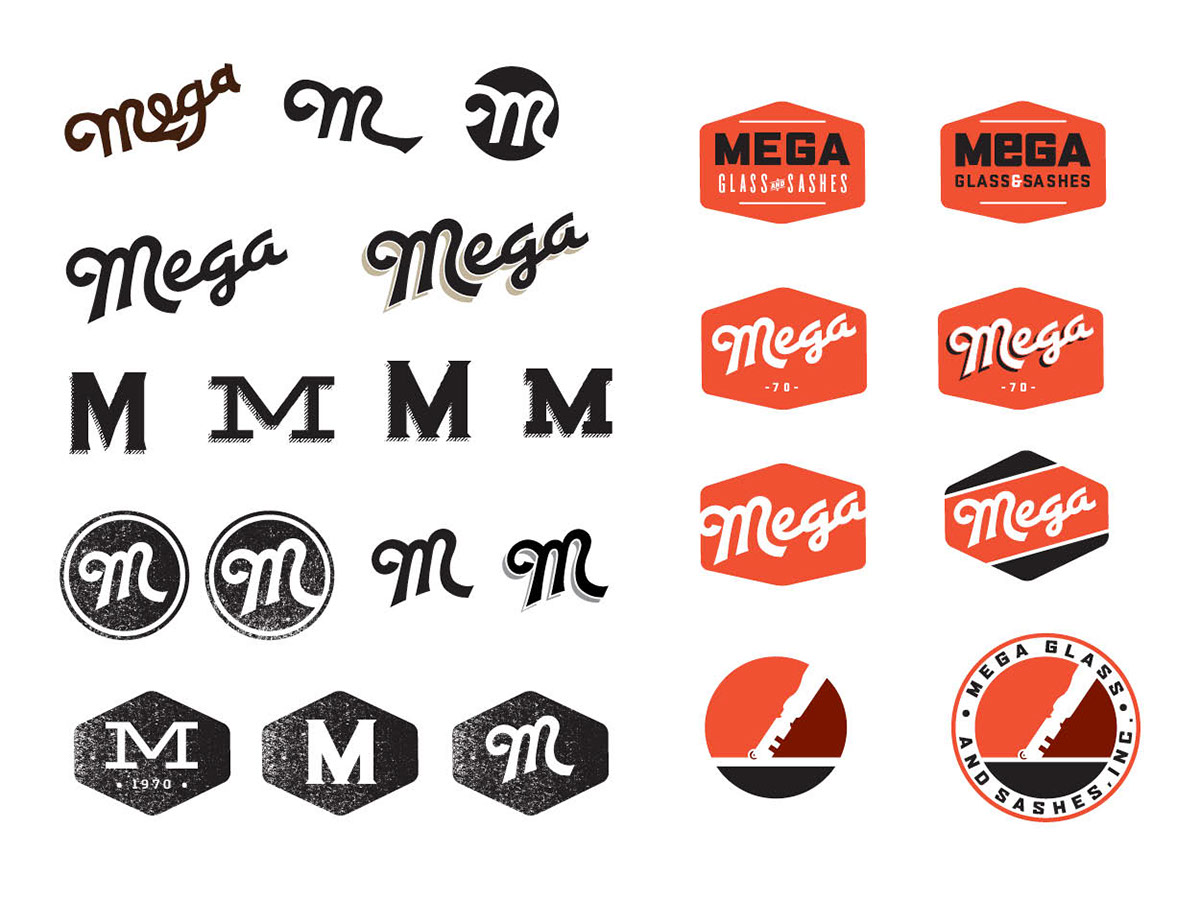
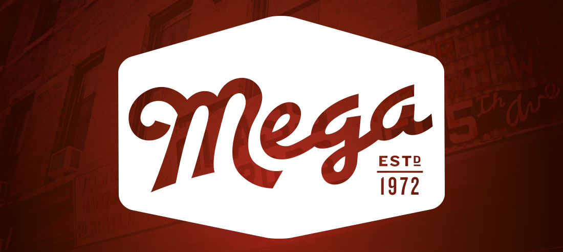
I went with the “M” idea. The only reservation was that it was looking too similar to a sports or beer logo as a singular letter, so I needed to incorporate the entire name. In the existing sign, the “Mega” name was created from jig saw cut plastic; It was imperfect, hand done, small and unique. It was never given any real prominence. I wanted to maintain the history of that icon while creating a refreshed and updated version. I customized the “M” based off of the image from the actual awning sign. I cleaned up the letterforms, making them more fluid. I also found a complementary typeface that would accent the ”M”. It was all coming together. For the finishing touches after the type was completed, I placed it in the hexagon shape.
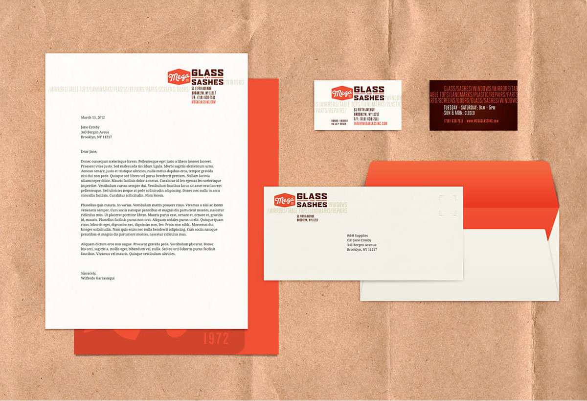
The new Mega name would become my main icon for the brand. The combination of the icon and the type, created a logo and mark that has the ability to have multiple applications and can be altered depending on any given situation. The mark became the basis for the brand guideline that has been created for the glass store. Mega would no longer be just a name on a sign or on the side of a van. I have elaborated the look and created a brand that would be constantly perceived as local, reliable and familiar. From stationery to ephemera as well as interior and exterior signage, Mega now possesses a visual that links its history to their quality and workmanship.