

T H E C L I E N T
Auroral is a family-owned company manufacturing affordable & high quality windows and doors. Their offer targets residential clients. They approached me in 2015 to redesign their brand identity.

T H E C H A L L E N G E
When working with a family business that has been using the same logo for more than 20 years, first there's some educational work to do before starting to design. Letting go of some elements was crucial in order simplify and improve the brand's notoriety.


T H E S O L U T I O N
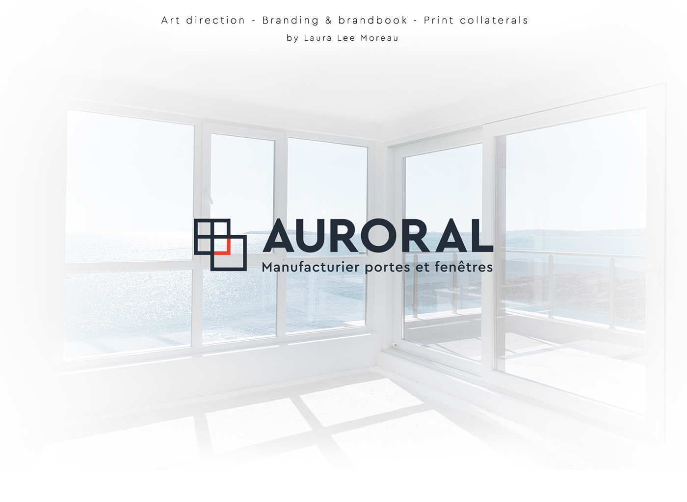
The client made his choice between three logo propositions. The final logo illustrates in a very minimalist way not only literally the transparency of Auroral's windows but also symbolically the impeccable transparency of their company, a quality that made them famous.
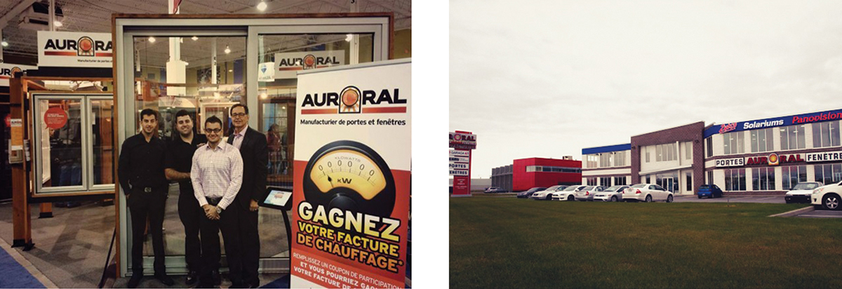
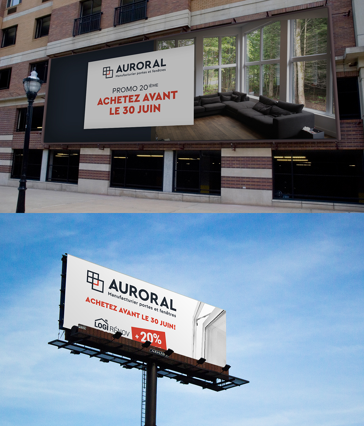
An array of printed material has been developed, from the business card to some gigantic highway billboards to the wrapping of different truck sizes.

Printed collaterals


Web advertising


Large scale billboards and car wrapping


r e t a i l & e - c o m m e r c e
Auroral
_
_
L i v e w e b s i t e
c o n s u l t t h e b r a n d g u i d e
F r e e l a n c i n g o p p o r t u n i t y
lauralee@ge-o-de.com | Book a free discovery call (EN) - Prendre R-V pour un appel découverte gratuit (FR)
f i n d m e o n l i n e


