I started out by checking out what Nature Hills already had as their layout and I would have to admit that it’s actually not that bad. I would only have to improve a few things. The first thing I would like to improve is their overall look, it is not updated and it looks like it came from the early 2000’s. It is not clean and not very user friendly. It just doesn’t really look right because none of the photos really match, everything is not aligned and it looks like it has been accidentally coded together, which it is not. The second thing that I would like to change is its photo layout on the home page, I think that there are too many options right there and the customer might not be able to decided and then they will just leave because they could not come to the right conclusion. The third thing I would like to change is the checkout preview page and the checkout page. It’s really difficult to see what I am supposed to press. Once again most of the pages are not aligned and the path of vision ends up looking all over the page for solutions.
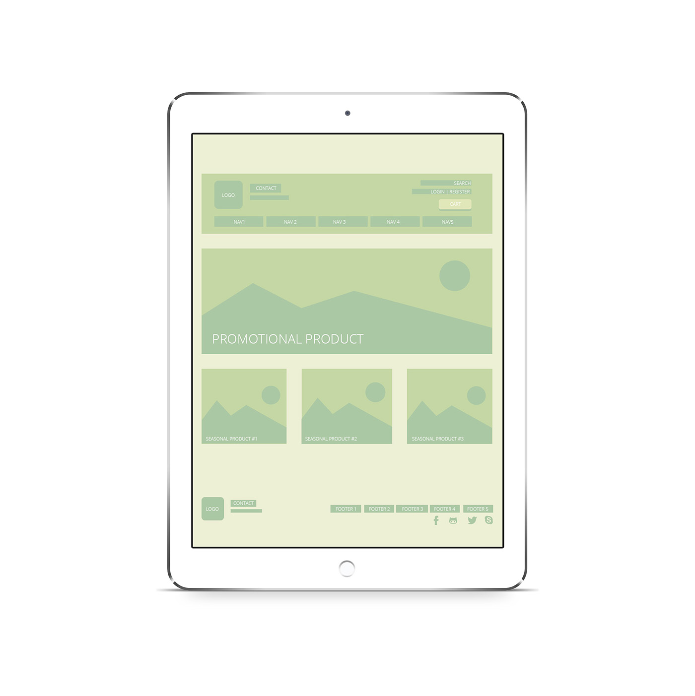
Home Page
First of all, I simplified the home page, I was extremely tired of all of the wild placement so I specifically made “important” sections for all of the content. For example, we have the three main parts of a website. The header, content and footer. The header contains the logo on the left as well as the contact us in the same area. Which means easy accessibility to help right away. I wanted to leave the logo in the same spot because I felt like it would look good there and it was easy to notice. On the right side of the header I have included the search bar, the login and register bar and a large cart bar. The cart bar was created to look much bigger for the customer to easily press there to get to their cart. On the current website my cart is slightly hidden and it blends in with the background of the page. I centered the navigation bar only to align it equally between the two sides. I think it looks awkward floating to the left on the current website. In the content area I have created a promotional product large photo banner to advertise the seasonal clearance or favorite, I made this change because I wanted it to be easier for a customer to look and choose at least on product when visiting the home page for the first time. Usually a lot of people look for best sellers or items on sale. Moving on to the footer, I added the logo once more along with all of the contact information and then on the left side I included a place for all of their random content. I also added a social media bar because for whatever reason, they don’t have one. Which is extremely weird because they use many different social media sites.
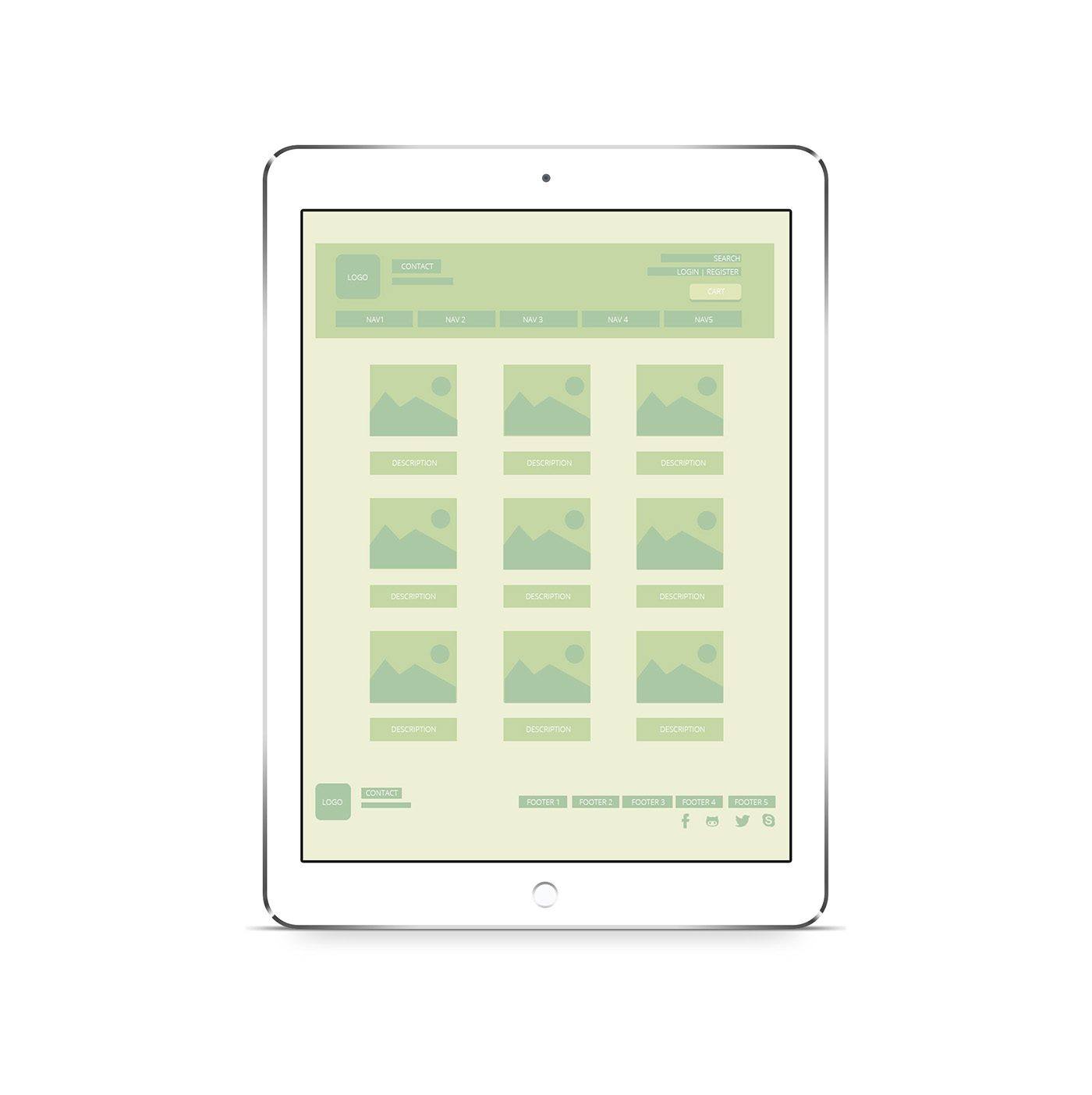
Best Seller Product List
I just included this for fun, because I thought it would be kind of cool to show what their best sellers are. They don’t have that option on their website so I thought it would be a nice addition to the webpage. I made it as simple as possible, with only a photo and the description (which would should the price as well!) I really wanted to recreate their beautiful Instagram look, because that’s where they had the most positive and social reactions to their products. This would be a great experiment to set up for a while to see if people would actually purchase the best seller products.
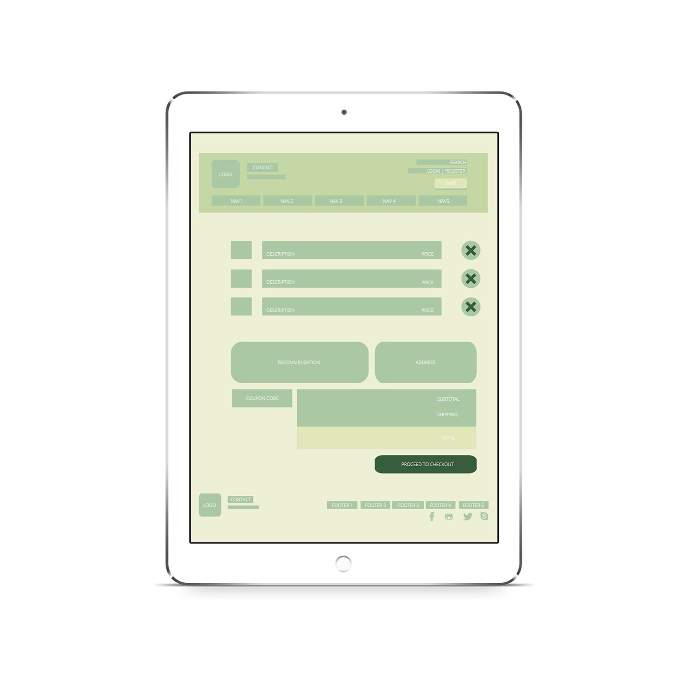
Cart
Once the customer chooses their favorite must buy plants, they head on over to their shopping cart page. Which looks quite different from the previous version. When an item is added to your shopping cart it is automatically pops up on the list and it also shows you the description and the price of the object. Once you put in a coupon code, the price would automatically update itself to match the discount code amount. Then you would see the subtotal and shipping amount. Another thing that I wanted to include was the soil recommendation, it shows what kind of soil will help the plant grow so the person can also add it to their card. I have also added an address section which shows your address and if you have never used this account before then that whole section disappears until you press proceed to checkout.
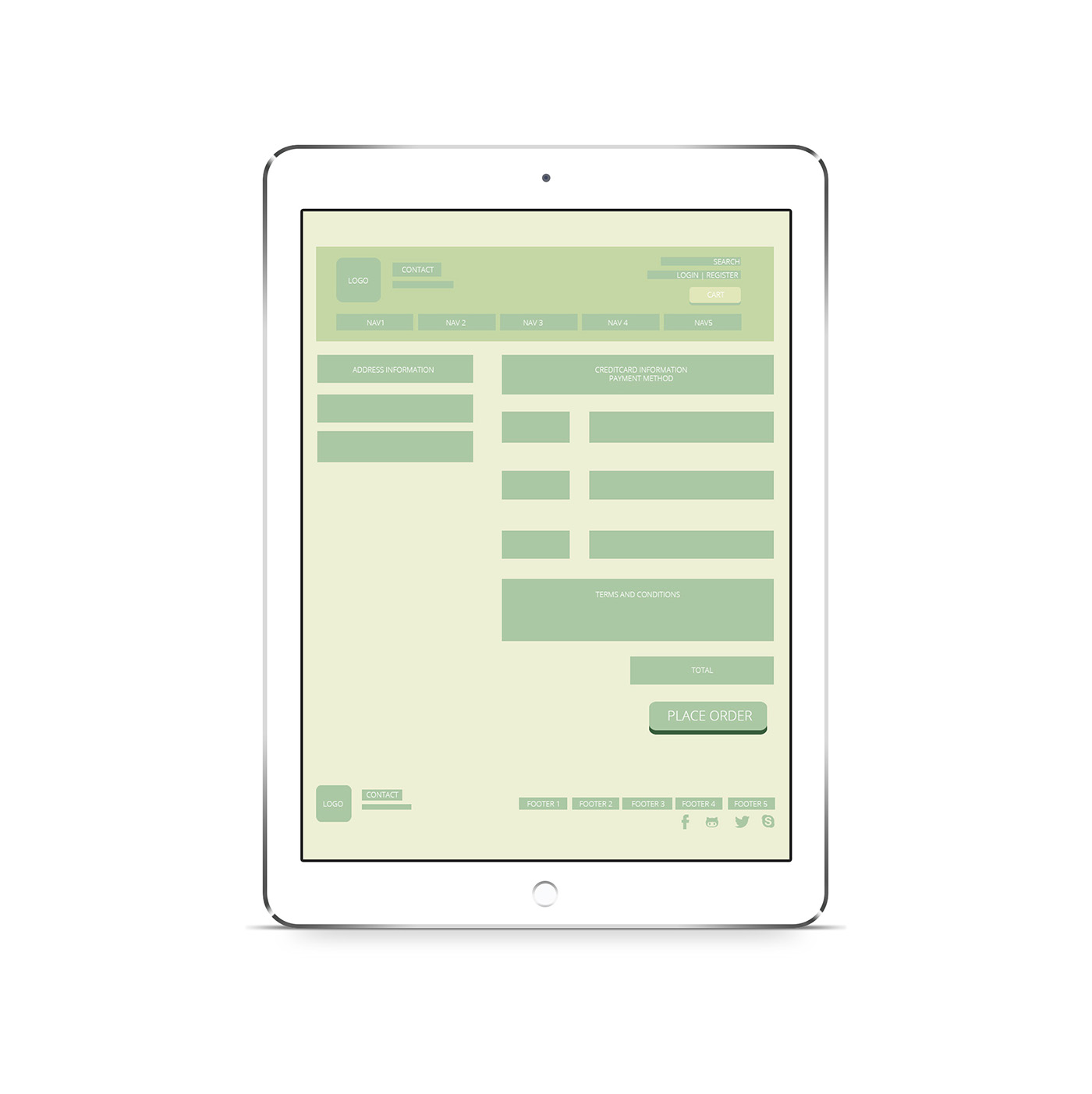
Cart Part 2
When the customer clicks on proceed to checkout they are directed to the address and billing page. Here they can change all of their information. For example, they can choose to add a new payment method or they can just switch it or even go through PayPal. This is also the page where you can add or change your address. It is located on the left side for convenience of the user because they can see which one they would like to use. After they have put in all of their payment and address information then they can accept the terms and conditions. Finally, after going through those steps they will press place order and the order will be processed.
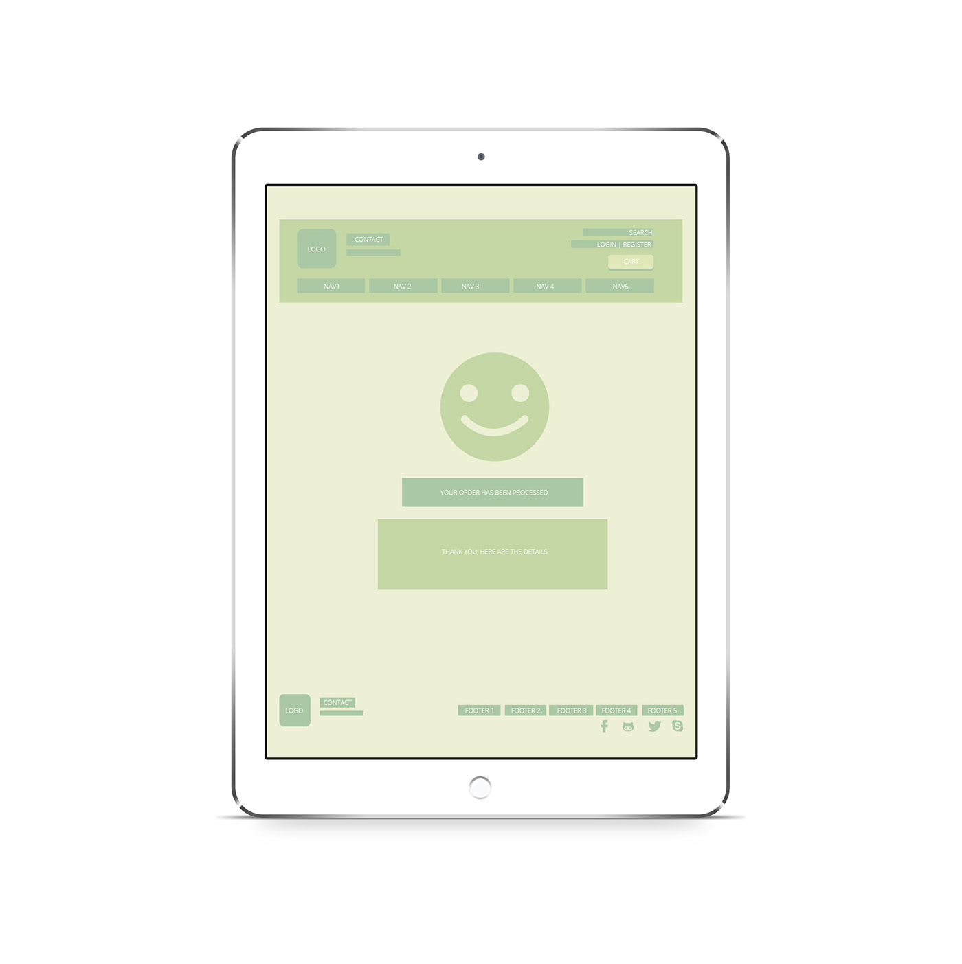
Your Order Has Been Processed
Once you have placed you order this page tells you if your order has been processed or if it failed to accept your information. I wanted to include a smiley face, if the smiley face actually smiles then it means your order has been successfully processed, if it turns into a sad face it means that there could be possible problems with submitting your order. Below the face there would be a “your order has been processed” confirmation or a “at this time we cannot receive your order, please try again or talk to our customer service.” I think that both of these options would be very helpful for the website user to see if their order was actually sent in. This will inform the customer right away and it would also send them an email as well to make sure the order was processed. I didn’t see that in the previous version and I think this was the greatest challenge because I do know what their process page looks like because I did not want to purchase anything from the actual website. I believe that my version of this page was suitable for the website.


