
The magic of Pi
—
After 20 years of activity, the design studio Paleta de Ideias went through a major rebranding process in 2015.
From the logo to the studio location, everything changed.
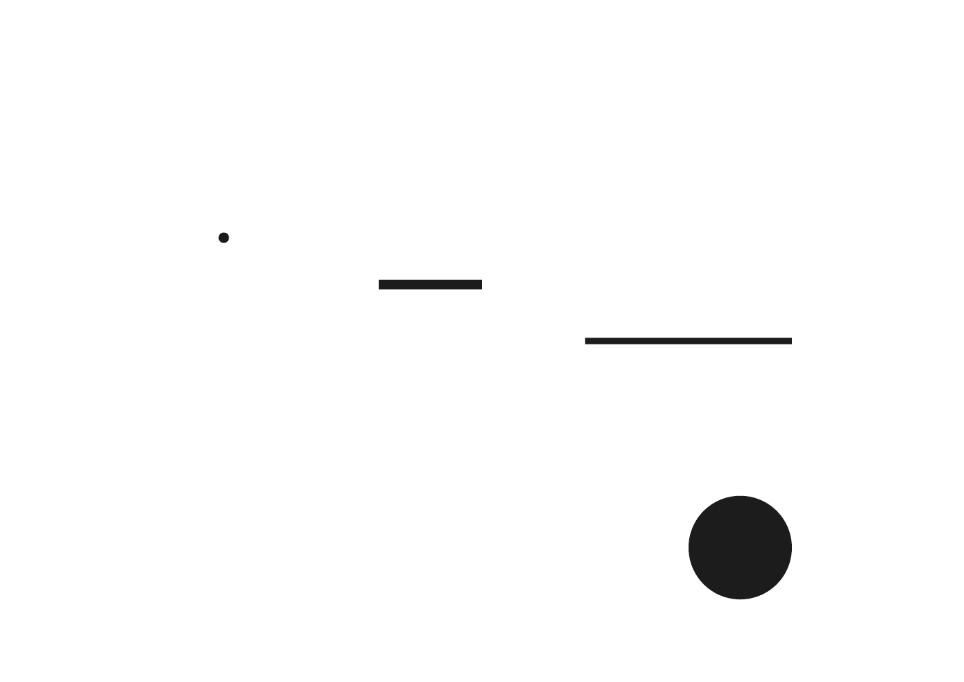
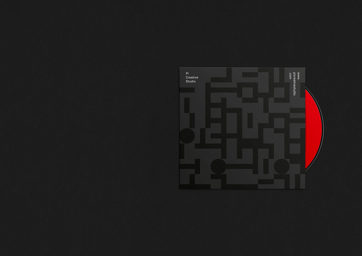
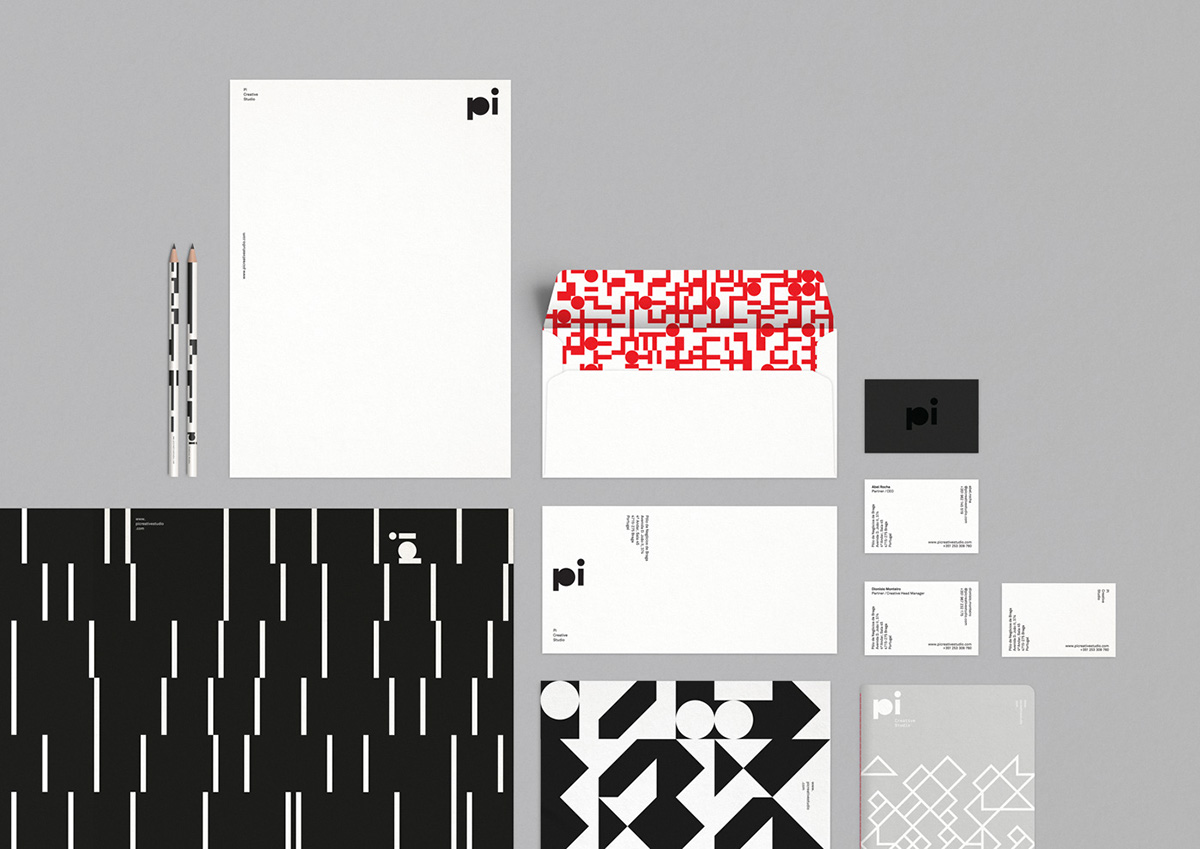
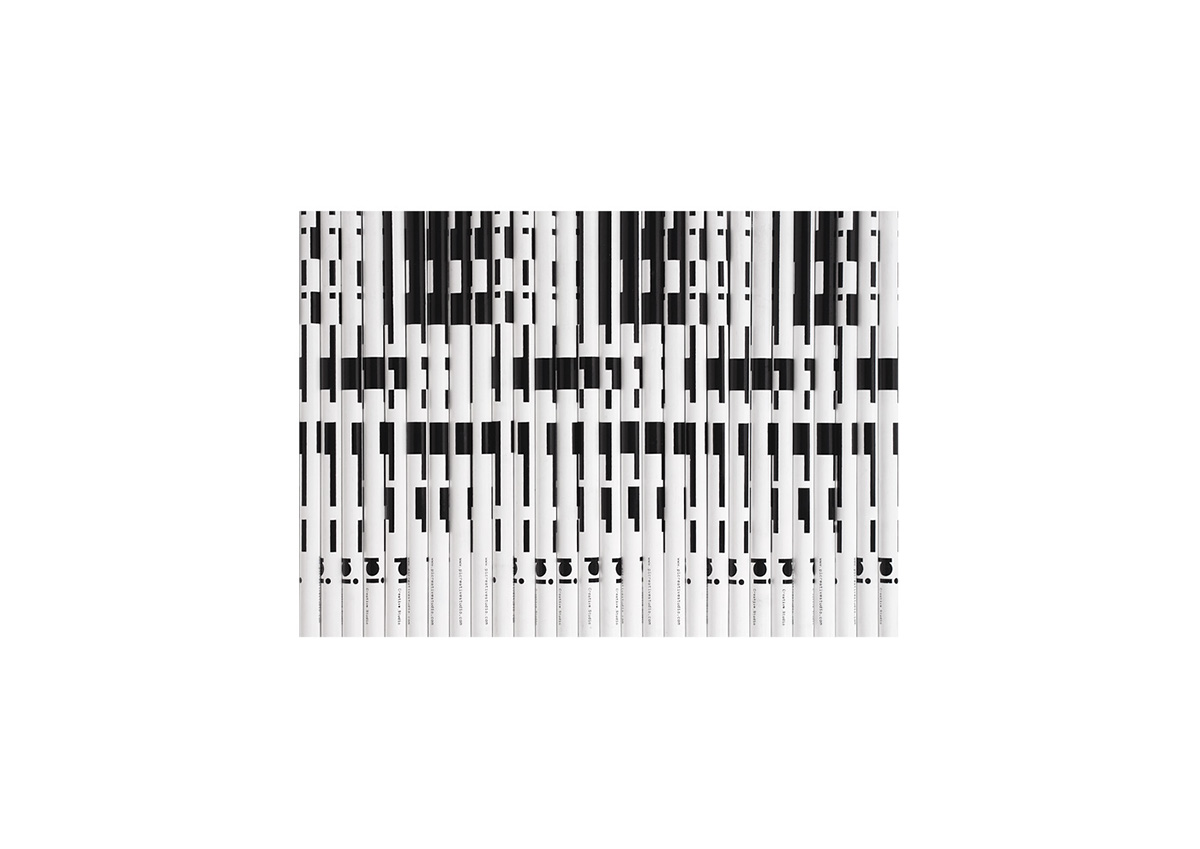
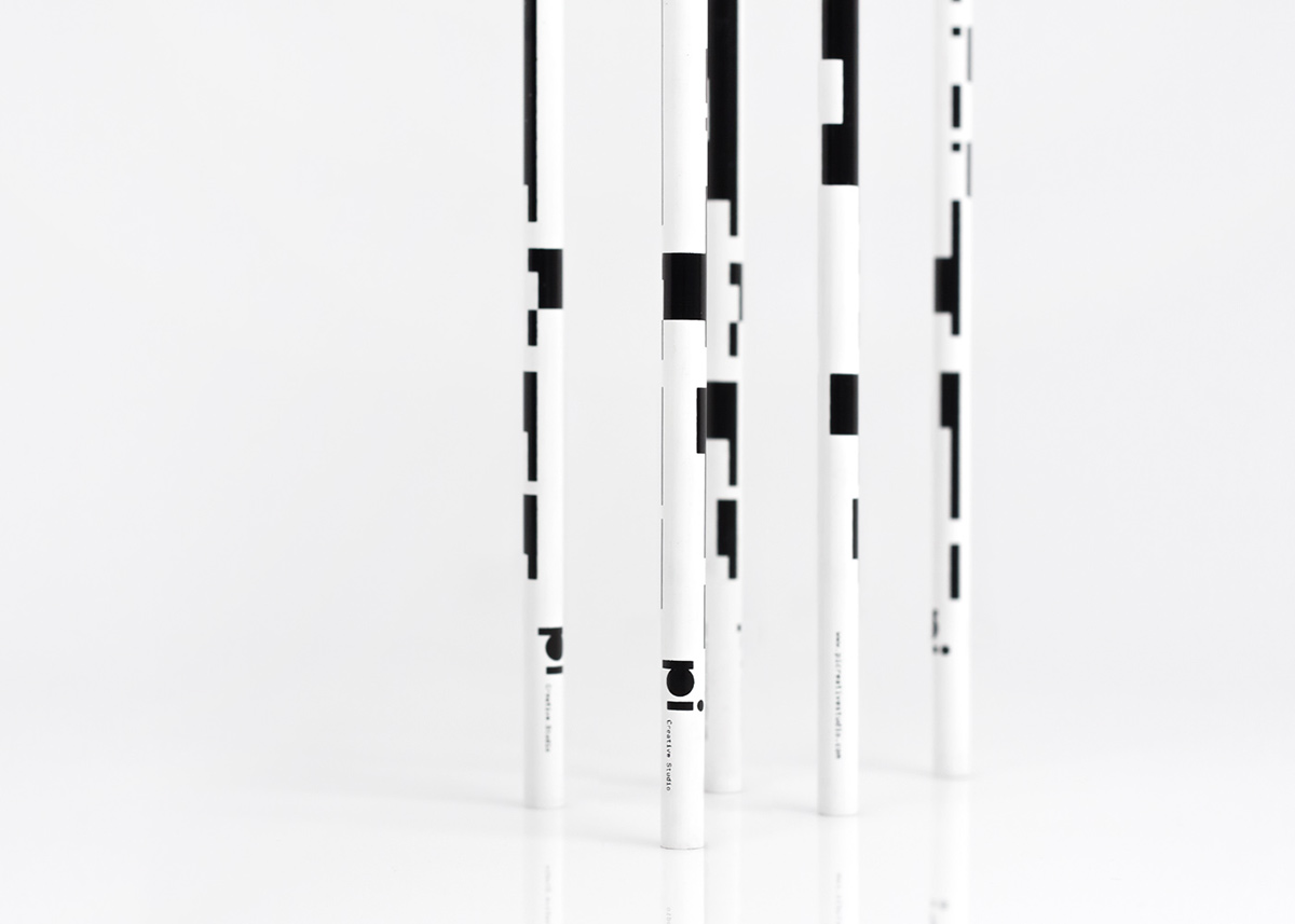
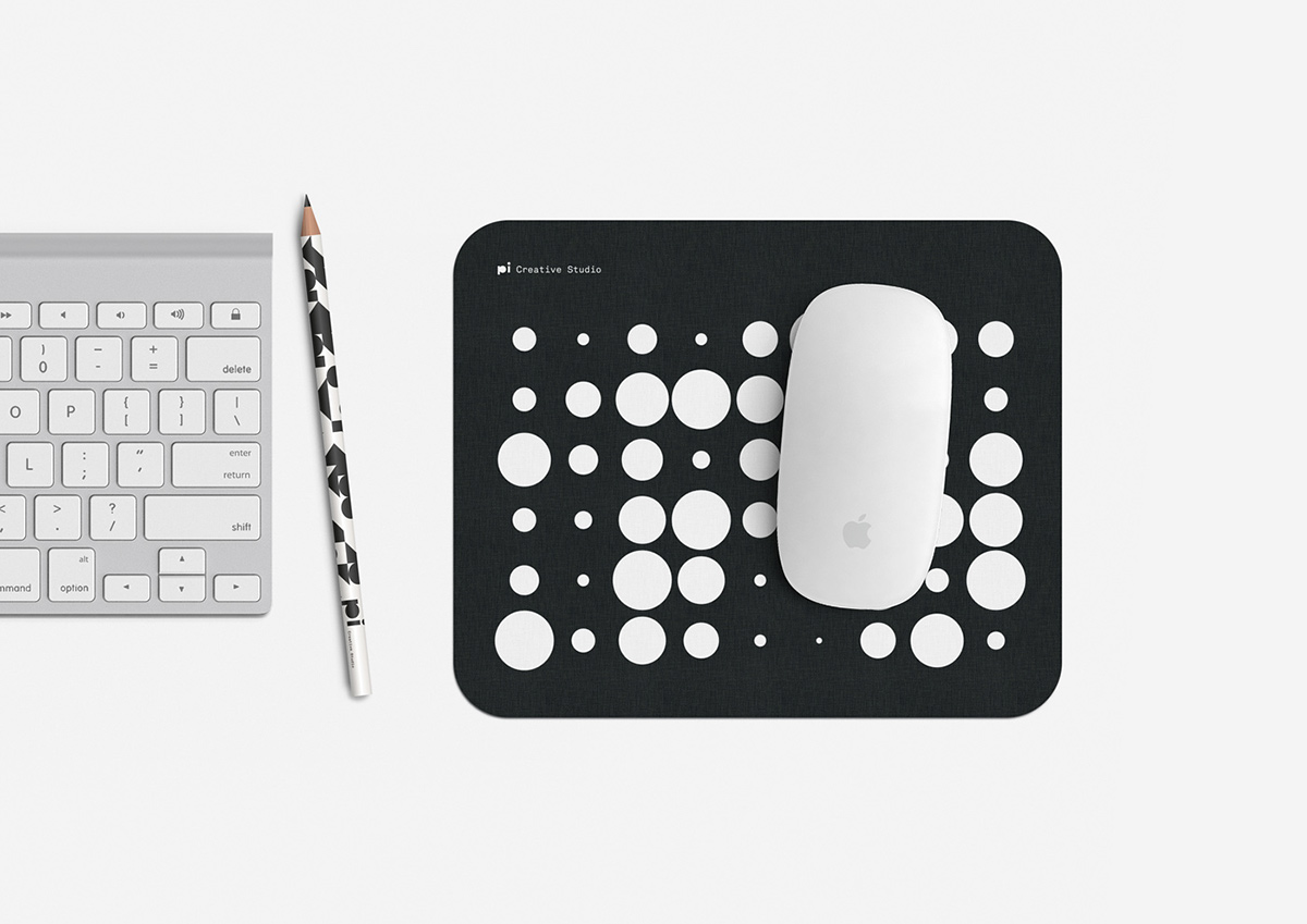
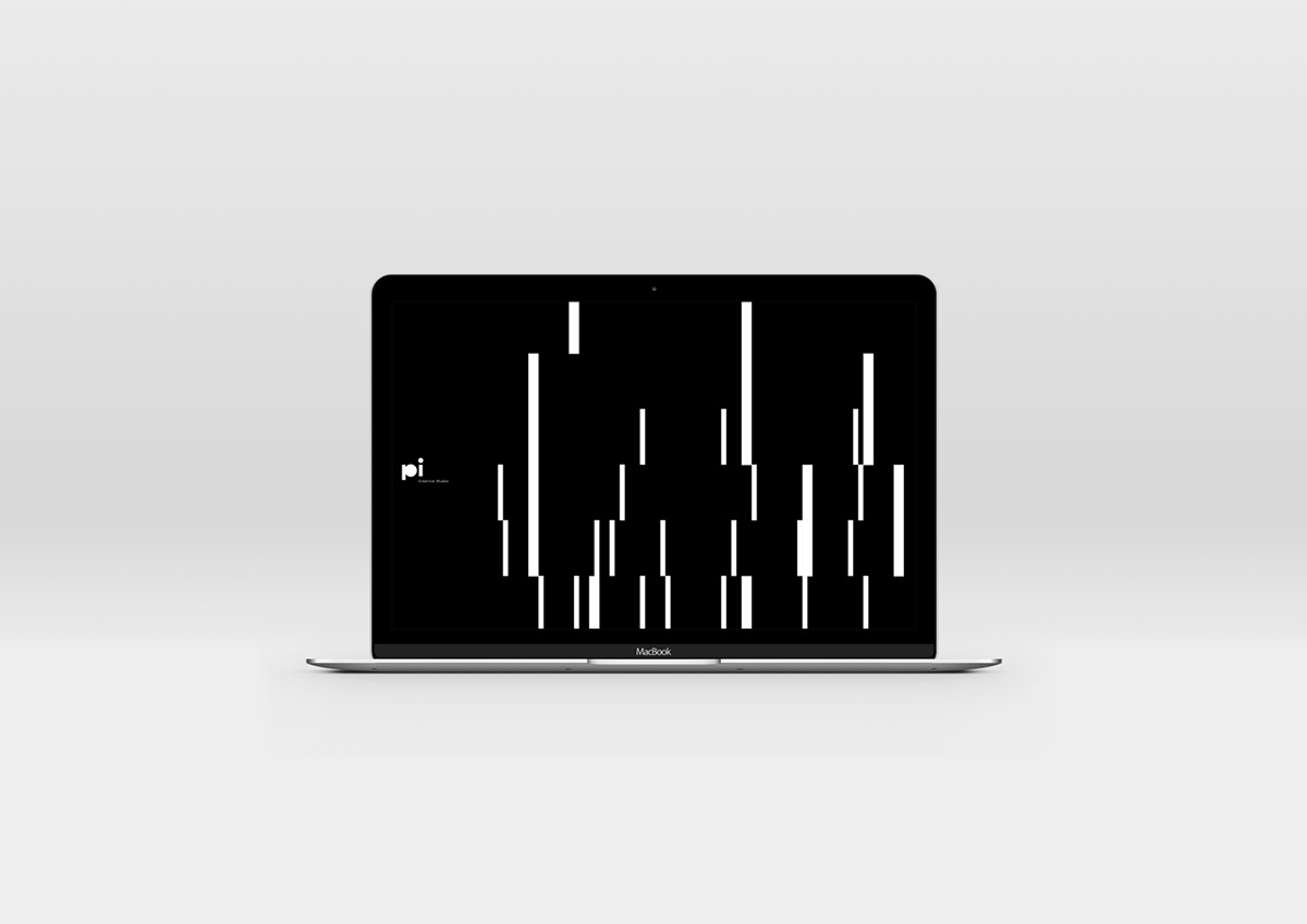
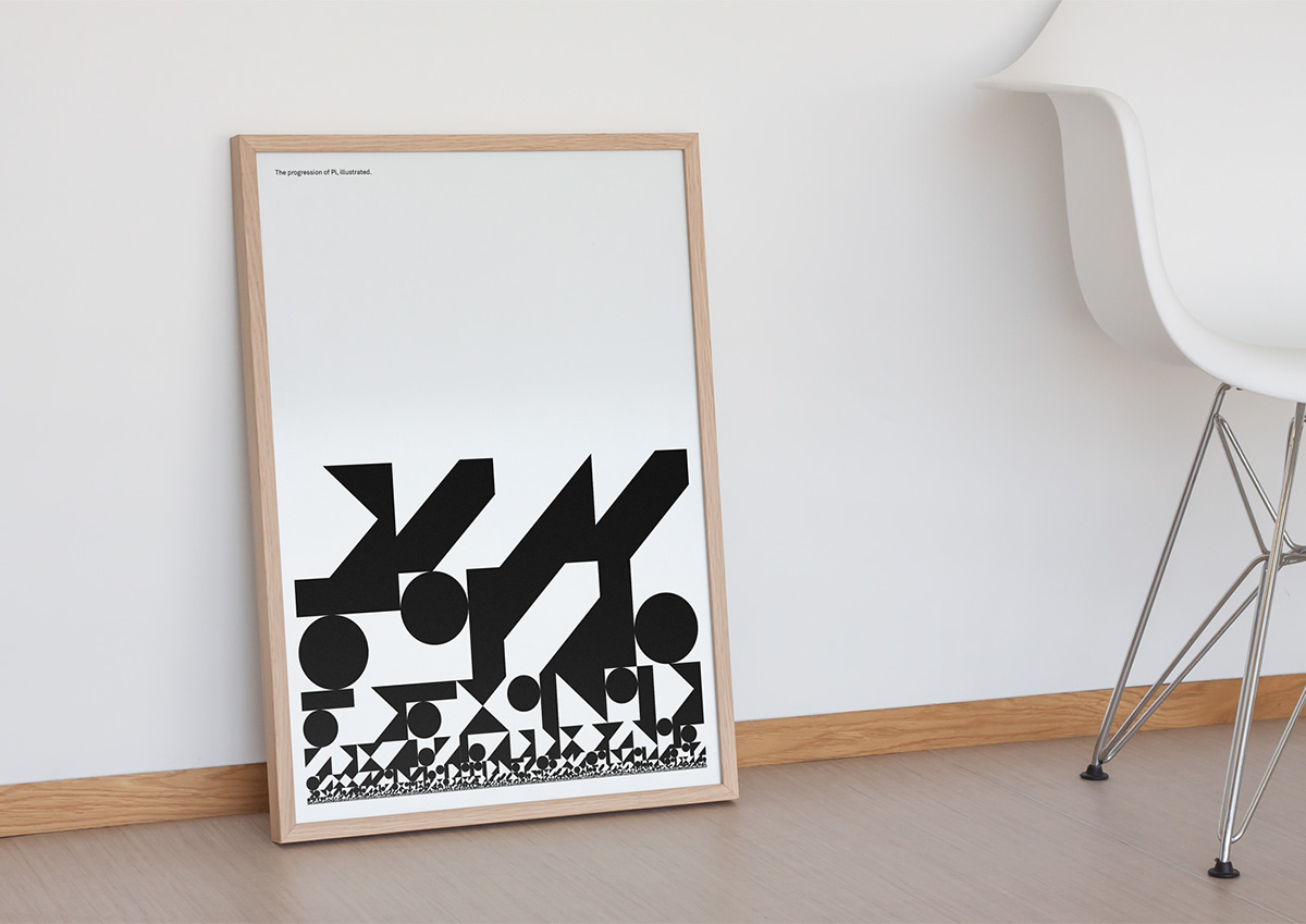
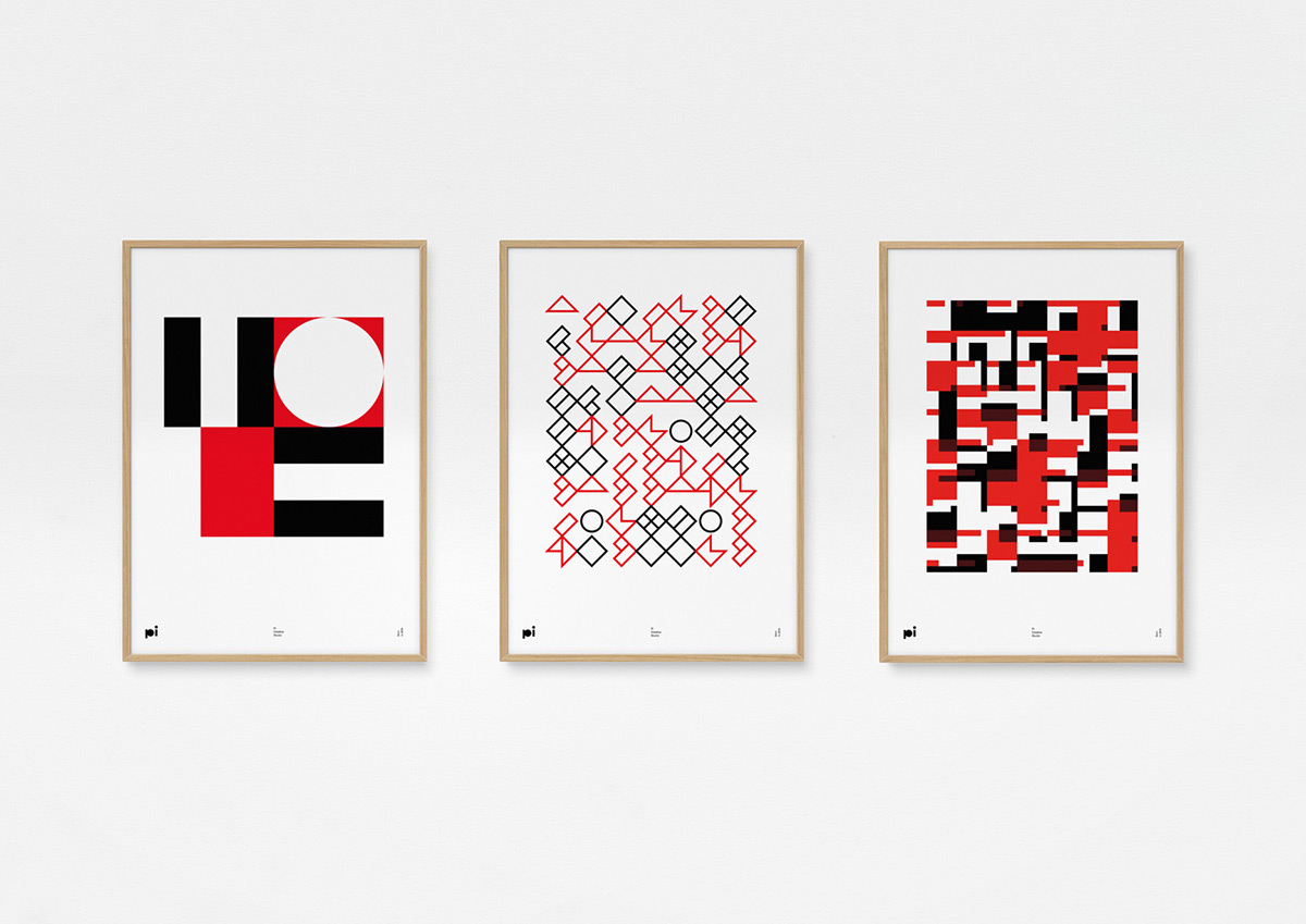
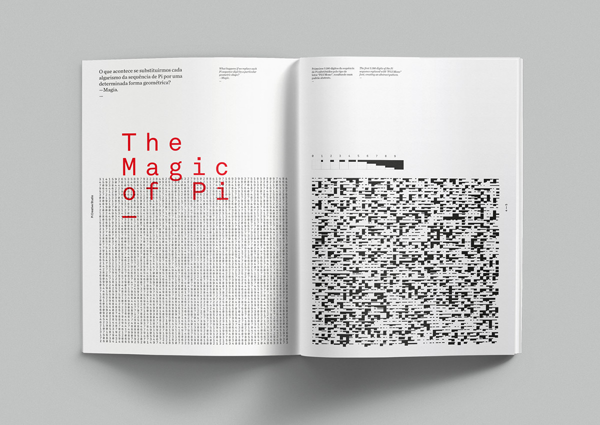
Shifting the name from Paleta de Ideias to Pi was a choice that came with a benefit: the new name also refers to the famous mathematical constant. The identity was built upon the mathematical symbol it represents, using Pi sequence as a tool to explore its visual language. A set of fonts with geometric shapes were designed, where numerals were replaced by diverse shapes, creating mesmerising patterns when applied to Pi sequence. This simple system is the base of Pi’s identity.
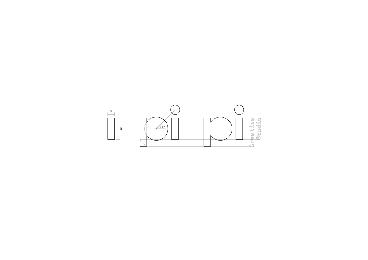
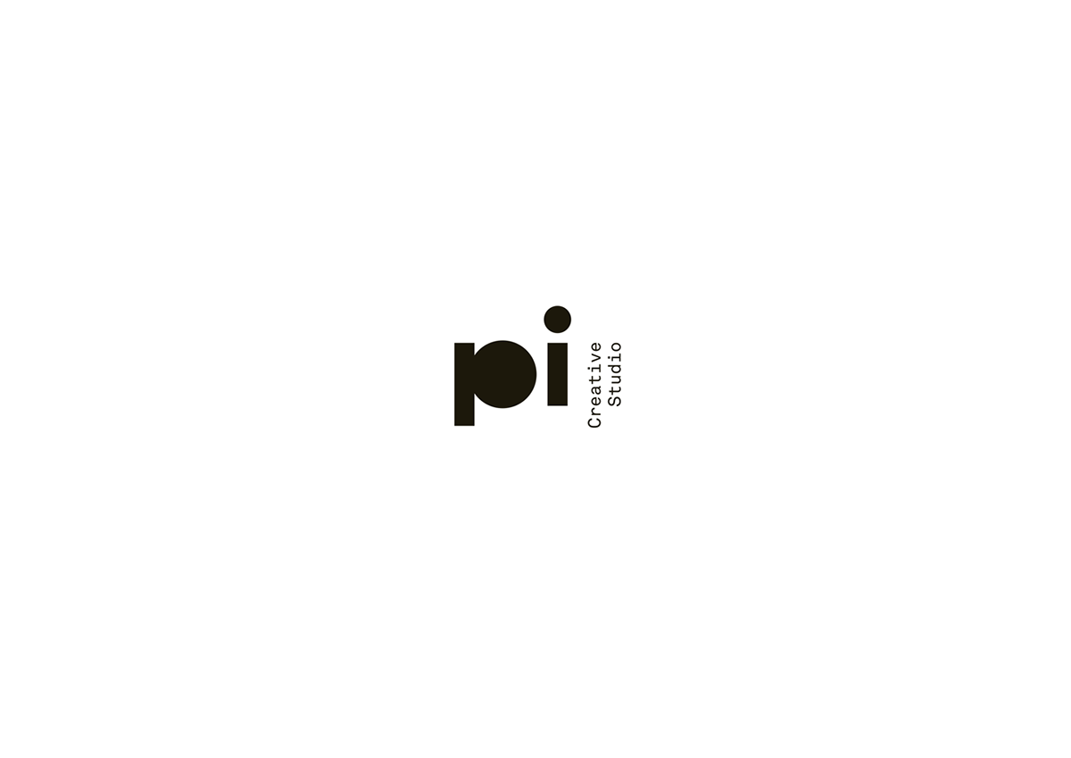
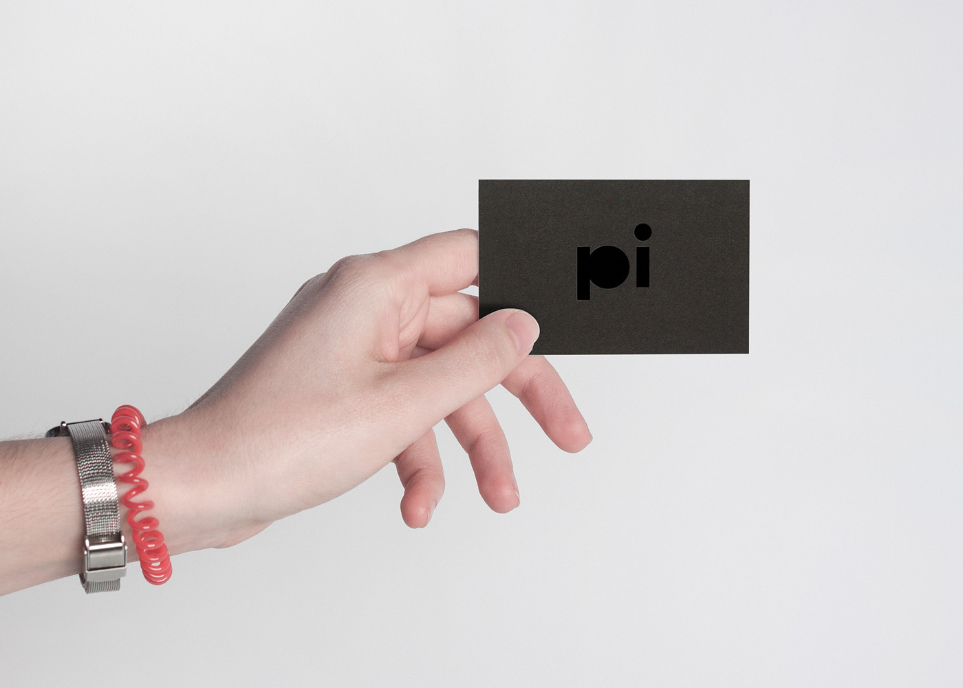
The logotype construction was based upon a rectangle with the proportion of Pi, which served as the start point for the i character. The closed counter of P calls attention to the circle, being Pi closely related to its geometry.
—
A set of fonts with geometric shapes were designed, where numerals were replaced by diverse shapes, creating mesmerising patterns when applied to Pi sequence.
This simple system is the base of Pi’s identity.
This simple system is the base of Pi’s identity.
—

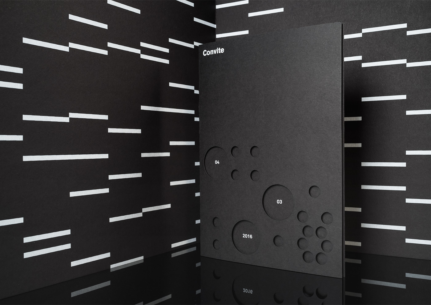
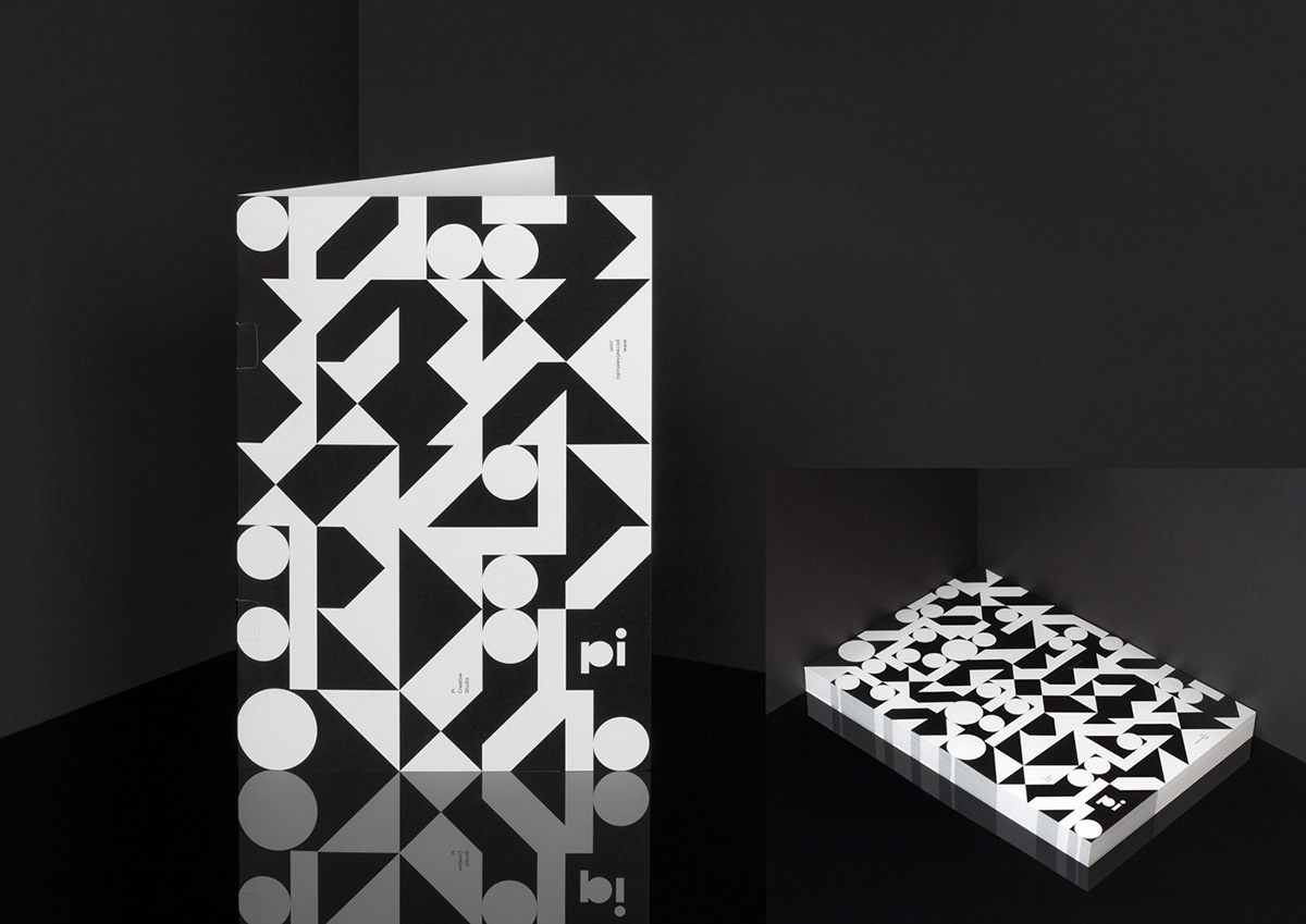
Open Day Invitation
—

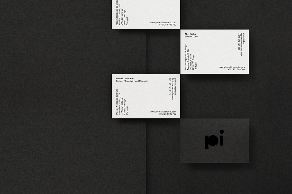
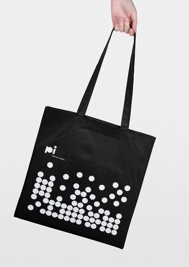
Stationery / Collateral
—

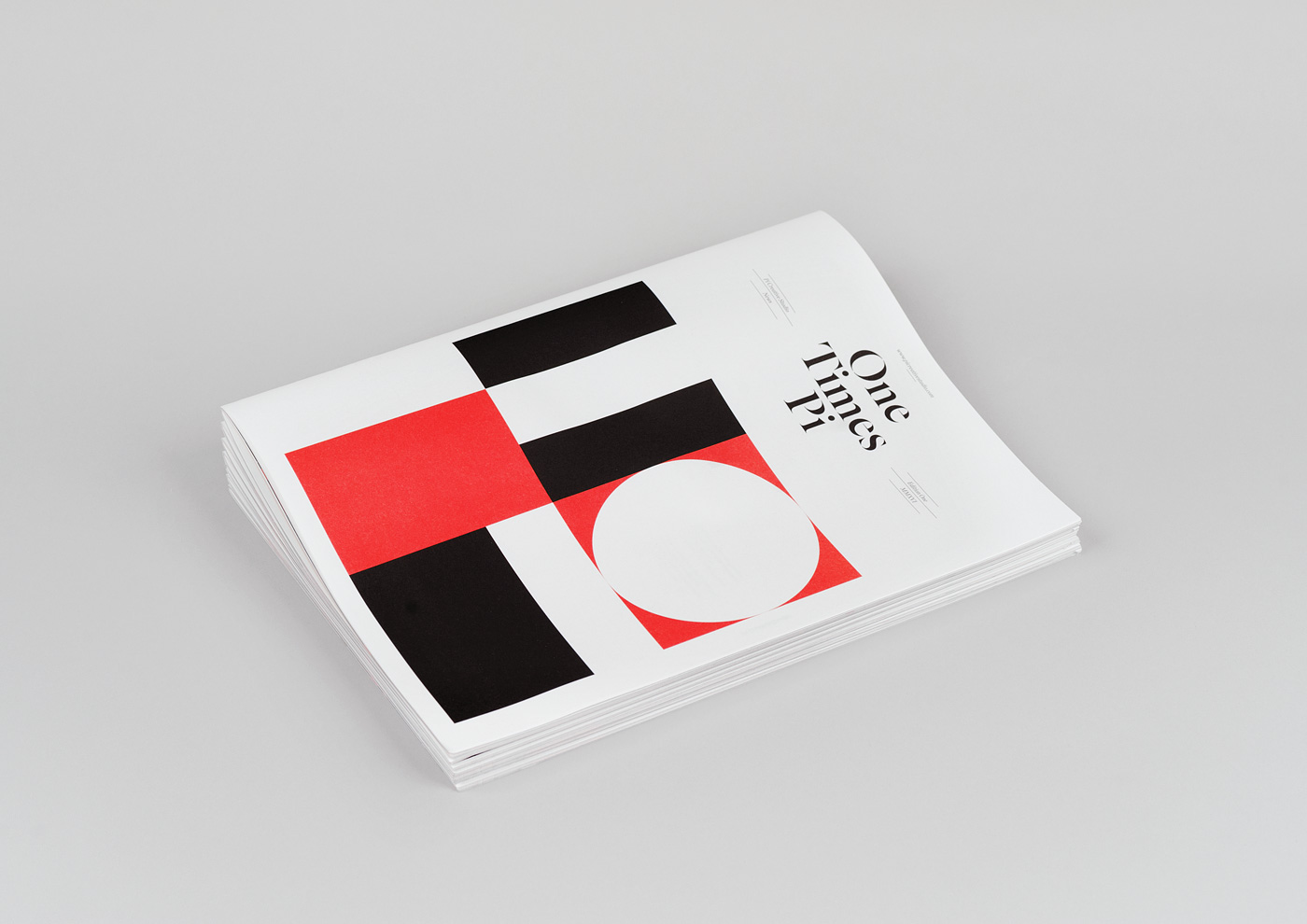
Times Pi
—
One Times Pi is the first issue of Times Pi, a publication that intends to reveal the portfolio and points of view from Pi Creative Studio.
One Times Pi is the first issue of Times Pi, a publication that intends to reveal the portfolio and points of view from Pi Creative Studio.
Times is a widely used term in news magazine and newspaper titles. Here it was used with a twist, meaning multiplication, creating an interesting guideline for the publication issues.
The second issue is to be called Two Times Pi.
The second issue is to be called Two Times Pi.
—

The studio
—
—
Pi Creative Studio Identity
—
Creative direction and design: Pedro Matos
Creative direction and design: Pedro Matos
Photography: Pedro Matos /WAPA
2015
—
—

