Reimagine Your City Through A New Color Scheme
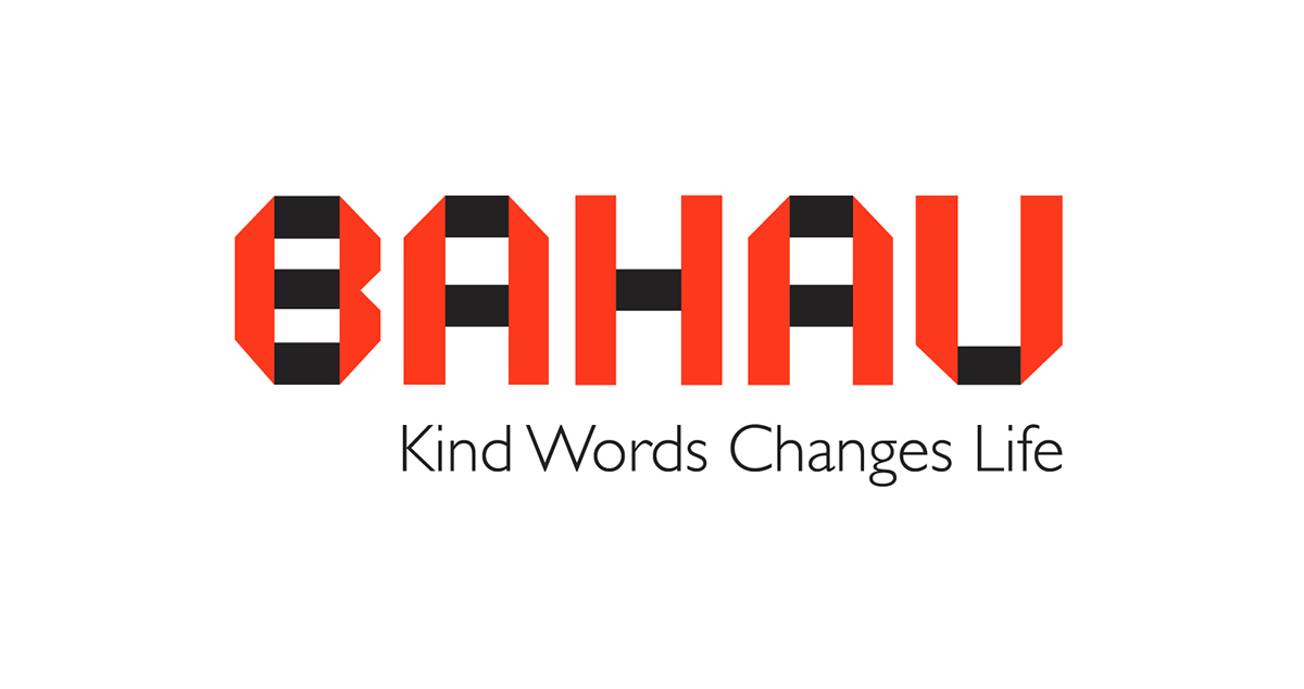
Inspired to look like a folded paper, the logoof Bahau city wants to show the value of kind words and transparency, unlike crumpled paper, which symbolises distrust. The colors are black and red to represent protection and love.

Brand applications for this city.

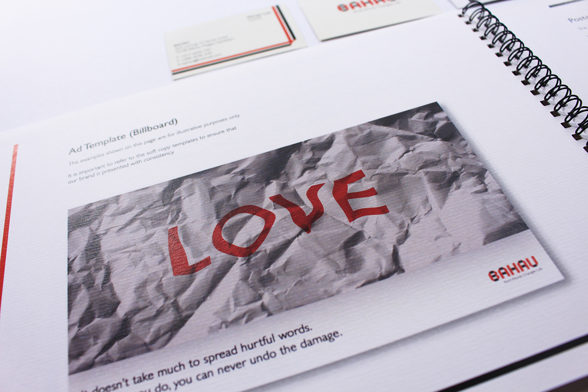
This is the page for the billboards of Bahau that was in the guide book. It will be a crumpled poster paper with words as you can see. This idea will also be input on billboards and newsprints where those media will be crumpled to grab attention and to let people feel the danger of gossiping. We can also change the words on the crumpled media to photos of loved ones which applied the same idea that when you gossip about people, the relationship will never be as smooth as before again.


