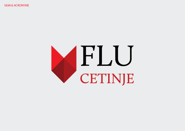
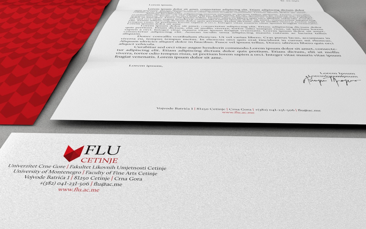
Logo for the Faculty of Fine Arts at Cetinje (Montenegro, Europe), consists the sign,acronym and logotype. The sign in its expression incorporates the fact that theFFA(FLU at Montenegrian) is composed of four study programs, active in fourfields of art, symbolically represented with triangles that make up the sign.All triangles are red color just different tones and symbolic reminder of allthe logos so far been used for visual identity of the Faculty. The triangles makea shield form, and that will grow as the Faculty continue to be develop andintroduce new programs of study (the new triangle for every new program).
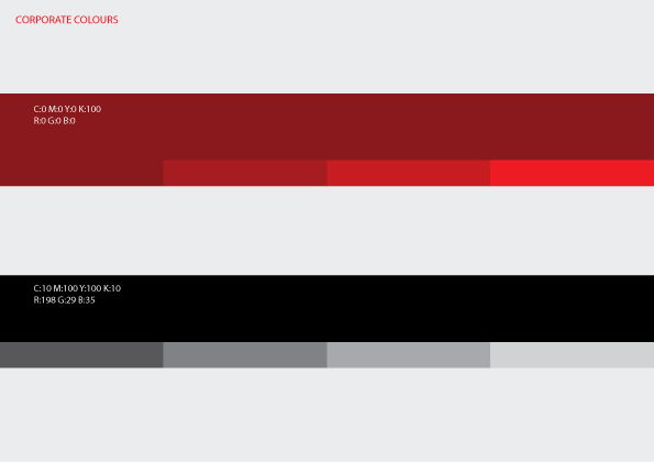
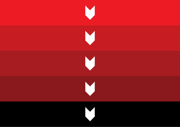
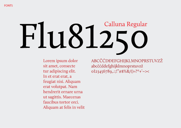
Brightest color is red (C: 0 M:100 Y: 100 K: 0), while each of the following is a darker shade for the 10% Cand K in the CMYK color palette. The acronym is printed in capital lettersCalluna font whose symbolize the art and the history of the Faculty. Word FLUis black, and word CETINJE is red (C: 10 M: 100 Y: 100 K: 10) which is withblack basic color entire visual identity.
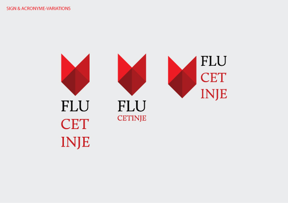
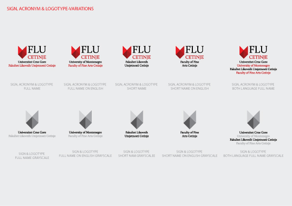
There are also the variants ofthe logo. The proposed logo is modern, distinctive, stylish and contributes tolinking with the previous visual identity used and alluding to long term successfulwork of the institution.
Brightest color is red (C: 0 M:100 Y: 100 K: 0), while each of the following is a darker shade for the 10% Cand K in the CMYK color palette. The acronym is printed in capital lettersCalluna font whose symbolize the art and the history of the Faculty. Word FLUis black, and word CETINJE is red (C: 10 M: 100 Y: 100 K: 10) which is withblack basic color entire visual identity.
There are also the variants ofthe logo. The proposed logo is modern, distinctive, stylish and contributes tolinking with the previous visual identity used and alluding to long term successfulwork of the institution.