Project Ask:
How do we come up with a flexible UI for splash and landing screens that corresponds with multitasking/Split View mode on the iPad, and doesn’t distort object proportions and sizing?
Understanding the Space
Not knowing anything about multitasking, Split View, or Storyboarding (the method in which the design solution would be implemented), I researched all topics and collaborated with the iOS Engineer assigned to this ticket to better understand the space.
Since Split View functionality allows the user to drag and resize windows, all of the elements within that window and their presentation are dependent on window width and device orientation. As that window width grows or shrinks, its elements adapt and scale with it. Furthermore, adding some complexity to the mix, MyFitnessPal’s approach to handling varying window widths meant attributing minimum width values, which would be defined according to mobile screen widths. This was the challenge.

Varying iOS screen sizes to illustrate complexity.

Varying Android screen sizes to illustrate complexity.
Attributing minimum width values is similar to a media query when designing for responsive web. Knowing this, I figured why not apply another responsive web design tactic of using percentages? Especially since the scope for this project had now shifted from just iPad, to all mobile and tablet devices due to consistency. It was a different way of thinking about design for MyFitnessPal but, considering the context, it was the only solution that made sense and was fluid enough to deliver results that scaled appropriately across all devices and screen sizes.
Math, Math, Math
Now that I knew my approach, I put on my thinking cap and started sketching layout ideas based on percentages. To do this, I divided both splash and landing screens into zones based on components (logos, CTAs, text, and an image carousel).
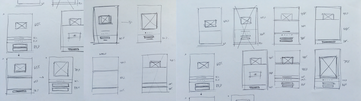
Additionally, because the splash screen blends into the landing screen, I knew it would be important to account for overlapping elements in order to create a seamless transition and overall user experience. Inherently, this also meant defining minimum/maximum height and width values for components.

iPhone 6 zones and components.

Android mobile, zones and components. Although the carousel isn't included on Android (legacy Product decision), notice the consistency with iOS. Both platforms essentially use the same system.

iOS and Android tablet, zones and components (landscape view).
Final Design Solutions
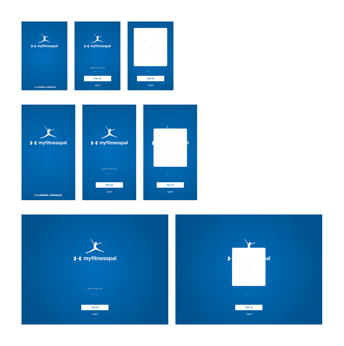
iOS designs, which showcase the adaptive solution across varying screen sizes (iPhone 4s, iPhone 6, and iPad Air).

Android designs, which showcase the adaptive solution across varying sizes and orientations (mobile, 7" tablet, and 9" tablet). Only on Android does MyFitnessPal have a landscape view for mobile.


