


CJ KX Brand eXperience Design Renewal
Background
Korea Express was incorporated into CJ group from Kumho Asiana in 2011, they changed their name as CJ Korea Express and also renewed their CI, in 2013. However, CJ Korea Express just changed only their logo and they didn’t apply the brandness of CJ Korea Express with consistency in every customer touch point. So they couldn’t deliver their own well.
By establishing customer values of CJ Korea Express more discriminatively and improving its brand generally, Plus X reinforced brand leadership of CJ Korea Express and differentiation as No.1 logistics company in Korea. Also we considered reinforcement of brand awareness and competitiveness in global market.
Strategy
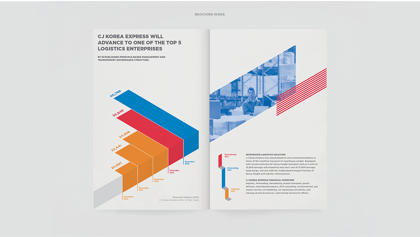
As an integrated logistics company that represents Korea, CJ KX develops various activities consistently, such as expanding of infrastructure and improving its process with their corporate philosophy and vision to become integrated logistics company in the global top 5.
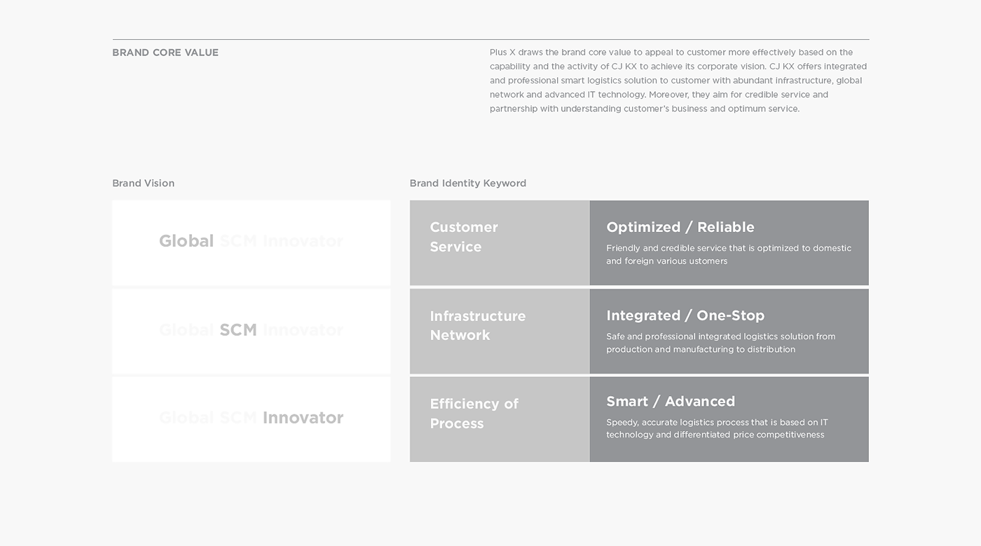
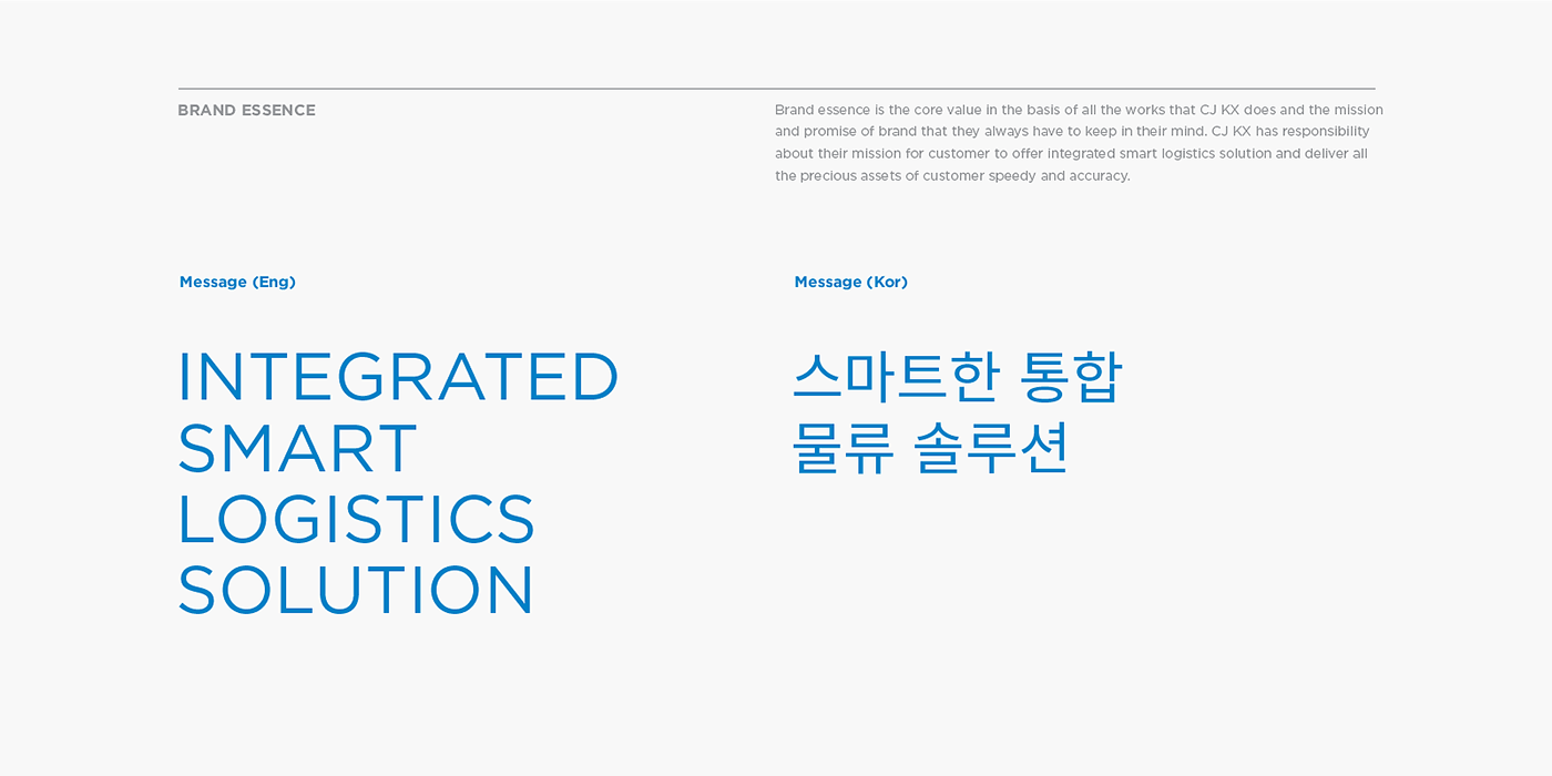
Plus X draws the brand core value to appeal to customer more effectively based on the capability and the activity of CJ KX to achieve its corporate vision. CJ KX offers integrated and professional smart logistics solution to customer with abundant infrastructure, global network and advanced IT technology. Moreover, they aim for credible service and partnership with understanding customer’s business and optimum service.
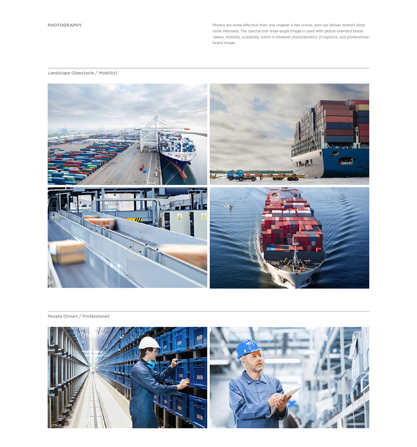
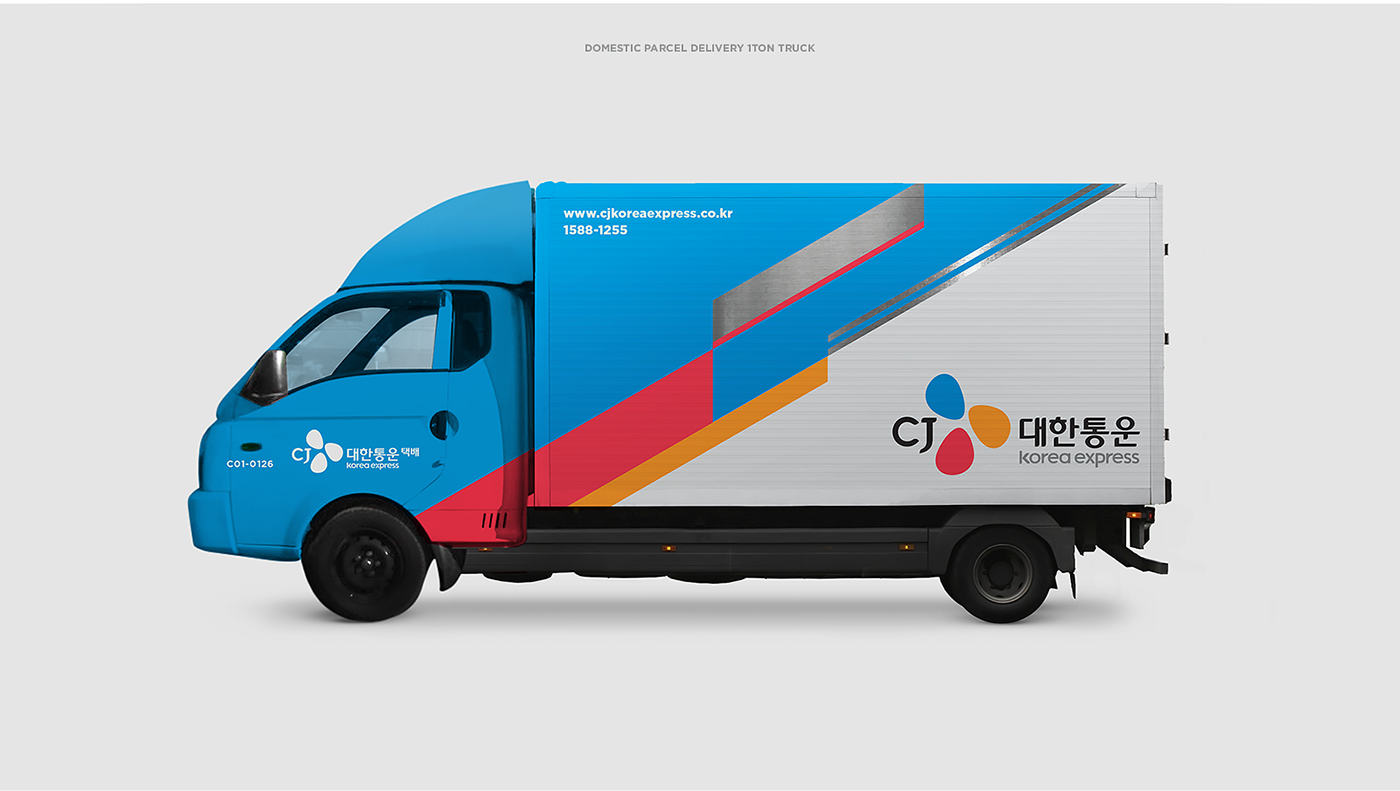
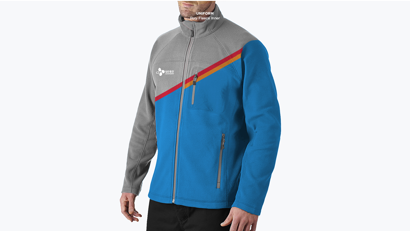
BX Design
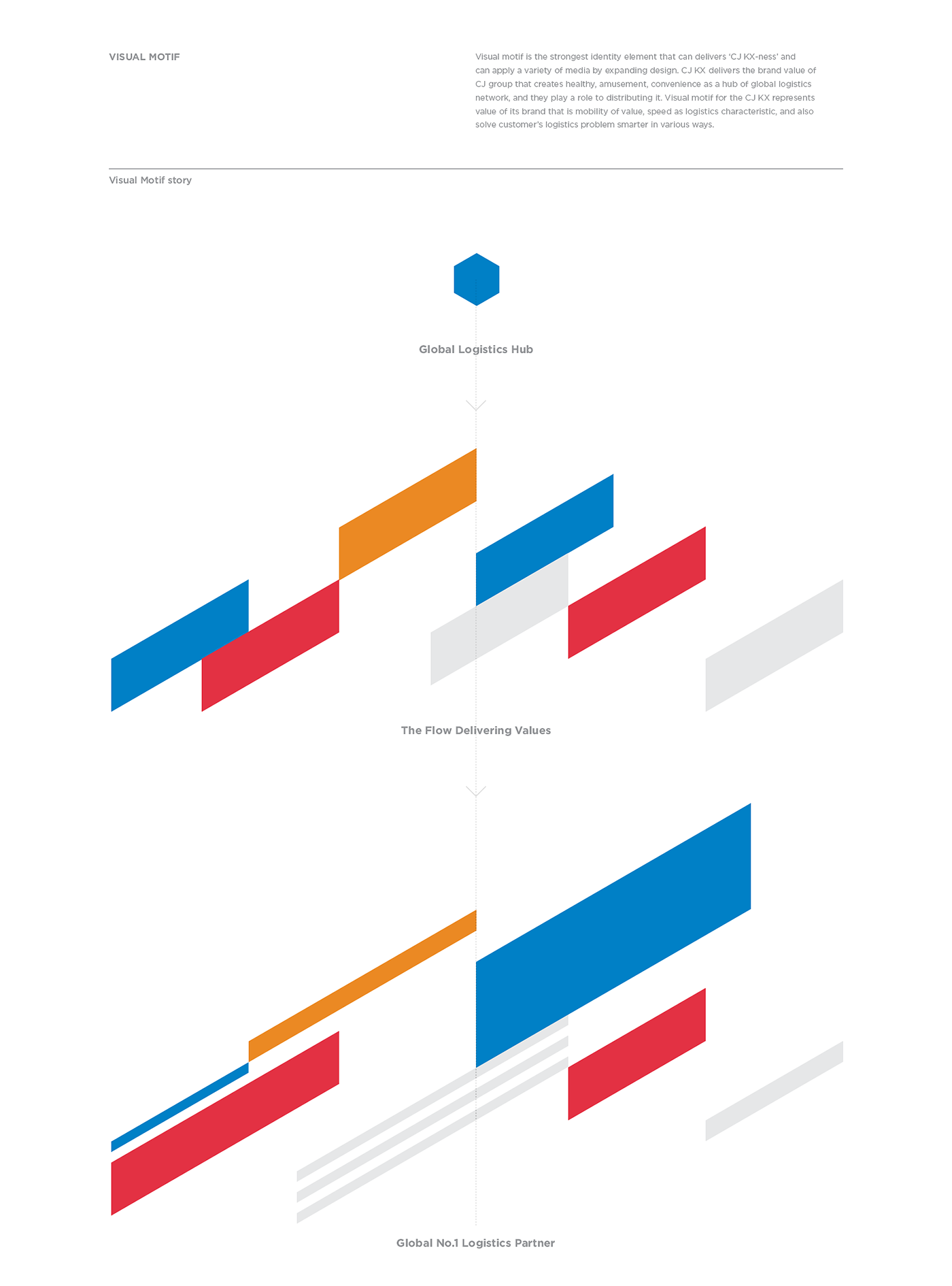
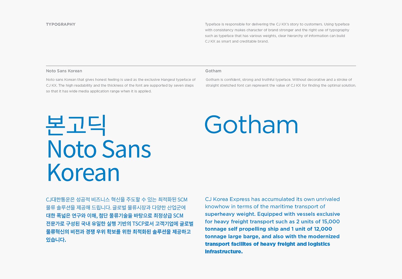
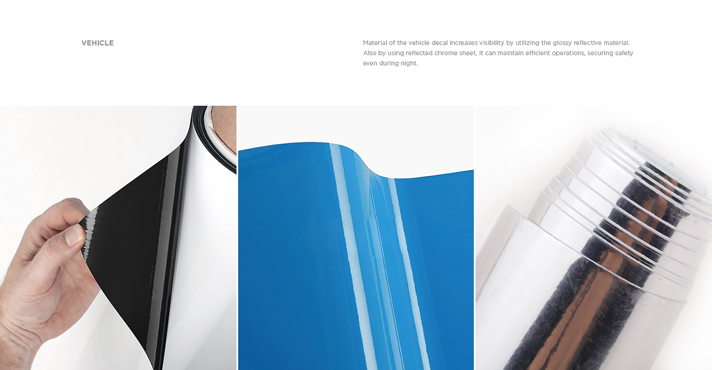
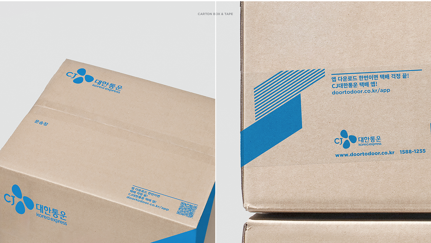
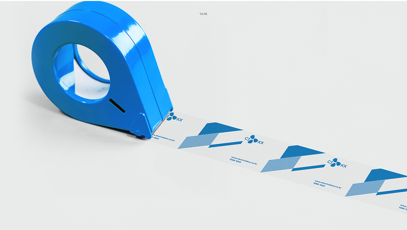
Based on the brand concept of Smart Flow, we express CJ KX-ness that provides smart and smooth flow to customer's logistics business. CJ KX provides smart logistics experience by solving the whole logistics business of the customers from smooth flow. Design Keywords reflects the brand image that have established itself as a leading brand in its field, extensibility that aims to global brand, and speed which is the characteristics of the logistics. Brand color of CJ KX uses the blossom color actively that is color of mother brand, CJ group, so that they can retain ‘CJ KX-ness’. Using chrome and silver color, they can deliver professional brand image to customers. Hexagon grid system as visual motif of CJ KX is used to embrace consistency and expandability. In addition, the angle of the motif is assumed to be 30°. The visual motif of CJ KX delivers its speed by varying the ratio to the size of each color.
Background
대한통운은 2011년 금호아시아나 그룹에서 CJ그룹으로 편입되면서, 2013년 CJ대한통운으로 사명을 변경하며 CI를 리뉴얼하였습니다. 하지만, 로고만 변경되었을 뿐 다양한 고객 접점에서 일관성없이 디자인이 전개되어 CJ대한통운스러움을 전달하지 못하고 있었습니다.
Plus X는 CJ대한통운의 차별적인 고객 가치 수립 및 브랜드 전반의 정비를 통해 대한민국 No.1 물류기업으로서의 브랜드 리더십 및 차별성을 강화하고, 글로벌 시장에서의 인지도 및 브랜드 경쟁력 강화를 꾀하고자 하였습니다.
Strategy
CJ대한통운은 국내를 대표하는 종합 물류 기업으로, 향후 글로벌 Top5 종합 물류 기업으로 발돋움하기 위해 기업이념과 비전 하에서 인프라 확충 및 프로세스 개선 등 다양한 활동을 지속적으로 전개하고 있습니다.
CJ대한통운의 기업 비전 달성을 위해 CJ대한통운이 보유하고 있는 역량과 활동을 기반으로, 고객들에게 효과적으로 어필할 수 있는 브랜드 핵심가치를 도출합니다. CJ대한통운은 풍부한 인프라와 글로벌 네트워크, 앞선 IT기술을 기반으로 고객들에게 통합적이고 전문적인 스마트 물류 솔루션을 제공합니다. 나아가, 고객들의 비즈니스를 이해하고 최적의 서비스를 바탕으로 언제 어디서나 신뢰할 수 있는 서비스와 파트너십을 지향합니다.
BX Design
브랜드 컨셉인 Smart Flow를 바탕으로, 고객들의 물류 비즈니스를 보다 스마트하고 원활한 흐름으로 제공하는 CJ대한통운스러움을 표현합니다.
고객들의 비즈니스 전반의 물류를 원활한 흐름으로 해결하여, 스마트한 물류 경험을 제공합니다. 동종업계 내 리딩 브랜드로 자리매김하고 있는 브랜드 이미지와 글로벌 브랜드를 지향하는 확장 가능성, 물류업의 특성인 신속성을 반영합니다.
CJ대한통운의 브랜드 컬러는 모기업인 CJ그룹의 블러썸 컬러를 적극적으로 사용하여 일관된 CJ대한통운스러움을 유지합니다. 크롬컬러와 실버컬러를 활용하여 고객들에게 보다 인상적이고, 전문적인 브랜드 이미지를 전달합니다.
CJ대한통운의 비주얼 모티브는 일관성과 확장성을 모두 아우를 수 있는 Hexagon Grid System을 사용하여 제작합니다. 또한, 모티브의 각도는 30°로 규정합니다. CJ대한통운의 비주얼 모티브는 컬러별 크기 비율을 달리하여 CJ대한통운의 속도감을 전달합니다.
-
PlusX
Creative Director : Shin Myungsup
BX Planner : Im Taesu, Kim Minkyung
BX Designer : Seo Jinwoong, Lee Hyojin, Kim Yura
BX Planner : Im Taesu, Kim Minkyung
BX Designer : Seo Jinwoong, Lee Hyojin, Kim Yura
CJ Group Marketing Office
Yang Hyoseok, Kim Taehyun, Kim Leah
CJ KX PR Team
Lee Dongsoo, Kim Eunkyung
CJ O Shopping Fashion Business Team
Kim Kyoungdeok, Hwang Jaewoong