INSTITUTE OF SOCIAL SCIENCE BELGRADE
new visual identity
new visual identity
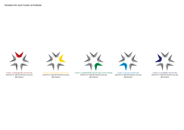
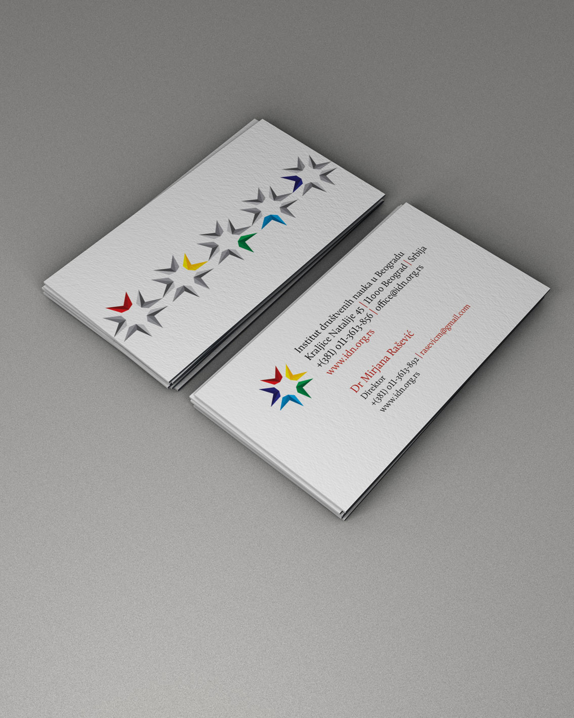
The sign in its expression incorporates the fact that theInstitute is composed of five centers that operate in five scientificdisciplines, separated by different colors, symbolically presented with rays tomake a sign. Each ray consists of four triangles of the same color justdifferent tone and symbolize the four tasks of the Institute proclaimed sinceits inception, namely: 1) basic research of social appearance, 2) improvement ofscientific thought, the development of scientific methodology and communicationand publication of results of scientific research, 3) training of scientific staffin the field of social sciences, and 4) develop cooperation with relevantinstitutions, organizations and individuals who are researching the nation.
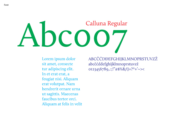
The logotype is black, in capital letters Calluna regularfont which serif symbolize Science, tradition and history of the Institute, theoldest research institutions in the region in social science. The logotype iswritten in Latin script for the institution’s internationality andaesthetically identical use the English language.
There are also logos for each center separately. In the signof these logos only one ray which symbolize the center is in a color, while theother rays are in grayscale. In the logo of each Center is kept full text of nameof the Institute, and before him the name of the Centre in a color that isassign for it.