Well...not exactly. But let me tell you what happened.
I saw this quote by Massimo Vignelli when I was still in school. I didn't pay it much attention. Rebrand the church? Yeah...right.
Then, maybe two weeks ago I stumbled upon it again. This time it sounded like a cool project. Rebrand the church? Why not?
But what if Massimo could do it? Well, obviously...but I'll give it a shot using the Canon and everything he's designed as a guide.
Oh, yeah! then there's context. I'll explain that later.
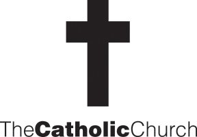
Why would the logo be O.K.? Well, it's a simple symbol, that basicaly works in any color. And it has A LOT of visual equity. Everyone knows what a cross is, right?
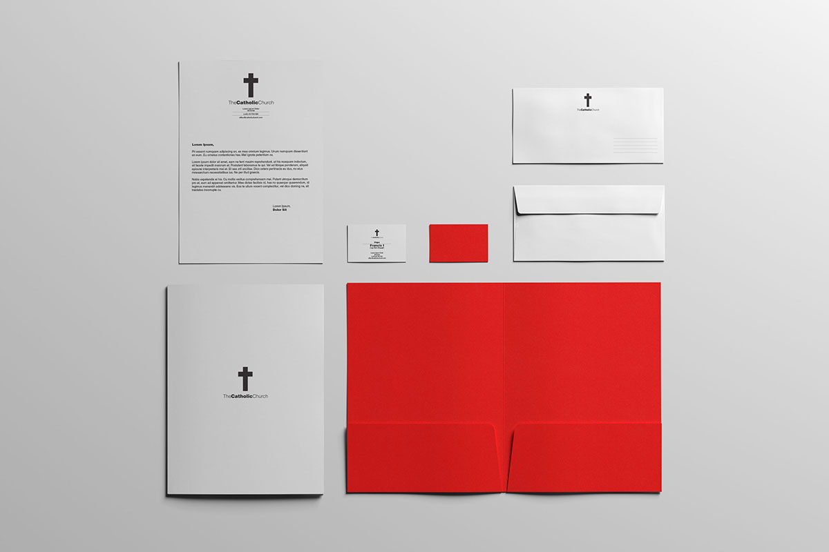
The obligatory stationary. Everything in white. That red? PMS 168 Warm Red. Massimo Vignelli's favorite color.

It's inside the envelopes.
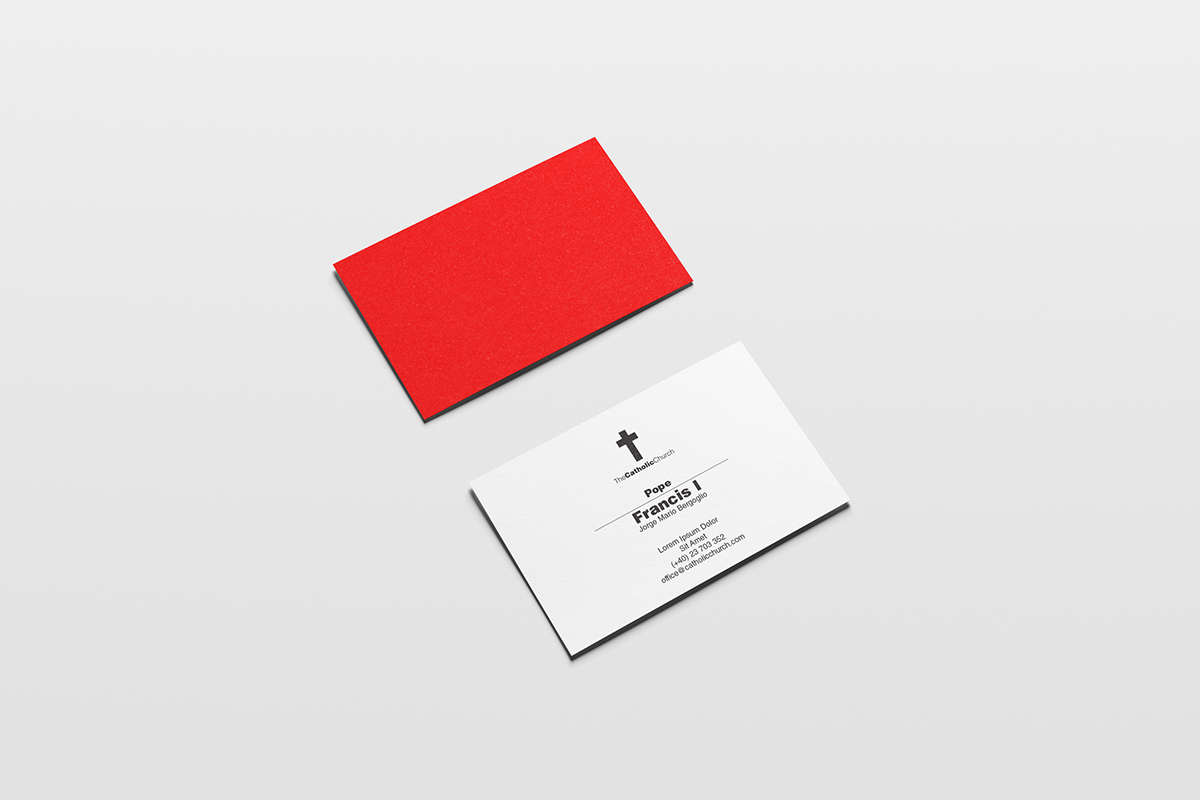
On the back of business cards. The Pope has a business card!
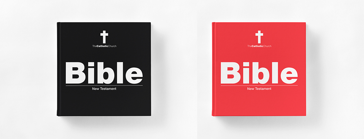
Then there are Bibles. Well, one Bible, two covers.
Oh, and then there's this:

What if The Catholic Church would rent ad space to gather members? That would be funny, but if it looked like this, it would be pretty cool!
Thanks for viewing!

