Love Knows No Bar was a creative UX Design challenge provided by the Talent Network in Phoenix. I placed first in this competition. The goal was to create a user friendly website to connect inmates with other inmates or people outside for possible friendships and relationships. It was supposed to be happy yet secure to make sure everyone was safe within the connections. It was supposed to be like a Tinder mixed in with Facebook.
Finding true love should be an option for everyone.
-LKNB (LoveKnowsNoBars) would be open for all inmates who wish to meet new singles
-LKNB would be set up to help with disabilities
-LKNB would allow lonely inmates to become social and recover faster
-LKNB would be a safe monitored environment with in house visiting “speed dating” hours
I chose this color scheme specifically because it does not interfere with any color deficiencies and therefore is color disability friendly. All of the text would still be clearly readable and the user should not have any problems with differentiating any of buttons or options. For a person with regular vision these colors are easy to spot and to remember. They are not used as often and illuminate a warm and safe environment.
I wanted to choose warm colors for the design in order to attract positive attention while avoiding the stereotypical “love” associated colors.
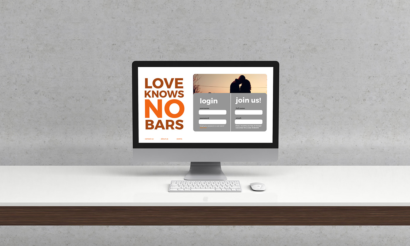
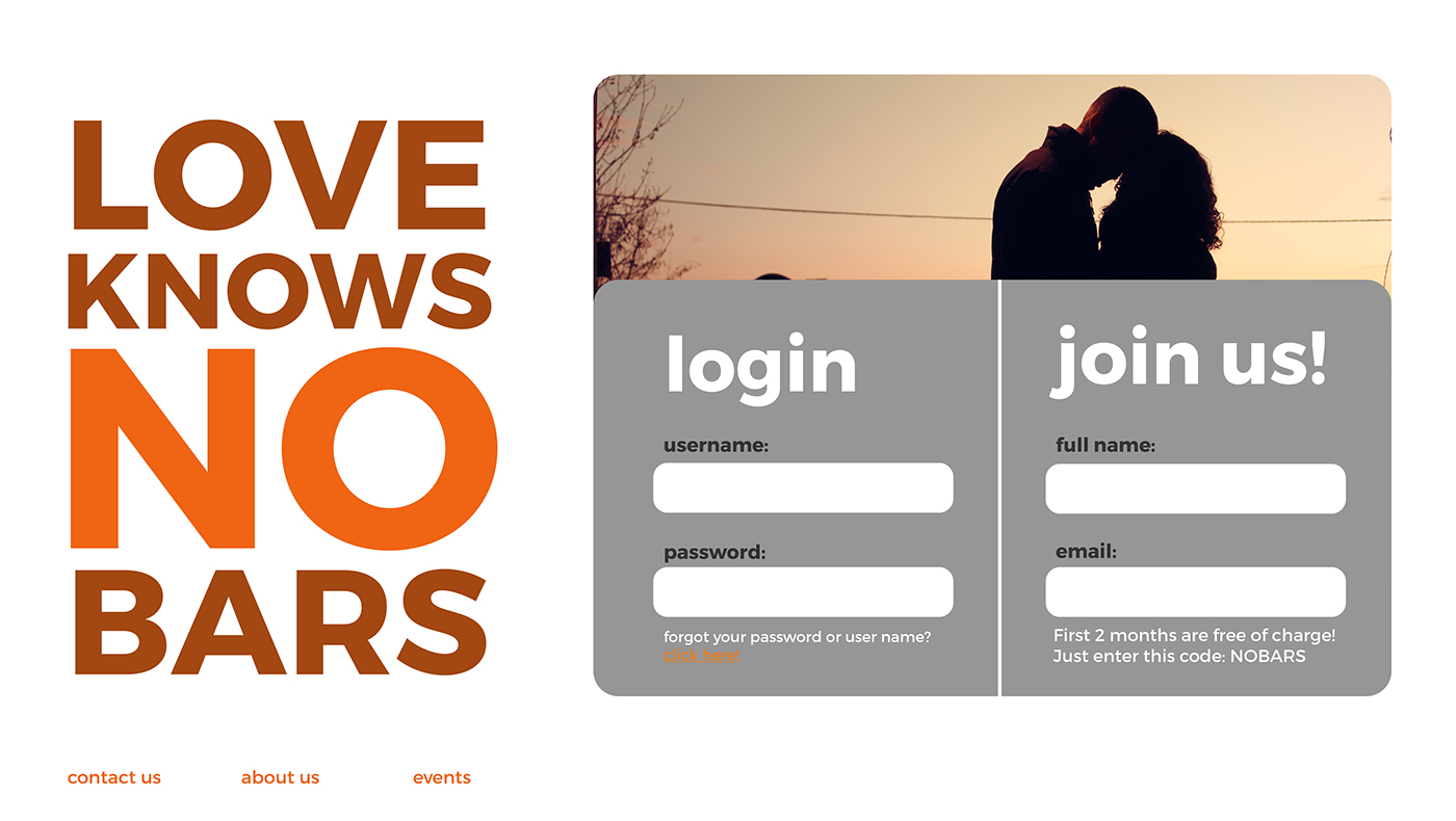
My goal was to keep the design as fresh and clean looking as possible. I believe that simplicity is the key for welcoming UX. As you can see here we have the login/entrance into the page. The user would have to sign in with their credentials or join as a new user. The new user would receive a verification email after pressing enter. After the credentials would be typed in a large login or submit would pop up in orange.
On the bottom we have a mini menu for the user to find out more about this dating website. It also lists future events which singles can sign up to go to and meet other singles.
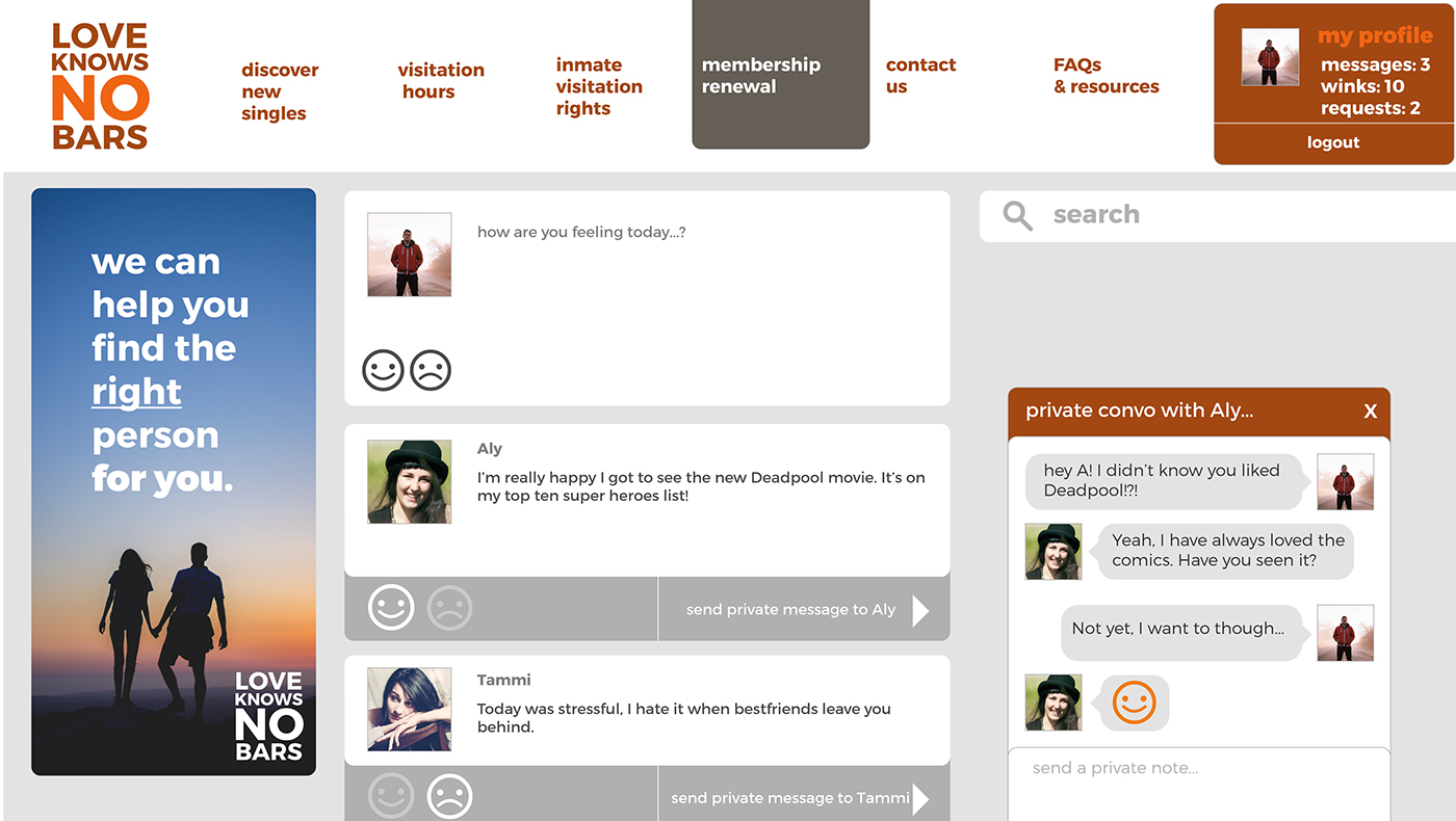
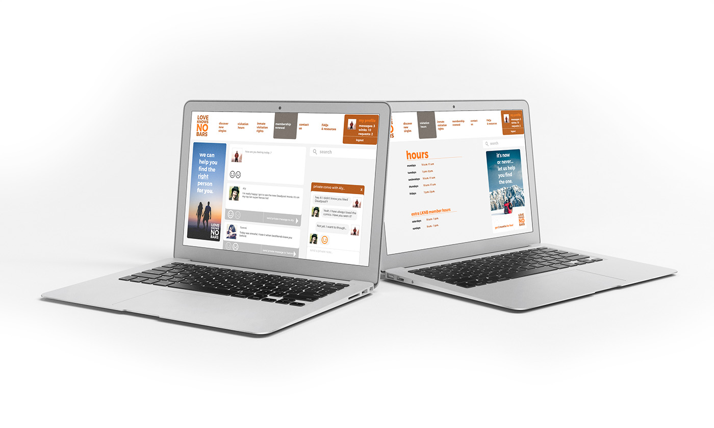
This is the main social page, it acts as a way for singles to communicate and share how they are feeling just like on Facebook or on twitter.
This would allow the user to share their feelings or thoughts along with a happy or sad smiley face depending on how they are feeling. As the user scrolls down they can see what their single friends are talking about and they can send them a private message that will show up in a chat box.
All of this content would be specifically monitored for aggressive behavior.
On this website the first two months are being advertised as free, however all of the content would afterwards be payed for by a subscription based method.
A payed membership would allow you to upload photos, send private messages, send winks (similar to saying “I am interested in you”) and they would be able to take advantage of the extra meetup hours on Saturday and Sunday!
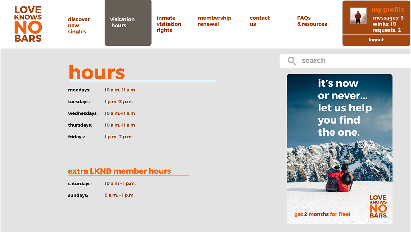
This is an example of what one of the inner menu pages would look like. It would have a gray background with bright orange titles and easy to navigate through content.