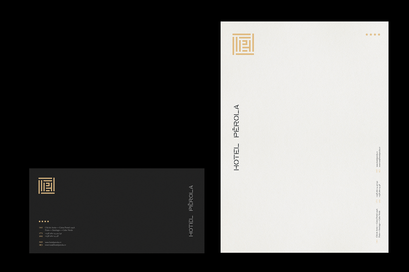
Hotel Pérola
An Hotel from Cape Verde located in one of the noble areas of the Capital intends to be a symbol of sophistication and refinement.
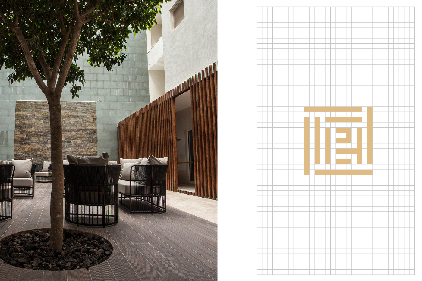
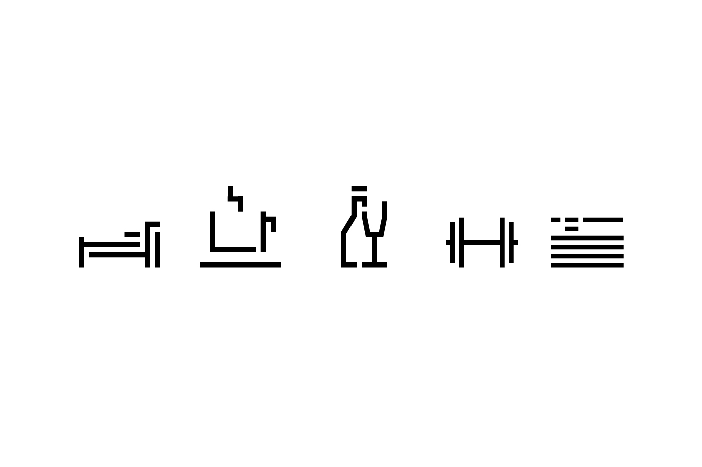
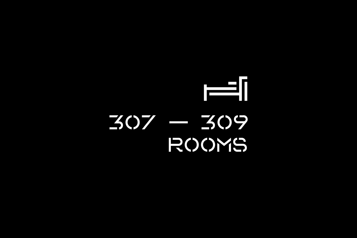
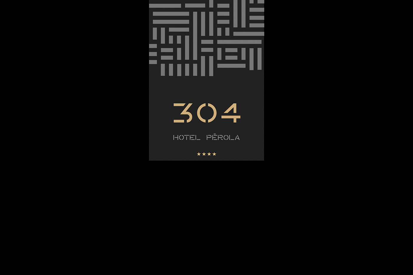
A strong point of reference in the project was Pérola's strong connection to the African Continent which unites a differential materials component and traditional symbology. The monogram is built around the fact that the initial characters (HP) are protected within a shell like an elegant pearl (pérola). The whole visual rhytm — typography, patterns, signage and way finding — was created to be an extension of that key communicative premisse — elegance and protection.
Photography: Hotel Pérola
Architecture: OGO Arquitectos