This Project was a Collaborative Effort
DESIGN & DIRECTION: Nick Adam | CLIENT: My Soon to be Wife
BRONZE ENGRAVING, DIE CUT & CUSTOM SLEEVE: Artistry Engraving
BLIND & INKED LETTERPRESS, WHITE FOIL, DIE CUT & CUSTOM SLEEVE: Rohner
SERIF TYPE: Grilli Type's GT Sectra | SAN-SERIF TYPE: Lineto's LL Brown
Perhaps the hardest and most important project in my thirteen-ish years of practicing design — the identity, system, & materials for my wife and I's wedding. While the baseline for every project is that it must be beautiful and hit its mark, this project was personal to us & our families — concept and execution had to be purposeful, top of class, and flawless.
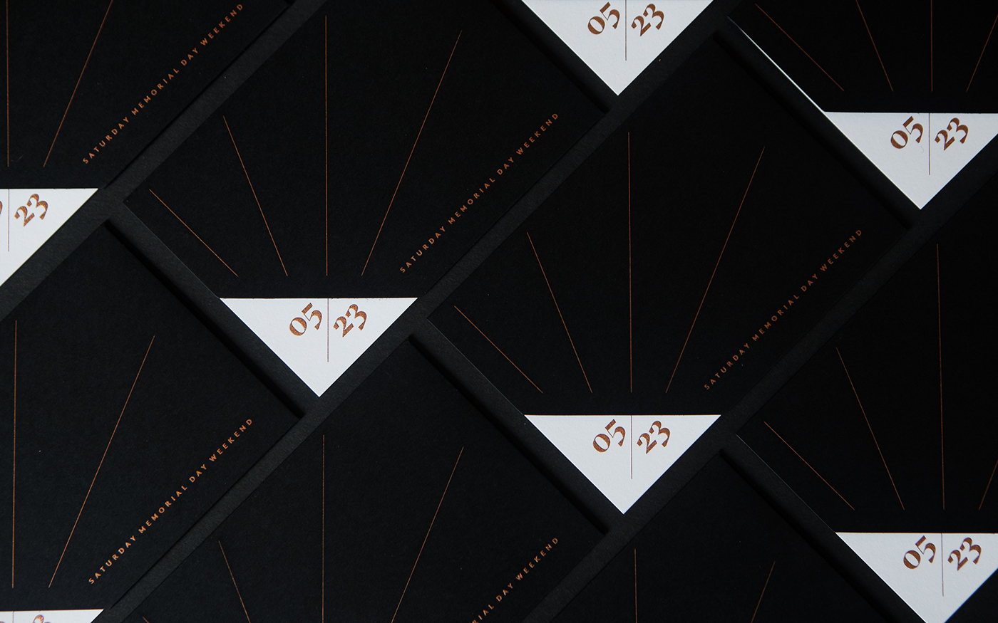
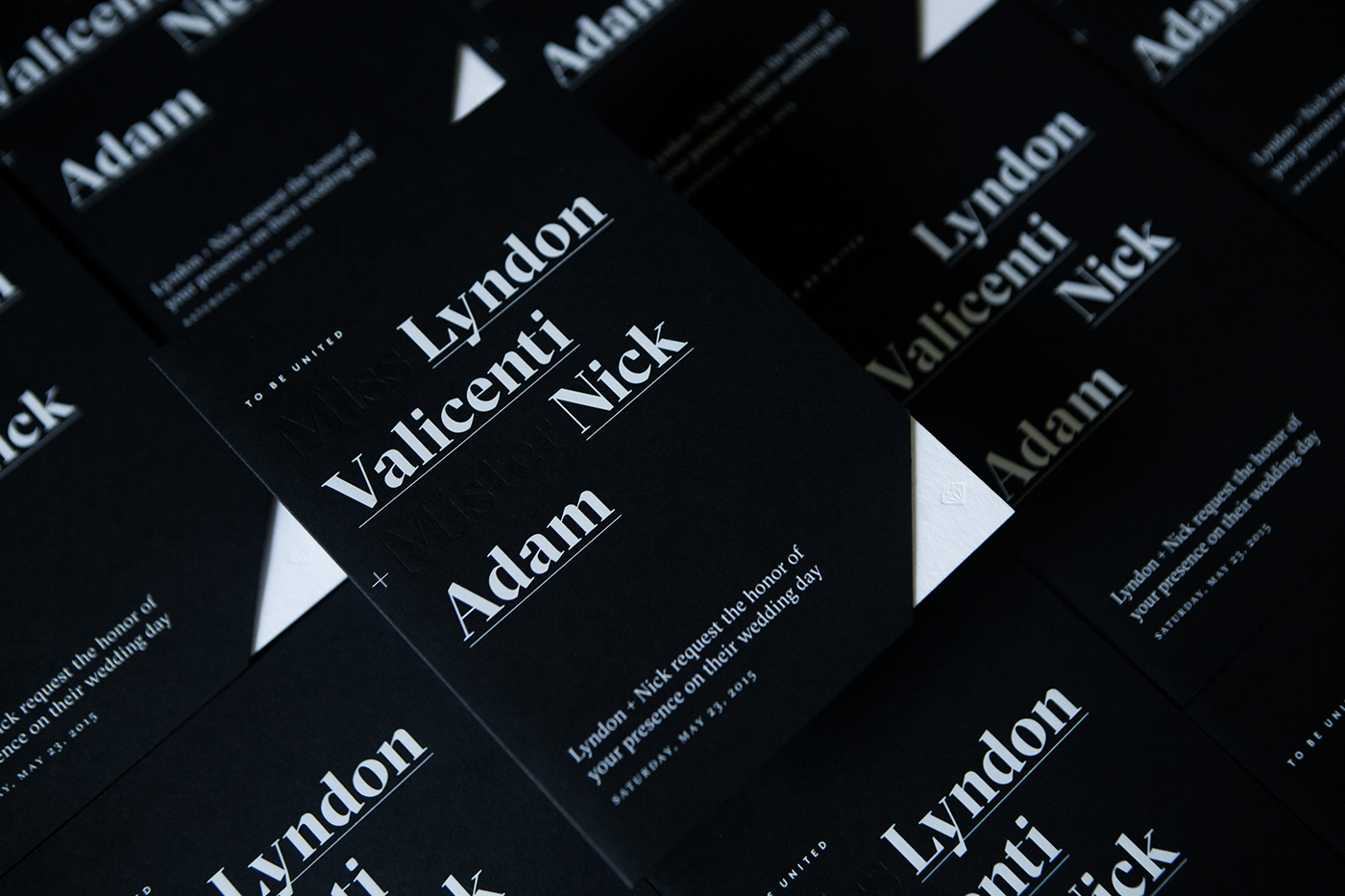
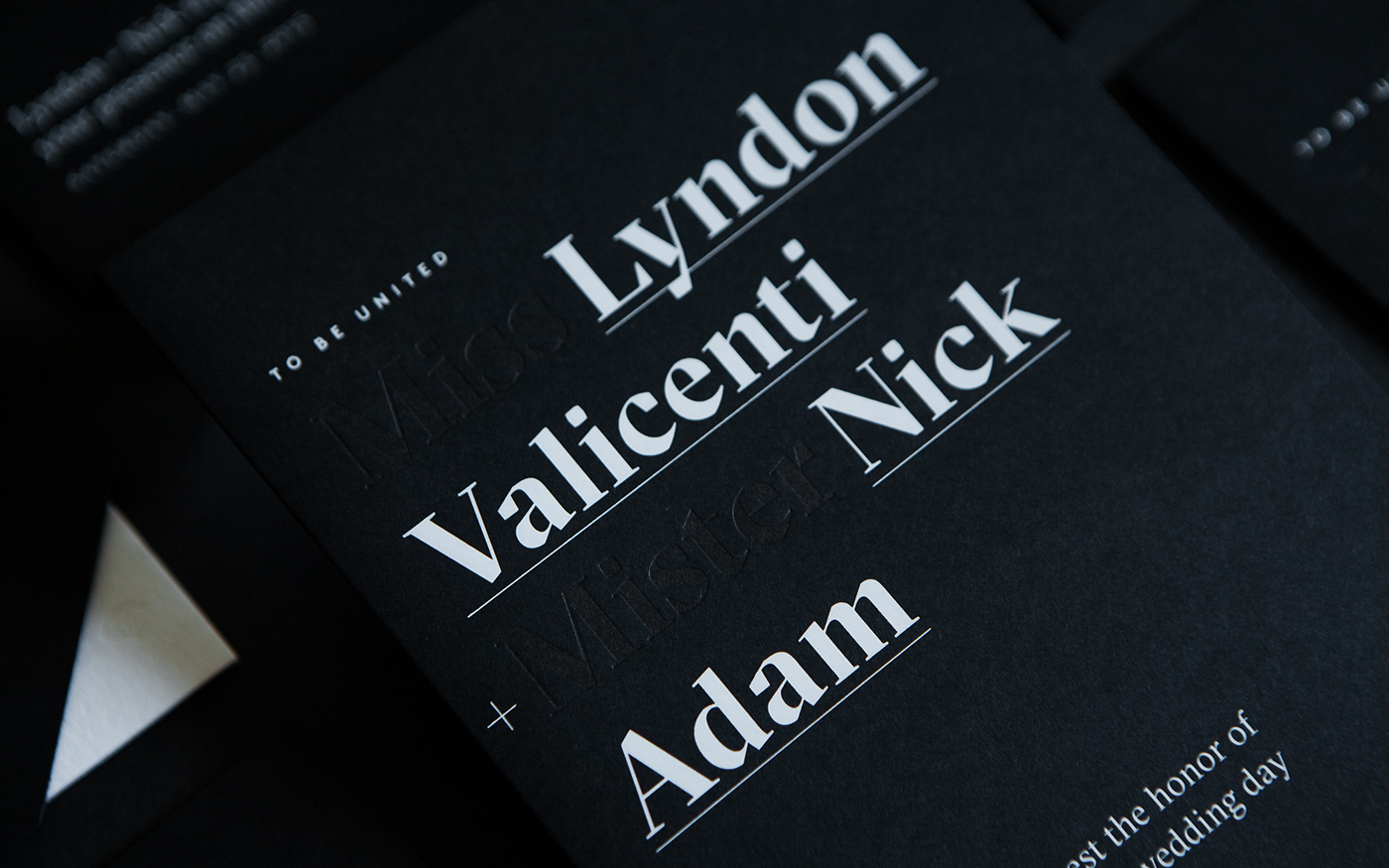
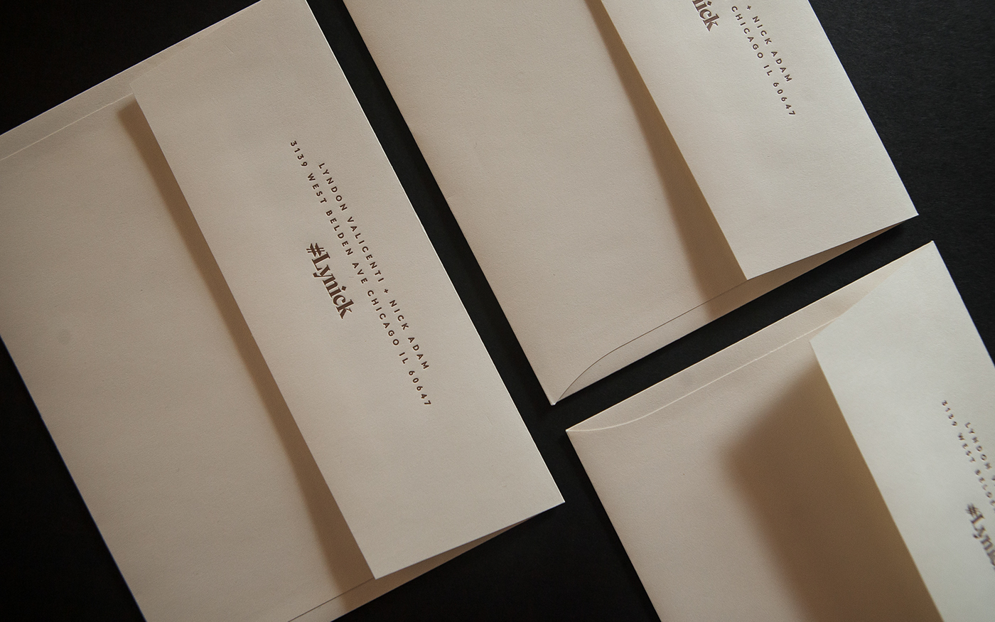
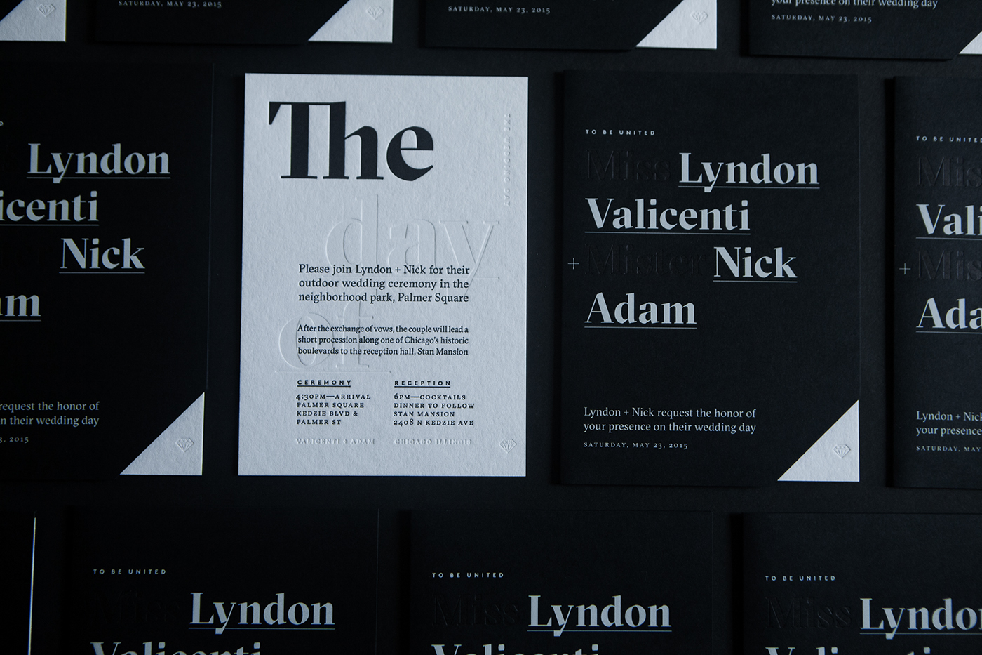
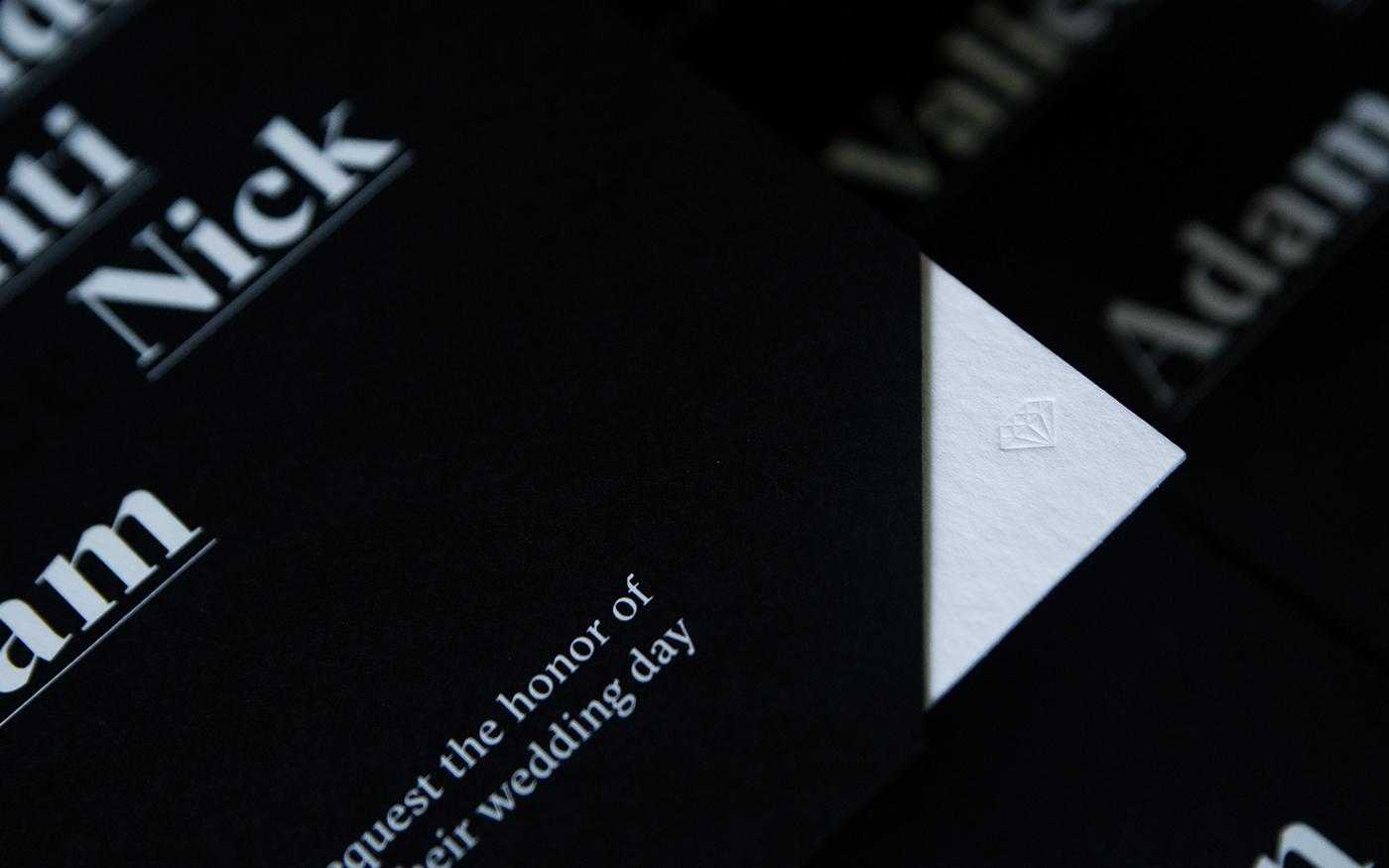
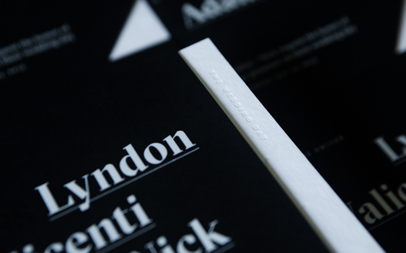
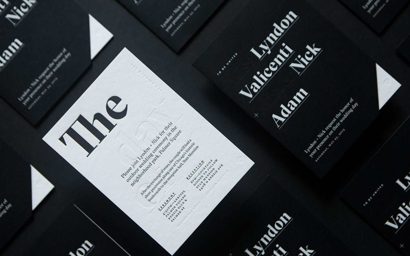
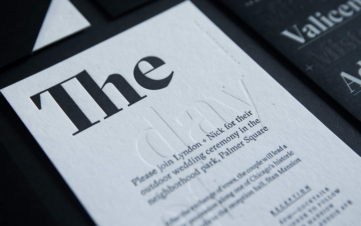
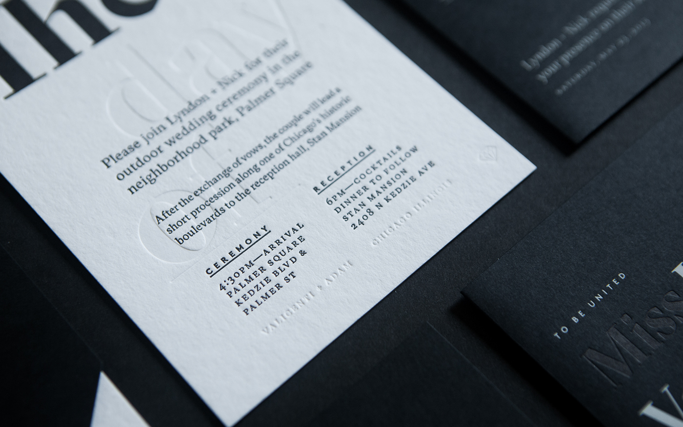
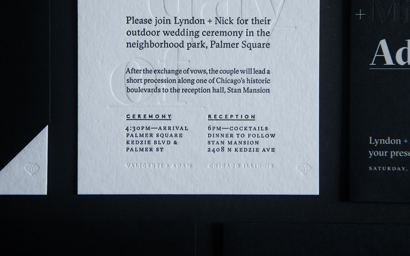
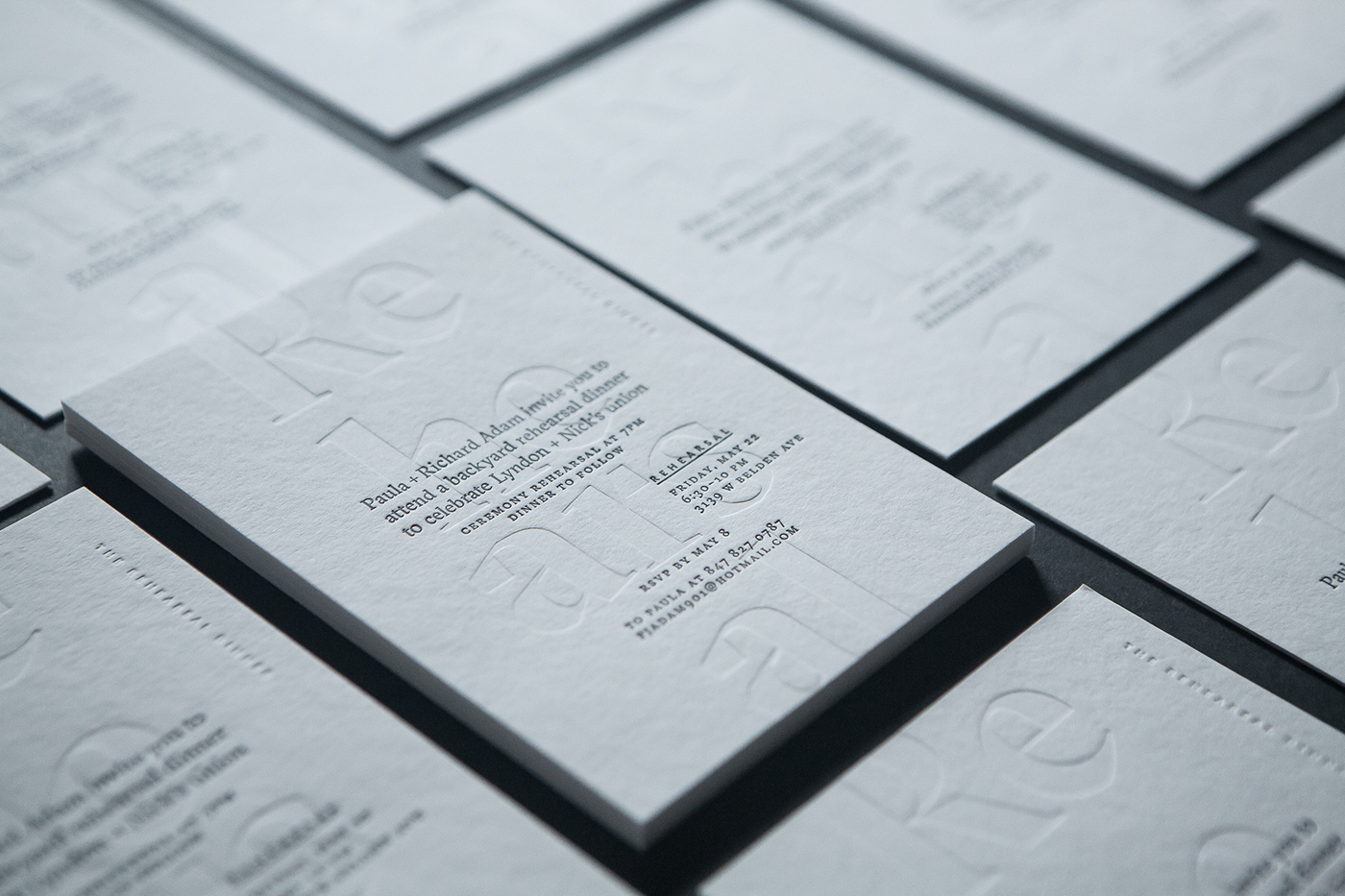
With my wife and I having moderately wild pasts (known all too well to our families), the objective for our materials was to set the right tone. Our ceremony would take place outdoors, assembled in a circular form, in Chicago's Logan Boulevard and would end with a Balkin marching band leading attendees a quarter-mile to the reception. While the ceremony wasn't not traditional, it was important to communicate to guest the attire was formal, and the vibe was classy. While fun, this was not to be confused with an outdoor picnic. Tone was set through style & production being at the height of what's achievable.

PROJECT CONCEPT:
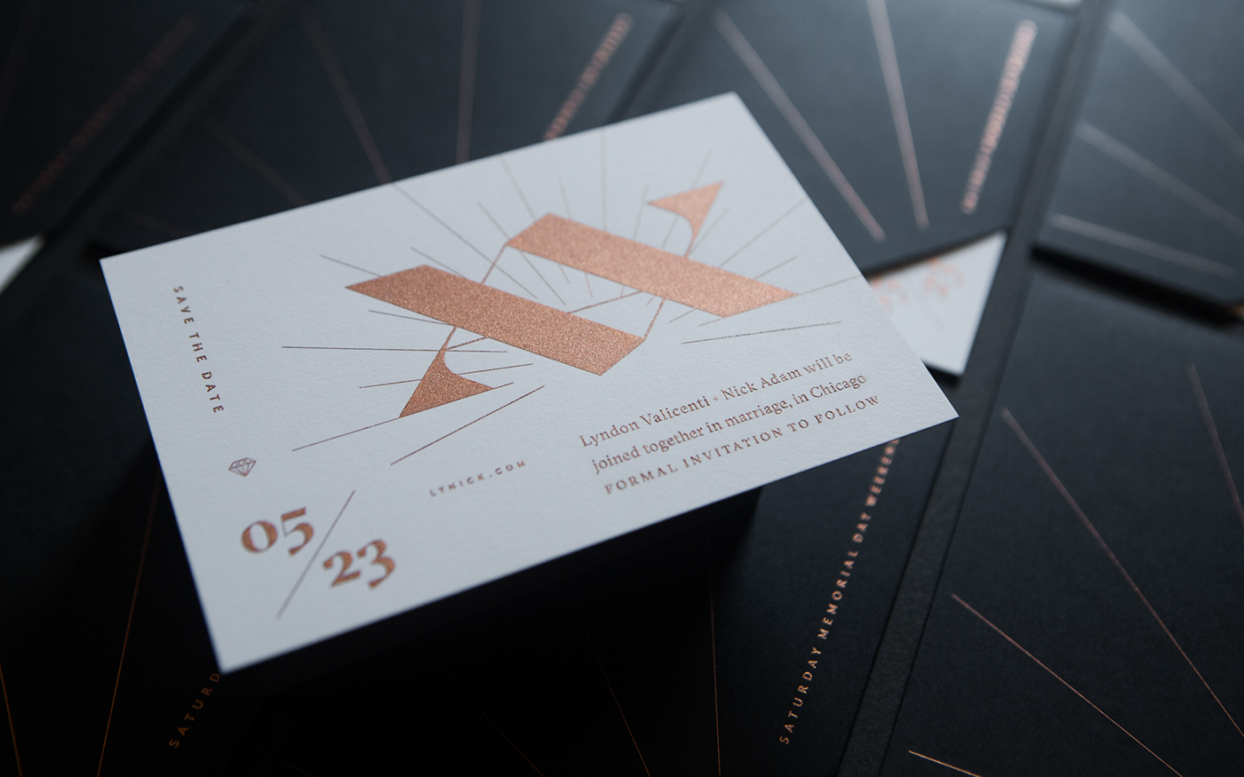
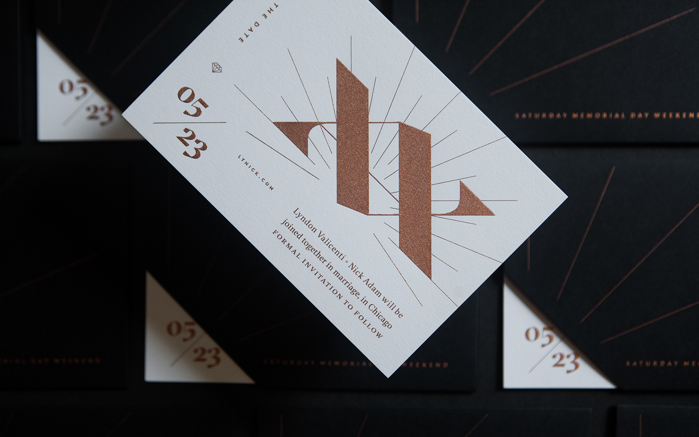
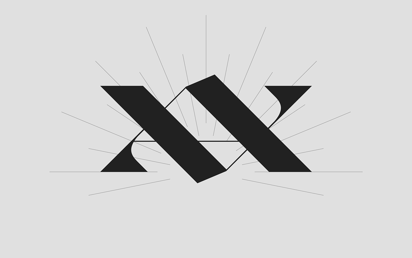
Symbols have always been important to my wife and I. Be that, the peace signs from Lyndon's hippy years of high-school, and this is true today with her crosses that adorn our home's hallway. For myself, the encapsulated A was omnipresent as I was a early-teen 90's punk rocker, today it's the stacked double V that I set to baseline for every project to rise to.
Each of these symbols find strength in the ideals they represent and their numbers they exist in. They too find strength in certainty of their structured forms. Beautiful, rigid, sacred geometry.
Wanting to capture our moment by illustrating equality and difference, the formal approach was in a manner not dissimilar to the yin-yang. Form informing form, complementary differences united — marking a moment of coming together or becoming joined.
The uppercased initials of our last names (V + A) are like mountains and valleys, near mirrored reflections of each other. They inform each other — the ups and down, highs and lows are an honest portal of every relationship.
The historical ties of these forms span most of recorded time, religions, and cultures. Their symbolic meanings date to Neolithic-Agrarian — the basis for the development of civilization.
The letter V has represented the chalice, an ancient symbol of femininity. The symbol's meaning is form based, the open-air negative space of the V acts as a container. This is likened to the chalice where wine is held, as well, like the uniquely female part of anatomy where new life is carried.
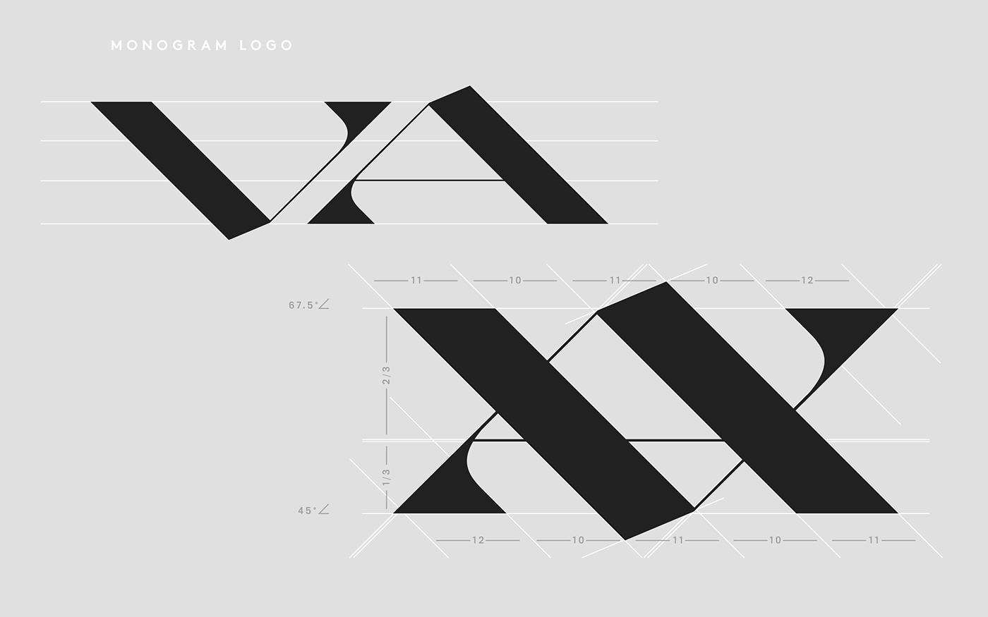
This V upturned, reveals the figure A or more accurately the Alphe (sans-crossbar) holds meaning that too is inverse of the V. This form represented the blade symbolizing masculinity. The upward triangle is not unlike sharpened daggers and swords, or the uniquely male part of our anatomy. The symbol's founding value comes from the power a sword takes, rather than the life the chalice gives.
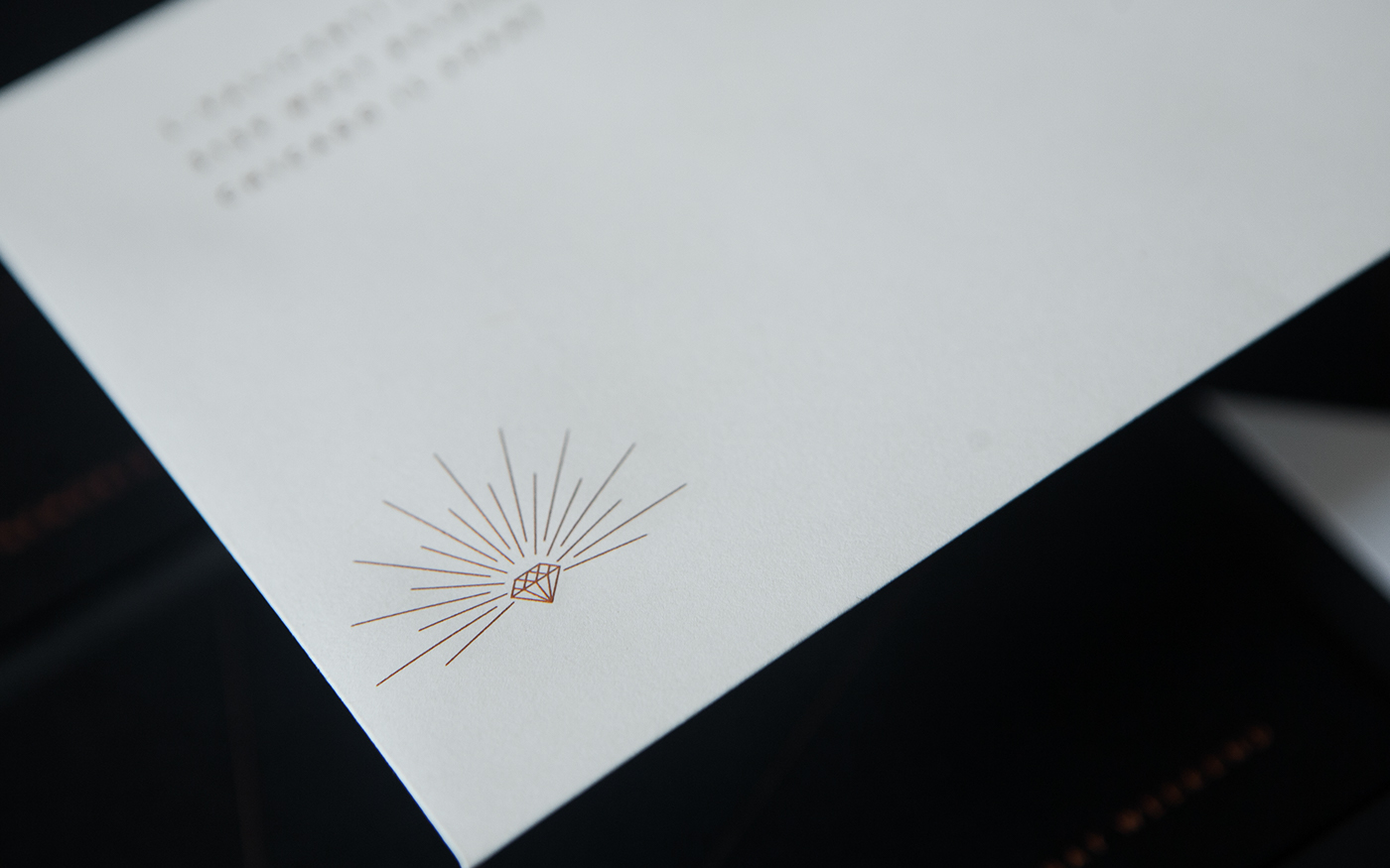
When placed on top of each other these two forms take on new meaning, new form. Released is the six-pointed star, the Seal of Solomon. A symbol balanced in structure and ideals, a symbol that stood to mean perfection by the union of two.
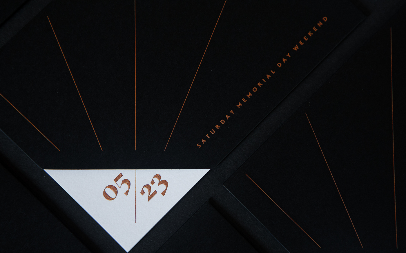
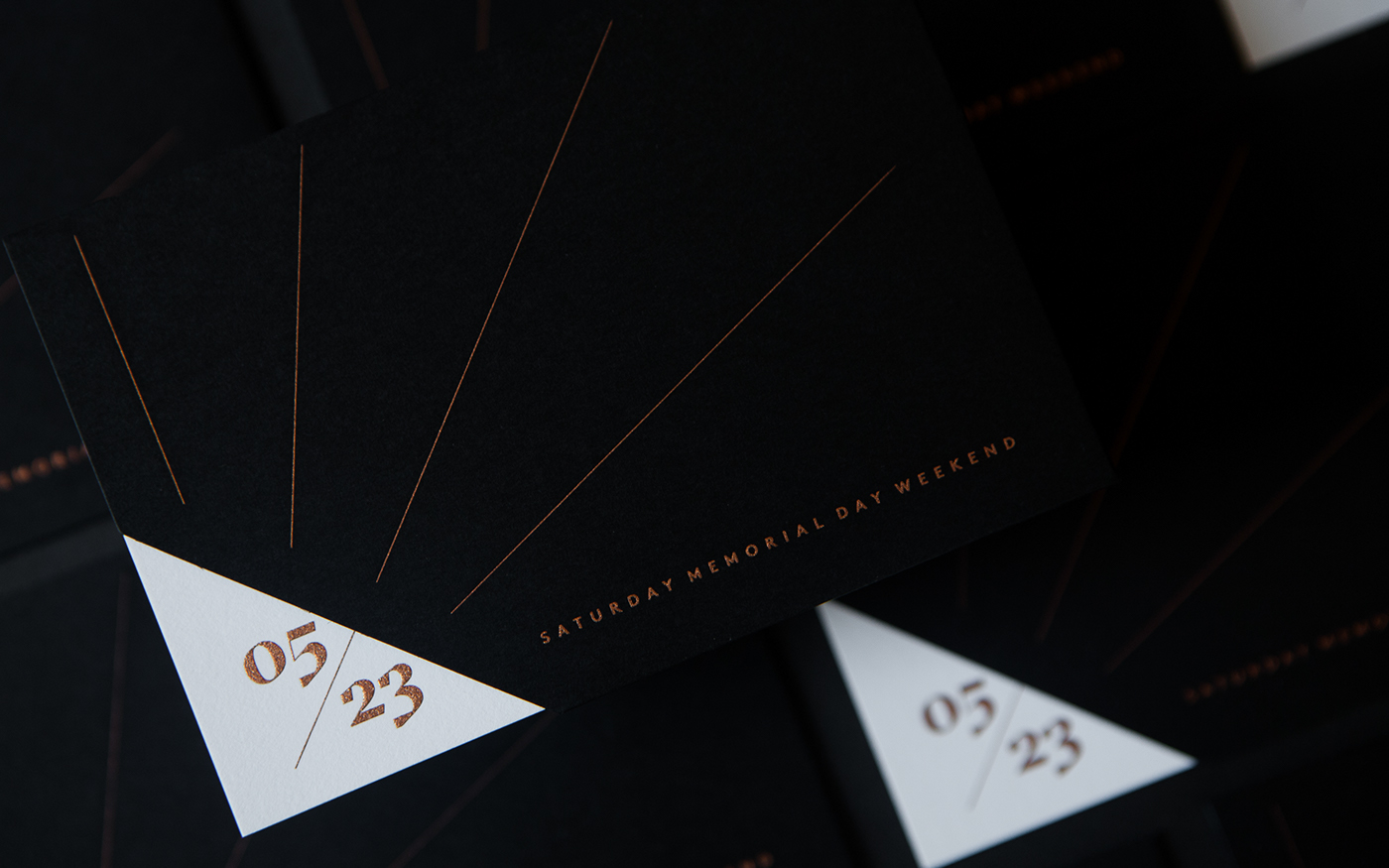
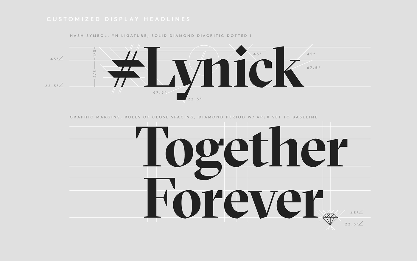
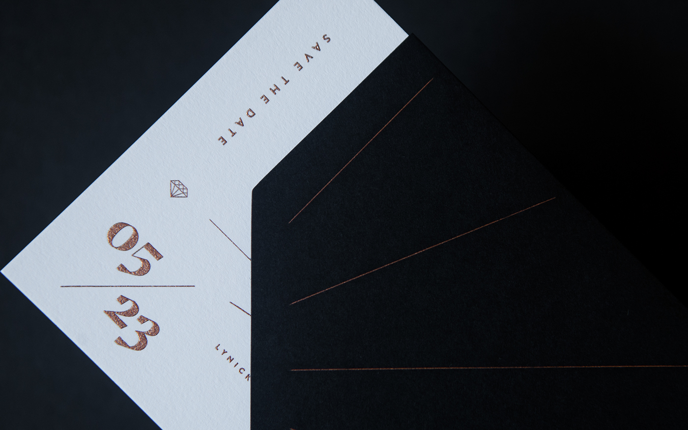
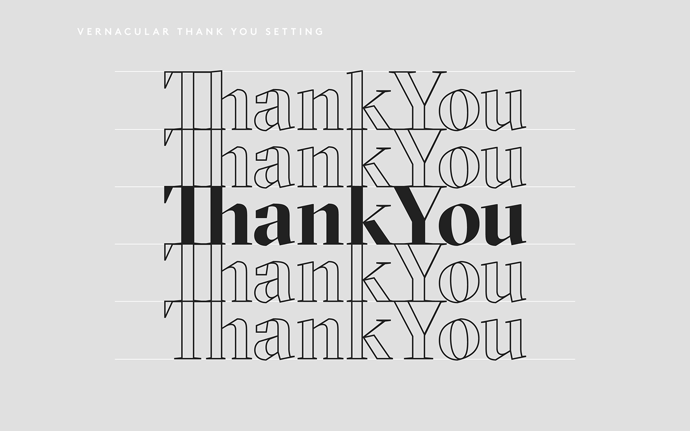
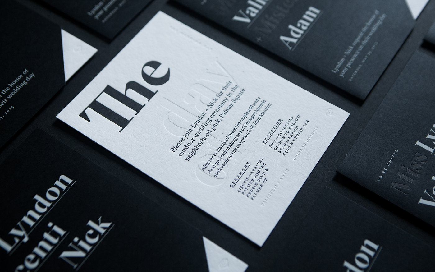
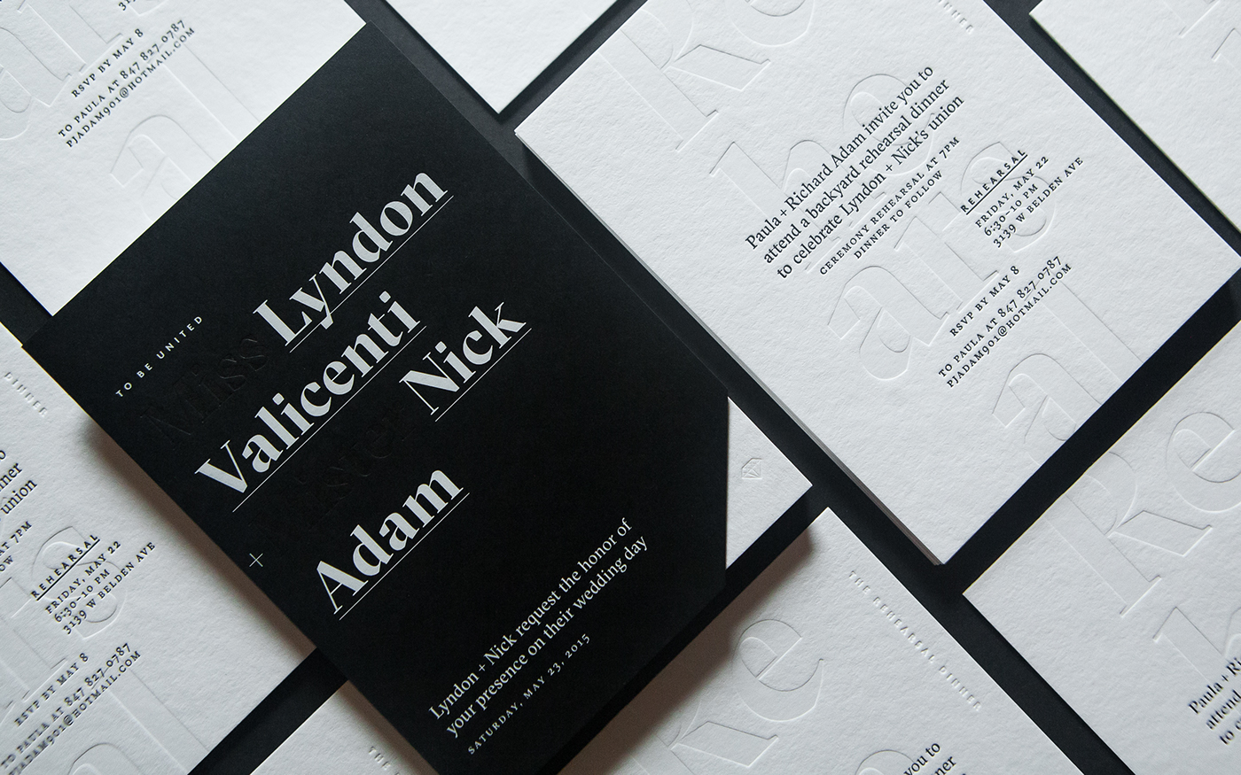
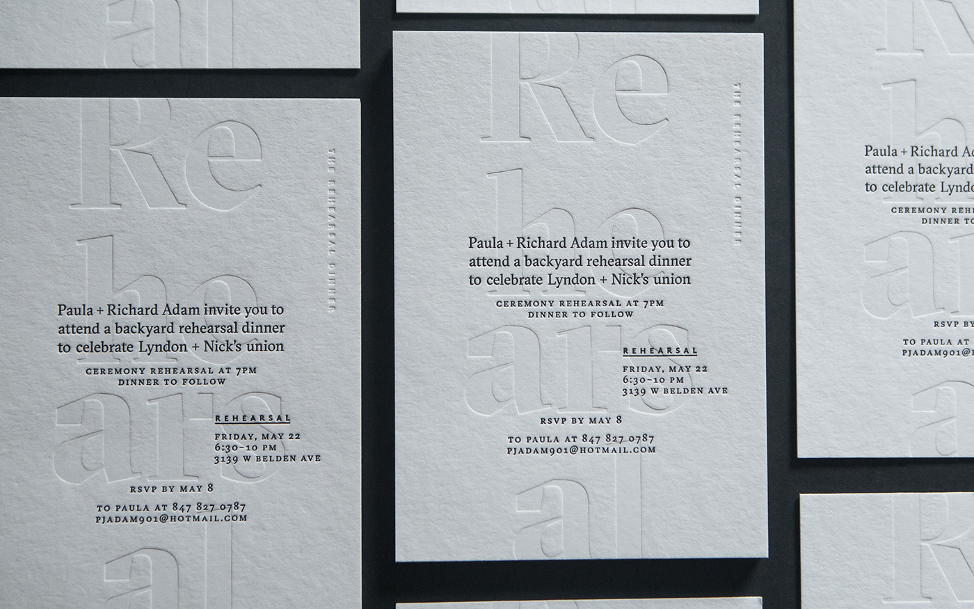
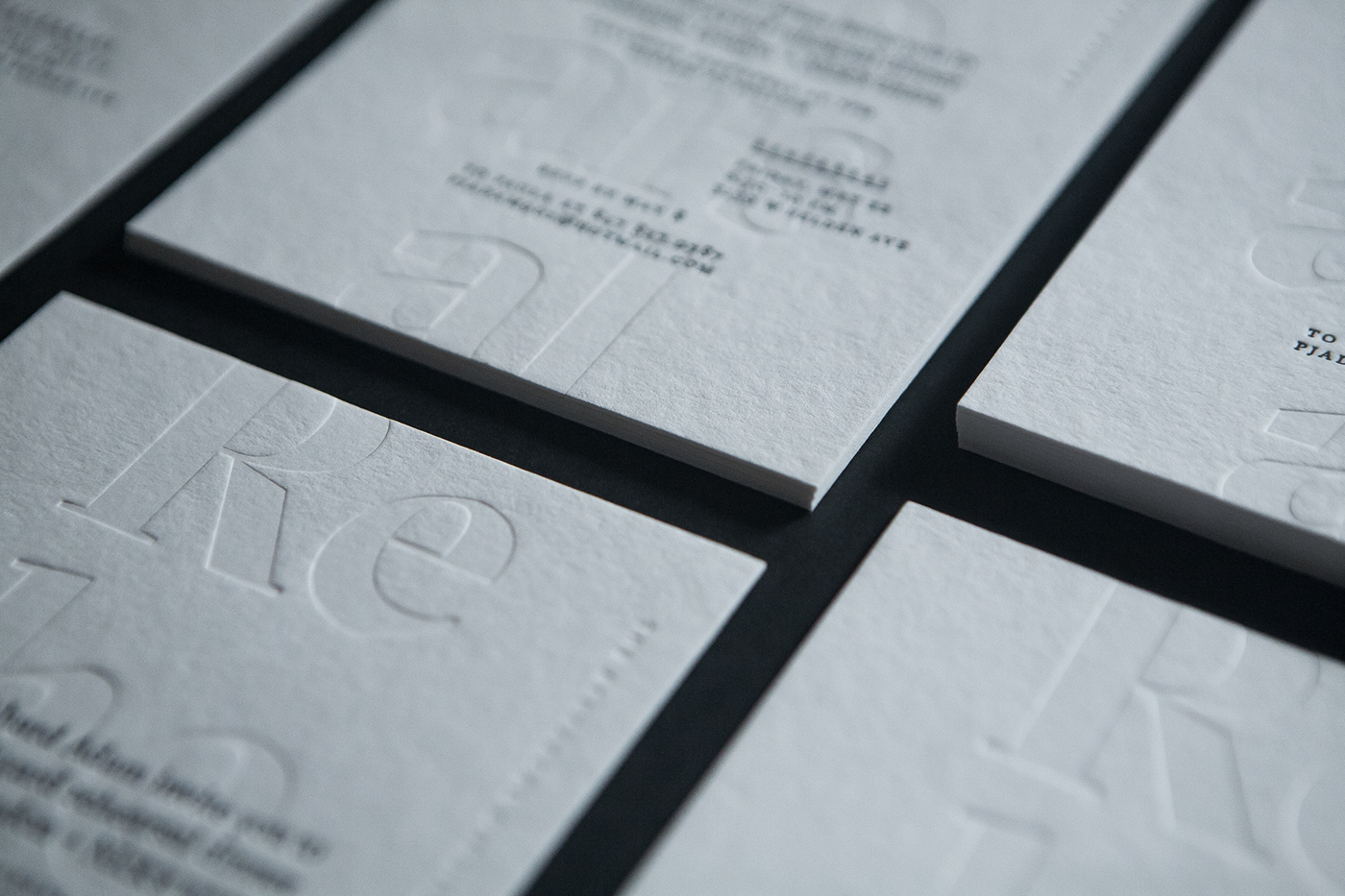
The primary type and structural inspiration for the monogram is Grilli Type's GT Sectra. It's roots are based on broad-nib calligraphic form, for this work that was an enjoyed nod to classic wedding invites and the evidence of human's hand in symbol making. Balancing contemporary characteristics with classy articulation the type was perfect for both long and short form text. The qualities of the display setting were perfect for bring drama and importance to headlines.
The secondary type, used solely for detail titling is LL Brown from Lineto. LL Brown complements GT Sectra through its formal geometric cues that yield hard angles analogous to the monogram and hairline illustrations. Compared to historical relatives LL Brown's geometry is simple and pure.
This Project was a Collaborative Effort
DESIGN TEAM: Nick Adam | CLIENT: My Soon to be Wife
BRONZE ENGRAVING, DIE CUT & CUSTOM SLEEVE: Artistry Engraving
BLIND & INKED LETTERPRESS, WHITE FOIL, DIE CUT & CUSTOM SLEEVE: Rohner
SERIF TYPE: Grilli Type's GT Sectra | SAN-SERIF TYPE: Lineto's LL Brown

