
Cornware is a London-based brand that produces 100% biodegradable, high quality, disposable tableware.
Rohit and Adam were at a party in Singapore, and they realised that switching all those plastic disposable plates and glasses
used at parties to an environmentally friendly alternative would make a real difference. So they decided to do something about it
and will develop a brand that produces an environmentally friendly alternative to plastic disposable tableware.
So Cornware was born.
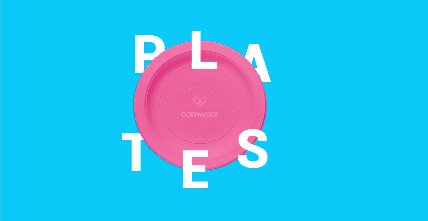
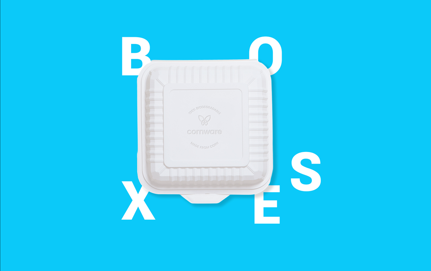
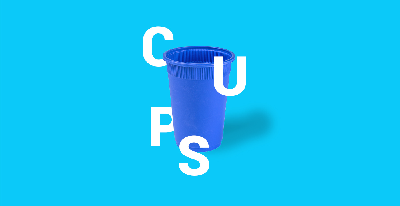
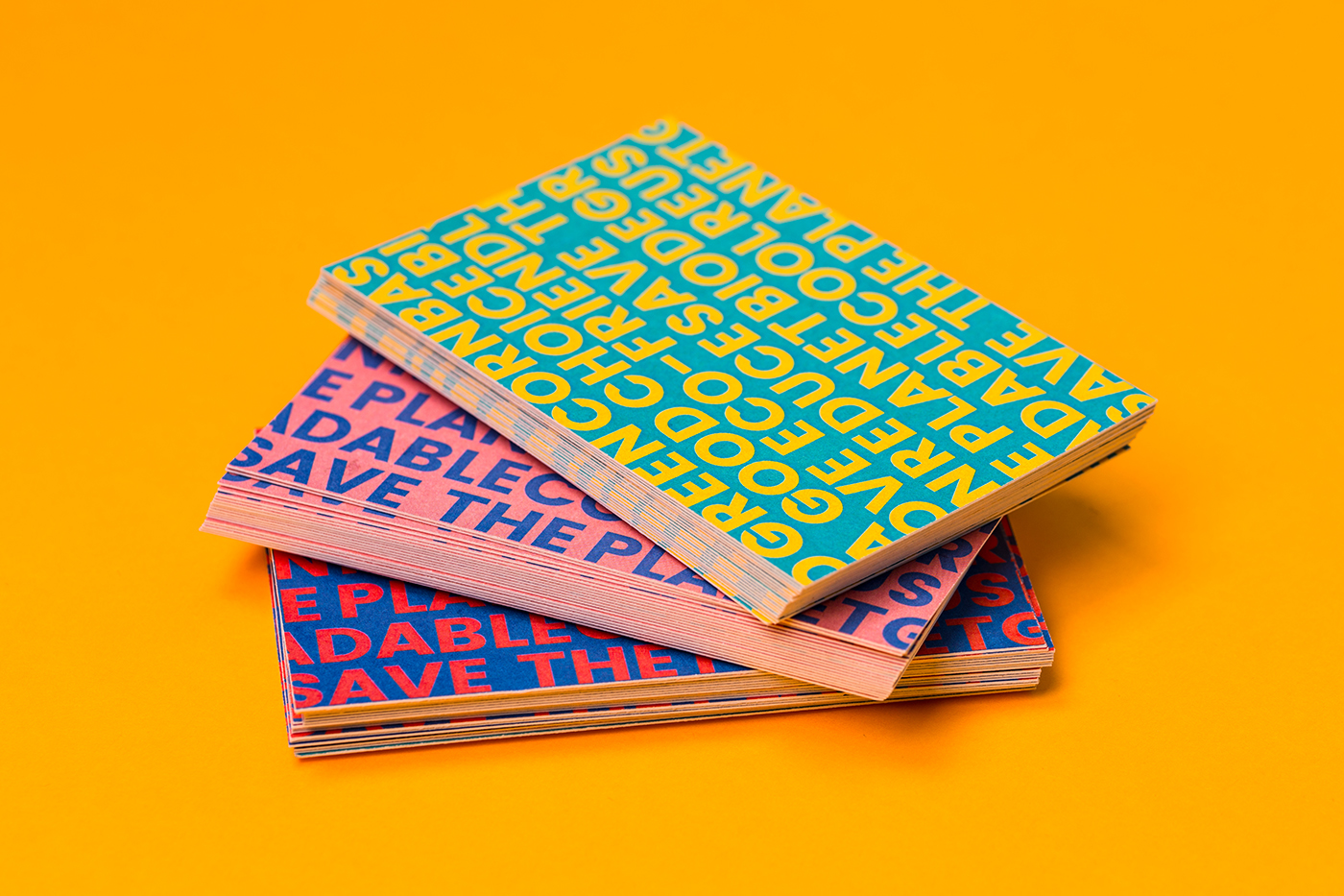
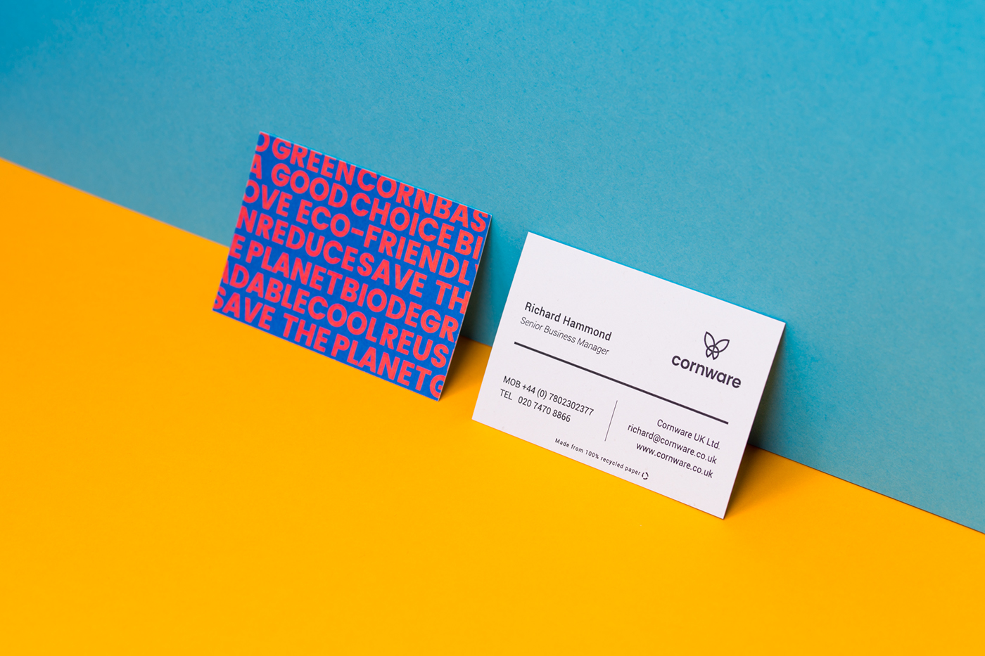
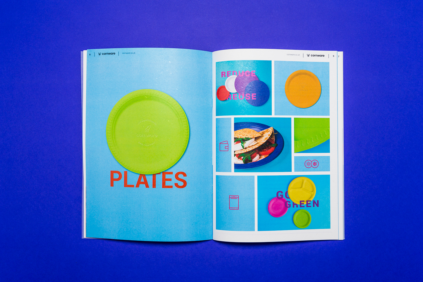
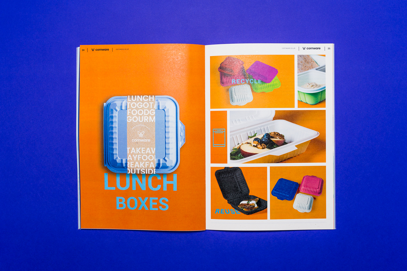
Our task was to create an iconic, cool and sexy identity for the brand, including a characteristic and memorable symbol for Cornware that people can relate to and can immediately recognise on products. In order to achieve this goal, we used bright colours, instead of the way too familiar sand, grey and green colours that are commonly used by recycling brands. As for the logo, we chose the butterfly, as it represents rejuvenation and it is also a symbol that is easy to remember. The typography is made up of bold letters so it can stand out and can be recognised even when they are printed small on the plates.
Design: Zsofia Nagy
Photography: Kevin Harald Campean & Balint Jaksa
Animation: Richard Woth